This post contains affiliate links. We may earn a commission if you click on them and make a purchase. It’s at no extra cost to you and helps us run this site. Thanks for your support!
Honestly, there are so many Adobe InDesign templates that look fine on the first day but totally fall apart on your fifth edit. These 86 do not because I selected each one from my own reviews on WE AND THE COLOR, and I tested every file myself.
The 86 Adobe InDesign templates sit in 11 categories, from annual reports and brand guidelines to resumes and pitch decks. Page counts also run from 2 to more than 60. Formats range from A4 and US Letter to 1920 by 1080 pixel screens. Prices and trial offers change, so I link every template to its listing and to my full review.
Please note that these templates require Adobe InDesign to be installed on your computer. Whether you use Mac or PC, the latest version is available on the Adobe Creative Cloud website—take a look here.
Choosing a layout now costs more time than editing one. Adobe Stock and Creative Market offer more InDesign layouts than anyone can open, and the previews hide the pages where templates break. I open those pages first. Therefore, each entry below says what the template does well, where it struggles, and which job it fits.
Start with the job you need to finish. Each category below links straight to its section.

- Annual & Business Reports (6 templates)
- Book Templates (9 templates)
- Brand Guidelines (7 templates)
- Brochure Templates (8 templates)
- Catalog Templates (9 templates)
- Corporate Stationery, Invoice, Letterheads (4 templates)
- Flyers & Posters (6 templates)
- Magazine & Newspaper Templates (11 templates)
- Portfolio Templates (9 templates)
- Presentation & Marketing Templates (10 templates)
- Resume & CV Templates (7 templates)
How Do I Choose Adobe InDesign Templates That Survive a Real Project?
I choose them by changing them. A template only proves itself when something moves. I call my routine the Four Swaps Test: swap the content, swap the font, swap the palette, and swap the page size. Therefore, a template that passes all four earns a place in this guide.
Swap One: The Content
First, replace every placeholder. Tom Sarraipo’s A4 catalog needed under eight minutes for one full spread. His 26-page furniture catalog needed under six minutes on my second attempt. The Royal Studio’s book template took under an hour for 34 photos and every line of body copy. When the same job takes an afternoon, the paragraph styles are weak.
Swap Two: The Font
Next, change the typeface once and watch the grid. RedGiant’s creative digital portfolio adjusted all 12 pages after one change on a master page. Tom Sarraipo’s 24-page magazine accepted two font swaps across every page in under fifteen minutes. Many templates fake consistency with copied text frames, and they break the moment you change one font.
Swap Three: The Palette
Then drop in three unrelated palettes. GraphyPix’s A4 resume set switched from orange to navy with one click on a swatch. Each alternate palette took under five minutes. Tom Sarraipo’s US Letter magazine passed two of three palettes in my Recolor Tolerance Test. The black and white pass exposed text blocks that rely on background tinting.
Swap Four: The Page Size
Finally, change the format. RedGiant’s 16-page corporate brochure ships US Letter and A4 as two complete files, so it avoids what I call the Two-Format Tax. Pixejoo’s resume set exists in US Letter only, and A4 needs a manual layout adjustment. Every hand-resized master costs margins and time.
Three More Checks Before I Trust a File
Three checks follow the swaps. The first is my CMYK Confidence Check. I confirm the document color mode, check the profile of every placed image, and run preflight before export. RedGiant’s corporate brochure passed without a single flag.
Second comes a printed proof. GraphyPix’s A4 resume set kept its orange accurate in a copy shop test, and the Hailward template kept the warmth of its cream background. Orangeberry’s resume stayed crisp on 24-pound paper, with a body copy of roughly 9 to 10 points.
Third comes contrast on image pages. McLittle Stock’s minimalist art book has no scrim behind the type on its texture spreads, so thin type loses legibility on dark backgrounds. I test contrast on every such spread.
Annual & Business Reports

Six Adobe InDesign templates cover annual and business reports in my selection. They run from 12 to 26 pages. Five of them list A4 as the format, and Valentin Plesa’s version adds US Letter. An annual report lives on its financial pages, and the templates differ most there.
Valentin Plesa’s 16-Page Annual Report Brochure in A4 and US Letter
Valentin Plesa builds this brochure on whitespace and precise typography. It ships in A4 and US Letter, so one template covers both European and American printers. The file includes 16 pre-designed pages. The blue and turquoise accents stay quiet because the layout leaves the talking to the content. Financial summaries, growth plans, and achievements each get a clear place. For a company that wants calm and no custom design work, this is a sound pick.
Read my full review of the Valentin Plesa annual report template or download it at Adobe Stock.
PixWork’s Neutral 16-Page Annual Report Brochure Template
PixWork’s brochure also has 16 pages, and every one follows the same layout. The sample text exists for display only, so you overwrite it with your own. The file is print-ready. You can also export it as a PDF for screen presentations. The design stays neutral on purpose, which makes it the plainest template in this category. For many brands, that is exactly the point. My review of it dates back to 2022.
Check my PixWork annual report brochure review or get the template at Adobe Stock.
GraphicArtist’s 26-Page Annual Report Layout With Teal Accents
GraphicArtist’s teal layout has the most pages in this category, 26 in total. All of them share one layout and one color scheme. The file is optimized for A4 and uses CMYK at 300 dpi, so it is print-ready. Everything stays editable, from dimensions to colors. Basic InDesign skills are enough, because you drag in your own photos and overwrite the placeholder text. The preview photos are not part of the download, and the template arrives as an INDT file.
Here is my review of the teal annual report layout. You can also download it from Adobe Stock.
ResumeInventor’s 20-Page Blue and Red Annual Report Template
ResumeInventor’s template offers 20 A4 pages in red, blue, and white. The red accents are the loudest in this category, and they guide the eye from section to section. The page list reads like a real report. It includes About Us, Mission & Vision, Market Analysis, and Business Solutions pages, plus plan and client review pages. An index page and a Meet the CEO page add the personal layer. CMYK keeps the file ready for print.
Read my ResumeInventor annual report template review or see it at Adobe Stock.
Tom Sarraipo’s 20-Page Minimalist InDesign Annual Report Layout
Tom Sarraipo’s 20-page A4 layout is the one I would hand to a finance team. The palette of beige, charcoal, and warm grey keeps attention on the numbers. Large numerals on the Contents page set expectations before the first spread. The From The CEO’s Desk page sits cleanly on the grid.
The Financial Overview and Business Review pages use simple bar and line charts that follow the color scheme. Because the charts stay plain, trends read at a glance. The Assurance Report deserves a mention, since it sets dense legal text in two columns with short line lengths. Pull quotes give skimming readers an entry point. Bold names on the Our Leadership page separate titles from body text.
Master pages handle page numbers and margins automatically, which saves time near a deadline. The CMYK settings remove any color conversion before the press. At the time of my review, an Adobe Stock trial subscription covered this template for free.
My full review of the Tom Sarraipo annual report layout goes through every page. You can download the layout at Adobe Stock.
GraphicArtist’s Compact 12-Page Annual Report Template
GraphicArtist’s second template is the shortest of the six, with 12 pre-designed pages. The cover pairs a dominant image with the company logo at the top. Inside, an About the Company page shows the people involved, and further pages carry financial and market data in charts. A table of contents and a Future Year Plan complete the set. White space is generous, and the palette stays subtle. I would pick it for a short report that still needs every standard section.
Read my review of the compact GraphicArtist template or download it at Adobe Stock.
Book Templates
Nine Adobe InDesign templates cover books in my selection. Page counts run from 16 to 52, where the reviews name one. A book template lives or dies on its chapter openers.
Tom Sarraipo’s 48-Page Colorful Book Layout in A4 and CMYK
Tom Sarraipo’s colorful book layout runs 48 A4 pages in CMYK. Chapter openers use full-bleed color fields in red, coral, orange, and yellow, and teal enters mid-book. Dark spreads with light type carry data and reference content. I call this the Chromatic Zone System because each hue has one structural job.
Oversized numerals such as 87, 1251, 2005, and 4120 act as visual landmarks. Display type reaches scales that most designers would find alarming, while body copy stays small. I call this Kinetic Typography Architecture. The eye speeds past text and slows at the big moments. The preview shows an astronaut in orange, headphones, a vintage radio, and a teal fluid pour, all placeholders.
Standard paragraph and object styles let you retheme the whole color system in under an hour. The Swiss tradition shows in the grid. The chromatic personality needs a client who wants it. I expect color as navigation to become a best practice in editorial and brand book design. My review ran in March 2026.
Read my full review of Tom Sarraipo’s colorful book layout or download it at Adobe Stock.
The Royal Studio’s 20-Page A4 Book Layout With 11 Urban Images
The Royal Studio’s A4 layout has 20 pages and includes 11 abstract urban photographs. The cover pairs a blurred city image with white serif type. The title Connection and the name sit low on the page, which breaks with centered conventions. Warm orange and amber tones set the mood. The file uses CMYK, and a free Adobe Stock trial covered the download at the time of my review.
Each spread follows what I call the Modular Anchor System, with one dominant visual anchor and structured white space. The interplay of warm photography and neutral body pages is my Thermal Contrast Framework. The contents page uses two columns with clear section numbering. I rate editorial templates with my Spatial Narrative Index, which measures Structural Clarity, Visual Momentum, and Adaptive Range. This one scores high on all three. My review dates to May 2026.
Here is my review of The Royal Studio’s A4 book layout. You can also get it at Adobe Stock.
Tom Sarraipo’s 52-Page Book Template in A4 and US Letter
Tom Sarraipo’s 52-page template comes in both A4 and US Letter. The layout is minimalist, with a strong grid, generous white space, and large image placeholders. All text and images are placeholders, and the preset styles format your manuscript automatically. The review lists portfolios, novels, photobooks, and brand publications as uses. Its 52 pages are the highest page count in this category. My review ran in August 2025.
Check my review of Tom Sarraipo’s 52-page book template or see it at Adobe Stock.
Tom Sarraipo’s 48-Page A4 Template for Book and Magazine Layouts
Tom Sarraipo built this A4 template for book and magazine layouts with 48 pages. It ships as INDD and IDML files, supports InDesign CS4 and higher, and uses CMYK at 300 dpi with bleeds. I call the approach Modular Narrative Architecture because content comes first and decoration last.
A double page with the number 63 pairs a massive numeral with dense text. The contrast creates drama without costing readability. The Introduction spread wraps text around negative space and a marble texture. You can replace the texture with a photograph, and the layout adapts. I call this the Zero-Destruction Workflow, because edits flow into the grid. The preview images are not included.
The template exports as a print PDF, an interactive PDF, or an e-book. I call that dual state Hybrid Publishing Flux. It suits architecture monographs, fashion lookbooks, and annual reports. My review ran in January 2026.
Read my review of the 48-page book and magazine template or download it at Adobe Stock.
The Royal Studio’s 20-Page Black-and-White Book Template With 34 Photos in A4
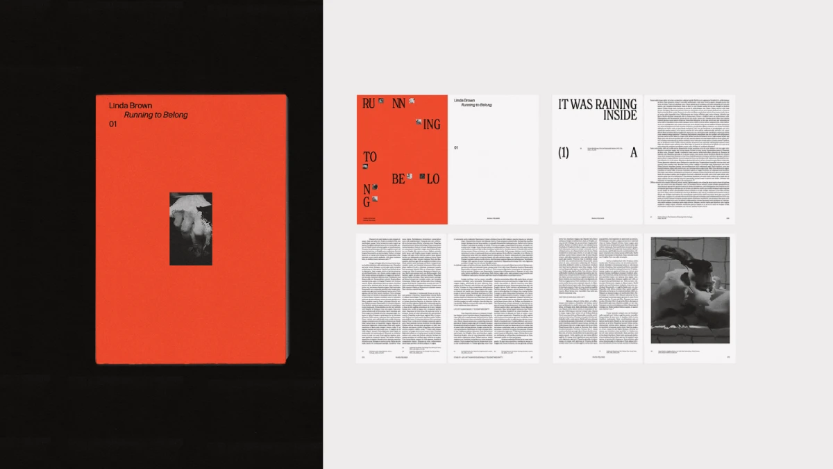
The Royal Studio’s second book template has 20 A4 pages in CMYK and comes with 34 black-and-white photographs. A flat orange field wraps the cover, which holds the fictional book Running to Belong. Inside, chapter openers pair oversized type with wide margins of white space, and body text runs in narrow, generously spaced columns. Two spreads near the middle fill with dense grids of small images, like an enlarged contact sheet. The orange field returns on the closing spread.
I call the cover logic the Threshold Cover Principle: full-bleed color outside, pure black and white inside. The orange does not reappear until the last spread, so the book has a shape before you read a line. I call the grid spreads Contact Sheet Continuity. They break up long text and photo sequences with a moment of density. Crop all photos to a square or a matching ratio first, or the grid fits vertical and horizontal shots awkwardly.
Replacing all 34 photos and rewriting every line of body copy took me under an hour. Master pages control the repeating footnote captions, so one style update applies everywhere. The limits are specific. The file is A4 only, so a US trim such as 6 by 9 inches needs a manual resize of every spread. The bold type pairing also takes time to rebalance if you swap fonts. It suits photo books and visual essays, not a 300-page novel. My review ran in September 2026.
Read my review of The Royal Studio’s black-and-white book template or download it at Adobe Stock.
The Royal Studio’s 20-Page Urban Portfolio Book Template in CMYK
The Royal Studio’s urban portfolio book has 20 pages in CMYK. Covers, chapter openers, full-bleed image spreads, text pages, and index-style lists form one coherent sequence. All preview images are included in the download, so you can open a populated document and study scale and cropping.
I call the layout logic the Contextual Restraint System, because negative space is as deliberate as content. Spatial Authorship is my term for the idea that a layout is itself a creative statement. The typography works as Editorial Infrastructure, with understated typefaces and a coherent scale. The European editorial tradition shows. Documentary photographers, architects and art directors fit it best.
Resist the urge to customize everything at once. I suggest editing type before images and keeping to one or two accent colors. I predict a Hybrid Portfolio Model within three to five years, with a print file and a digital PDF generated from one source file. My review ran in April 2026.
Here is my review of The Royal Studio’s urban portfolio book template. You can download it from Adobe Stock.
McLittle Stock’s Minimalist Art Book Template in A4, Tested With Real Content
McLittle Stock’s A4 art book template drops color entirely. It runs on black, white, grayscale, and photographic texture. I laid out every spread with real content. The file is CMYK at 300 dpi, comes as INDD and IDML for CS4 and newer, and uses master pages and paragraph styles.
Oversized headlines meet narrow columns of small body text, sometimes stacking words across the full page height. That contrast is the whole argument of the template. Full-bleed textures such as raw concrete, wood grain, cracked leather, matte fur, gravel, marble, woven fabric, and chain-link mesh alternate with plain type spreads.
The weak spots are specific. Texture spreads have no scrim behind the type, so thin type loses legibility on dark backgrounds, and you must test contrast every time. There are no variants for pull quotes, captions, or small insets. All-caps headlines get loud after three similar spreads. The preview photos are not included. My review ran in September 2026.
Read my full review of McLittle Stock’s minimalist art book template or download it from Adobe Stock.
Sirisako’s 16-Page Minimalist Portfolio and Photobook Template in A4 and US Letter
Sirisako’s template dates to July 2022. It comes in A4 and US Letter and is fully print-ready. Sixteen predesigned pages can grow or shrink because you can add, duplicate, or delete pages as needed. Basic InDesign knowledge is enough, and a few clicks add your own content.
Check my review of Sirisako’s portfolio and photobook template or see it at Adobe Stock.
McLittle Stock’s Visual Editorial Art Book Template in US Letter
McLittle Stock’s second art book template uses US Letter, 8.5 by 11 inches, in CMYK. Bold, condensed serif headlines sit beside narrow body columns with generous line spacing. The spreads alternate between full-bleed images and restrained type compositions. The preview shows aerial photography, oil paintings, flat illustration, and botanical art, and each fits without friction.
I call the pacing the Visual Breath Sequence and the three spread types the Tri-Rhythm Layout System: impact, dialogue, and rest. The template shows Compositional Neutrality, meaning the structure recedes enough to let the artwork lead. All images and texts are placeholders.
For print, embed all fonts and export PDF/X-1a or PDF/X-4. Uncoated stock gives a matte gallery finish, and semi-gloss coated paper reproduces photographs best. I predict that within five years the editorial art book becomes the expected portfolio format for serious fine art, photography and illustration. My review ran in April 2026.
Here is my review of McLittle Stock’s visual editorial art book template. You can also get it at Adobe Stock.
Brand Guidelines
Seven Adobe InDesign templates cover brand guidelines in my selection. They range from 6 pages to more than 60. Five come from Adobe Stock, and two come from Creative Market. Three are built for screens at 16:9. The strongest ones start with strategy, not with the logo.
Designcy Studio’s 22-Page Brand Guidelines Brochure in A4 With Orange and Dark Green
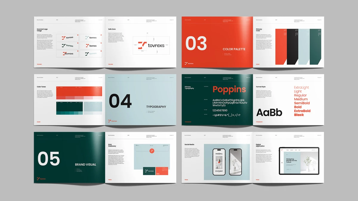
Designcy Studio built this A4 brochure around five numbered chapters: Overview, The Logo, Color Palette, Typography, and Brand Visual. Large color fields and oversized numerals open each chapter. I call this the Section Signal System, because the openers work as navigation and not as decoration. The file uses CMYK and holds 22 pages in orange, dark green, pale blue, black, and white.
The logo chapter follows a designer’s working order. It runs from the Primary Logo through the Grid System, Logo Variations and Incorrect Logo Usage to the Safe Zone. Typography shows Poppins from ExtraLight to Black. The Brand Visual chapter ends with Print Stationery, Social Media and Digital Application pages, which I call the Application Proof Ladder.
Test the orange in a print proof first. The preview photos are not part of the download. Twenty-two pages also leave little room for motion rules or complex co-branding, so I would not use the file unchanged for a large enterprise.
Read my full review of Designcy Studio’s brand guidelines brochure or download it at Adobe Stock.
Broluthfi’s Magazine-Style Brand Guidelines Template in A4 and US Letter
Broluthfi designed this brand guidelines template to read like a magazine. It comes in A4 and US Letter, with CMYK for print. You choose between two distinct design options. The sample text exists for display only, so you overwrite it with your own.
The pages cover a logo overview, typography in Bold, Regular, and Light, a color bar option page, and a stationery set with letterheads and envelopes. Large, bold headings make navigation easy. My review of it dates back to July 2024.
Check my review of Broluthfi’s brand guidelines template or see it at Adobe Stock.
ContestDesign’s 16-Page A4 Brand Guidelines Template With Marbled Cover Art
ContestDesign opens with abstract, marbled artwork on the cover, which suits high-end brands. The 16 pages inside stay minimal and keep generous white space. A grid system aligns the content. The typography section gives clear font rules, and primary and secondary color palettes sit on their own pages.
The file is A4 in CMYK. Its layers are organized and labeled, so beginners can find their way. I covered it in August 2024.
Here is my review of ContestDesign’s A4 brand guidelines template. You can also get it at Adobe Stock.
RedGiant’s Six-Page Brand Guidelines Presentation at 1920 by 1080 Pixels
RedGiant’s template is the shortest in this category, six pages for screens at 1920 by 1080 pixels. A palette of black, blue, yellow, and gray carries the sample brand Creviden. Strong horizontal and vertical lines give the pages order.
The Brand Logo page shows logo usage and clear space. The Brand Color page lists RGB and HEX codes with lighter swatches. Typography splits into primary and secondary fonts with numerals and letters. Imagery combines product shots with lifestyle photos. All images, colors, and text are placeholders, and you can duplicate pages to add web assets, social icons, or voice and tone.
The format fits meetings and screen sharing. It does not fit a printed manual. I covered it in October 2025.
Read my review of RedGiant’s brand guidelines presentation or download it at Adobe Stock.
Studio Industry’s Osla Brand Guidelines With 36 Animated Slides for InDesign and Canva
Osla by Studio Industry is the only template in this category that does not require InDesign. The package includes files for Canva, PowerPoint, Google Slides, and Adobe InDesign, with both INDD and IDML. It holds 36 animated slides in 16:9 full HD. Master layouts and drag-and-drop photo replacement keep editing simple.
Free fonts are included, and the Google Slides version needs no font installation. The design is elegant and feminine, which suits fashion, beauty, photography, and lifestyle brands. You buy it at Creative Market, not at Adobe Stock. My review ran in July 2025.
Check out my review of the Osla brand guidelines template or get Osla at Creative Market.
PixWork’s 16-Page Brand Guidelines Brochure With Desert Photography
PixWork’s brochure has 16 A4 pages in CMYK and a distinct desert mood. Dune photography meets a dark cover and bright white interiors. Black and white anchor the palette, and a sandy gold and an earthy orange serve as accents. Vertical black bars on the side of many pages mark the sections.
The pages cover the brand story, logo construction, primary color usage, mobile mockups, icon sets, and forbidden logo uses. A pixel-like geometric logo signals digital readiness. Images and text are placeholders. Color changes take minutes in the Swatches panel, and master pages update the whole file at once. My review ran in October 2025.
Read my review of PixWork’s brand guidelines brochure or see it at Adobe Stock.
Lab.131’s Petricore Brand Guidelines Template With 60+ Pages of Real Content
Petricore by Lab.131 is the largest template in this category, with more than 60 pages. It ships as INDD and IDML and was designed at 1920 by 1080 pixels. Unlike the others, it comes with real content instead of lorem ipsum. I call this approach populated logic. You learn what a tone of voice page should say because one already says something coherent.
I tested it for a full week with content for a fictional skincare brand called Marlow & Ash. I kept the grid, the type scale, and the color logic, and the structure held. The logo pages show real measurements for clear space and minimum size. The color pages list HEX, RGB, CMYK, and Pantone values for each color. I ran the primary and secondary pairings through a contrast checker, and every pair passed for body text.
The order of the pages matters most. I call it the Five-Layer Identity Stack: Strategy, Mark, Type, Color, and Application. Petricore starts with mission, vision, values, and tone of voice, and every later page refers back to them. Its imagery pages give photographers framing, lighting, and mood cues instead of vague adjectives.
There are limits. Mockups and photography are not included. The 1920 by 1080 pixel format needs resizing for A4 print. Without an InDesign license, you cannot open the file. If you swap in a font with a taller x-height than the included free fonts, check the vertical rhythm on dense pages. My review ran in July 2026.
Here is my full review of the Petricore brand guidelines template. You can also buy Petricore at Creative Market.
Brochure Templates

Eight Adobe InDesign templates cover brochures in my selection. Two are bifolds, one is a tri-fold, and five are multi-page layouts. Where the reviews name a page count, it runs from 12 to 24. Only RedGiant’s corporate brochure ships separate US Letter and A4 files. I judge a brochure template by its page sequence more than by its cover.
Boris Cupac’s 24-Page Blue Brochure Template in US Letter
Boris Cupac, who publishes on Adobe Stock as Refresh, designed this brochure in US Letter. It has 24 pages. White and blue shades carry the modern layout, and minimalist graphic accents set the tone. Everything is fully customizable in Adobe InDesign. Together with Bourjart’s A4 layout further down, it is the longest brochure in this category.
Read my review of the blue brochure template by Boris Cupac or download it from Adobe Stock.
GraphicArtist’s A4 Portfolio Brochure Template in Black and White
GraphicArtist’s A4 portfolio brochure opens with a dark, bold cover and keeps the interior black and white. The file uses CMYK at 300 dpi, includes bleeds, and comes as INDD and IDML. A modular grid keeps every page consistent.
The spreads alternate between text and imagery. The Portfolio section headers break the grid on purpose, which gives the layout an editorial pulse. Table of Contents, Values, and About pages give a creative studio room to state its philosophy. I call the effect Negative Space Authority, because the white space frames the work instead of filling the page.
All images are placeholders. The clean sans-serif fonts and the colors are easy to swap, and Master Pages speed up the replacement. My review of this template ran in January 2026.
Here is my full review of GraphicArtist’s A4 portfolio brochure. You can also download it at Adobe Stock.
GraphicArtist’s 16-Page Bi-Fold Brochure Template for Adobe InDesign
GraphicArtist’s bi-fold brochure has 16 fully customizable pages. You can change the main layout and every color, image, and text section. The sample texts are for display only. Adding your own content takes a few clicks. At the time of my review in October 2021, an Adobe Stock trial subscription covered the download for free.
Check out my review of the 16-page bi-fold brochure template or see it at Adobe Stock.
Bourjart’s 24-Page A4 Brochure Template With Gray Accents
Bourjart designed this A4 brochure with 24 customizable pages and gray accents. The file is fully print-ready, and you can also save it as a PDF for screen presentations. Like the blue brochure above, it runs 24 pages, but it is built in A4. At the time of my review in November 2021, an Adobe Stock trial subscription covered the download for free.
Read my review of Bourjart’s brochure with gray accents or download it at Adobe Stock.
RedGiant’s 16-Page Corporate Brochure in US Letter and A4, Tested for a Week
RedGiant’s corporate brochure is the only one in this category that ships US Letter and A4 as two separate, complete files. Each has 16 pages in CMYK. I tested it for a week. I call the cost of single-format templates the Two-Format Tax, and this file pays it for you.
The page sequence follows a company profile or an annual report. The sequence starts with a cover, an overview, and a contents page. Next come an about-us spread with mission and values and a CEO message with team bios. A services page, a process spread, and a project showcase follow. Clients, testimonials, and a contact page close the file.
The services page uses an icon grid with six categories in two columns. The process spread shows four numbered steps with day-range placeholders. The stats spread gives three large numbers room to breathe: years of experience, projects completed, and client satisfaction.
The file passed my CMYK Confidence Check without a single preflight flag. That check has three steps. You confirm the document color mode, check the profile of every placed image, and run preflight before export. The photos in the preview are not included. The layout is disciplined and grid-based, so it fits corporate work better than experimental editorial projects. My review ran in August 2026.
Here is my hands-on review of RedGiant’s corporate brochure template. You can also get it at Adobe Stock.
GraphicArtist’s Simple 14-Page Bifold Brochure in A4
GraphicArtist’s simple bifold brochure comes as an A4 file with 14 customizable pages. The layout is modern and easy to use, and it targets business purposes. You add text, graphics, and images with a few clicks. The file is fully print-ready. My review dates back to August 2022.
Check my review of the simple bifold brochure template or download it from Adobe Stock.
RedGiant’s Business Tri-Fold Brochure in A4 With Red Accents
RedGiant’s tri-fold brochure is an A4 file in CMYK with two distinct design options. Greys and whites form the base, and red accents mark calls to action and key headings. The cover carries a large portrait photo and the headline CREATIVE WORK.
Inside, three panels read Who We Are, Our Services, and Why Choose Us. The services panel uses icons for strategic planning and market analysis. Client testimonials with headshots and a contact panel close the fold. All text and photos are placeholders. My review ran in July 2025.
Read my review of RedGiant’s business tri-fold brochure or see it at Adobe Stock.
Refresh’s 12-Page Desert Dreams Brochure in US Letter
Refresh built this brochure on a strong grid with generous white space. It offers 12 page layouts in US Letter. Refresh is the Adobe Stock name of Boris Cupac, who also made the blue brochure above. The listing is titled Lifestyle Desert Dreams Brochure Layout, and the preview shows desert scenes.
You drag your own images into the frames, and pasted text picks up the paragraph styles automatically. The review suggests company profiles, creative portfolios, real estate lookbooks, and event programs as uses. My review ran in October 2025.
Here is my review of Refresh’s 12-page brochure template. You can also download it at Adobe Stock.
Catalog Templates

Nine Adobe InDesign templates cover catalogs in my selection. Tom Sarraipo made four of the nine. Where the reviews name a page count, it runs from 16 to 26. BrandPacks, Sirisako, E-Type and Sarraipo’s 24-page layout ship in both A4 and US Letter, and only PixWork’s catalog is built for screens. A catalog template earns its keep on the product pages, not on the cover.
Tom Sarraipo’s A4 Furniture, Interior and Product Catalog Template
Tom Sarraipo’s A4 catalog opens with a bold Catalog headline, the subtitle Furniture | Interior | Product, and a full-bleed hero image placeholder. It runs in CMYK. I tested it over several sessions with furniture collections, interior lookbooks, and product lines, and the structure held every time.
A summary spread pairs sample images with color swatches. The item cards carry product names, item codes, short descriptions, and swatch squares. Collection openers use a large left-column headline, an intro paragraph, and a dominant image. I call this the Modular Clarity Framework, because every page type has one clear job.
Each item appears first in a lifestyle image and then again as a clinical item card. I call this Contextual Proximity. It builds desire before it delivers data. Replacing all placeholder content on one full spread took me under eight minutes. My review ran in June 2026.
Read my full review of Tom Sarraipo’s A4 catalog template or download it at Adobe Stock.
McLittle Stock’s Minimalist Art Catalog Template in A4
McLittle Stock built this A4 catalog for artists, galleries, and designers. Clean lines, ample white space, and refined typography keep the focus on the artwork. All images and text are placeholders, and the pre-designed pages are fully customizable. You can export the finished file as a PDF for online viewing. My review dates to March 2025.
Check my review of McLittle Stock’s art catalog template or see it at Adobe Stock.
Tom Sarraipo’s 26-Page A4 Furniture and Interior Design Catalog Template, Built for the Printer
This second Sarraipo template offers 26 predesigned A4 pages in CMYK. It took me three hours to pick apart. The grid assumes large product photography as the hero, which is the right call for furniture. Nobody buys a sofa because of the copywriting.
The layout types include cover and closing pages, brand story spreads, and full-bleed hero product pages. Three-up and four-up product grids follow. Detail pages leave room for dimensions and materials, and lifestyle pages show room scenes. I call this Full Catalog Coverage, because the page count matches the real structure of a catalog instead of padding it with cover variants.
The file ships in CMYK from the start, which avoids what I call the Print Fidelity Gap between screen and press. Preview photos are not included, and that follows the Placeholder Photography Principle: you license layout and images separately. I replaced a full product spread in under six minutes on my second attempt. My one critique is the missing digital companion layout. My review ran in August 2026.
Here is my hands-on review of the 26-page furniture catalog template. You can also get it at Adobe Stock.
BrandPacks’ 20-Page Minimalist Catalog Template in A4 and US Letter
BrandPacks delivers 20 pages in A4 and US Letter, in CMYK, as INDD and IDML files. Bold headers meet delicate serif body text. Black and grey accents leave the photography in charge, and master pages and layers keep edits fast. The placeholders are grey boxes.
I call the underlying structure Silent Grid Architecture, a grid that guides the eye without showing its mechanics. The pacing alternates dense information pages with open visual spreads, and the sequence runs from introduction to highlights to contact. The minimalism leaves no place to hide, so low-resolution photos will show. My review ran in January 2026.
Read my review of the BrandPacks catalog template or download it at Adobe Stock.
Tom Sarraipo’s 26-Page Catalog Layout for Designer Furniture Brands
A third Sarraipo catalog also has 26 A4 pages in CMYK, with a palette of deep charcoal, warm ivory, and muted sage. Sage anchors the cover and back cover, and charcoal backgrounds carry the product sections. The summary page pairs index entries with small product thumbnails, which I rate as a design moment rather than a table of contents.
I call the structure the Three-Phase Catalog Arc: orientation, immersion, and resolution. Grid spreads in the middle section carry multiple items with color chips. Full-bleed lifestyle images close the book. The modular grid lets you reorder pages without breaking the logic, a trait I call Plug-and-Play Grid Logic. Shoot photos at 300 dpi and request a print proof before the full run. My review ran in March 2026.
Check my review of the designer furniture catalog layout or see it at Adobe Stock.
Sirisako’s Clean 20-Page Product Catalog Template in A4 and US Letter
Sirisako designed this clean product catalog in A4 and US Letter. It has 20 pages, and you can duplicate or add as many as you need. Sample text and images are for display only. Basic InDesign knowledge is enough to edit it. At the time of my review, an Adobe Stock trial subscription covered the download for free.
Read my review of Sirisako’s clean product catalog template or see it at Adobe Stock.
Tom Sarraipo’s 24-Page Minimalist Product Catalog in A4 and US Letter
Sarraipo’s fourth entry offers 24 pre-designed pages in A4 and US Letter. A contemporary sans-serif and a clear type hierarchy support the minimalist layout, and negative space lets products stand out. About Us and collection pages make it usable as a portfolio as well. My review of it dates back to September 2024.
Here is my review of the 24-page minimalist product catalog. You can also download it from Adobe Stock.
E-Type’s Product Catalog Template in US Letter and A4
E-Type’s product catalog comes in US Letter and A4, with INDD and IDML files. Images and text are placeholders, and organized layers make editing easier. You can export a print PDF or an interactive PDF with hyperlinks. This is the most general entry in this category, with no page count named in my review. It dates to May 2025.
Check my review of E-Type’s product catalog template or see it at Adobe Stock.
PixWork’s 16-Page Product Catalog Presentation at 1920 by 1080 Pixels
PixWork’s catalog is the only one in this category made for screens, at 1920 by 1080 pixels. It has 16 pre-designed pages. White space dominates, and the layout suits furniture, technology, fashion, and lifestyle products. You can change colors, typography, and layout. My review dates to June 2024.
Read my review of PixWork’s product catalog presentation template. You can also download it from Adobe Stock.
Corporate Stationery, Invoice, Letterheads
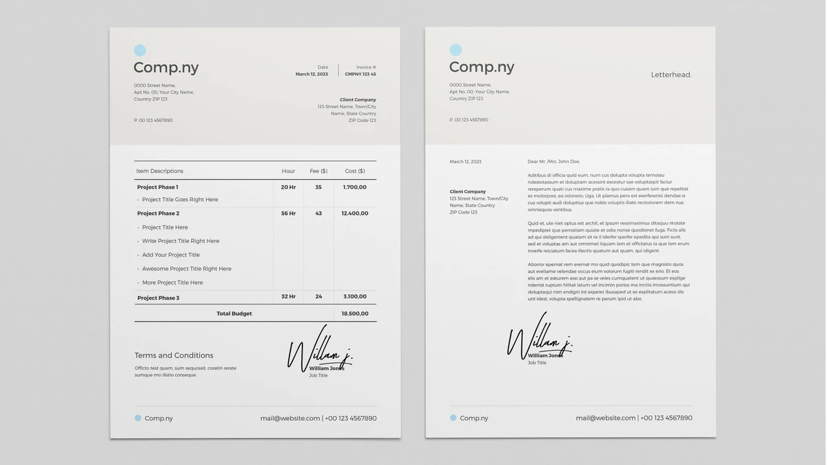
Four Adobe InDesign templates handle the paperwork side of a brand in my selection. Two are invoices, one is a stationery set, and one is a letterhead. Three of the four come in A4, and two of those add US Letter. For a new brand, I would start with the letterhead and the stationery set, then add an invoice.
Broluthfi’s Invoice Template With Cover Letter in A4 and US Letter
Broluthfi’s invoice template ships in A4 and US Letter. It includes a cover letter in addition to the invoice layout. The file is print-ready, and editing is easy because you add your company logo and text in a few clicks. My review of it dates back to March 2022.
Read my review of Broluthfi’s invoice template or download it at Adobe Stock.
Orangeberry’s Stationery Set With Green and Beige Accents
Orangeberry’s stationery set bundles a cover letter, an envelope, and a two-sided business card. All pieces are editable in Adobe InDesign, and you add your own text, images, and graphics. The neutral design suits private people and companies alike. Green and beige accents give the set a warm tone without shouting. It is the only template in this category that includes an envelope and a business card.
Here is my review of the green and beige stationery set. You can also get the set at Adobe Stock.
Bourjart’s Clean Invoice Template in CMYK, US Letter and A4
Bourjart’s invoice template relies on a clean layout and little else. It uses CMYK color mode and comes in US Letter and A4. Fonts, colors, logos, and layout are all customizable. Because the design stays simple, it adapts to almost any brand identity. My review of this template ran in April 2024.
Check my Bourjart invoice template review or see it at Adobe Stock.
GraphicArtist’s Corporate Letterhead Template in A4 With Blue Line Work
GraphicArtist designed this corporate letterhead in A4 and CMYK. Thin blue lines structure the page, and faint geometric outlines sit in the background. White space does most of the work. The sender, recipient, date, and body fields are placeholders, so you simply click and type.
A clearly marked area takes your logo. The blue lines and geometric elements can be recolored in a few clicks, which lets you match any brand palette. It is the newest entry in this category, and my review ran in July 2025.
Read my full review of the GraphicArtist letterhead template or download it at Adobe Stock.
Flyers & Posters
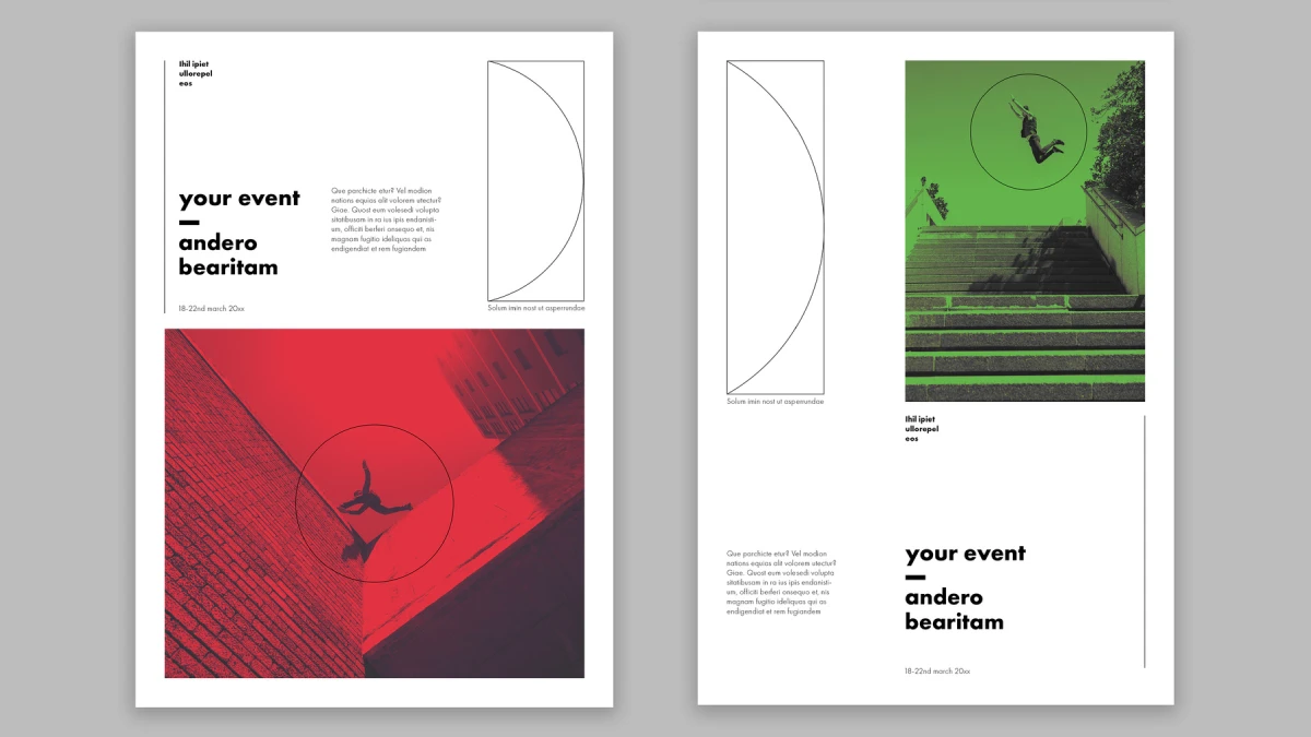
Six Adobe InDesign templates cover flyers and posters in my selection. Two are flyers, three are posters, and one is a gift voucher. The formats run from an 8.5 by 3.5 inch voucher to an 18 by 24 inch poster. Only two of the six are classic flyers, and both come from PixWork.
PixWork’s A4 Flyer Template With a Fully Changeable Layout
PixWork’s A4 flyer template allows you to change the entire layout. Replacing the placeholder text and images takes a few clicks. The InDesign file is print-ready, and you can also save it as a low-resolution PDF for screen presentations. The Adobe Stock listing is titled Red Box Flyer. My review of it dates back to August 2021.
Read my review of PixWork’s A4 flyer template or download it at Adobe Stock.
BrandPacks’ Christmas Gift Coupon Voucher in 8.5 by 3.5 Inches
BrandPacks built this voucher around a deep red palette and a pattern of intersecting circles and semicircles. The format is 8.5 by 3.5 inches, set up in CMYK with bleed. Two pages hold the front and the back. The front carries the Gift Voucher headline, and the back holds the terms and conditions. The design skips Santa and reindeer, which suits boutiques, spas, and cafes.
All text is editable, and the layers are organized and labeled. A Valid Until field sits on the back, and a QR code placeholder is included. The typography pairs classic serif fonts with clean sans-serif details. My review ran in December 2025.
Here is my full review of the Christmas gift coupon voucher. You can also get the voucher layout at Adobe Stock.
ContestDesign’s Brand Identity Poster Template in A4
ContestDesign turns brand rules into an A4 poster. It covers logo usage, a color palette with hex, CMYK, and RGB values, and primary and secondary typography. Designs for business cards, letterheads, and envelopes sit next to imagery guidelines and a mission and vision section. The file is print-ready, and every element is customizable. My review dates to May 2024.
Check my ContestDesign brand identity poster review or see it at Adobe Stock.
BrandPacks’ 18 by 24 Inch Brand Guidelines Poster Template
BrandPacks made this brand guidelines poster for the wall of a workspace, at 18 by 24 inches. It collects logo usage, typography recommendations, color schemes, imagery styles, and graphic elements on one sheet. Colors and layout are fully adjustable in Adobe InDesign. Compared with ContestDesign’s A4 version, this one works as a wall piece. My review is from February 2024.
Read my review of the BrandPacks brand guidelines poster or download it at Adobe Stock.
Wavebreak Media’s Two Minimalist Poster Layouts in A4 and US Letter
Wavebreak Media supplies two poster designs, and both come in A4 and US Letter. The layouts stay simple, so you add your own graphics, images, and text in a few clicks. The Adobe Stock listing is titled Black and White Poster. These are the only plain poster layouts in this category, with no brand guideline content attached. My review is from September 2022.
Here is my review of the Wavebreak Media poster layouts. You can also download them at Adobe Stock.
PixWork’s Minimal Business Flyer in A4
PixWork’s second flyer uses a modern, minimalist A4 layout. You can swap the header image or add your own text in seconds. The file is print-ready and also works for screen presentations. The layout suits all kinds of businesses. At the time of my review in October 2021, an Adobe trial subscription covered the download for free.
Read my review of PixWork’s minimal business flyer or get it at Adobe Stock.
Magazine & Newspaper Templates

Eleven Adobe InDesign templates cover magazines and newspapers in my selection. Eight are magazines, and three are newspapers. Where the reviews name a page count, it runs from 8 to 40. Only Tom Sarraipo’s 24-pager is built for US Letter. Most magazine templates fail the moment you swap a font.
McLittle Stock’s Fresh and Clean A4 Magazine Template
McLittle Stock built this A4 magazine template in CMYK at high resolution. It works for lifestyle, fashion, technology, and travel titles. Pre-designed elements and organized layers speed up the work, and colors, fonts, images, and layout elements are fully editable. The Adobe Stock listing is titled Fresh and Clean Magazine. My review dates to October 2023.
Read my review of McLittle Stock’s A4 magazine template or download it at Adobe Stock.
PixWork’s 16-Page A4 Magazine Template With Nature-Inspired Layouts
PixWork’s A4 magazine template has 16 predesigned pages in CMYK. The page types include covers, a table of contents, article spreads, image galleries, and closing pages. You can duplicate, delete, or rearrange pages, and all text and image areas are placeholders. The sample layouts use nature imagery, strong typography, generous white space, and organized grids. The Adobe Stock listing is titled Clean Magazine Template. My review ran in April 2025.
Check my review of PixWork’s A4 magazine template or download it at Adobe Stock.
Marcel’s 14-Page Tabloid Newspaper Template for Adobe InDesign
Adobe Stock contributor Marcel designed this newspaper in tabloid format with 14 predesigned pages. You can add, duplicate, or remove pages. The file uses CMYK and is fully print-ready. All sample text and images are for display only, and a few clicks add your own content. My review dates back to 2022.
Check my review of the tabloid newspaper template. You can download it from Adobe Stock.
PixWork’s Minimalist A4 Travel Magazine Template With Master Pages
PixWork’s travel magazine template is a minimalist A4 layout with generous white space. It uses CMYK with proper bleed and margins, so a print run needs no extra setup. Master pages, paragraph styles, and character styles organize the file, and you can add or remove pages without breaking the layout. The template suits photo essays, city guides, and personal travelogues. My review ran in July 2025.
Here is my review of PixWork’s travel magazine template. You can also see it at Adobe Stock.
Studio Luuqas Design’s 20-Page A3 Classy Newspaper Template
Studio Luuqas Design made this newspaper in A3 with 20 pages. All pages follow one uniform layout and grid system. Basic graphic design and InDesign skills are enough to edit it. You can copy pages, add new ones, and include your own text and images. It is the only template in this category in A3.
Read my review of the classy newspaper template or download it from Adobe Stock.
Tom Sarraipo’s 36-Page A4 Magazine Template in CMYK
Tom Sarraipo’s 36-page A4 template lands in the typical range of 32 to 48 pages. It ships in CMYK with bleed already configured, and the swatches, paragraph styles, and character styles are set up. Layers separate design elements, text, and backgrounds. I call the principle Structural Editorial Integrity because every design decision serves both aesthetics and production logic.
Bold full-bleed spreads follow dense editorial sections, and text columns alternate between single and multi-column setups. I call this Editorial Pacing Architecture. Feature spreads use asymmetric two-column grids, while news-style sections shift to three columns. I call the grid’s quiet precision the Invisible Grid Principle.
Export with the PDF/X-4 preset and keep the page count in multiples of four for binding. The preview photos are not included. The template needs InDesign, and there is no Canva version. My review ran in April 2026.
Here is my review of Tom Sarraipo’s 36-page magazine template. You can also get it at Adobe Stock.
Adam’s 40-Page A4 Interior Design Magazine Layout in CMYK
Adam’s interior design magazine layout has 40 A4 pages in CMYK. The cover pairs a dominant hero image with a restrained masthead. The palette stays in creams, taupes, and soft grays with sage accents. The page list covers a contents page, an editor’s letter, feature spreads, product showcases, project deep-dives, interviews, brand features, and back matter.
I call the mix of layout modes Editorial Range Architecture, a coherent system with real variety. The designer spotlight and interview pages balance a strong portrait with pull quotes and column text. For print, coated stock of 130 to 170 gsm inside and a 300 gsm cover suit the warm palette. The photos are not included. My review ran in April 2026.
Check my review of Adam’s interior design magazine layout or see it at Adobe Stock.
Roverto Castillo’s Modern A4 Magazine Template for Adobe InDesign
Roverto Castillo’s magazine template uses the standard A4 size and CMYK, so it is print-ready. You can also export a PDF for screen presentations. The preview photos are not part of the download, and a few clicks add your own images and text. My review dates to November 2022.
Read my review of Roverto Castillo’s modern magazine template or download it at Adobe Stock.
Tom Sarraipo’s 18-Page A4 Magazine Layout With Gray Accents
Tom Sarraipo, a Switzerland-born graphic designer and photographer, made this A4 magazine layout with 18 pages. You can delete, duplicate, or add pages. Images, graphics, text sections, and colors are fully editable. It shares a designer with the 36-page and 24-page layouts in this category. My review dates back to November 2020.
Here is my review of the 18-page magazine layout with gray accents. You can also get it at Adobe Stock.
BrandPacks’ 8-Page Classic Newspaper Template for Adobe InDesign
BrandPacks’ newspaper template has eight pages and the look of an early twentieth-century broadsheet. Ornate headlines, vintage typography, and elegant column layouts carry the style. Fonts, colors, and layouts are easy to change, and graphic elements add to the aesthetic. You can use it for printed newspapers, newsletters, or digital editions.
The review suggests local news, business reports, lifestyle, sports, opinion, and technology as topics. It is the shortest template in this category. My review ran in November 2023.
Check out my review of BrandPacks’ classic newspaper template or download it at Adobe Stock.
Tom Sarraipo’s 24-Page US Letter Magazine Template, Tested With Real Photography
Tom Sarraipo’s 24-page template is built for US Letter in CMYK. I ran it through a full editorial mockup, swapped fonts twice, and dropped in real photography. I checked the swatches panel, and every fill traced back to a process color. No stray RGB swatch hid in a gradient.
I call the alternation of text-heavy and image-heavy pages the Editorial Density Curve. This template’s curve moves. A portrait spread with generous copy gives way to a tight two-column grid and then a full-page interior shot. The cover uses an oversized wordmark over a moody interior photo, and the contents spread uses large numerals.
My Recolor Tolerance Test drops three unrelated palettes into a layout: a cool blue-gray, a warm terracotta, and a black-and-white pass. This template passed two of the three. The warm swap went through without a single manual fix. The cool one needed manual work on the accent panels behind the pull quotes. The black-and-white pass exposed text blocks that rely on background tinting. Swapping typefaces took under fifteen minutes across all 24 pages.
The layout suits interior, lifestyle and architecture content. For A4, you must rebuild the master pages, and the preview photos are not included. My review ran in July 2026.
Read my full review of Tom Sarraipo’s 24-page US Letter magazine template or download it at Adobe Stock.
Portfolio Templates

Nine Adobe InDesign templates cover portfolios in my selection. Four are A4 print layouts, and the rest are built for screens. Where the reviews name a page count, it runs from 12 to 28. A portfolio template should limit you more than it helps you.
RedGiant’s 12-Page Creative Digital Portfolio Presentation, Built Around Negative Space
RedGiant’s creative digital portfolio presentation has 12 pages at 1920 by 1080 pixels in RGB. It is built for screens, not for print. Three cover treatments, four full-bleed image spreads, two contact-sheet grids, a bio page, an education and skills page, and a contact page make up the file. The cover uses a crosshair motif, a thin plus-sign grid that splits the page into quadrants with a small headshot in one corner. The preview photos are not included.
I call the key figure the Negative Space Ratio, the share of a spread given to empty margin. Most stock portfolio templates hover around 15 to 20 percent. This one runs close to 55 percent on its text-heavy pages. A hairline rule and a tiny caps label such as STUDIO, INFO, or CLIENT anchor each empty page, so the template reads as deliberate and not unfinished.
Every spread pulls from a shared master. I swapped in a heavier grotesk, and the whole document adjusted without breaking the grid. The contact-sheet pages are the weak point. A two-line caption crowds its neighbor, and I nudged three text frames by hand, which cost about fifteen minutes. An interactive PDF export makes the contact page’s email field clickable. There is no color variant, so saturated work needs a rebuilt hierarchy. My review ran in September 2026.
Read my full review of RedGiant’s creative digital portfolio presentation or download it at Adobe Stock.
RedGiant’s 12-Slide Personal Portfolio Presentation in Black, White and Deep Gray
RedGiant’s personal portfolio presentation has 12 slides at 1920 by 1080 pixels. The palette stays in black, white, and deep gray, and bold condensed sans-serif headlines carry the type. Images work as atmosphere, not as decoration. The slide order runs from title and intro through Education, Experience and Skills to a portfolio overview, three project pages and a closing contact slide.
I call the underlying idea the Three-Act Portfolio Framework: Establish, Evidence and Close. Structural Intentionality is my name for the way every slide earns its place. Master pages and an interactive PDF export with navigation and transitions keep the deck usable on screen. I rate portfolio templates on five dimensions: narrative completeness, content flexibility, typographic confidence, display-native resolution, and customization depth.
For screens, export at 72 to 150 dpi. My review ran in May 2026.
Read my review of RedGiant’s personal portfolio presentation or download it at Adobe Stock.
GraphicArtist’s 22-Page Clean Portfolio Presentation at 1920 by 1080 Pixels
GraphicArtist’s clean portfolio template offers 22 fully editable pages at 1920 by 1080 pixels. The layout is minimalist and made for screen presentations. Basic InDesign knowledge is enough, and you can add, duplicate, or remove pages. My review dates back to 2022.
Check my review of GraphicArtist’s clean portfolio template or download it from Adobe Stock.
PixWork’s 26-Page A4 Minimalist Portfolio Brochure in CMYK
PixWork’s minimalist portfolio brochure has 26 customizable pages in A4. The file is print-ready in CMYK. It includes areas for project descriptions, image galleries, and contact details, and white space keeps the focus on the work. The review points to photographers, graphic designers, and architects. At the time of my review in June 2024, an Adobe Stock trial subscription covered the download for free.
Here is my review of PixWork’s minimalist portfolio brochure. You can also get it from Adobe Stock.
ContestDesign’s 16-Page A4 Graphic Design Portfolio Template With Year Markers
ContestDesign’s graphic design portfolio template has 16 predesigned A4 pages. The cover pairs a bold title and your name with an image. Project pages carry year markers from 2024 to 2028, which keep the work in chronological order. Replace those placeholder years before you publish. Layers are organized cleanly, and an included instruction file helps beginners. My review ran in July 2024.
Read my review of ContestDesign’s graphic design portfolio template or see it at Adobe Stock.
ContestDesign’s 20-Page A4 Portfolio Template for Photography, Art and Design
ContestDesign’s second portfolio template has 20 A4 pages. It targets photographers, artists and designers. The file is fully customizable and print-ready. My review of it dates to 2023.
Check my review of the 20-page ContestDesign portfolio template. You can download it from Adobe Stock.
E-Type’s 28-Page Graphic Design Portfolio Presentation at 1920 by 1080 Pixels
E-Type’s presentation template has 28 pages at 1920 by 1080 pixels and a full agency structure. It runs from Contents, About Me, and Resume to Capabilities and project showcases. The capabilities are numbered Design, Editorial, Consult, and Productions. Project pages cover branding, editorial, web design, and packaging. Art and Photography, Client List, Testimonials, and Team pages follow. All images and text are placeholders. My review ran in 2025.
Here is my review of E-Type’s graphic design portfolio presentation. You can also download it from Adobe Stock.
PixWork’s 16-Page A4 Portfolio Brochure Template With a Grid System
PixWork’s second portfolio brochure has 16 portrait A4 pages and a grid system. You can add, remove, or duplicate pages. The file is print-ready in CMYK, and placeholders mark every image and text. Basic InDesign skills are enough. My review ran in July 2024.
Read my review of PixWork’s A4 portfolio brochure or download it at Adobe Stock.
RedGiant’s 12-Page Black and White Portfolio Presentation, Tested With a Fictional UI/UX Designer
Another RedGiant portfolio deck has 12 pages at 1920 by 1080 pixels and one rule: black, white, and warm off-white. I swapped the placeholder images, updated the paragraph styles, and rewrote the cover for a fictional UI/UX designer in under forty minutes. A dark and a light cover sit in the same file, so you can choose per audience.
The file opens with two covers, an introduction and an About Me page with a full-bleed portrait. An education table and two experience pages follow. A skills page with four percentage bars comes next. A six-project thumbnail index, three project spreads, and a contact page close it. A footer band repeats the template title, a date field, and a page reference on every spread. I call this Kicker Bar Wayfinding.
I call the fixed page count the Twelve-Page Discipline. One skills page and three project spreads force a choice that most portfolios avoid. Grayscale Confidence is the second pattern. Without color, a mediocre photo has nowhere to hide.
Two friction points stand out. The skills page holds only four bars, and the index grid expects exactly six projects. Photos are not included, so shoot or source true grayscale images. My review ran in September 2026.
Check my full review of RedGiant’s black-and-white portfolio presentation or download it at Adobe Stock.
Presentation & Marketing Templates

Ten Adobe InDesign templates cover presentations and marketing in my selection. Eight are built at 1920 by 1080 pixels. Where the reviews name a page count, it runs from 12 to 32. PixWork made four of the ten. The quieter a deck, the more the numbers speak.
RedGiant’s 12-Page Sample Pitch Deck With a Vinyl Disc Motif
RedGiant’s sample pitch deck has 12 pages at 1920 by 1080 pixels and skips gradients, icons, and stock-photo cheer. A large vinyl-style disc with thin concentric rings anchors the cover and the closing page. The palette is cream, black, and a single orange accent, and orange appears on only a few headlines. I call this the Quiet Deck Principle: a pitch deck earns trust when design volume stays below content volume.
A slim header strip on every page carries a brand mark, a page label, a document number, and a small barcode. The footer repeats a date, a name, and a web address. The page order follows an investor story from Cover, Index and Mission to Team, Products, Services, Competitive Analysis, Market Size, Numbers and Thank You. On the Team page, portraits sit inside record discs, which makes uneven headshots look consistent.
I score decks with the Slide Load Index, which counts how many separate ideas one slide asks you to read. One is ideal, and three is too many. Most pages here score two, and the Services layouts reach three. My Placeholder Honesty Test replaces every Latin line with a real sentence. Long headlines crowd the Mission page. The light cover suits investors, and the dark cover suits creative clients. Photos are not included, and the grainy image style is hard to match with bright stock photos. My review ran in October 2026.
Read my full review of RedGiant’s sample pitch deck or download it at Adobe Stock.
A 32-Page Presentation Template With Yellow Accents at 1920 by 1080 Pixels
This Adobe Stock presentation template has 32 pages at 1920 by 1080 pixels and yellow accents. It is a fully customizable InDesign file for personal and commercial use. All sample text is for display only, and you can add your own text or images in seconds. Its 32 pages are the highest page count in this category. My review dates back to January 2021.
Check my review of the presentation template with yellow accents or see it at Adobe Stock.
PixWork’s 27-Page Business Plan Presentation at 1920 by 1080 Pixels
PixWork’s business plan template has 27 fully customizable pages at 1920 by 1080 pixels. It includes graphs for market trends, financial projections, and sales figures. You can edit, modify, and rearrange every page. My review dates to May 2023.
Here is my review of PixWork’s business plan presentation. You can also download it from Adobe Stock.
PixWork’s Business Marketing Presentation With Eleven Slide Types
PixWork’s marketing deck covers Company Profile, Mission, Vision, Services, Team, Timelines, Target Customer, Goals and Objectives, Business Model, Company Overview, and Problem/Solution slides. A clean, modern layout and a vibrant color palette set the tone. Text, colors, and placeholder images are easy to change. The review names no page count or format. My review ran in February 2025.
Read my review of PixWork’s business marketing presentation or get it at Adobe Stock.
Wavebreak Media’s 12-Page Minimal Presentation for Product Demos
Wavebreak Media’s template has 12 predesigned pages at 1920 by 1080 pixels. A uniform layout, ample white space, and elegant typography keep the focus on the product. Text, colors, and images change in seconds. The Adobe Stock listing is titled Minimal Presentation Layout. My review ran in July 2024.
Check out my review of Wavebreak Media’s minimal presentation or download it at Adobe Stock.
GraphicArtist’s 22-Page Simple Minimalist Presentation in Muted Earth Tones
GraphicArtist’s template has 22 customizable pages at 1920 by 1080 pixels. Muted earth tones, whites, and soft grays set a calm mood. A grid-based structure keeps the alignment consistent across all slides. Some slides carry large images, and others leave room for charts and infographics. My review ran in October 2024.
Here is my review of GraphicArtist’s minimalist presentation. You can also get it at Adobe Stock.
PixWork’s 20-Page Infographics Screen Presentation
PixWork’s infographics template has 20 customizable pages at 1920 by 1080 pixels. It is packed with fully editable infographics for business reports, marketing projects, and studies. Basic InDesign knowledge is enough. My review dates to October 2022.
Read my review of PixWork’s infographics presentation or download it from Adobe Stock.
PixWork’s 20-Page Marketing Plan Presentation for Screen and Print
PixWork’s marketing plan template has 20 pages in one uniform style. Customizable text sections and infographics fill the pages. You can use it for screen and print media. The review names no format. My review dates back to October 2021.
Check my review of PixWork’s marketing plan presentation or see it at Adobe Stock.
GraphicArtist’s 24-Page Media Kit Presentation at 1920 by 1080 Pixels
GraphicArtist’s media kit template has 24 predesigned pages at 1920 by 1080 pixels. The pages include a cover, an About Us section, analytics, services, and contact pages. Colors, fonts, images, and text are fully customizable, and clear placeholders mark where content goes. The review names influencers, freelancers, small businesses, startups, and non-profits as users. My review ran in May 2025.
Here is my review of GraphicArtist’s media kit presentation. You can also download it at Adobe Stock.
RedGiant’s 17-Page Pitch Deck Template With a Red Accent
RedGiant’s pitch deck template has 17 pages at 1920 by 1080 pixels. A strong grid, generous white space, and bold typography set the tone, and a red accent stands out against a neutral background. Every element sits on its own layer. The slides run from cover and company profile through Problem, Solution, Services and Goals to statistics, market size, competitor research, team and a closing page. My review ran in June 2025.
Read my review of RedGiant’s 17-page pitch deck template or see it at Adobe Stock.
Resume & CV Templates

Seven Adobe InDesign templates cover resumes and CVs in my selection. Five come as resume and cover letter sets, and two are single layouts. Only one is built for screens at 1920 by 1080 pixels. The rest target paper in A4, US Letter, or both. The best of the seven treat the cover letter as a second page of the same design.
E-Type’s Creative Resume Template With an Optional Photo in US Letter and A4
E-Type designed this resume to work with or without a portrait. The masthead carries a heavy, condensed RESUME wordmark on a cream background. The name runs vertically beside a small square image, and removing the photo barely disturbs the grid. The file uses CMYK and comes in US Letter and A4.
Section labels such as About Me, Skills and Experience use a monospace-leaning face with a colon after each word. That suits a design portfolio. A finance or legal recruiter may find it too self-conscious. The left column holds About Me, Experience and Education. The right column holds Skills, Reference, Awards and Contact.
I call my check for lopsided layouts the Column Balance Test. It asks whether one column grows with your input while the other stays fixed. Here the left column grows, so the default rhythm assumes four solid experience entries. A short career needs manual tightening. Two columns can also confuse applicant tracking systems, so I would send this file straight to studios and keep a plain single-column version for corporate portals.
Read my full review of E-Type’s creative resume template or download it at Adobe Stock.
GraphyPix’s A4 Resume and Cover Letter Set, Tested With a Print Proof
GraphyPix pairs an A4 resume with a matching cover letter, both in CMYK. A slim left column holds contact details and skills. A wider right column takes experience and education. I call this the Asymmetric Anchor Layout because one column stays fixed while the other absorbs the content.
I tested the set in InDesign 2024. One click on the accent swatch turned the orange scheme into navy across both pages. I also built three alternate palettes, including a black-and-white version for conservative industries. Each swap took under five minutes. Editing three job entries took under ten minutes, and the spacing held without manual repair.
A PDF export confirmed 15-millimeter margins on all sides. A test print at a local copy shop kept the orange accurate. The set passes what I call the Usability Triangle of layout flexibility, typographic integrity, and file accessibility. It suits designers, marketers, and creative directors who apply abroad. I would skip it for accounting or government roles.
Here is my hands-on review of the GraphyPix A4 resume set. You can also get the set at Adobe Stock.
E-Type’s 16-Page Designer Resume Portfolio Presentation at 1920 by 1080 Pixels
E-Type’s presentation template is the one screen-first design in this category. It runs 16 pages at 1920 by 1080 pixels in black, white, and a single red accent. Section headers such as RESUME, EXPERIENCE, EDUCATION, PORTFOLIO, and CONTACT INFO use massive uppercase type that bleeds across the slide.
The Experience slide shows percentage indicators for four disciplines: Graphic Design, UI/UX Design, Web Development, and Editorial Design. A five-image grid carries the Portfolio spread. The red accent appears on the Communication Skills spread, where it resets attention. I named the approach the Editorial Tension Framework because the oversized type competes with the image space.
This template is for screens and stages, not paper. At 72 dpi, it will not print well, so a print version needs a rebuild. All preview photos are placeholders. Plan two to four hours to customize all 16 pages.
Check my review of E-Type’s designer resume portfolio presentation or see it at Adobe Stock.
GraphyPix’s Hailward Resume and Cover Letter in A4, Proofed in CMYK
Hailward ships as two A4 pages, a cover letter and a resume, built on one grid. The set uses CMYK from the start. In a printed proof from a local shop, the cream background kept its warmth.
The eye moves from the name to the contact block, then through Profile, Graduated, Experience, and Skill. I call that checking the Recruiter Scan Path Test. Hailward scores well because bold weight and spacing carry the hierarchy. The resume page leaves roughly 38 percent white space, a figure I call the Typographic Silence Ratio.
The weak point is the Experience section. Entries longer than four lines crowd the bottom margin, so a dense work history needs trimming. The cover letter leaves about 40 points of clearance for a signature. At the time of my review, an Adobe Stock trial subscription covered the download for free.
Read my Hailward resume template test review or download Hailward at Adobe Stock.
Pixejoo’s Minimalist InDesign Resume and Cover Letter in US Letter
Pixejoo’s set has two US Letter pages with no rules, icons, or color blocks. The resume uses three columns. Work experience sits on the left, education and awards in the center, and skills, software, and languages on the right. The name repeats at the bottom right next to the contact details.
Hierarchy comes entirely from type size, weight, and spacing. I call this Typographic Resume Restraint. I tested the grid with sparse and dense work histories, and it did not break. The cover letter aligns date and subject with tab stops instead of separate frames, so edits cause no drift.
It is the only template in this category built for US Letter alone. For A4, you change the document setup and adjust the layout by hand. If you know InDesign, swapping the content takes 15 to 30 minutes.
Here is my review of Pixejoo’s minimalist resume template. You can also get it at Adobe Stock.
Orangeberry’s Two-Column Resume and Cover Letter With a Circular Portrait
Orangeberry’s set comes in A4 and US Letter as separate document setups, so you pick your region without rescaling. The resume uses two columns. Education and skills sit in a tight left rail, and work experience takes the wider right column. A circular portrait photo sits in the left column.
I swapped in three portrait crops with different aspect ratios, and the frame held every time. Deleting the photo leaves the text blocks untouched, because the frame sits on its own layer. A test print on 24-pound paper kept the small caps labels crisp and the body copy of roughly 9 to 10 points legible.
The name is the largest element on the page. I call this the Single Focal Point Rule. The cream background and script signature repeat on the cover letter. One gap remains, because the contact block has no style for portfolio links. At the time of my review, an Adobe Stock trial subscription covered the download for free.
Read my review of Orangeberry’s resume and cover letter layout or download it at Adobe Stock.
GraphyPix’s Modern Minimalist Resume and Cover Letter Layout in A4
Another GraphyPix set closes this category: a minimalist A4 layout in CMYK. A portrait placeholder anchors the page. The typography avoids extremes, with no loud contrasts and no heavy weights.
My review names four working ideas. Controlled Attention Flow sends the eye to identity first and then to the details. Editorial Grid Discipline borrows from magazine layout, with left-aligned text and generous white space. The Selective Emphasis Principle allows contrast only where it earns its place. The Application Continuity Effect ties resume and letter into one visual language.
Editing is quick. You replace the portrait, overwrite the text styles, and change the global swatches once. Basic InDesign knowledge is enough. It shares a designer with the A4 set above, so compare both before you decide.
Check my review of the minimalist GraphyPix resume and cover letter template or see it at Adobe Stock.
Adobe InDesign Templates at a Glance
This table sums up all 86 templates by category. Page counts and formats come from my reviews, so each range lists only what the reviews name.
| Category | Templates | Page range | Formats | Best for | Standout detail |
|---|---|---|---|---|---|
| Annual & Business Reports | 6 | 12 to 26 pages | A4, one also in US Letter | Finance teams and small companies | Tom Sarraipo’s 20-page layout with a two-column Assurance Report page |
| Book Templates | 9 | 16 to 52 pages | A4, US Letter | Photo books, art books and essays | The Royal Studio’s contact-sheet grids and Sarraipo’s 52-page template |
| Brand Guidelines | 7 | 6 to 60+ pages | A4, US Letter, 1920 by 1080 px | Agencies and in-house brand teams | Petricore’s 60+ pages with real content instead of lorem ipsum |
| Brochure Templates | 8 | 12 to 24 pages | A4, US Letter | Company profiles and portfolios | RedGiant’s corporate brochure with separate US Letter and A4 files |
| Catalog Templates | 9 | 16 to 26 pages | A4, US Letter, 1920 by 1080 px | Furniture, product and art catalogs | Four catalogs by Tom Sarraipo |
| Corporate Stationery, Invoice, Letterheads | 4 | Single documents and one set | A4, US Letter | Freelancers and small studios | Orangeberry’s set with an envelope and a two-sided business card |
| Flyers & Posters | 6 | Single sheets and one two-page voucher | 8.5 by 3.5 in to 18 by 24 in | Retail and brand teams | BrandPacks’ 18 by 24 inch brand guidelines poster |
| Magazine & Newspaper Templates | 11 | 8 to 40 pages | A4, A3, tabloid, US Letter | Lifestyle, interior and travel titles | Sarraipo’s US Letter magazine and my Recolor Tolerance Test |
| Portfolio Templates | 9 | 12 to 28 pages | A4, 1920 by 1080 px | Photographers, designers and architects | RedGiant’s 12-page decks built on strict rules |
| Presentation & Marketing Templates | 10 | 12 to 32 pages | 1920 by 1080 px for 8 of 10 | Founders and marketing teams | RedGiant’s sample pitch deck and the Quiet Deck Principle |
| Resume & CV Templates | 7 | Resume and cover letter sets, one 16-page deck | A4, US Letter, 1920 by 1080 px | Creative job seekers | GraphyPix sets tested with a print proof |
What 86 Reviews Taught Me About Adobe InDesign Templates
Four Authors Made 41 of the 86
PixWork made 13 of the templates, Tom Sarraipo made 11, GraphicArtist made 9, and RedGiant made 8. Each also has a signature. PixWork delivers plain, dependable grids. Sarraipo builds restrained editorial layouts with generous white space. RedGiant’s newest decks work with strict rules, such as one palette and twelve pages. When time is short, I start with these four.
One in Five Is Built for Screens
At least 17 of the 86 templates are built for screens at 1920 by 1080 pixels. Presentation decks lead with eight, and portfolios follow with five. Brand guidelines add two, while a catalog and a resume deck add one each. Print still dominates the list, but the screen share is hard to ignore.
Where These Adobe InDesign Templates Still Fall Short
Four weak points came up again and again. First, many downloads leave out the preview photos, so you license images separately. Second, every template needs InDesign, and only Osla also ships Canva, PowerPoint, and Google Slides files. Third, single-format files need hand work for the other size, and Pixejoo’s resume and Sarraipo’s US Letter magazine both do. Fourth, some layouts have hard limits, such as four skill bars in RedGiant’s black and white portfolio or a six-project index grid.
Where Adobe InDesign Templates Go From Here
I base these four predictions on patterns I saw while testing.
Color Becomes Navigation
I expect color as navigation to become best practice in editorial and brand books. Tom Sarraipo’s 48-page colorful book already gives each hue one structural job.
Print and Screen Ship Together
I expect templates to arrive with a print layout and a screen layout in one package. Today only RedGiant’s corporate brochure ships two sizes as complete files, and Sarraipo’s 26-page furniture catalog lacks a digital companion. Buyers will start to ask for both.
Portfolios Become Editorial Art Books
I predict that within five years the editorial art book becomes the expected portfolio format for serious fine art, photography, and illustration. McLittle Stock’s two art book templates already point in that direction.
Pitch Decks Shrink
I expect investor decks to settle at 10 to 12 pages with one tactile motif. RedGiant’s 12-page sample deck follows that pattern, and its vinyl disc makes the deck memorable.
Frequently Asked Questions About Adobe InDesign Templates
How many Adobe InDesign templates are in this guide?
This guide lists 86 Adobe InDesign templates in 11 categories. Every template comes from my own reviews on WE AND THE COLOR, and each entry links to its full review.
Where can I download these Adobe InDesign templates?
Most listings are on Adobe Stock. Osla and Petricore are on Creative Market. Several reviews noted a free download with an Adobe Stock trial subscription at the time of writing, so check the current terms before you buy.
Do I need Adobe InDesign to edit them?
Yes, because every file opens in InDesign. Only Osla by Studio Industry also ships Canva, PowerPoint, and Google Slides versions.
Which Adobe InDesign templates are print-ready?
Most A4 and US Letter layouts in this guide use CMYK, and several passed a test print. The 1920 by 1080 pixel decks, such as RedGiant’s sample pitch deck and E-Type’s resume portfolio presentation, are built for screens and need a rebuild for print.
Which templates ship in both A4 and US Letter?
Several do, for example, Tom Sarraipo’s 52-page book, BrandPacks’ 20-page catalog, E-Type’s creative resume, and Orangeberry’s resume set. RedGiant’s corporate brochure ships the two sizes as separate files. Pixejoo’s resume set is US Letter only.
Do the downloads include the preview photos?
Usually not, because most reviews note that the preview photos are not part of the download. The Royal Studio’s book templates are the exception, because they ship with their images.
How do I test Adobe InDesign templates before a client project?
Run the Four Swaps Test. Replace the content, change the font, drop in a new palette, and change the page size. Then run preflight and print one proof. If any step takes more than an afternoon, pick another template. My fastest full-spread swap took under six minutes, in Tom Sarraipo’s 26-page furniture catalog.
You’ll find plenty more Adobe InDesign templates on WE AND THE COLOR. Or browse our general Templates category for countless other design assets covering a wide range of creative applications and software. Every product is handpicked by our editorial team and tested for practical use.
Subscribe to our newsletter!