This post contains affiliate links. We may earn a commission if you click on them and make a purchase. It’s at no extra cost to you and helps us run this site. Thanks for your support!
I’ve seen so many creative digital portfolio presentation templates that try to do too much. They stack gradients on grids, drop icon sets into corners that don’t need them, and end up looking like a pitch deck wearing a photography book’s clothes. RedGiant’s twelve-page InDesign template on Adobe Stock does the opposite. It leans on negative space so hard that the first time I opened it, I genuinely thought half the file hadn’t loaded. But it had. That’s the point.
Please note that this digital presentation template requires Adobe InDesign to be installed on your computer. Whether you use Mac or PC, the latest version is available on the Adobe Creative Cloud website—take a look here.
What Does a Photographer Actually Need From a Presentation Template?
Not more layout options. Most working photographers and visual artists already know how to sequence a body of work. What they need is a structure that doesn’t fight the images for attention, holds up at 1920 by 1080 pixels on a client’s monitor, and doesn’t require three hours of kerning repair before it’s usable. RedGiant’s template answers all three, though unevenly, and the unevenness is worth walking through.
The file ships as an RGB document built for screen, not print, at 1920 x 1080 px across twelve pages. That screen-first sizing matters more than the product description lets on. It tells you this template was built for a deck viewed on a laptop or projected in a pitch meeting, not a printed leave-behind. If you’re planning to send this to a printer, budget time to rebuild the color profile and bleed settings from scratch.
Inside the File: What You’re Actually Buying
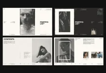
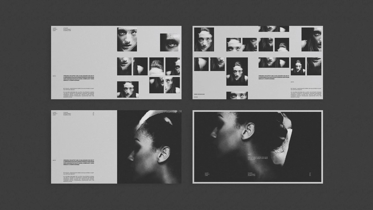
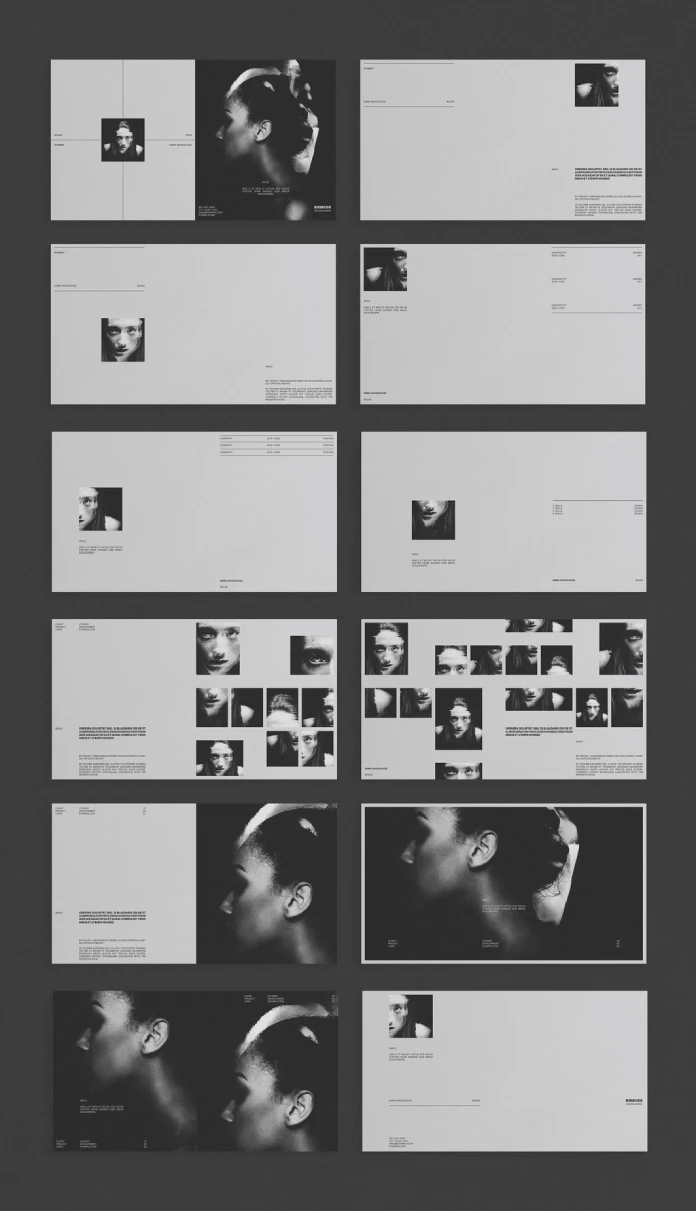
Twelve pages break down roughly into three cover treatments, four full-bleed image spreads, two contact-sheet-style grids, a bio page, an education and skills page, and a closing contact page. The preview photography (moody black and white portraiture, mostly profile shots and close crops) is not included in the download. You’re buying structure, not stock imagery, and RedGiant is upfront about that in the listing.

The cover page uses a crosshair motif, a thin plus-sign grid that splits the page into quadrants with a small headshot dropped into one corner. It’s a nice touch and an unusual one. Many portfolio covers go full-bleed hero image. This one makes you commit to a small, deliberate frame before the reader even turns the page. That’s a confident choice for a template that costs less than a coffee subscription.
The Negative Space Ratio
I want to name something here because it’s the actual reason this template works, and it’s not a concept RedGiant advertises anywhere in the listing. Call it the Negative Space Ratio: the proportion of a spread given over to empty margin versus content. Most stock portfolio templates hover around 15 to 20 percent negative space. This one runs closer to 55 percent on its text-heavy pages, and even the image spreads leave a full third of the canvas untouched.
That ratio is a gamble. Push it too far and a template reads as unfinished. RedGiant stays just on the right side of that line by anchoring every empty page with a single hairline rule and a tiny caps-lock label (STUDIO, INFO, CLIENT). The rule does the work a border would normally do, but without boxing anything in. It’s a small trick. It’s also the entire personality of the template.
Typography and Grid Behavior
The template runs on a placeholder sans that behaves like a Helvetica Neue substitute, with tight tracking and uppercase labels set in what measures out to roughly 8 pt for metadata and 11 to 12 pt for body copy. Line spacing on the body paragraphs sits close to 150 percent, which is generous and, frankly, correct for a document meant to be skimmed on a screen rather than read cover to cover.
Master Pages and Reusability
Every spread pulls from a shared master, which means swapping fonts across all twelve pages takes one edit, not twelve. I tested this by dropping in a heavier grotesk and the whole document adjusted its label widths without breaking the grid. That’s not a given with Adobe Stock templates. A lot of them fake consistency with copy-pasted text frames that each need separate fixing.
Where the Grid Gets Tight
The two contact-sheet pages, the ones built for grids of small crops and detail shots, are the weak point. Image frames sit close enough that a caption running two lines will crowd its neighbor. I had to manually nudge three text frames after swapping in real captions instead of the placeholder Latin text. Not a dealbreaker, but budget fifteen extra minutes here.
Interactivity: The Feature Nobody Reads Past
Adobe InDesign lets users add interactive elements like hyperlinks, page transitions, and buttons directly into a layout like this one, and the listing mentions that capability almost as an afterthought. It’s worth more attention than that. Export this template as an interactive PDF and the contact page’s email field becomes clickable, the bio page can link straight to a reel, and the whole deck behaves less like a static file and more like a lightweight portfolio site. For a freelancer without the time to build an actual website, that’s genuinely useful.
Where It Falls Short
No color variant exists out of the box. Every page assumes a grayscale photography set, and if your work is saturated or brightly colored, you’ll spend real time rebuilding the hierarchy the template currently gets from tonal contrast alone. There’s also no mobile-responsive export path, since InDesign documents don’t translate to web layouts on their own. If your primary portfolio channel is a phone screen, this template is the wrong tool entirely.
Who Should Actually Buy This
- Photographers building a black and white or muted-tone body of work
- Designers who need a fast, credible creative digital portfolio presentation template for client pitches
- Freelancers preparing a deck for a specific project rather than a full career retrospective
- Anyone who wants an interactive PDF portfolio without building a website
It’s a poor fit for colorful illustration portfolios, print-first leave-behinds, or anyone who needs a template that does the sequencing thinking for them. This one assumes you already know how to edit your own work down.
At a Glance
| Spec | Detail |
|---|---|
| Format | Adobe InDesign (.indd) |
| Color mode | RGB |
| Page count | 12 |
| Dimensions | 1920 x 1080 px |
| Best for | Screen-based, black and white photography portfolios |
| Weakest point | Tight contact-sheet grid spacing |
| Strongest point | Negative space discipline and master page consistency |
| Includes photography | No, preview images are not included |
Frequently Asked Questions
Is this creative digital portfolio presentation template suitable for print?
Not without rework. It’s built RGB and sized for a screen at 1920 x 1080 px, so you’ll need to convert color modes and add bleed before sending it to a printer.
Does the template include the photography shown in the preview?
No. The preview images are for display only. You’re buying the layout structure, grid system, and master pages, not the photography itself.
Can I use a different typeface throughout the whole document?
Yes, and easily. Because every page pulls from shared master pages, swapping the font once updates all twelve pages without breaking the grid.
Is this template good for a portfolio with color photography?
Not ideal. The layout’s hierarchy leans on tonal contrast from black and white imagery. Color work will need extra adjustment to read as intentional rather than accidental.
Can I add interactive features like clickable links?
Yes. Adobe InDesign supports hyperlinks, buttons, and page transitions, and exporting this template as an interactive PDF turns static contact and bio pages into clickable ones.
Browse WE AND THE COLOR’s Templates category for more.
Subscribe to our newsletter!