
This post contains affiliate links. We may earn a commission if you click on them and make a purchase. It’s at no extra cost to you and helps us run this site. Thanks for your support!
This portfolio presentation template stays quiet on purpose, and I like it for that. RedGiant, an Adobe Stock contributor, masterfully designed all 20 pages on one uniform off-white canvas. I went through every page with a single concern. Would a client remember my work or the layout?
Screen-first pitching makes that concern urgent. Clients open decks on laptops and phones, so a loud layout competes with your projects. A calm portfolio presentation template solves that problem before you place a single image.
Please note that this template requires Adobe InDesign to be installed on your computer. Whether you use Mac or PC, the latest version is available on the Adobe Creative Cloud website—take a look here.
What Is a Portfolio Presentation Template, and Who Needs One?
A portfolio presentation template is a pre-built InDesign document that arranges your projects as screen-sized slides. It replaces the slow work of building every layout from blank pages.
Freelancers need one. So do small studios and art directors. Anyone who sends work to clients more than twice a year saves hours with a reliable portfolio presentation template.

My thesis is simple. A good portfolio presentation template gives images the largest share of every page and keeps structure small. This file follows that rule closely.
What Is Inside This Portfolio Presentation Template?
RedGiant designed the file at 1920×1080 px, the standard 16:9 screen size. That makes this portfolio presentation template ideal for screen presentations. All 20 pages are fully customizable, and you can add, remove, or duplicate as many as you like.
The images and text in the preview only showcase the layout. You replace them with your own images and text in no time.
The Page Lineup
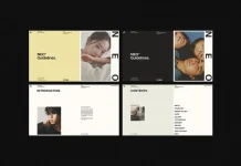
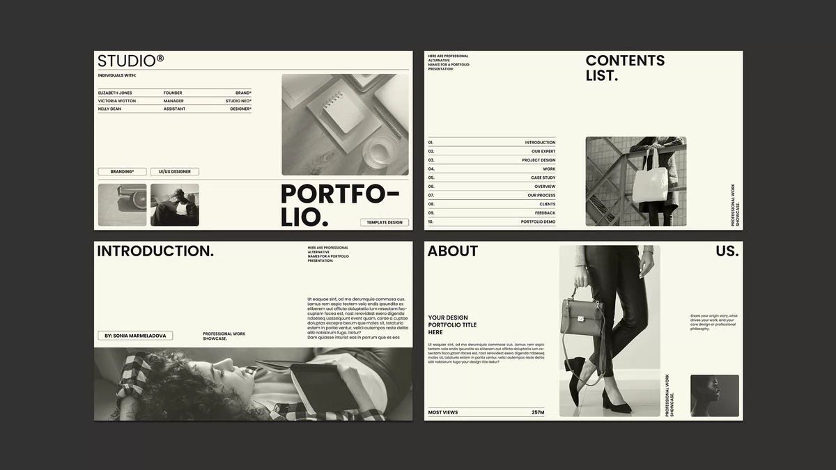
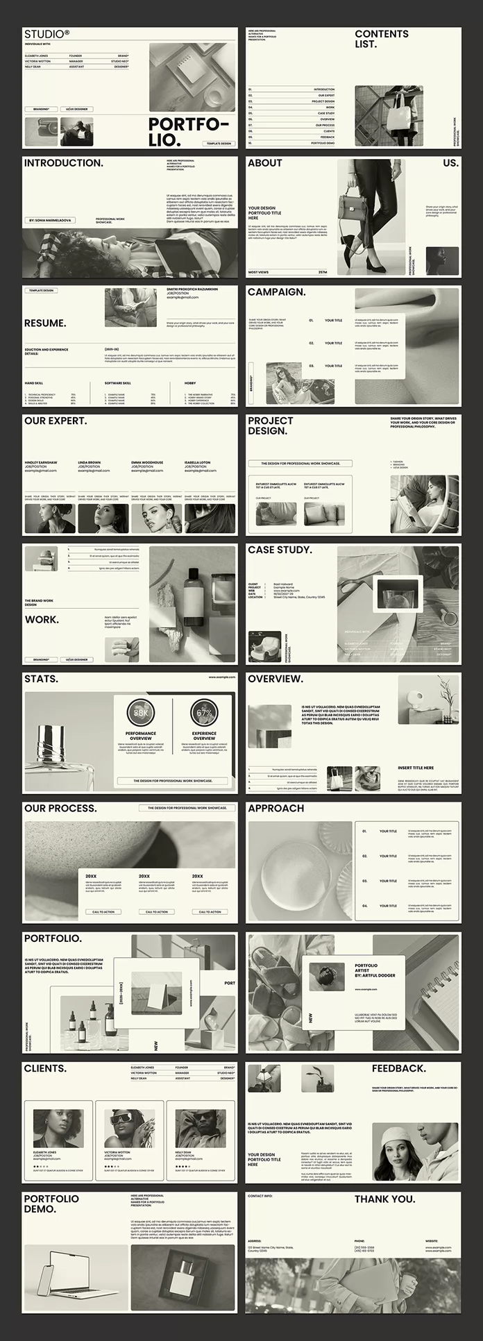
The 20 pages follow a clear order. The cover carries a heavy uppercase “Portfolio.” wordmark, and a contents list with ten numbered entries comes next. Introduction, About Us, and Resume follow after that.
Campaign, Project Design, Work, and Case Study carry the actual projects. Stats, Overview, Our Process, and Approach explain how you think. Clients, Feedback, a Portfolio Demo page, and Thank You close the deck.
That sequence mirrors a real pitch. First you introduce yourself. Then you show proof, and finally you ask for the job.
The Three-Second Cover Test
I use a simple check for covers, which I call the Three-Second Cover Test. A cover passes when a viewer names your discipline within three seconds. Here, the giant wordmark, the “Studio®” label, and two small tags for branding and UI/UX design answer that question at once.
Why Does Off-White Work in a Portfolio Presentation Template?
Pure white glares on a screen. Off-white softens the page and makes photography look printed instead of backlit. I call this the Neutral Canvas Rule. The page stays neutral, so your work supplies the color.
The preview pages show the rule clearly. RedGiant filled them with monochrome imagery, so the layout reads like a gallery wall. Your colorful projects will stand out against that cream background. Therefore, this minimalist portfolio presentation template suits brand work with strong palettes best.
How the Frame-and-Plate System Shapes Each Page
I use the term Frame-and-Plate System for the layout logic here. Large image frames fill the page, and rounded-corner plates hold text on top of them. You see it on Campaign, Project Design, Stats, and both Portfolio pages.
The system matters for one reason. Text on a plate stays readable, whatever photo sits underneath. Consequently, you can swap a dark image for a bright one with fewer fixes. That alone makes this portfolio presentation template faster than a custom layout.
The Stats Page Deserves Three Paragraphs
The Stats page is my favorite. Two circular badges show 88K and 67%, and each sits above a short caption titled Performance Overview or Experience Overview.
Replace those numbers with real results, such as followers gained or sales lift, and the page becomes your proof point. Most designers bury results on page 14. This page puts them in the middle of the deck, where a client still pays attention.
I would go one step further. Pick one number per badge and cut the caption to a single line. A client reads a figure in a second, but a paragraph under it costs you the moment.
The Case Study Page in One Glance
The Case Study page works differently. A small data block lists client, project, web, date, and location. That gives a client the facts in five lines, and a large image then carries the story.
How to Customize This Portfolio Presentation Template Step by Step
Here is the order I recommend for any creative portfolio presentation template in InDesign.
- Replace the images first. Place your files into the frames. Then right-click each frame, choose Fitting, and select Fill Frame Proportionally.
- Rewrite the text second. Dummy Latin copy hides in small blocks, so check every page. I call forgotten dummy text Placeholder Debt. Pay it before you export.
- Duplicate or delete pages third. Use the Pages panel. Afterward, rebuild the contents list so its entries match your final page count.
- Add interactivity last. Open Window > Interactive > Buttons and Forms. Then turn the contents entries into buttons that jump to pages.
Adding Interactive Features
RedGiant made this portfolio presentation template well suited to interactive features in Adobe InDesign. The contents list is the obvious start. A button on the Thank You page that jumps back to page one also helps.
Next, add hyperlinks to the website lines that appear on several pages. A subtle fade from the Page Transitions panel suits the calm look. Finally, export with Adobe PDF (Interactive) so buttons and links keep working for the client.
Where Does This Portfolio Presentation Template Fall Short?
Nothing here is perfect. Body copy looks small at 1920×1080, and I would raise the size before showing it on a conference-room projector. The vertical “Professional Work Showcase” labels along the page edges shrink even further.
The naming also needs cleanup. “Our Expert” shows four people, so it should read “Our Experts.” The Resume page in the preview reads “Eduction and Experience Details,” a typo you must fix before sending.
The contents list names ten sections, although the deck has 20 pages. You must decide which pages deserve a line. Portfolio, Portfolio Artist, and Portfolio Demo also share a name root, which makes the list repetitive. Rename them to match your own work, because a client who scans a list of near-identical titles learns nothing.
Is This Portfolio Presentation Template Worth Using?
Yes. I would use this InDesign portfolio template for a client pitch next week. I would raise the type size and fix the Resume heading first. Everything else I would leave alone.
Prediction: Where the Portfolio Presentation Template Goes Next
I expect screen-first decks to replace A4 portfolio PDFs for first contact. Clients scroll on phones, and A4 pages force pinching. A 16:9 portfolio presentation template avoids that friction. I also expect interactive buttons to become standard in InDesign templates, because exported PDFs already support them.
A second prediction concerns AI search. Tools such as ChatGPT and Gemini will summarize studio case studies for buyers. Clear data blocks, like the one on the Case Study page, help those tools read your work correctly. Structure will count as visibility.
Portfolio Presentation Template at a Glance
| Feature | Detail |
|---|---|
| Designer | RedGiant, Adobe Stock contributor |
| Software | Adobe InDesign |
| Pages | 20 predesigned pages |
| Size | 1920×1080 px (16:9) |
| Background | Uniform off-white |
| Customization | Add, remove, or duplicate any page |
| Best use | Screen presentations, client pitches, interactive PDF portfolios |
| Strongest page | Stats |
| Weak spots | Small body copy, typo in the Resume heading |
Common Questions About the Design Studio Portfolio Presentation Template
What size is this portfolio presentation template?
The template measures 1920×1080 px. That is the 16:9 format for screens, so it fits laptops, monitors, and video calls.
How many pages does the template include?
It includes 20 predesigned pages. You can add, remove, or duplicate as many as you need.
Can I add interactive features to this portfolio presentation template?
Yes. Use the Buttons and Forms panel for page jumps and add hyperlinks for websites. Then export as Adobe PDF (Interactive).
Can I print this InDesign portfolio template?
It targets screens. For print, change the page size and check image resolution first.
Who should use a portfolio presentation template like this one?
Designers, small studios, and art directors benefit most. Anyone who pitches work to clients on screen will save time.
Browse WE AND THE COLOR’s Graphic Design and Templates categories for more.
Subscribe to our newsletter!