
This post contains affiliate links. We may earn a commission if you click on them and make a purchase. It’s at no extra cost to you and helps us run this site. Thanks for your support!
Yes, this grid-based presentation template by Nowshinz Shoma earns its $16 price. It removes the one decision that quietly ruins most design decks, which is where each element sits. Nowshinz Shoma listed it on Creative Market on November 16, 2026. I recommend it to anyone who presents creative work to clients.
I call the damage gutter debt. Gutter debt is the spacing error you accept on slide three and repeat on slide twelve. Every shortcut adds interest. As a result, the deck looks uneven by the final slide, and nobody can say why.
Slide generators now produce a twelve-page deck in minutes. However, I find their spacing weak under close inspection. As a result, polished surfaces sit on top of sloppy structure. A real grid costs effort at the start. Still, a grid-based presentation template pays that effort back on every slide after.
Because a modular grid fixes every margin and gutter before you place a single image, you spend your attention on the story of the project and on the questions the room will ask, and clients feel that calm even when they cannot name its source.
The verdict is short. This grid-based presentation template suits designers who present portfolios, branding projects, visual identities, and creative concepts in Illustrator. However, it does not suit anyone who needs slide transitions or a client-editable PowerPoint file.

Please note that this template requires Adobe Illustrator to be installed on your computer. You can get the latest version from the Adobe Creative Cloud website. Just have a look here.
Why Does a Grid-Based Presentation Template Matter More Than a Fancy Theme?
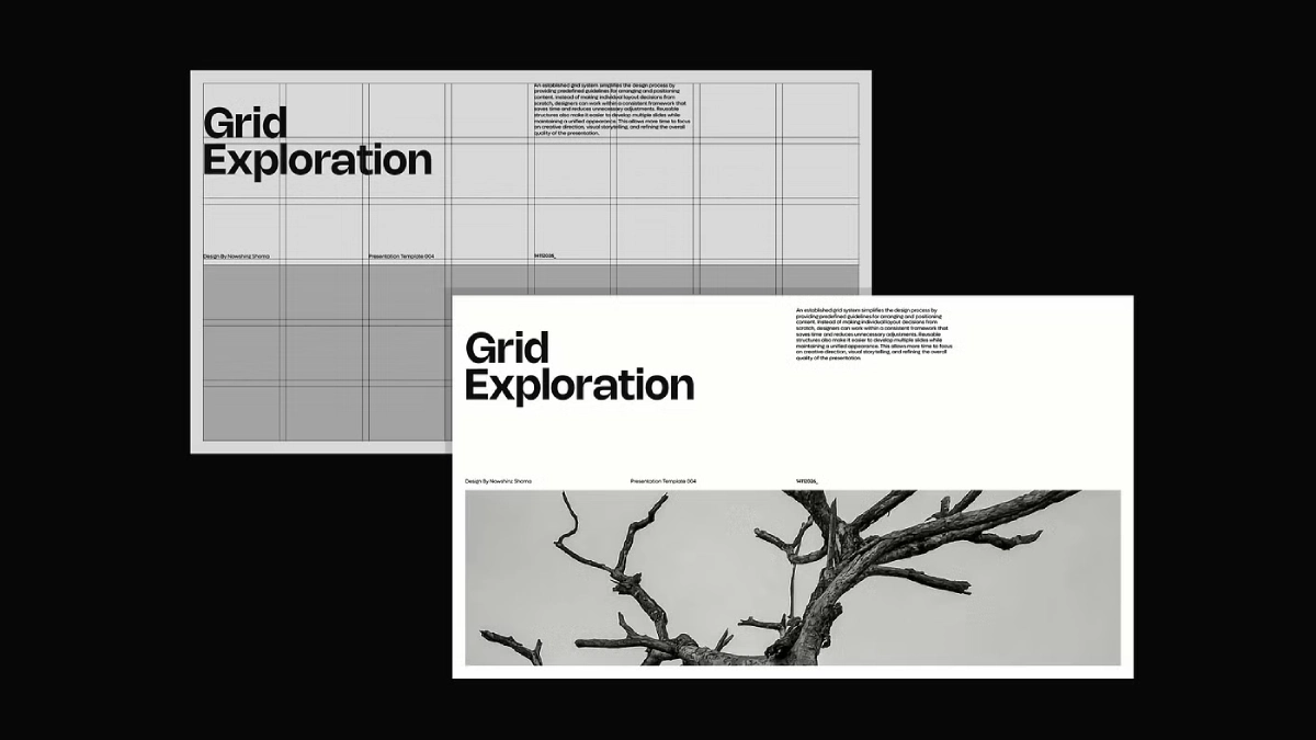
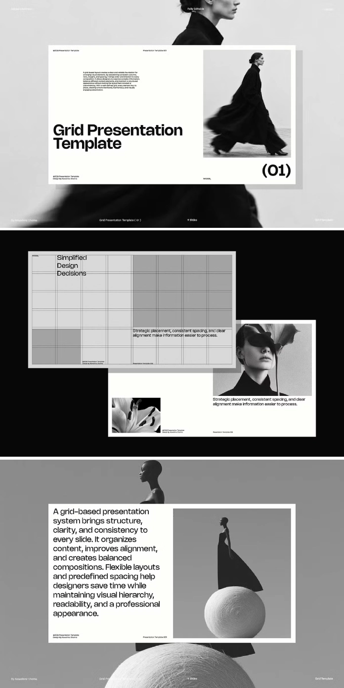
A grid-based presentation template is a set of slide layouts that share one modular grid. As a result, every text block and image snaps to the same columns and gutters. That shared structure gives a twelve-slide deck the look of one authored system.
Seasons change the look of a theme. Instead, a grid assigns every object a position and keeps it there. Therefore, a deck built on a grid ages more slowly than a deck built on decoration.
Think about your last deck. Did the left margin stay identical from the cover to the final slide? Would you bet $50 on it?
What a Modular Grid Controls
A modular grid rests on four values. Those are margin, gutter, column count, and row count. For example, change one value and every layout shifts. For that reason, a grid-based presentation template saves hours.
The listing gives the artboard size as 1980 × 1080 px. Full HD screens measure 1920 × 1080 px, so check this number before you export. First, on 1980 × 1080, a 180 px module yields 11 columns and six rows with no remainder. Second, on 1920 × 1080, a 120 px module yields 16 columns and nine rows.
An odd column count such as 11 gives you a true center column. Therefore, that column helps symmetrical cover slides. I call the number of cells a block may occupy its cell budget. For instance, a headline might get eight cells and a caption two.
What Does the Grid-Based Presentation Template Include?
The download of this grid-based presentation template contains an Adobe Illustrator file. A Preview PDF and a Help PDF come with it. The product specs describe the file as layered, at 1980 × 1080 px and 79.59 MB.
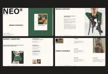
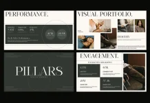
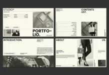
The listing shows eight artboard previews, which suggests at least eight layouts. The designer excludes fonts, images, and mockups. So you must supply all three yourself.
The listing names five features. Consistent spacing and alignment carries the most weight for me. Still, clean composition means little when elements drift three points from slide to slide. Alignment drift is the gradual shift of elements off a shared grid across a deck, and a grid-based presentation template prevents it.
Grid-Based Presentation Template at a Glance
This table sums up the facts about the grid-based presentation template from the Creative Market listing.
| Attribute | Detail |
|---|---|
| Designer | Nowshinz Shoma |
| Product type | Presentation template for Adobe Illustrator |
| Listed on | November 16, 2026 |
| Files included | Illustrator file, Preview PDF, Help PDF |
| Not included | Fonts, images, mockups |
| Artboard size | 1980 × 1080 px |
| Structure | Layered |
| File size | 79.59 MB |
| Personal license | $16 |
| Commercial license | $23 per seat |
| Extended Commercial license | $76 |
| Best fit | Portfolios, branding projects, visual identities, creative concepts |
| Main limit | No presentation mode inside Illustrator |
How I Stress-Test a Grid-Based Presentation Template
Four tests reveal how a grid-based presentation template behaves under real content. I run them on every template before I recommend it.
The Swap Test
First, replace a sample image with a vertical photo. A good grid-based presentation template keeps the crop inside its cells. Otherwise, a weak grid forces you to resize frames by hand. Use a clipping mask to keep each frame fixed. The shortcut is Ctrl+7 on Windows and Cmd+7 on Mac.
The Headline Test
Next, paste a headline of fourteen words into the title area. Then watch where the second line lands. It should end on a cell boundary. If it crowds the next object, the cell budget is too small.
The Empty-Cell Test
First, delete one image from a layout. Does the slide still balance? Real projects have gaps, because real clients send three photos when you planned for four.
The Export Test
Save the artboards as a multipage PDF. Then zoom to 400 percent and inspect the type. Gutters should stay equal on every slide. Vector layouts pass this test easily, while embedded photos can slow it down.
Run all four tests before client work begins. Together they take about twenty minutes. They also show whether the grid-based presentation template or your content causes each problem.
The Anchor-and-Span Method for Placing Content
The Anchor-and-Span method is my own way to place content on any grid-based presentation template. First, the anchor is the cell cluster where the eye lands first, usually the largest image or the headline. Second, the span is every cell that carries supporting text. Give each slide exactly one anchor. So if two clusters compete, shrink one.
Take a grid-based presentation template with a 1980 × 1080 px artboard and 180 px modules. So that grid has 66 cells. An anchor of 6 by 4 cells covers 24 of them. A supporting text column of 3 by 6 cells covers 18 more. Then 24 cells stay empty, which is 36 percent of the slide. That white space is deliberate, and it makes the anchor read first.
Who Should Buy This Illustrator Presentation Template?
Freelancers and Small Studios
Branding projects benefit most. A visual identity promises precision. So if you present that identity on a loose slide, you contradict your own work. A grid-based presentation template keeps the presentation as exact as the logo it shows.
Students and Junior Designers
Junior designers learn modular spacing by editing a finished example. Edit one layout, then compare its cells with the next layout. Then you will see how a grid scales from a cover to a data slide. A grid-based presentation template also teaches restraint.
Who Should Skip It
Skip this grid-based presentation template if clients must edit slides in PowerPoint. Skip it if you need speaker notes. Illustrator offers neither. Also skip it if you expect bundled fonts or photos.
Where This Grid-Based Presentation Template Falls Short
Illustrator is not a slide tool. It has no presentation mode and no transitions. Instead, you export a PDF and present it from Acrobat in full-screen mode. That works well enough, yet it limits how interactive your delivery can get. Even a good grid-based presentation template cannot add features that Illustrator lacks.
Repeated elements need care. However, Illustrator syncs repeated objects through symbols. Check whether the footers in this grid-based presentation template use symbols. Otherwise, you edit every artboard by hand.
The listing is new, so no reviews exist yet. Therefore, long-term feedback on file stability is missing. The listing describes the grid in general terms and gives no margin or gutter values, so before I trusted any layout with a real client deck, I would read the Help PDF to find the exact numbers that govern every artboard in the file.
Fonts need a license. Free families such as Inter and IBM Plex Sans ship under the SIL Open Font License, so they cost nothing and suit a grid-based presentation template well.
How to Set Up a Grid-Based Presentation Template for Client Work
Seven steps to set up a grid-based presentation template for client work.
- First, read the Help PDF. It may document the grid values, and you should know them before you move anything.
- Install your typeface. Otherwise, Illustrator substitutes a font and shifts every text frame.
- Link your photos. Check the Link option when you place images, because embedding inflates a file that already weighs 79.59 MB.
- Align with a key object. Select your objects, click one to set the key object, and let the Align panel move everything else to it.
- Next, duplicate artboards. Redrawing a slide invites alignment drift.
- Then export a multipage PDF. Save as Adobe PDF and enable the artboard option, so each artboard becomes one page.
- Finally, present from Acrobat. Press Ctrl+L on Windows or Cmd+L on Mac for full screen.
What a Grid Does for Branding Presentations
A visual identity is a system of rules. Its logo clearance follows measured spacing. So a presentation of that system should follow comparable rules.
Still, clients notice this even when they cannot name it. A grid-based presentation template for branding signals discipline before you say a word. Nowshinz Shoma aims this grid-based presentation template at exactly that moment, and the listing names visual identities as a core use.
What does your current deck say about your own spacing habits? Open it and measure the margins on three slides.
Where Are Grid-Based Presentation Templates Heading?
I make three predictions about the grid-based presentation template market, and I plan to revisit them in a year.
Documented Grids Become the Selling Point
By the end of 2027, I expect buyers to demand margin, gutter, and module values in the Help PDF. Today this listing describes its grid in general terms. Therefore, a grid-based presentation template with published numbers will win that comparison.
AI Slide Tools Accept Grid Inputs
By 2028, I expect AI slide tools to accept a grid definition as an input. Then a designer will paste module values and receive slides that respect them. As a result, tools that ignore grids will look amateur next to tools that obey them.
Vector Decks Keep a Niche in Identity Work
Identity designers will keep building decks in vector tools. PDF export keeps type sharp at every zoom level. So an Illustrator-based grid-based presentation template fits that habit.
Q&A:
What is a grid-based presentation template?
A grid-based presentation template is a set of slide layouts built on one shared modular grid. Margins, gutters, and cells stay constant from slide to slide.
Which file format does this grid-based presentation template use?
The template ships as an Adobe Illustrator file. A Preview PDF and a Help PDF come with it.
Does the grid-based presentation template include fonts or images?
No. The listing states that fonts, images, and mockups are not part of the package. Mockups and preview images appear for presentation purposes only.
Can I edit text, colors, and images in the grid-based presentation template?
Yes. The listing calls all layouts fully customizable, and it names text, images, colors, and arrangements as editable.
How much does the grid-based presentation template cost?
The Personal license costs $16, the Commercial license costs $23 per seat, and the Extended Commercial license costs $76. Creative Market describes Personal use as individual projects such as resumes and Instagram posts. Client decks sit closer to commercial use, so read the license page before you buy.
Can I present a grid-based presentation template directly from Illustrator?
No. Illustrator has no presentation mode. Instead, export the artboards as a multipage PDF and open it in Acrobat full screen.
How large is the grid-based presentation template download?
The listing states a file size of 79.59 MB. Close other heavy files before you open it.
Browse WE AND THE COLOR’s Graphic Design and Templates categories for more.
Subscribe to our newsletter!