
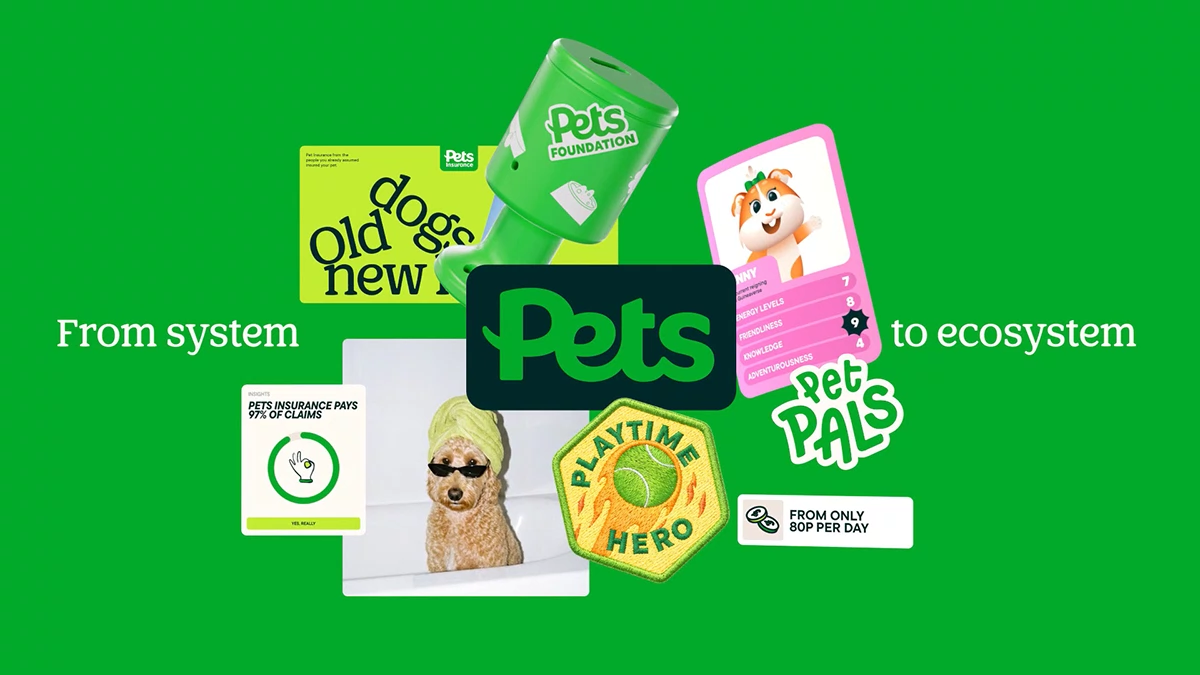
Honestly, brand architecture rarely earns applause. The Pets project by HOW+HOW deserves some. It splits the UK’s largest pet retailer into a family of three sub-brands. Each one sounds different. All of them still sound related. I think that is the hardest trick in branding, and this team pulls it off.
What Is Brand Architecture, and Why Did Pets Need a New One?
Brand architecture is the logic that connects a company’s brands. It decides which name leads, which name supports, and how much freedom each part gets. Most people never notice it. They notice the mess when it is missing.
Pets has the scale to need a clear brand architecture. The retailer runs over 450 stores. It also operates 300 groom rooms and 400 vets. Its share of the UK pet market sits at 25%.
The audience is huge, too. Around 18 million UK households own a pet. Yet 34% of those owners say their behavior changed in the last year. The press release points to rising vet bills and shaky trust in insurers. Petcare also stays fragmented because products, advice, insurance, and vets live in separate places.
Now the business is growing into philanthropy, kids’ clubs, and pet insurance. One masterbrand voice cannot sell a chew toy and a claims promise in the same tone. Try it yourself. Read a squeaky-toy slogan aloud, then imagine it above an insurance policy. It sounds wrong, doesn’t it?
How HOW+HOW Built the Pets Sub-Brands
HOW+HOW is a branding agency with studios in London and Los Angeles. Cat How and Rog How founded it. The studio worked with Pets on three layers at once. Those layers were strategic positioning, creative, and shared brand systems.

Each sub-brand received its own positioning, voice, and visual identity. Shared systems then tie every one of them back to the Pets masterbrand. That second step matters more than the first. Anyone can draw three logos. Few teams make three logos feel like one household.
Pets Insurance Sells Calm by Looking Chaotic
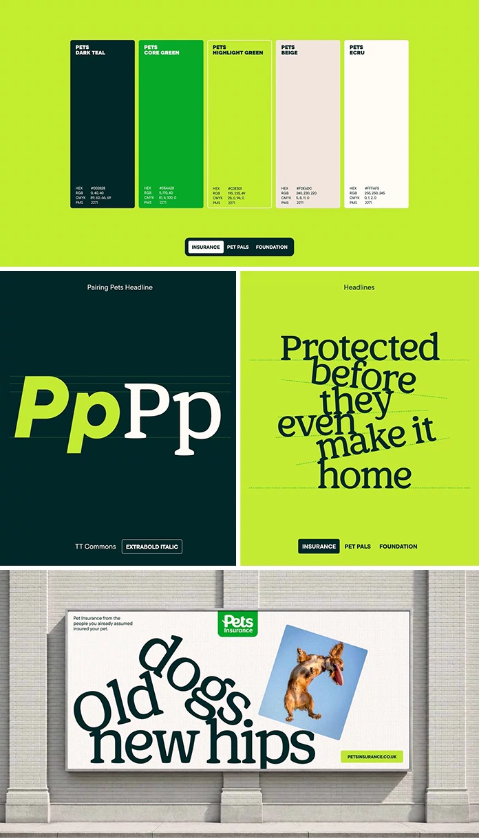
The insurance idea starts from a simple truth. Your pet will surprise you, and your policy should not. The art direction looks chaotic and cuddly at the same time. The illustration feels like a safe pair of hands. The voice sees the best in everything, even when the worst happens.
I like this choice a lot. Insurance brands usually pick a gray palette and a legal tone, which is the opposite of what a worried owner needs. Pets goes the other way. The surface stays playful, so the promise underneath feels warmer, and since the press release says confidence in insurers has fallen, a friendly face is a smart place to start rebuilding it.
Helen Dean, Head of Brand, Creative and Studio at Pets, says the work brought fresh perspectives to the Pets Insurance brand identity. She also says her team cannot wait for customers to see it. That is a client talking, of course. Still, she names the insurance launch specifically, and that tells me where the pressure sat.
Pet Pals Turns a Kids’ Club into a Pet Universe
Pet Pals is the Pets kids’ club. HOW+HOW gave it lore, the kind you expect from a cartoon series. Pogo and the gang lead the cast. The universe grows with every workshop, so children get a reason to return.
This is the quiet commercial engine of the project. A cartoon cast can carry merchandise. A kids’ club with a cast behaves like a small content studio. Pets said as much, because the sub-brand opens up new merchandising opportunities. I would watch this one closest.
Pets Foundation Speaks Action with Heart
Pets Foundation received a flexible system that speaks to any cause, big or small. Every story comes from the viewpoint of the two- and four-legged heroes behind it. A graphic “zoomie” appears now and then, named after the sudden burst of speed pets show at random.
The zoomie is a small detail with a big job. Charity branding often turns solemn and stiff. A playful signature gives the foundation a face without cheapening a cause.
The Spine-and-Limbs Model: My Reading of This Brand Architecture
I use a simple model to judge any family of brands. I call it the Spine-and-Limbs Model. The spine holds the shared systems, the rules, and the strategic logic. The limbs are the sub-brands that move freely.
A healthy brand architecture needs both. A spine without limbs gives you one bland brand with three labels. Limbs without a spine give you three strangers who share a parking lot.
Two quick checks make the model practical. The Spine Test asks whether you can hide every logo and still tell the brands belong together. The Limb Test asks whether each sub-brand can speak to its own audience without borrowing another’s voice.
Pets passes both on paper. The press release says the common threads bring rigour and consistency across the family. It also says each sub-brand keeps the freedom to address its own audience. Cat How puts the idea in eight words: “Our pets deserve the world. Here’s one more.” That line is the spine in a sentence.
One caveat belongs here. I worked from the press release, not from the artwork or from store signage. The real exam happens across 450 stores, on packaging, in claims emails, and at kids’ workshops. I would love to see that rollout in person.
Brand Architecture at a Glance
| Brand | Role | Core idea | Creative signature |
|---|---|---|---|
| Pets (masterbrand) | Anchor for the whole family | Help every pet and pet owner | Shared brand systems that bring rigour and consistency |
| Pets Insurance | Pet insurance | Your pet will surprise you, your policy should not | Chaotic, cuddly art direction and safe-hands illustration |
| Pet Pals | Kids’ club | A pet universe that grows with every workshop | Cartoon lore led by Pogo and the gang |
| Pets Foundation | Philanthropy | Action with heart, for any cause | Stories told by two- and four-legged heroes, plus the graphic zoomie |
What Can Other Retailers Learn From This Brand Architecture?
Start with strategy, then draw.
HOW+HOW began with clear positioning. Design followed. That order protects a sub-brand strategy for retailers from the usual trap, where a pretty logo covers an unclear job.
Give every sub-brand one job.
Insurance builds trust. The kids’ club builds habit. The foundation builds goodwill. Each limb carries one load. A pet retailer branding project fails when one brand tries to do everything.
Keep the spine short.
Shared rules work best when few of them exist. A short spine leaves room for a cartoon universe and a claims promise to live under one roof. Heavy rulebooks crush the limbs.
Frequently Asked Questions About the Pets Brand Architecture
Who created the Pets brand architecture?
HOW+HOW created it. The branding agency works from studios in London and Los Angeles.
Which sub-brands does Pets now have?
Pets now has three sub-brands. They are Pets Insurance, Pet Pals and Pets Foundation. Each has its own positioning, voice and visual identity.
Why did Pets need new brand architecture?
The business is expanding into insurance, kids’ clubs, and philanthropy. A single masterbrand voice cannot serve those audiences equally well. A connected family lets each part speak clearly.
How big is Pets in the UK?
Pets is the UK’s largest pet retailer. It runs over 450 stores, 300 groom rooms, and 400 vets, and it holds a 25% market share.
What is Pet Pals?
Pet Pals is the Pets kids’ club, rebuilt as a pet universe. Pogo and the gang lead the cast, and the world grows with every workshop.
What are good brand architecture examples for retailers?
The Pets project is a recent one. It shows how a masterbrand can anchor three distinct sub-brands through shared systems.
Who founded HOW+HOW?
Cat How and Rog How founded the agency. It works across brand strategy, brand identity, verbal identity, visual identity, website design, and website development.
Any footage © HOW+HOW. Browse WE AND THE COLOR’s graphic design and branding categories for more.
Subscribe to our newsletter!