
This post contains affiliate links. We may earn a commission if you click on them and make a purchase. It’s at no extra cost to you and helps us run this site. Thanks for your support!
Honestly, many brand strategy decks lose the room by slide three. This InDesign brand strategy presentation template from Adobe Stock contributor RedGiant avoids that fate, and I would put it in front of more studios than it will probably reach.
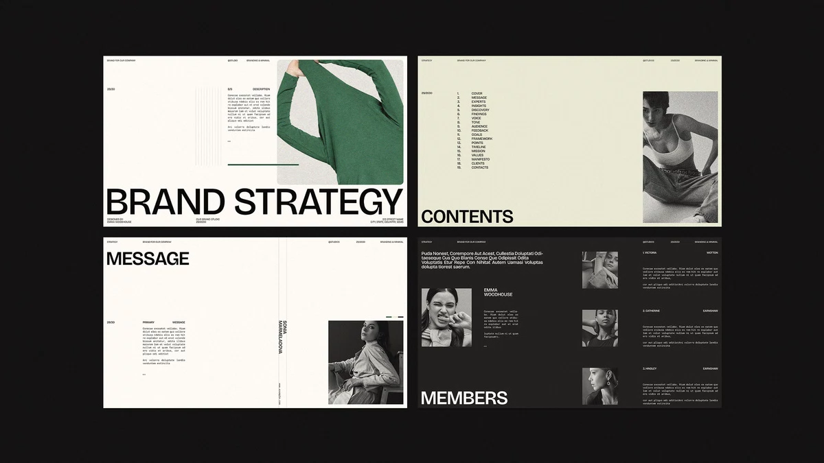
RedGiant designed the file at 1920 x 1080 px, so it fills a screen without cropping. The layout stays minimalist and uniform across 20 predesigned pages. Each page accepts your own images and copy.
Clients judge strategy by how finished it looks, and remote pitches have made that judgment faster. A sloppy deck suggests sloppy thinking, fair or not. Polish buys you the first ten minutes of trust.
Please note that this template requires Adobe InDesign to be installed on your computer. Whether you use Mac or PC, the latest version is available on the Adobe Creative Cloud website—take a look here.
What Is an InDesign Brand Strategy Presentation Template?
An InDesign brand strategy presentation template is a prebuilt set of editable layouts that turns research and positioning into a screen-ready sequence. It replaces the blank-page problem with a structure.

RedGiant’s version targets designers who present strategy to clients. In-house teams that want a brand strategy deck template without a PowerPoint look will also find it useful.
The core facts are short. The file contains 20 pages at 1920 x 1080 px, and every page is fully customizable. You can add or remove pages and duplicate any layout. The download does not include the preview photos, so you must supply your own.
Page by Page: What the Template Contains
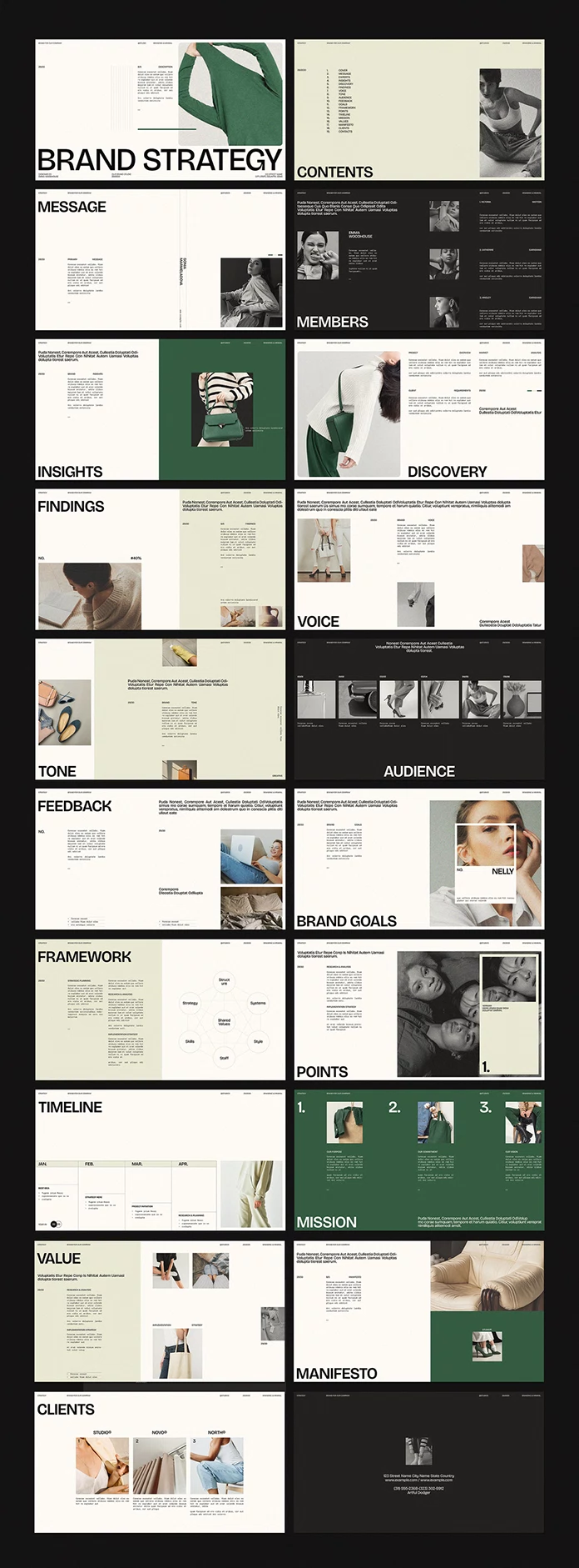
The table below maps all 20 pages. It also shows how the deck moves from research to belief to contact details.
| Page | Title | What it holds |
|---|---|---|
| 1 | Cover | Oversized uppercase headline over a photo |
| 2 | Contents | Numbered section index |
| 3 | Message | Primary message and a vertical text line |
| 4 | Members | Team portraits on a charcoal page |
| 5 | Insights | Research observations beside a forest green panel |
| 6 | Discovery | Project overview, market analysis, and client requirements |
| 7 | Findings | One large figure with supporting text |
| 8 | Voice | Brand voice statement with two photos |
| 9 | Tone | Brand tone statement on a sage panel |
| 10 | Audience | Strip of six numbered image slots |
| 11 | Feedback | Response notes with two photos |
| 12 | Brand Goals | Goal statement beside a portrait |
| 13 | Framework | Seven-node circle diagram |
| 14 | Points | Research and implementation notes with a large photo |
| 15 | Timeline | Four-month columns, January through April |
| 16 | Mission | Three numbered columns on full green |
| 17 | Value | Strategy text beside a photo cluster |
| 18 | Manifesto | Statement page with a green block |
| 19 | Clients | Three client columns with images |
| 20 | Contact | Dark closing page with an address block |
The Proof-Before-Purpose Order
Read the page titles in order, and you see an investigation, not a pitch. Research pages open the argument on pages five through seven. Mission waits until page sixteen.
I call this the Proof-Before-Purpose Order. A deck follows it when evidence appears before belief. Many agency decks do the opposite and open with a mission statement that the client has no reason to trust yet.
The order matters because a mission that follows the findings reads as a conclusion. A mission that opens the deck reads as a wish. The Message page at position three softens the rule slightly, but it frames the story rather than making a pledge.
Whether RedGiant planned this sequence or not, it works. A template that teaches argument order earns more respect than a pretty set of empty frames.
Why the Framework Page Matters Most
Page thirteen decides whether this InDesign brand strategy presentation template fits your project. The Framework page shows seven circles linked around a central node labeled Shared Values. Six outer nodes labeled Strategy, Structure, Systems, Skills, Style, and Staff surround it.
That arrangement matches the McKinsey 7-S model. Consultants at McKinsey, including Tom Peters and Robert Waterman, developed it around 1980. The model describes how an organization holds together. It does not describe a brand.
I like the gesture and distrust the content. A brand strategist who leaves those seven labels untouched will present organizational theory to a client who hired a studio to talk about positioning, and the mismatch will show up as soon as someone asks what Staff has to do with the logo. Rename the nodes. Swap in labels that match your project, such as Promise, Audience, Category, and Price, with Positioning at the center. The circles and connector lines look like simple vector shapes, so edits should take minutes.
Three More Pages Worth Your Attention
The other pages mostly pair a heavy uppercase title with a narrow text column and photography. Three of them deserve a closer look.
The Findings Page
One large figure takes center stage here, and the preview shows 40%. Use that slot for a single number. One strong statistic beats a chart that nobody reads.
The Timeline Page
Four-month columns, January through April, structure this page. However, a real brand rollout usually runs longer. Duplicate the page and continue the sequence.
The Mission Page
Forest green fills the whole page, and three numbered columns carry the titles Our Purpose, Our Commitment, and Our Vision. Three columns invite padding. If your brand has one clear purpose, merge the columns and enlarge the type.
Voice and Tone Get Separate Pages
RedGiant gives Voice and Tone their own pages, and I applaud that choice. Brand voice stays constant. Brand tone shifts with the situation. A support reply and a product launch should sound like the same person in different moods.
Most brand guidelines blur the two into one paragraph of adjectives. This template forces you to write two statements. The Voice page pairs its text block with two photos, and the Tone page sets its text on a sage panel beside a few product shots.
Use that separation. Write the voice statement as a fixed trait. Then write the tone statement as a range, with one example for a good day and one for a bad day.
Design Language: Type, Color, and Photography
Type
RedGiant sets titles in a heavy uppercase grotesque and body copy in a typewriter-style monospace. The pairing gives the pages an archival, editorial tone. However, the body copy looks small next to the headlines in the preview. On a conference-room projector, that gap hurts. I would not go below 24 px for body text. Check the fonts before you open the file, because InDesign flags missing fonts and substitutes them.
Color
The deck rotates through cream, charcoal, pale sage, and forest green backgrounds. The green marks the pages meant to be remembered. Mission fills the page with it. Insights and Manifesto use it as a block.
Photography
RedGiant’s preview uses fashion editorial photography, and the download omits it. The grid carries the look. Because the preview relies on fashion editorial photography with muted tones and generous crops, a brand with loud product shots or cluttered packaging will need to adjust the margins and the image frames before the pages feel as calm as they do on the Adobe Stock listing.
The Audience page shows a strip of six small images. Six mismatched photos break its rhythm quickly.
How to Customize the InDesign Brand Strategy Presentation Template
Treat the InDesign brand strategy presentation template as a kit rather than a finished document. These steps keep the edit short.
- Check fonts and links first. Resolve any missing-font warning before you type a word.
- Place your images with File > Place so each one lands inside its existing frame.
- Replace the placeholder text and rename each section title to match your project.
- Duplicate the closest layout in the Pages panel and delete the rest.
- Update the page counters and the Contents page after you remove pages.
- Export the file and test it on the screen you will use.
Presenting From a Screen
Export through Adobe PDF (Interactive) and select Open in Full Screen Mode. Next, use the Hyperlinks panel to link each Contents entry to its page. For email, export a standard PDF at screen quality instead. Then open the file on the actual projector before the meeting.
A Ten-Page Version for a First Meeting
Twenty pages overwhelm a first conversation. Keep the Cover, Message, Insights, Findings, Audience, Brand Goals, Framework, Timeline, Mission, and Contact pages. Delete the rest and save the full version for the second meeting. That cut preserves the Proof-Before-Purpose Order.
Who Needs an InDesign Brand Strategy Presentation Template?
Freelance designers who present brand foundations to clients get the most from it. Small studios gain a shared structure, and students can turn a case study into a credible deck.
Teams that live in PowerPoint or Google Slides should look elsewhere. A client cannot open your layout without Adobe InDesign. Send a PDF. Also check the Adobe Stock license tier before you use any template on client work.
Template or Custom Layout?
A custom layout demands decisions about grid, type scale, and color before you write a single sentence of strategy. A template makes those decisions for you, so your hours go to the argument. The trade-off is sameness, because another studio can buy the same file.
Protect your work with small, deliberate changes. Raise the body type size, crop the photos your own way, and recolor the green to match your client’s brand. Open the Swatches panel first. If RedGiant built the green as a global swatch, one edit recolors every green page. If not, you will update each block by hand.
The Slot Honesty Score
I rate templates with a framework I call the Slot Honesty Score. It averages three scores out of five, and the table below defines each one.
| Score | What it measures | RedGiant template |
|---|---|---|
| Slot Clarity | Whether each page tells you what to write | 4.5 |
| Edit Distance | How few steps separate placeholder from finished content | 4.0 |
| Photo Resilience | How well a page survives weak photography | 3.0 |
| Slot Honesty Score | Average of the three scores | 3.8 |
The titles and labels on each page, such as Primary Message, earn the high Slot Clarity. The frame-based layouts keep Edit Distance short. Photo Resilience drops because pages like Audience lean heavily on imagery. These scores rest on the preview sheet and not on a client job, so treat them as an informed first read.
How It Compares With PowerPoint and Canva Decks
The table sorts the trade-offs by who touches the file next.
| Criterion | InDesign template (RedGiant) | PowerPoint deck | Canva deck |
|---|---|---|---|
| Typographic control | High, with paragraph and character styles | Moderate | Limited |
| Client editing | Needs InDesign, so most clients receive a PDF | Client edits directly | Client edits in a browser |
| Layout consistency | Strong, set by the grid | Depends on master slides | Depends on the brand kit |
| Best use | Designer-led pitches | Client-edited decks | Fast team collaboration |
My Verdict
I would buy this InDesign brand strategy presentation template for a client pitch tomorrow. I would rewrite page thirteen before the first client sees it. The Tone page I would keep exactly as it is, because its sage panel gives a voice description room to breathe.
Quick Facts at a Glance
| Item | Detail |
|---|---|
| Template | InDesign brand strategy presentation template |
| Creator | RedGiant, Adobe Stock contributor |
| Software | Adobe InDesign |
| Format | 1920 x 1080 px, built for screen presentations |
| Pages | 20 predesigned, fully customizable pages |
| Customization | Add, remove, or duplicate pages; add your own images, graphics, and text |
| Images | Preview photos are not included |
| Design | Uniform, modern, minimalist |
| Best for | Designer-led brand strategy pitches |
| Weak spots | Organizational Framework page; small monospace body text |
| Slot Honesty Score | 3.8 out of 5 |
Predictions: Where Brand Strategy Decks Go Next
AI Will Draft the Evidence Pages by the End of 2027
By the end of 2027, I expect AI assistants to draft most Insights and Findings pages. Designers will spend their hours on sequence and proof. A template with a clear order will matter more than a template with pretty frames.
Twenty Pages Will Become the Ceiling
Clients keep shortening meetings. I expect first-round strategy decks to settle near 20 pages through 2027. Anything longer will move into an appendix.
Interactive PDFs Will Replace Static Exports
Screen-first studios will send linked, full-screen PDFs as the default. A Contents page with working links will become a basic expectation.
Q&A:
What is an InDesign brand strategy presentation template?
It is a set of editable InDesign layouts that organizes brand research and positioning into a presentation. RedGiant’s version offers 20 pages.
How many pages does the template include?
It includes 20 predesigned pages. You can add, remove, or duplicate as many as you need.
Does the download include the photos?
No. The preview photos are for display only. Add your own images in InDesign.
Can I use it without InDesign?
You need Adobe InDesign to edit the layouts. Clients can view an exported PDF without it.
Is the template suitable for screen presentations?
Yes. RedGiant designed it at 1920 x 1080 px. Export an Interactive PDF and open it in full-screen mode.
Which page needs the most editing?
Page thirteen, the Framework page. Rename its seven nodes, from Shared Values at the center to Staff at the bottom, before you present.
Browse WE AND THE COLOR’s Graphic Design, Branding, and Templates categories for more.
Subscribe to our newsletter!