
This post contains affiliate links. We may earn a commission if you click on them and make a purchase. It’s at no extra cost to you and helps us run this site. Thanks for your support!
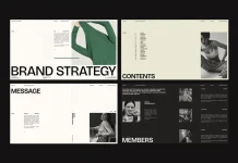
This grid-based brand strategy presentation template exposes weak thinking faster than any deck I have built from scratch. RedGiant, an Adobe Stock contributor, designed it for Adobe InDesign. It holds 16 editable slides at 1920 x 1080 px. I filled every page with a fictional fashion label, and the file held up better than I expected.
Strategy decks usually fail in the layout, not in the logic. A writer squeezes a brand promise into a box the designer left too narrow. Then the whole argument shrinks to fit. A strict grid stops that habit. It forces you to cut before you decorate.
How many of your last client decks would survive a grayscale printout? This one would, and that tells you most of what you need to know.
Please note that this template requires Adobe InDesign to be installed on your computer. Whether you use Mac or PC, the latest version is available on the Adobe Creative Cloud website—take a look here.
What a grid-based brand strategy presentation template is
A grid-based brand strategy presentation template is a prebuilt slide file in which every text block, image frame, and margin follows one shared column structure, so strategic content stays aligned from the first slide to the last.

RedGiant’s version targets screen delivery. The file runs on 16 pages, and you can add, duplicate, or delete as many as you like. The preview photos are display material only. They do not ship with the download, so you place your own images, graphics, and text.
- Software: Adobe InDesign
- Pages: 16 predesigned, fully editable
- Format: 1920 x 1080 px, built for screens
- Images: Not included in the download
- Palette in the preview: warm off-white, near-black, one deep forest green
First impressions of the file
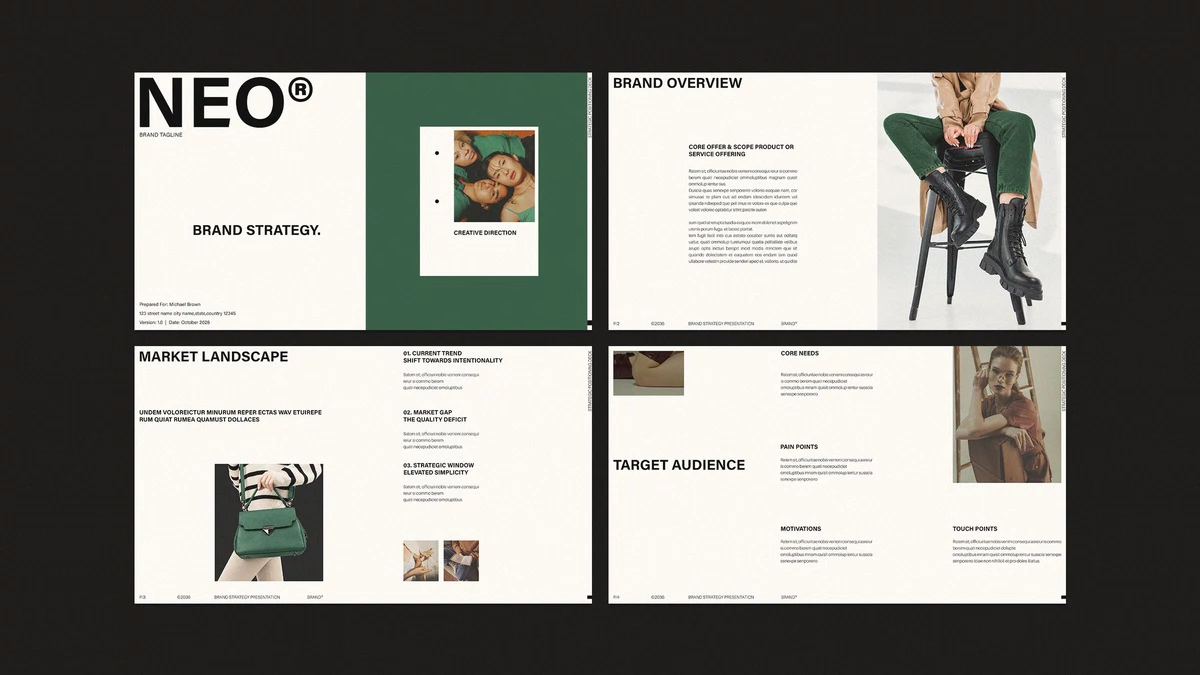
The look is quiet. Headlines sit in heavy, uppercase grotesque type, usually top left. Body copy stays small and tidy beneath them. Green appears on only three slides, and that restraint makes each green page feel like a decision.
The cover carries a large NEO® wordmark, a single framed photo, and a tagline slot. Below it sits a small block for client name, address, version, and date. It reads like a real agency cover. I appreciate that RedGiant did not invent a decorative title treatment.
How the 16 slides build an argument
The order matters more than the styling. The template moves from market evidence to brand claims and then to execution. Most decks I see jump straight to logos.
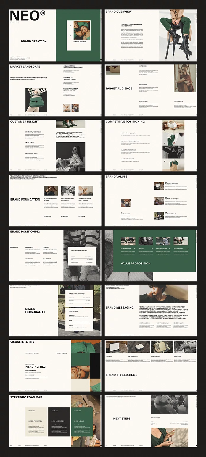
Slides 1 to 6 set the context
The cover opens the file. Brand Overview, the market slide, Target Audience, Customer Insight, and Competitive Positioning follow. Each uses a different split of text and image, yet all of them share the same margins.
Competitive Positioning deserves one extra remark. It numbers four rival types in a vertical stack, from traditional luxury down to niche boutiques, and pairs each with a photo tile. You fill four slots, so you cannot hide behind a vague “competitors” line.
Slides 7 to 12 form the strategic core
Brand Foundation, Brand Values, Brand Positioning, Value Proposition, Brand Personality, and Brand Messaging make up the middle. Foundation splits into purpose, mission, and vision. Values offers four numbered slots. Positioning uses a clean five-field block.
Value Proposition is the green slide. It runs four columns labeled brand promise, benefits, differentiators, and proof points. The color shift tells the room that this is the page everyone should remember.
Brand Personality is the best page in the file, and I will spend the most time on it. Two white cards float over a photograph. The first card holds attribute pairs written as opposites, such as restrained versus flamboyant, articulate versus loud, and enduring versus trendy. The second card defines tone of voice with three labels, namely measured, warm, and direct, each followed by a one-line rule.
Why does this work so well? Because it makes you choose a side. Most personality slides list adjectives that no brand would reject. Opposing pairs force a position. I changed the pairs three times before the card felt honest, and each revision made my test brand sharper.
The white card also solves a real problem. It sits on a busy image without any gradient overlay. Text stays readable on whatever photo you drop behind it. You can reuse that card trick on any deck you build later.
Slides 13 to 16 make the strategy tangible
Visual Identity shows a typography block next to a color palette. Brand Applications lists digital, packaging, editorial, and spatial. Strategic Road Map follows with three vertical panels in cream, charcoal, and green, labeled Foundation, Activation, and Scale. Next Steps closes with direct contact details.
The road map earns a second look. Its three panels read as a quiet gradient from light to dark to color. Month 01 feels cautious, Month 02 feels weighty, and Month 03 feels like arrival. Few templates let color carry a timeline this clearly.
Where this grid-based brand strategy presentation template struggles
Body copy runs small. On a laptop it looks elegant. On a conference-room projector, it will strain the back row. I would raise the body size before any client meeting and trim the copy to match.
The photography does a lot of heavy lifting in the preview. Without images, several slides look sparse. Buyers should budget time for image research, because the download contains none of the photos you see in the preview.
The sample content also leans toward fashion and lifestyle. A software company or a food brand can still use the structure. However, you will rewrite the labels on Customer Insight and Brand Applications, since “spatial” means little to a SaaS startup.
Finally, the footer carries small repeated text on every page. Check it early, because a forgotten placeholder name in a footer embarrasses you in front of a client.
How to customize the template in InDesign
Start with the text, not the pictures. Paste your real strategy copy into each frame and see where it overflows. Overflow shows you which claims need cutting.
Next, place your images. Frames accept drag-and-drop, and the grid keeps crops consistent. Then open the Pages panel and duplicate any layout you need twice. A brand with six values simply gets two Values slides.
Export at 1920 x 1080 px as a PDF for sharing or as an interactive PDF for presenting. Test the export on the actual screen you will use. In practice, small type surprises people only at that stage.
An original test for any brand deck: Claim-to-Proof Distance
I use a measure I call Claim-to-Proof Distance. It counts the slides between a brand statement and the first slide that shows evidence for it. A distance of zero means the claim and its proof share a page. A distance above three means the audience has forgotten the claim before the proof arrives.
Apply it to this grid-based brand strategy presentation template. The brand promise appears on slide 10. The first slide that shows the brand in use is Brand Applications on slide 14. That gives a distance of four, which is long.
The fix costs nothing. Move a small proof image into the Value Proposition columns, or duplicate Brand Applications and place it directly after slide 10. The template allows both moves because its pages are fully editable.
Template summary at a glance
| Aspect | Detail |
|---|---|
| Designer | RedGiant, Adobe Stock contributor |
| Software | Adobe InDesign |
| Pages | 16 editable, with add, duplicate, and delete options |
| Dimensions | 1920 x 1080 px, screen presentations |
| Images | Preview photos not included |
| Strongest slide | Brand Personality, with opposing attribute pairs |
| Weakest point | Small body text, heavy reliance on photography |
| Best fit | Fashion, lifestyle, and design-led brands |
| Claim-to-Proof Distance | 4 slides (promise on slide 10, applications on slide 14) |
Predictions for brand strategy decks
I expect strategy decks to shrink within two years. Clients already skim 40-slide documents. A 16-page structure with one idea per slide will become the default for first-round pitches, and longer files will serve as appendices.
I also expect AI tools to read decks as structured data. Slides with clear labels such as purpose, mission, vision, and proof points give a model clean fields to extract. Templates that name their sections plainly will travel further than clever ones.
Frequently asked questions
What is a grid-based brand strategy presentation template?
It is a prebuilt slide file in which all text and image frames follow a one-column structure. This keeps strategy content aligned and consistent across every slide.
Which software do I need to edit this template?
You need Adobe InDesign. The file is fully customizable there, and you can edit all 16 pages.
What size is the template?
The pages measure 1920 x 1080 px. That is the standard full HD screen format, so the slides fit monitors, projectors, and video calls.
Can I add or remove slides?
Yes. You can add, duplicate, or delete as many pages as you need in the Pages panel.
Are the photos from the preview included?
No. The photos appear in the preview only. You add your own images, graphics, and text after downloading.
Browse WE AND THE COLOR’s Templates category for more.
Subscribe to our newsletter!