
One angle does all the work. Everything else steps aside. The Rotterdam bistro sits inside a working shipyard, and ships still slide down the slipway outside its door. Vilnius studio andstudio measured that slope, set it at 20 degrees, and tilted the logo to match. Menus, posters, aprons, wine labels, and matchboxes all follow. Most restaurant branding starts with a mood board. This one started with a ramp.
Branding in late 2026 comes with strategy decks and hundred-page systems. Yet people remember one idea. Synthesis CG made that point when it pitched me the project, and I agree. The WERF branding proves it with a protractor.
What Is the WERF Branding in Rotterdam?
The WERF branding is the visual identity of WERF, a bar and bistro inside Stadswerf Koningspoort. That yard is an active historic shipyard that still restores flat-bottomed Dutch vessels. Synthesis CG says the bistro opened in 2025 in the Stadsdriehoek district. The identity covers the logotype, typography, colors, packaging, posters, and menus.
andstudio describes the logo as a tribute to the slipways that lower ships into the North Sea. I would put it more bluntly. The WERF branding uses a piece of heavy infrastructure as a letterform.
The Slipway Rule
I call the core method the Slipway Rule. One physical constant from the site governs every asset, and nothing else may compete with it. At WERF, that constant is a 20-degree slope. The logo tilts by that angle, and the display type leans along it.
The angle also echoes a bar gesture. andstudio points to the tilt of a glass or a bottle during fermentation. So the slope belongs to the shipyard and to the table at once. That double meaning makes the WERF branding feel earned rather than pasted on.

The Dock Palette
The Dock Palette is the second idea. Seasonal menu colors follow whichever ship sits in the yard at the time. A new vessel brings a new palette. So the brand moves with the harbor, and nobody has to write a new strategy. I love that, because it hands the calendar to the water.
The Restoration Voice
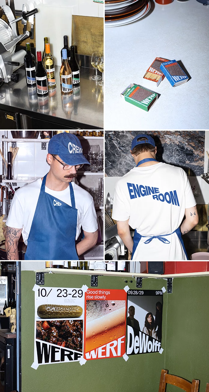
The third idea lives in the words. The bill reads like a restoration report, with a project number and a line for work performed. On one poster, the line “Fermentation is just restoration in slow motion” sits above a hand-drawn cheese wedge. It is dry. It is also correct, because a shipyard repairs old things slowly, and so does a cellar.
Who Designed the WERF Branding?
The WERF branding comes from andstudio, the Vilnius creative agency led by Augustinas Paukštė. Synthesis CG, the Lithuanian group that pitched me the project, lists andstudio among its ecosystem agencies. Its leadership page names Paukštė as creative director and partner. So Synthesis CG sent the project to WE AND THE COLOR, and andstudio made it.
Two more names matter. Paukštė publicly thanked Mykolas Saulytis for the logotype and the whole identity. Vincas Cygas took the photographs, according to andstudio’s case page.
How Does the WERF Branding Use a 20-Degree Tilt?
Look at the press images. The wordmark sits low in a corner, where a stamp would sit. Big words run diagonally above it. On the menu, SNACKS and DRINKS split a sheet into a blue field and a white field, and the letters bulge along the slope like cargo on a ramp.
One orange poster shows a glass of beer under the line “Good things rise slowly.” The wordmark cuts across the bottom edge. Nothing else competes with it.
Wine Labels and Matchboxes
The wine labels carry a tilted WERF across a colored band. Small bottle, big angle. Then come the matchboxes in blue, red and green. Two of them carry the names First Spark and Tool Nº1. A matchbox travels farther than any menu, and this one advertises the bistro in every kitchen it reaches.
Crew Gear
The staff wears blue aprons and white tees. The caps say CREW. The chef’s apron says CHEF. On one tee, ENGINE ROOM runs across the back in huge tilted letters. Those are ship roles, not restaurant roles. The kitchen becomes a vessel, and the cooks become its crew.
Which Typefaces and Colors Define the WERF Branding?
Two typefaces carry the system. Mona Sans, designed by Deni Anggara and released in 2022, sets the logo. Fira Mono, drawn by Erik Spiekermann and Ralph du Carrois in 2013, handles the small text. Brand Archive lists both. Emily Gosling at BP&O praised the single angle as a lesson in graphic restraint.
I like the pairing. Mona Sans is loud and wide. Fira Mono sounds like a work order. Together they say shipyard without a single rivet.
What Does the WERF Branding Predict for Restaurant Identity?
I expect a wave of copies. By 2028, more hospitality brands will anchor their identities on a single site measurement, such as a tide line, a stair pitch, or a tilt. The WERF branding makes that approach look easy. It is not easy.
Because every ship that enters the yard brings a new palette, the bistro gets fresh posters and fresh photographs without commissioning a single new idea, and I expect other restaurant and bar brands to copy that mechanic within the next two years.
AI tools will also reward this clarity. A one-sentence idea survives summaries. The Slipway Rule fits in one sentence, which is why bistro brand identity design may start to cite it.
WERF Branding at a Glance
| Item | Detail |
|---|---|
| Project | WERF branding, visual identity for a bar and bistro |
| Location | Stadswerf Koningspoort, Rotterdam (Stadsdriehoek) |
| Opening | 2025, according to Synthesis CG |
| Agency | andstudio, Vilnius |
| Creative director | Augustinas Paukštė |
| Logotype and identity | Mykolas Saulytis |
| Group behind the pitch | Synthesis CG |
| Photography | Vincas Cygas |
| Core idea (Slipway Rule) | 20-degree slipway angle governs every asset |
| Seasonal mechanic (Dock Palette) | Menu colors follow the ship docked at the yard |
| Voice (Restoration Voice) | Bills and slogans borrow shipyard repair language |
| Typefaces | Mona Sans, Fira Mono |
| Applications | Menus, posters, wine labels, matchboxes, aprons, caps, tees, bills |
Q&A:
Who designed the WERF branding?
andstudio, a Vilnius agency led by creative director Augustinas Paukštė, designed it. Synthesis CG, the group that lists andstudio among its ecosystem agencies, pitched the project. Mykolas Saulytis drew the logotype.
Where is WERF located?
WERF sits inside Stadswerf Koningspoort, a working shipyard in Rotterdam’s Stadsdriehoek district. A steep slipway runs beside it, and ships still go down that ramp into the water.
Why does the WERF branding tilt the logo 20 degrees?
The angle matches the slipways that lower ships into the North Sea. It also mirrors the tilt of a raised glass or a bottle during fermentation, according to andstudio.
Which fonts does the WERF branding use?
Two fonts carry it. Mona Sans by Deni Anggara sets the logo, and Fira Mono by Erik Spiekermann and Ralph du Carrois sets the small text.
All images © andstudio. Browse WE AND THE COLOR’s Branding and Graphic Design categories for more.
Subscribe to our newsletter!