This post contains affiliate links. We may earn a commission if you click on them and make a purchase. It’s at no extra cost to you and helps us run this site. Thanks for your support!
Say Hello to Circe Contrast: The Elegant Sans-Serif Your Designs Have Been Waiting For.
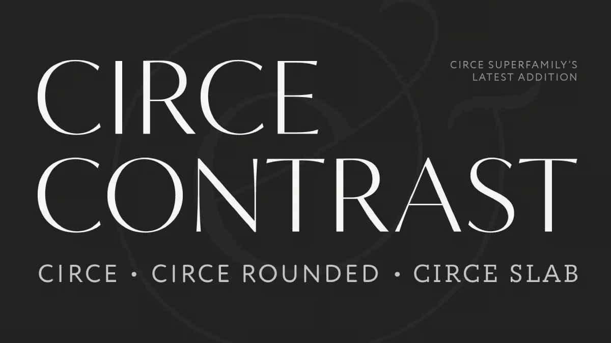
I like a typeface that speaks with grace yet commands attention. You know, the kind that can transform a simple word into a statement piece. Speaking of that, let’s take a closer look at the Circe Contrast font family by ParaType. This isn’t just another font; it’s a sophisticated typographic tool designed by the talented trio Alexandra Korolkova, Isabella Chaeva, and Alexander Lubovenko. The Circe Contrast family brings a unique blend of elegance and modern functionality to the table, offering a refreshing take on the sans-serif style. Could this be the missing ingredient in your next branding project or headline design?
What Makes Circe Contrast So Special? The Allure of Graceful Contrast
At its heart, the Circe Contrast font family is a graceful and inviting sans-serif typeface. But what truly sets it apart is its distinctive contrast. You might wonder, “What does contrast mean in a font?” It refers to the variation in thickness between the thick and thin strokes of a letter. In Circe Contrast, this feature is not just present; it’s celebrated. The high-contrast styles, in particular, are crafted for impact. Imagine them in large and extra-large formats. Think bold branding statements, captivating headlines that pull you in, stunning book covers, and sophisticated packaging designs. These are the arenas where Circe Contrast truly shines.

Interestingly, if you look closely at the Circe Contrast font family, you might notice subtle details reminiscent of classic elegance. Similar to the renowned Optima typeface, Circe Contrast features delicate, almost imperceptible bulges at the ends of thin strokes in letters like ‘T’, ‘E’, and ‘C’. These aren’t serifs in the traditional sense, but they whisper of their elegance, adding a touch of warmth and refinement to their modern sans-serif structure. It’s these nuances that elevate it from a mere typeface to a design element with personality.
The Expansive World of Circe Contrast: Weights, Variations, and Variables
Versatility is a cornerstone of the Circe Contrast font family. It doesn’t just offer one look; it provides a whole spectrum. The family extends impressively from an ethereal Extra Light weight, perfect for delicate touches, all the way to a powerful Extra Bold, designed to make an undeniable statement. This range ensures you have the right voice for any message.
Beyond weights, Circe Contrast plays masterfully with its defining feature: contrast. You can choose from variations that span from extremely high contrast, for those moments demanding high drama and flair, to low contrast options that offer a more subtle and understated sophistication. This flexibility is a designer’s dream, isn’t it?
And for those who love cutting-edge typography, there’s more. The Circe Contrast family includes a fully functional variable font. What does this mean for you? It means you get continuous control over weight and contrast (and potentially other axes if defined), allowing for incredibly fine-tuned adjustments. Instead of being limited to predefined styles, you can pinpoint the exact expression you need. This adaptability makes this family a truly future-proof choice for dynamic and responsive design.
Circe Contrast: Crafting Logos and Impactful Headlines with Ease
One of the most exciting aspects of the Circe Contrast typeface is its potential for logo design. With a generous selection of alternative characters, you can effortlessly transform almost any word into a unique and memorable logotype. This feature allows for a level of customization that can make a brand truly stand out. Have you ever struggled to find a font that gives you enough creative liberty for identity work? This typeface might be the solution.
Its aptitude for impactful visuals extends naturally to headlines. The contrast-rich styles are inherently eye-catching. They draw the reader in, making them ideal for magazine spreads, website banners, and any application where you need to grab attention immediately. The clarity and elegance of Circe Contrast ensure that even the boldest headlines remain readable and aesthetically pleasing.
A Typographer’s Toolkit: Rich Features within Circe Contrast
A great font family offers more than just beautiful letterforms; it provides a comprehensive set of tools. The Circe Contrast typeface excels here, too. Consider its extensive array of numeral styles. You get old-style figures, which blend beautifully with running text, and lining figures, perfect for tables and more formal settings. It also includes proportional and tabular figures, ensuring your numbers align perfectly when needed. Plus, you’ll find dedicated numbers for indices and fractions, covering all your numerical typesetting needs.
But the feature set doesn’t stop there. Circe Contrast includes useful arrows, elegant small caps for sophisticated text emphasis, and comprehensive language support. It offers full coverage of European Latin languages and extended support for Cyrillic. This broad language capability makes it an invaluable asset for international projects. Aren’t these practical features precisely what you need to tackle diverse design challenges?
Unleashing Your Inner Artist with Circe Contrast’s Stylistic Alternatives
Ready to add even more personality to your typography? This elegant font family invites you to play with its rich selection of stylistic alternatives. Some of these are thoughtfully grouped into thematic sets, offering curated aesthetics at your fingertips. Imagine infusing your design with an Art Deco-inspired flair, or perhaps the classic charm of an Elzevir-style set. There’s even a whimsical “fairy tale” set for projects that call for a touch of magic.
Beyond these thematic collections, the Circe Contrast font family also provides numerous standalone stylistic alternates. These individual character variations give you even more granular control, allowing you to fine-tune your typography and imbue it with a truly unique character. This flexibility means your designs won’t just look good; they’ll have a distinctive voice, all thanks to the versatility of Circe Contrast. How often do you find a font that encourages such creative exploration?
Perfect Pairings: How to Complement Circe Contrast
Choosing the right font is only half the battle; pairing it effectively is just as crucial. So, what goes well with this elegant typeface? When Circe Contrast is taking center stage in headlines or display settings, it harmonizes beautifully with compact geometric sans-serifs. Think of fonts like Circe (its well-known sibling), Hint, or Stem. Their straightforwardness provides a balanced counterpoint to the expressive nature of this typeface.
Alternatively, for a different kind of harmony, consider pairing Circe Contrast with more neutral text serifs. Typefaces like Circe Slab, Charter, or Newton can create a sophisticated and readable combination, where Circe Contrast handles the display work and the serif font manages the body copy.
What if you decide to use one of the lower-contrast versions of Circe Contrast for text settings? While primarily a display font, its more subdued styles can work for shorter blocks of text. In such cases, it complements humanist serifs and slab serifs particularly well, creating a cohesive and engaging reading experience. Finding the right typographic partner often involves experimentation, but these suggestions offer a great starting point for using this typeface effectively.
The Visionaries: ParaType and the Designers of Circe Contrast
Behind every great typeface are skilled designers and a supportive foundry. The typeface was designed by Alexandra Korolkova, Isabella Chaeva, and Alexander Lubovenko, and brought to life by ParaType, a foundry renowned for its quality and innovation. Their collective expertise is evident in every curve and counter of the Circe Contrast family. Creating a typeface with such a broad range of styles, features, and aesthetic appeal requires immense skill and a deep understanding of typographic principles. The success of this sophisticated type design is a testament to their vision.
Why Should Circe Contrast Be Your Next Typographic Choice?
So, why should you consider Circe Contrast for your upcoming projects? This font family offers a rare combination of elegance, versatility, and a rich feature set. Its distinctive contrast makes it a powerful choice for branding, headlines, and any design that needs to make a memorable visual impact. The extensive weights, contrast variations, and the inclusion of a variable font provide unparalleled flexibility.
Furthermore, the wealth of OpenType features, including diverse numeral styles, stylistic alternates, and broad language support, equips you for nearly any typographic task. Whether you’re designing a sophisticated logo, a striking book cover, or elegant packaging, this family provides the tools to express your vision with clarity and style. Explore its styles, play with its alternatives, and see how it can elevate your designs from good to truly exceptional. This ParaType gem is more than just a font; it’s an invitation to create something beautiful.
All images © ParaType. Feel free to find other popular typefaces in the Fonts section here at WE AND THE COLOR.

