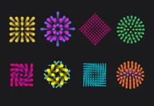
Chinese studio RONG Design created a unique restaurant brand identity for Shirou.
Shirou is a Japanese-style sukiyaki all-you-can-eat restaurant located in Changsha, China. ‘Shi’ means number 10 in Chinese. It is often considered perfect and abundant. Furthermore, Shi has the same pronunciation as the Chinese word for ‘eat’ and Rou means meat, so Shi and rou together not only showed the specialty of the restaurant but also presented a brand image with quality and abundance of food.
Studio RONG Design created a new brand visual that appears to be modern and vibrant because Shirou wants to not only provide quality food at an affordable price but also to build a brand culture with its target customers, who are mostly gen-z.
Below you can see a few visuals. For more, please visit RONG Design’s website or follow the studio on Behance.


All images © by RONG Design. Check out more creative projects in the Graphic Design and Branding categories.
Subscribe to our newsletter!


