
This post contains affiliate links. We may earn a commission if you click on them and make a purchase. It’s at no extra cost to you and helps us run this site. Thanks for your support!
Every interior designer has sat across from a prospective client, armed with ideas, talent, and vision — and still lost the project to a competitor with a slicker deck. That’s not a talent problem. That’s a presentation problem. The interior design presentation template has quietly become one of the most decisive tools in a designer’s business arsenal. Not because clients understand layout grids or color hierarchies, but because they feel confident when they see it.
The E-Type interior design presentation template for Adobe InDesign is one of the most considered, visually intelligent layouts currently available. It reframes what a design proposal can be: not a document, but a story. This article unpacks exactly why that matters, and how the template delivers it across 16 fully customizable, screen-optimized pages.
Please note that this template requires Adobe InDesign installed on your computer. Whether you use Mac or PC, the latest version is available on the Adobe Creative Cloud website—take a look here.
Why Do So Many Interior Designers Still Lose Clients at the Proposal Stage?
The interior design industry has a presentation gap. Most designers pour their creative energy into concepts, mood boards, and materials — and then deliver proposals that look like Word documents from 2009. Clients, meanwhile, are surrounded by beautiful visuals at every scroll. Their standards are high, even when they don’t consciously know it.
Additionally, the rise of AI-generated content has made the production of generic content easier than ever. The result? A market flooded with cookie-cutter proposals that all look vaguely the same. What breaks through is precision. What wins trust is polish. And what builds repeat business is a brand identity so consistent that clients immediately recognize your work.

That’s precisely the gap this interior design presentation template fills.
Think about the moment a client opens your proposal. What do they see first? The cover slide establishes tone, brand, and professionalism in under three seconds. After that, every subsequent slide either reinforces or erodes that first impression. With the wrong layout, even brilliant ideas feel uncertain. With the right one, even early-stage concepts feel inevitable.
What Is the E-Type Interior Design Presentation Template?
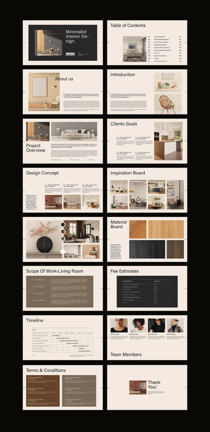
The E-Type interior design presentation template is a professional Adobe InDesign layout designed specifically for interior designers presenting to clients. It ships with 16 predesigned, fully customizable pages built at 1920 x 1080 px — the standard widescreen resolution that renders perfectly on monitors, projectors, and digital displays.
Furthermore, the template operates entirely within Adobe InDesign, meaning designers who already work in the Adobe ecosystem can adapt it without touching an unfamiliar tool. All images and text shown in the template are placeholder content. Designers simply swap in their own photography, project details, and branding — and the structural elegance of the layout does the rest.
The 16-Page Architecture: A Framework for Designer-Client Communication
What makes this template genuinely useful is its structural logic. The 16 pages don’t just look good — they follow a communication sequence designed to build trust, convey competence, and move a client toward a decision. Here’s how the layout architecture works:
The Trust Stack (Pages 1–4): The cover, table of contents, “About Us,” and introduction pages establish identity and credibility before a single concept is discussed. Clients need to trust the designer before they evaluate the design.
The Diagnostic Layer (Pages 5–6): The Project Overview and Client Goals pages demonstrate that the designer listened. Reflecting a client’s own language and objectives back to them is one of the most powerful persuasion techniques in service-based business.
The Creative Core (Pages 7–10): Design Concept, Inspiration Board, and Material Board give the client a sensory experience of the vision. These pages work best when they’re visually cohesive — which the template’s grid system naturally supports.
The Operational Bridge (Pages 11–14): Scope of Work, Fee Estimates, and Timeline translate creative vision into concrete business terms. This is where proposals often fall apart — but the template’s structured, clean layouts make complex information feel transparent rather than overwhelming.
The Relationship Close (Pages 15–16): Team Members and the Thank You slide humanize the studio, name the people behind the work, and end with a memorable, gracious final impression.
This isn’t just a pretty template. It’s a Proposal Persuasion Architecture — a term worth defining: a sequenced, visual narrative structure that progressively reduces client hesitation while increasing perceived value.
How Does an Adobe InDesign Interior Design Template Actually Save Time?
Here’s a question designers rarely ask themselves: how many hours per proposal do they spend on formatting instead of designing? The answer is usually uncomfortable.
Moreover, when every proposal requires starting from scratch, inconsistency creeps in. Fonts shift. Spacing drifts. Color palettes diverge from brand standards. Over time, this creates a portfolio of proposals that doesn’t feel like a unified studio — it feels like a series of experiments.
The Customization Workflow in Adobe InDesign
The InDesign format gives designers precise control without requiring graphic design expertise beyond the basics. Here’s the practical workflow:
- Open the template in Adobe InDesign.
- Replace placeholder images with project photography using the standard Place command.
- Update all text fields — studio name, project details, scope items, fee structures — directly within each text frame.
- Adjust colors to match studio branding through the Swatches panel.
- Export as PDF or package for screen presentation.
The entire process — for a designer already familiar with InDesign — takes hours rather than days. For a designer new to the tool, the template’s clean structure actually teaches good layout logic simply through interaction.
Long-Tail Benefit: Brand Cohesion at Scale
A studio that uses this customizable interior design presentation template across every pitch builds something more valuable than individual proposals — it builds visual brand memory. When a client refers the studio to a colleague, the referral often begins with “their presentations are so impressive.” That impression isn’t accidental. It’s systemic.
The Minimalist Aesthetic: Why Restraint Is a Strategic Choice
The visual language of this interior design proposal template is deliberately restrained. Warm neutrals — creams, tans, charcoals, and warm blacks — establish a palette that recedes gracefully behind the designer’s own photography. Typography is clean and authoritative. White space is generous.
This aesthetic choice is not simply about taste. It’s rooted in a principle called Visual Deference Design — a framework where the template intentionally subordinates its own visual identity to amplify the content placed within it. A loud, highly branded template competes with the designer’s work. A quiet, precise one frames it.
The Material Board slide exemplifies this principle perfectly. The grid of wood veneer samples, leather swatches, and textured panels communicates luxury through restraint. Nothing shouts. Everything suggests.
Who Should Use This Interior Design Presentation Template?
The honest answer is: any interior design professional who presents work to clients. But let’s be more specific, because context matters.
Solo practitioners and boutique studios benefit most directly. They often lack dedicated marketing staff, so every proposal must work harder. This template functions as a silent business development tool — polished enough to compete with larger firms.
Mid-size design studios benefit from standardization. When multiple designers within a studio use the same professional interior design template, proposals become consistent and brand-reinforcing regardless of who prepares them.
Design educators and students find the template invaluable for academic presentations and portfolio development. The 1920 x 1080 px format is ideal for digital submission and screen-based critique sessions.
Real estate staging professionals and architectural consultants can equally adapt the template’s structure. The Scope of Work, Fee Estimate, and Timeline pages translate directly to adjacent service contexts.
Why Your Proposal Template Is a Marketing Asset
Here’s a perspective that rarely gets discussed: your proposal template is a marketing document. It functions at the intersection of sales, brand identity, and client experience. A strong interior design client presentation template directly affects conversion rate — the percentage of proposals that become signed contracts.
Consider the math. If a studio sends 20 proposals annually and converts 40% of them, that’s 8 clients. Improving that conversion rate to 55% through a more compelling presentation adds 3 clients per year. Over five years, at average project values of $30,000, that’s $450,000 in additional revenue — attributable, at least in part, to presentation quality.
That’s not a design expense. That’s a business investment.
What the Market Is Shifting Toward
The interior design industry is increasingly moving toward digital-first client communication. Virtual consultations, digital proposals, and screen-based presentations have become standard practice. This makes the 1920 x 1080 px resolution of this template not just convenient — it’s forward-thinking.
Furthermore, as AI tools begin generating more generic visual content, the premium on considered, human-designed templates increases. A template with genuine structural intelligence — like this one — will become more valuable, not less, as AI-generated mediocrity saturates the market.
Introducing the “Proposal Perception Gap”: A Framework for Design Studios
The Proposal Perception Gap describes the distance between how a designer perceives their own expertise and how a client perceives it before a contract is signed. This gap is almost entirely closed or widened by the quality of the presentation.
Designers with decades of experience regularly lose projects to younger competitors with more polished proposals. Conversely, early-career designers with exceptional presentation skills win projects above their expected market position. This isn’t unfair — it’s rational. Clients are hiring based on the evidence available to them. The proposal is the evidence.
The E-Type template systematically narrows the Proposal Perception Gap by ensuring that every designer who uses it presents at the visual standard of an established, brand-conscious studio — regardless of their actual studio size.
Critical Perspective: What This Template Does Well, and What It Doesn’t Do
This piece would be incomplete without an honest, critical take.
Where the template excels: The structural sequence is genuinely well-considered. The visual hierarchy is clean. The 1920 x 1080 px format is the correct choice for modern screen presentations. The placeholder content — room photography, material samples, team headshots — gives designers an accurate preview of how the finished proposal will feel.
Where the template requires designer input: The template cannot replace strategic thinking. The Client Goals section, for instance, is only as powerful as the language a designer uses to articulate those goals. A poorly written scope, even in a beautiful layout, still reads as a poorly written scope. The template is a vehicle — the designer provides the engine.
The learning curve consideration: Adobe InDesign has a steeper learning curve than Canva or PowerPoint. Designers unfamiliar with InDesign may need to invest time in basic tutorials before the customization process feels fluid. That said, InDesign offers far greater typographic and layout control than template-based alternatives — the investment pays dividends across many future projects.
Predictions: Where Interior Design Presentations Are Heading
By 2027, the standard interior design proposal will be interactive. Clients will navigate through digital presentations, click on material samples to view specifications, and toggle between concept options in real time. The static PDF will decline as the primary delivery format.
This shift makes the foundation provided by a well-structured interior design presentation template more important, not less. The designers who master presentation structure now — who understand how narrative sequencing, visual hierarchy, and Proposal Persuasion Architecture work together — will transition most fluidly into interactive formats.
Additionally, as sustainability becomes a more explicit client concern, expect to see dedicated slides for materials sourcing, environmental certifications, and carbon footprint estimates entering the standard proposal structure. The current template’s Material Board slide is already positioned to absorb that evolution.
FAQ: Interior Design Presentation Template
What software do I need to use this template?
You need Adobe InDesign. The template is built in InDesign format and takes full advantage of its layout and typography capabilities. You cannot open or fully edit it in Canva, PowerPoint, or Illustrator.
What is the page size and resolution?
The template is built at 1920 x 1080 px — standard full-HD widescreen resolution. This makes it ideal for screen presentations, projector displays, and digital submission.
How many slides does the template include?
The template includes 16 predesigned, fully customizable pages covering the complete interior design proposal sequence — from cover slide through to the closing Thank You page.
Are the images and text in the template final?
No. All images and text are placeholder content. They exist to demonstrate how the layout will look with real content. You replace everything with your own photography, project details, studio information, and branding.
Can I use this template for different types of interior projects?
Yes. The structure is flexible enough to support residential, commercial, hospitality, and retail interior design projects. The scope and fee sections in particular are highly adaptable to different project types and budgets.
Is this template suitable for beginner InDesign users?
The template is accessible to intermediate InDesign users. Beginners will benefit from learning basic InDesign skills first — specifically how to replace linked images and edit text frames — before working with the template. The layout logic is clean enough to serve as a learning tool itself.
Can I change the color scheme to match my studio’s brand?
Absolutely. Adobe InDesign’s Swatches panel allows you to replace the existing color palette with your studio’s brand colors throughout the document. This is one of the most impactful customizations you can make to differentiate the template from other studios using the same layout.
What is the Proposal Persuasion Architecture framework?
Proposal Persuasion Architecture is a concept introduced in this article to describe the deliberate, sequenced structure of a client proposal, where each section is positioned to reduce hesitation and build trust progressively. The E-Type template’s 16-page sequence naturally embodies this framework.
How long does it take to customize the template for a new project?
For an InDesign-proficient designer, a complete customization — replacing all images, updating all text, adjusting colors, and exporting the final PDF — typically takes between two and four hours. Subsequent proposals using the same template become faster as familiarity builds.
Why should I use Adobe InDesign instead of Canva or PowerPoint for my interior design proposals?
InDesign offers superior typographic control, precise grid alignment, professional color management, and print-ready export capabilities. For a design professional — whose work is judged on visual detail — using a professional-grade layout tool signals competence. It’s consistent with the standard of work a client is hiring you to deliver.
Don’t hesitate to find other graphic design templates here at WE AND THE COLOR.


