
This post contains affiliate links. We may earn a commission if you click on them and make a purchase. It’s at no extra cost to you and helps us run this site. Thanks for your support!
A presentation is not just a document. It is a claim. It says: this is how we think, and here is proof. Most strategy decks fail that test spectacularly. They look like they were assembled the night before, formatted with the wrong font, and filled with bullet points that explain nothing. The content strategy presentation template created by E-Type for Adobe InDesign breaks that pattern completely. And that matters, because the way a brand presents its strategy is often as persuasive as the strategy itself.
This template is not a shortcut. It is a system — a 16-page, 1920 × 1080 px InDesign framework built for screen presentations. It covers the full strategic cycle, from brand voice to content planning. And it does so with a visual language that communicates clarity, ambition, and structure before the reader reads a single word.
Please note that this template requires Adobe InDesign installed on your computer. Whether you use Mac or PC, the latest version is available on the Adobe Creative Cloud website—take a look here.
Why Does a Content Strategy Presentation Template Actually Change How Teams Work?
Most marketing teams treat presentation design as an afterthought. The strategy is written in a document first. Then someone converts it into slides. Then someone reformats the slides. By the time the deck reaches a stakeholder, the original thinking has been diluted three times over.
A well-designed content strategy presentation template interrupts that chain. It forces teams to think in the format from the beginning. That shift is not cosmetic — it is cognitive. When the format is fixed and beautiful, the thinking inside it sharpens.

The Problem With Generic Slide Templates
Generic slide templates have no POV. They accommodate everything, which means they communicate nothing specific. A sans-serif font on a white background tells the audience: we did not think about how this looks. That impression bleeds into how they evaluate the content.
The E-Type template has a POV. Its palette — black, teal, white, and orange — carries intent. The oversized typography creates hierarchy without hierarchy labels. The grid creates rhythm. Together, these choices say: this team has standards.
What “Strategic Artifact” Means — and Why It Matters
Here is a concept worth naming: the Strategic Artifact Framework. A strategic artifact is any deliverable that both communicates a plan and embodies that plan’s values. A content strategy deck should not just describe brand voice — it should demonstrate brand voice. The E-Type template operates as a strategic artifact. Its design choices are consistent with the content they contain. That alignment is rare, and it is powerful.
Inside the Content Strategy Presentation Template: What 16 Pages Actually Cover
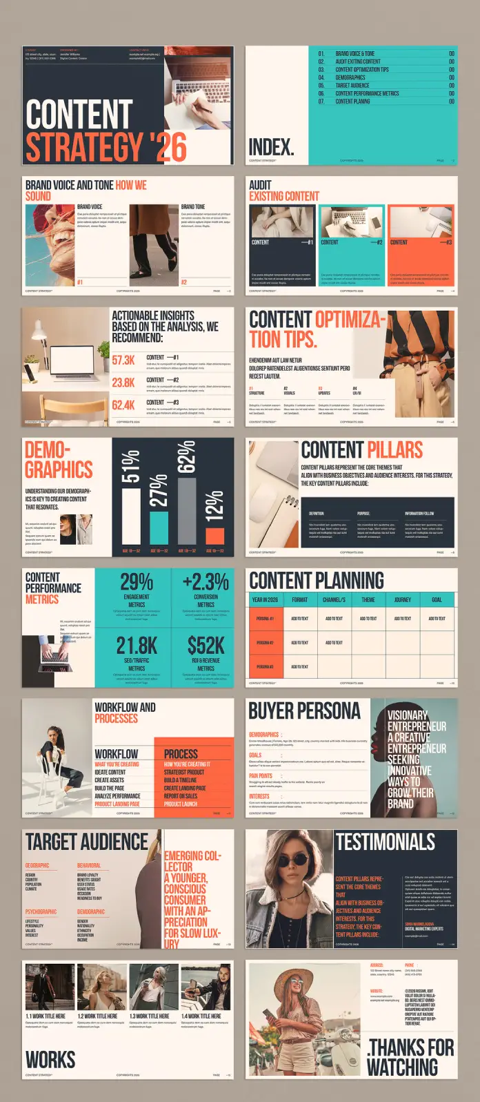
Sixteen slides sounds limited. But structure is not about quantity — it is about sequence. This content strategy presentation template follows a narrative arc that moves from brand identity through to operational planning. Each page earns its place.
Slide 1–2: Title Page and Index
The title page opens with a bold typographic lockup: CONTENT STRATEGY ’26. The year is not incidental. It signals currency, ambition, and a time-bound commitment. Below the headline, placeholder contact details establish the human behind the strategy.
The following index page is clean and structured. Seven sections are listed: Brand Voice & Tone, Audit Existing Content, Content Optimization Tips, Demographics, Target Audience, Content Performance Metrics, and Content Planning. The layout uses a teal color block to differentiate sections and create visual weight. This is not decoration. It is navigation.
Slide 3–4: Brand Voice and Content Audit
The brand voice slide introduces a split structure — brand voice on one side, brand tone on the other. This separation is intentional. Voice and tone are related but distinct. Voice is consistent. Tone adapts to context. A template that distinguishes the two tells teams to think more precisely.
The content audit slide follows with a three-column layout. Each column holds a placeholder for existing content — labeled Content #1, Content #2, Content #3. This layout supports a comparative review process. It invites the presenter to place actual content side by side and evaluate it visually, not just analytically.
Slide 5–6: Insights and Content Optimization Tips
The insights slide uses large numerical data points — 57.3K, 23.8K, 62.4K — as anchors. Each figure links to a content item and a brief analysis. This format applies what can be called the Metric-Narrative Pairing Model: every data point earns a sentence of interpretation. Without that pairing, numbers are noise. With it, they become evidence.
The optimization tips slide organizes recommendations into four columns: Structure, Visuals, Updates, and CTA/UI. This four-part classification system is not arbitrary. It reflects the core variables in content performance. Teams that use this layout are forced to evaluate content across all four dimensions, not just the one they prefer.
The Color-Blocked Typography System: A Design Language Decoded
The most striking visual feature of this content strategy presentation template is its typography. Oversized, bold, condensed sans-serif headings dominate every page. Color splits within single words — part of a word in white, part in orange or teal — create emphasis without italics or underlines. This is a typographic hierarchy through chromatic contrast.
Why Chromatic Contrast Typography Works in Strategy Decks
Traditional strategy decks emphasize hierarchy with font size. The E-Type template adds color to that system. The result is a Dual-Axis Hierarchy System where size signals importance and color signals category. Orange marks active or analytical content — metrics, optimization tips. Teal marks structural or navigational content — the index, section headers. White anchors body text and definitions.
This system is not just attractive. It is functional. A reader scanning the deck can orient themselves by color alone, before reading a single word.
The Role of Negative Space
Notice how much white space (or dark space on the black-background slides) the template preserves. The grid never feels crowded. That restraint is a design decision with strategic implications. Overcrowded slides signal that the presenter does not trust the audience to hold information in memory. White space communicates confidence. It says: this point is complete.
Content Strategy Presentation Template in Practice: The Placeholder Philosophy
All text and images in this template are placeholders. That statement deserves more attention than it usually gets.
Placeholder design is its own discipline. A well-designed placeholder communicates the type of content expected, the amount of content that fits, and the tone of voice the format supports. Poorly designed placeholders create anxiety in editors — they do not know how much to write or where to start.
How to Replace Placeholders Without Losing the Design Logic
The most common mistake teams make when customizing a presentation template for content strategy is replacing placeholders with content that breaks the grid. They write three times as much copy as the placeholder implied, import images with the wrong aspect ratio, change the font because their brand guide says so, and then the hierarchy collapses.
Here is a practical rule for working with this template: match the placeholder’s character count before you match its meaning. If a headline placeholder is four words, write a four-word headline. Adjust from there. Similarly, all images in the template use consistent aspect ratios — preserve those ratios when importing your own photography or graphics.
Furthermore, the template supports images, videos, graphics, and text, all easily replaceable through InDesign’s standard tools. The file is fully layered and logically named. Teams with basic InDesign knowledge can complete a full customization in a few hours.
Demographics, Pillars, and the Audience Architecture Model
The content strategy presentation template dedicates multiple slides to audience understanding. Specifically, it addresses demographics, content pillars, buyer personas, and target audience segmentation. Together, these slides form what can be called the Audience Architecture Model — a layered approach to understanding who the content is actually for.
Slide 7–9: Demographics and Content Pillars
The demographics slide uses a bar chart visualization with large percentage labels. The visual weight of the data makes the slide readable from a distance. This matters in live presentations. If a stakeholder in the back of the room cannot read the chart, the chart has failed.
Content pillars get their own slide — a three-column table with columns labeled Definition, Purpose, and Information Flow. This structure forces clarity. Most teams define their content pillars by topic alone. This template demands that they also articulate the purpose and how information moves from pillar to audience. That is a meaningfully higher bar.
Slide 10–12: Buyer Persona and Target Audience
The buyer persona slide is one of the most useful in the deck. It includes demographics, goals, pain points, and interests — all organized into a clean layout with a large typographic pull quote on the right. The pull quote (“Visionary Entrepreneur, a Creative Entrepreneur Seeking Innovative Ways to Grow Their Brand”) is a persona summary in advertising copy form. That format is memorable in a way that bullet-point descriptions are not.
The target audience slide expands this into a four-quadrant breakdown: Geographic, Behavioral, Psychographic, and Demographic. This four-quadrant segmentation model reflects standard audience research methodology. The fact that this content strategy deck template surfaces it as a visual format — rather than a text-heavy appendix — is a real strength.
Content Performance Metrics and Planning: The Operational Backbone
Strategy without measurement is aspiration. The E-Type template takes measurement seriously. Two full slides address content performance metrics and content planning, respectively.
The Metrics Slide: Four Data Points, One Clear Picture
The metrics slide presents engagement metrics, conversion metrics, SEO/traffic metrics, and ROI and revenue metrics. Each figure sits inside a clearly labeled block. The layout makes comparison easy. Teams can update these figures post-campaign and use the same slide structure to track performance across quarters.
The Content Planning Grid
The content planning slide is structured as a table with columns for Year, Format, Channel/s, Theme, Journey, and Goal. Three persona rows anchor the rows. This content planning template layout applies what can be called the Cross-Dimensional Planning Matrix — a single view that maps content across format, channel, audience, and stage simultaneously. Most planning tools force teams to view one dimension at a time. This slide eliminates that limitation.
Workflow, Works, and the Closing Arc
The workflow and processes slide separates workflow (what you are creating) from process (how you are creating it). The distinction is important. Most teams conflate the two and then wonder why their content production is chaotic.
The works slide presents four portfolio items in a horizontal strip. It functions as a proof-of-concept gallery — a place to show, briefly, what the strategy has already produced or what it aims to produce.
The final slide — Thanks for Watching — uses a full-bleed photograph and minimal text. It closes the deck on a human note. That is the right instinct. Strategy presentations often end with a wall of appendices. This template ends with a face and a simple sentence. The effect is warm and confident.
Why This Template Belongs in Every Creative Team’s InDesign Library
Adobe InDesign remains the gold standard for editorial and presentation design for a reason. It offers precise typographic control, master page structures, object styles, and linking capabilities that presentation software simply cannot match. A content strategy presentation template built natively in InDesign gives teams access to all of those tools.
Specifically, this template’s 1920 × 1080 px format is optimized for full-screen digital display. It works on monitors, projected screens, and video exports. For teams presenting to distributed stakeholders over video calls, that format alignment is not a minor detail — it is the difference between a deck that fills the screen and one that floats awkwardly in the center.
Who Gets the Most Out of This Template
This template is genuinely useful for content strategists building annual plans, brand managers presenting to C-suite stakeholders, digital marketing teams pitching to clients, creative directors auditing and optimizing existing content, and freelance consultants presenting strategy deliverables. The template’s professional aesthetic signals expertise before the presenter speaks. That is a competitive advantage.
Forward-Looking Predictions: Where Content Strategy Presentations Are Heading
The content strategy presentation template market will grow significantly over the next three to five years. Several forces are driving that growth.
First, remote-first work has permanently elevated the importance of self-explanatory documents. A deck must communicate clearly without a presenter in the room. Templates that bake narrative logic into their design — as this one does — will outperform generic alternatives.
Second, AI-assisted content planning is increasing the volume of strategic documentation that teams produce. More content strategies mean more presentations. Teams that rely on ad hoc slide design will fall behind teams that use structured templates.
Third, the line between brand design and content strategy is blurring. Content teams now make design decisions daily. A presentation template for content strategy that integrates visual identity principles into its structure — as this one does — is better aligned with how modern creative teams actually operate.
Frequently Asked Questions (FAQ)
What is a content strategy presentation template?
A content strategy presentation template is a pre-designed slide deck that structures the communication of a brand’s content plan. It typically covers brand voice, audience research, content pillars, performance metrics, and planning grids. The E-Type template for Adobe InDesign includes 16 fully customizable pages built for screen presentations at 1920 × 1080 px.
Who designed this content strategy deck template?
Adobe Stock contributor E-Type designed this template. E-Type specializes in professional design assets for Adobe Creative Cloud, including editorial and presentation formats built natively in Adobe InDesign.
What software do I need to use this template?
This template requires Adobe InDesign. It is not compatible with PowerPoint, Keynote, or Google Slides. InDesign allows for the most precise typographic and layout control, which is why the template’s design quality is significantly higher than slide software alternatives.
Can I add my own images and videos to this template?
Yes. All images and texts in the template are placeholders. Teams can replace them with their own photography, graphics, video frames, and text directly within Adobe InDesign. The layout accommodates a range of media types without requiring significant redesign.
How many pages does this content strategy presentation template include?
The template includes 16 predesigned pages. These pages cover: title, index, brand voice and tone, content audit, actionable insights, content optimization tips, demographics, content pillars, content performance metrics, content planning, workflow and processes, buyer persona, target audience, testimonials, works/portfolio, and a closing slide.
Is this template fully customizable?
Yes. The 16 pages are fully customizable. Teams can adjust typography, colors, images, text content, and layout structure using standard InDesign tools. The design uses a coherent visual system — black, teal, white, and orange — but that palette can be updated to match a specific brand identity.
What makes this template better than a generic PowerPoint deck?
This template was designed in Adobe InDesign with editorial-level typographic precision. It uses a chromatic contrast hierarchy system, a coherent grid, and a narrative structure that follows the full strategic cycle. Generic PowerPoint templates accommodate everything and communicate nothing specific. This template has a point of view, and that specificity makes it significantly more persuasive in a professional setting.
What is the ideal use case for a content strategy presentation template like this?
Ideal use cases include annual content strategy planning sessions, client-facing strategy pitches, brand audits, content performance reviews, and onboarding new team members to an existing content framework. The template is especially useful for consultants and agencies that present strategy deliverables regularly and need a professional, repeatable format.
How does this template support SEO and content planning workflows?
The content planning grid in the template maps content across format, channel, theme, audience journey, and goal simultaneously. That structure supports SEO-aligned planning by making keyword-to-theme and channel-to-audience mapping visible in a single view. It also includes a dedicated metrics slide for tracking SEO and traffic performance alongside conversion and revenue data.
Where can I find this template?
This template is available through Adobe Stock, designed by contributor E-Type. It is available as an Adobe InDesign file and can be downloaded directly through the Adobe Stock marketplace.
Check out other amazing graphic design assets in the Templates category here at WE AND THE COLOR.


