
Padel has a branding problem. Walk into most padel clubs today, and you’ll see the same visual vocabulary repeating itself — aggressive angles, neon accents, performance photography, and a color palette borrowed from energy drink packaging. It communicates speed. It communicates competition. But warmth? Belonging? Community? Rarely. That gap is exactly what makes the Mostai Padel Club identity, created by Vilnius-based studio andstudio, so genuinely refreshing and worth examining closely.
Mostai Padel Club is a new venue in Vilnius, Lithuania, and it arrives with a clear premise: a padel club doesn’t have to feel exclusive to feel exciting. Moreover, andstudio built a visual identity that makes that premise impossible to miss from the very first glance. This is sport branding that prioritizes belonging over status — and it does so with remarkable precision.
Why Does Padel Club Branding Still Look Like It’s Stuck in the Early 2000s?
That’s an honest question worth sitting with. Padel’s meteoric rise across Europe has produced thousands of new clubs and venues. Yet the branding across most of them feels curiously uniform. The sport’s visual culture still leans hard on legacy sports aesthetics — the kind of design language that communicates hierarchy before it communicates welcome.
Andstudio’s work on Mostai challenges that pattern directly. Furthermore, it does so by reaching backward rather than forward — returning to the cultural roots of padel itself to find a different kind of energy.
The Cultural Context That Makes This Work
Padel was first played in the 1960s in Mexico and later spread through Spain’s Costa del Sol in the 1970s. Importantly, it didn’t start as an elite competition sport. It started as a social game — played at leisure clubs, enjoyed with friends, embedded in a culture of relaxed Mediterranean conviviality.
That origin story matters. Because andstudio used it as the conceptual engine for the entire Mostai identity.

The design channels warm Mediterranean color palettes. It incorporates nostalgic two-tone illustrations reminiscent of 1970s print culture. Typography references vintage sports posters and holiday postcards. The result feels less like a modern athletic brand and more like a sun-faded invitation to something you genuinely want to attend.
This is what could be called Temporal Anchoring in sport branding — the deliberate use of a historical cultural moment to create emotional resonance in a contemporary context. Andstudio didn’t invent this technique. But they applied it here with exceptional clarity and confidence.
What Is Mostai Padel Club, and Why Does Its Brand Philosophy Matter?
Mostai Padel Club isn’t simply a place to play padel in Vilnius. It’s a community infrastructure project wrapped in exceptional design. The club runs a kids’ academy, offers physiotherapy sessions, hosts film evenings, and organizes degustation dinners. These activities aren’t afterthoughts. They’re core to Mostai’s identity as a space for sport, conversation, rest, and shared experience.
This is meaningful because it changes what the brand needs to do. Most padel club branding targets athletes. Mostai’s identity needs to speak to athletes, families, film enthusiasts, food lovers, and anyone looking for a third place between home and work.
The Naming Decision: Grounding in Local Language
The name “Mostai” comes from a casual Lithuanian expression describing a racket swing. That choice is quietly significant. It grounds the club in everyday local familiarity rather than aspirational abstraction. Instead of a name that gestures toward performance or prestige, Mostai takes its cue from the informal, vernacular language of the sport as regular people experience it.
This approach — what might be called Vernacular Anchoring — is underused in sports branding. Most venues reach for internationalism. Mostai reached inward, toward local specificity, and came out looking far more distinctive for it.
How andstudio Translated Community Values Into a Visual System
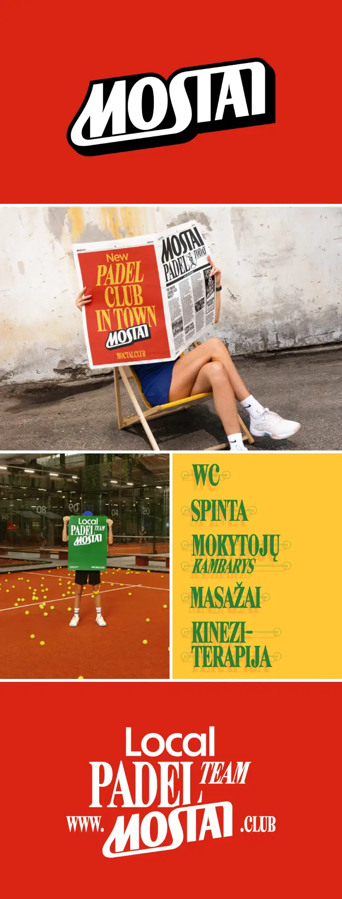
The Mostai Padel Club identity isn’t built on a single strong element. Instead, andstudio created a system — a coherent set of visual decisions that reinforce each other across every touchpoint.
The Wordmark and the “M”
A bold wordmark anchors the identity. The stylized “M” echoes the physical movement of a racket swing, capturing the sport’s energy without resorting to the aggression that typically signals athletic branding. It’s kinetic without being aggressive. It feels alive without feeling threatening.
This is an important distinction. There’s a difference between energy and intimidation in sports identity design. Mostai lives firmly on the energy side — motion implied, welcome implied alongside it.
The Color System: Mediterranean Warmth as Philosophy
The color palette draws from the same visual world as 1970s leisure culture. Earthy terracottas, sun-bleached creams, muted olive greens, and warm ochres. These aren’t colors that say “work harder.” They say “stay longer.”
In practical terms, this palette performs differently than the neon-and-black combinations that dominate competitor branding. It photographs well in warm light. It reads as inviting rather than clinical. And it ages gracefully — an important quality for a permanent venue where the brand lives on walls, tiles, and signage over years and decades.
Typography: Marlfield and Solar
Andstudio selected Marlfield by Ornamental Title Type and Solar by Dinamo Typefaces. This combination is worth pausing on. Marlfield brings the character of vintage display typography — the kind seen on mid-century travel posters and sports event flyers. Solar balances it with contemporary clarity.
Together, they create a typographic voice that feels both familiar and fresh. Neither purely nostalgic nor aggressively contemporary. That tension — between then and now — is where Mostai’s visual personality lives.
The Interior as Brand Extension: When Space Becomes Identity
One of the more ambitious aspects of andstudio’s work on Mostai Padel Club is how deliberately the visual identity extends into the physical environment. This isn’t a case of slapping a logo on a wall and calling it branded space. Instead, the identity genuinely informs the architecture of the visitor experience.
Earthy tiles, plants, and southern club motifs translate the graphic language into three dimensions. The same color temperature that defines the printed materials shows up in the interior atmosphere. Whether a visitor is arriving for a padel match, dropping off a child for the kids’ academy, attending a physiotherapy session, or settling in for a film evening, the brand environment remains consistent.
This concept — Environmental Brand Coherence — represents one of the more underrated disciplines in identity design. Many brands are built for screens and paper. Fewer are designed with equal care for the spatial experience. Mostai’s brand works as hard in its interior as it does on a business card.
Why Spatial Branding Is Increasingly Critical for Padel Club Identity
Consider the visitor journey at a padel venue. People arrive, check in, change clothes, warm up, play, cool down, socialize, and leave. Each of those moments is an opportunity to communicate brand values or undermine them.
At Mostai, andstudio considered that full arc. The result is a brand that doesn’t drop off at the threshold between digital and physical space. It continues, uninterrupted, through every stage of the visit.
The “Leisure-Led Identity” Framework: A New Way to Think About Sport Branding
Looking at the Mostai Padel Club identity as a whole, it’s possible to identify a broader design framework that doesn’t yet have a widely accepted name. Let’s call it the Leisure-Led Identity Model.
The Leisure-Led Identity Model defines a branding approach in which the primary emotional territory is welcome, rest, and social pleasure — rather than performance, aspiration, or competitive achievement. It draws from a sport’s social and cultural origins rather than its competitive present. And it prioritizes community coherence over individual status signaling.
This framework applies most naturally to sports with inherently social structures — padel, tennis, golf, bocce, lawn bowling, pickleball. These are games played in pairs and groups, games where the social dimension is inseparable from the athletic one. Brands built for these sports should reflect that social DNA. Too often, they don’t.
Mostai, through andstudio’s work, offers a model for how they could.
What andstudio Got Exactly Right
There’s a kind of design criticism that evaluates work primarily on stylistic grounds — is it beautiful? Is it consistent? These are valid questions, but they’re incomplete. The more interesting question is whether a design system genuinely serves the values it claims to represent.
By that measure, andstudio’s work on Mostai Padel Club is exceptional. Every element — the name, the wordmark, the color palette, the typography, the illustrations, the interior language — points toward the same set of values. Openness. Warmth. Belonging. Community.
That alignment between stated values and visual expression is harder to achieve than it looks. Most brand identities have gaps between the two. Mostai’s identity doesn’t. Additionally, it manages this coherence without becoming heavy-handed or overly literal. The brand communicates its values through texture and atmosphere rather than slogans and mission statements.
Long-Tail Perspectives: Who Should Be Paying Attention to This?
For Padel Club Owners Considering Brand Investment
The Mostai Padel Club identity demonstrates something practically important: thoughtful, values-aligned branding creates a fundamentally different kind of venue. It attracts a broader demographic. It generates word-of-mouth more naturally. And it ages better than trend-chasing alternatives.
If you’re planning a padel club identity for a new venue, the question to ask isn’t “what does a padel club look like?” Ask instead: “what kind of place do we actually want this to be?” Then build the identity from the answer.
For Designers Working on Sports Branding Projects
Andstudio’s approach is a masterwork in restraint. They could have leaned into contemporary sports design trends and produced something technically competent and culturally generic. Instead, they went deeper — into history, into local language, into the spatial experience of the venue — and came out with something genuinely distinctive.
The lesson isn’t “use 1970s aesthetics.” The lesson is to find the specific cultural territory where your client’s values and their sport’s history genuinely intersect. That intersection is where the interesting work lives.
For Branding Researchers and Design Critics
The Mostai identity raises productive questions about what sport branding is actually supposed to communicate. If the function of sports club identity is to attract the right people, create the right atmosphere, and sustain a coherent community experience over time — then the aggressive, performance-first aesthetic that dominates the category is often failing on all three counts.
Furthermore, Mostai offers an alternative hypothesis: that inclusive, warmth-first sport branding isn’t just more ethical, it’s more effective. It will be worth following how the club develops to see whether that hypothesis holds under real-world conditions.
A Note on Photography: Vincas Čygas and the Documentation of Brand Atmosphere
Photography by Vincas Čygas completes the picture. Great brand photography doesn’t just document a system. It extends it — finding angles and light conditions that deepen the emotional register of the visual identity.
The photography of the Mostai Padel Club identity achieves exactly that. The warm light, the emphasis on human presence and community, and the balance between graphic elements and spatial context all work together to make the case that this brand exists in three dimensions, not just on screens.
The Bigger Picture: Mostai Padel Club as a Case Study in Values-Led Design
Ultimately, the significance of the Mostai Padel Club branding by andstudio extends beyond the specifics of one club in one city. It demonstrates that sports branding is capable of carrying real philosophical weight — of expressing genuine positions about who belongs, what sport is for, and how a venue wants to exist in its community.
That’s rare. And it’s worth naming directly.
Most sports branding is communicative in a narrow sense — it identifies a brand, distinguishes it from competitors, and signals a broad category of values. What andstudio created for Mostai is communicative in a deeper sense. It tells a story about why this place exists, what kind of community it wants to build, and where it locates its roots in the longer history of a sport that started as something joyful and social before competition culture got hold of it.
There’s something genuinely moving about that intention being executed this well. Moreover, it makes you hope that Mostai Padel Club is as good a place to be as its brand suggests it is.
Vilnius is lucky to have it. And the global conversation about padel club identity design is significantly richer for this work’s existence.
Photography: Vincas Čygas. Typefaces: Marlfield by Ornamental Title Type and Solar by Dinamo Typefaces. Feel free to browse WE AND THE COLOR’s Branding and Graphic Design sections to find more inspiring content.


