
Most dating app brands look the same. Bold gradients, a heart or a flame, a tagline about finding love. The visual language is so predictable that users barely notice it anymore. That’s exactly why the Koit branding project by Felipe Corrêa Holman of Holman\Design® deserves serious attention. Instead of following the category playbook, Holman broke it entirely — and built something that feels genuinely new.
Koit is a relationship-management dating app led by former Amazon executive Miller Simberg. From the start, Simberg’s premise was sharp: professionals use CRM systems to manage business relationships with precision and care. So why does managing personal or romantic relationships still feel so chaotic, reactive, and disposable? Koit was built to answer that question. And Holman\Design® was brought in to make that answer visible.
This article breaks down exactly how the Koit brand identity was built, what makes it strategically distinctive, and why this project is a model worth studying for anyone working in brand design for digital products.
Why Does the Dating App Market Desperately Need Better Branding?
The dating app industry is saturated beyond belief. There are hundreds of apps competing for attention, yet the brand differentiation between most of them is nearly zero. Tinder gamified swiping. Bumble gave women control. Hinge calls itself “designed to be deleted.” Each carved out a positioning niche — but the visual identities still feel like variations of the same template.
Furthermore, the emotional context of dating apps is fundamentally broken. Users report anxiety, burnout, and low trust as chronic problems. The experience often feels transactional rather than meaningful. That’s not just a product problem — it’s a branding failure. When a brand consistently signals speed, volume, and game mechanics, it trains users to behave that way too.
Koit’s entry into this market wasn’t about competing on features. It was about reframing the category entirely. Holman\Design® understood this immediately. The strategic brief wasn’t “make a prettier dating app brand.” It was: build a brand that makes people feel safe, prepared, and intentional about how they connect with others.

That’s a fundamentally different design problem. And it demanded a fundamentally different solution.
The CRM-to-Romance Transfer Model: Koit’s Core Brand Positioning
One of the most striking things about the Koit brand strategy is how clearly it borrows from the B2B world. I’d call this the CRM-to-Romance Transfer Model — a positioning framework that applies the logic of structured relationship management to personal and romantic connection.
This model works because it speaks directly to a real, underserved user group: busy professionals who are actually good at managing complexity in their careers, but feel overwhelmed and disorganized in their personal lives. These users don’t need another app that shows them 200 profiles per day. They need a system that helps them show up with intention.
By positioning Koit as a relationship manager — not just a dating app — Holman\Design® accomplished something rare. They gave the product a category of its own. That’s the highest level of brand strategy: not to win inside an existing category, but to define a new one.
The Three Brand Pillars That Drive Everything
The Koit brand strategy is built on three clearly defined pillars: intentionality, security, and innovation. These aren’t vague values pulled from a brand workshop. Each one does specific strategic work.
Intentionality pushes back against the mindless swiping behavior that dominates the market. It signals that Koit users are choosing quality over quantity. Security directly addresses the anxiety that so many users feel in digital dating spaces — the fear of judgment, the vulnerability of putting yourself out there. Innovation frames the product as a new kind of tool, not just another app update. Together, these pillars create a coherent brand personality: supportive, modern, and trustworthy.
Notice what’s not in those pillars. There’s no mention of algorithm speed, match volume, or entertainment. Koit deliberately steps away from the metrics that define competitive success in the dating app market. That’s a bold strategic choice — and it’s the right one.
Mythological Anchoring: How Estonian Folklore Became a Brand Asset
Here’s where the Koit visual identity gets genuinely fascinating. The name Koit comes from Estonian mythology, where Koit is an eternal lover who meets their partner only briefly — at dawn and at dusk. They never spend a full day together. But those fleeting moments carry extraordinary depth and meaning.
I’d describe the strategic use of this origin as Mythological Anchoring — a technique where a brand draws its emotional DNA directly from a cultural or mythological narrative, giving it depth and resonance that no invented brand story could replicate. Done well, it’s extraordinarily powerful. Done poorly, it feels like a branding exercise in cultural appropriation.
Holman\Design® did it well. The mythology doesn’t feel forced or decorative. It genuinely informs the brand’s emotional register. The idea that meaningful connection happens in moments — not in endless scrolling — maps perfectly onto Koit’s product philosophy. Every touchpoint in the brand now carries that emotional weight, even if users never read a single word about the mythology behind the name.
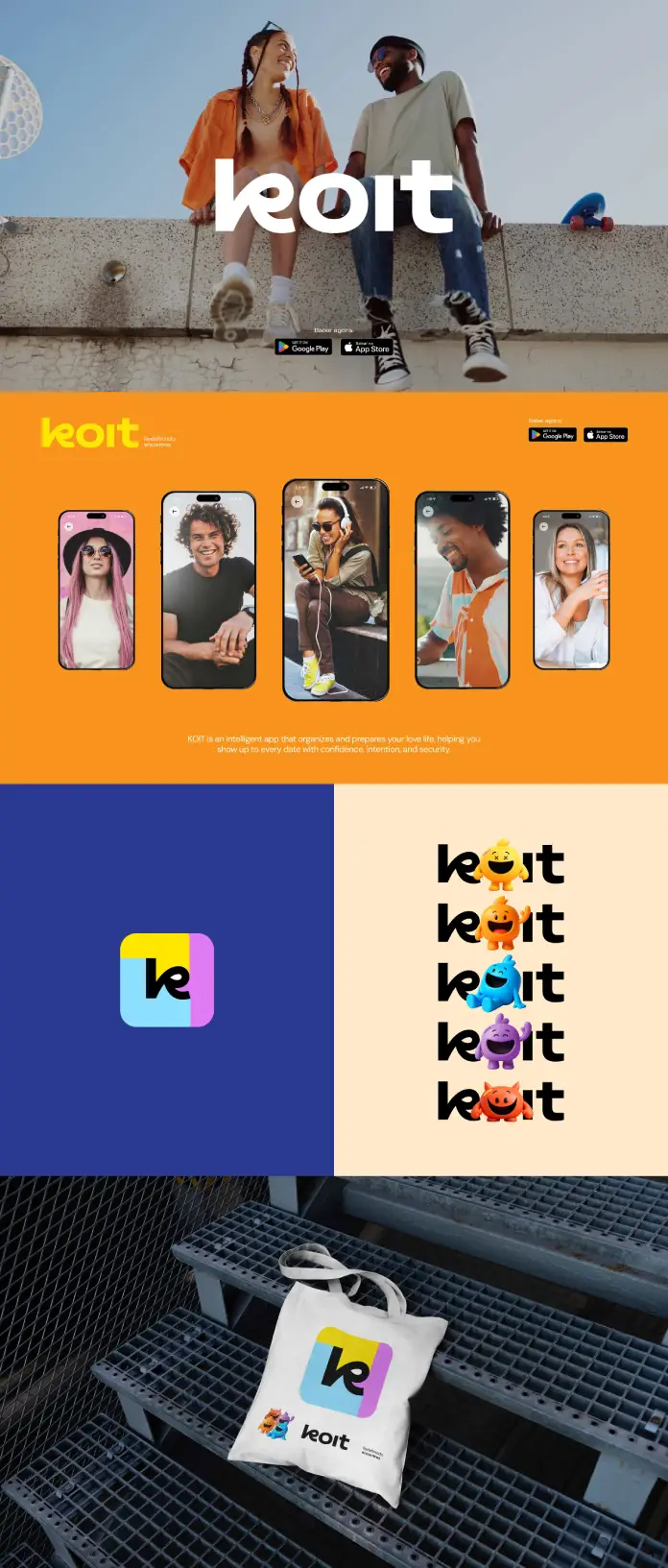
What the Logo Actually Communicates
The Koit logo combines a speech bubble with a soft embracing form. That combination is doing a lot of work. The speech bubble signals conversation and communication — the foundation of any real relationship. The embracing form introduces warmth, safety, and physical closeness. Together, they communicate a brand promise without using a single word.
Holman chose a modified Vinila typeface for the wordmark. This is a smart choice for a digital-native brand. Vinila is clean and highly legible at small sizes, which matters enormously for an app UI where the logo appears across dozens of contexts. The modifications ensure the wordmark feels custom and proprietary rather than off-the-shelf.
The overall visual system avoids the aggressive color palettes and sharp geometric forms that dominate dating app design. Instead, the identity projects softness, clarity, and structure — qualities that reinforce the brand’s commitment to emotional safety.
The Emotional Trust Stack: Designing for Anxiety-Aware Users
One of Holman\Design®’s sharpest insights in this project was recognizing that a significant portion of Koit’s target audience experiences real anxiety around dating. This isn’t a niche use case. Dating anxiety is extremely common, particularly among professionals who are confident in structured environments but feel destabilized in ambiguous social situations.
To address this, the brand was built around what I’d call the Emotional Trust Stack — a layered approach to building user confidence through every brand touchpoint. The stack works in three layers:
Layer 1 — Visual Safety: The color palette, typography, and logo form all signal calm, warmth, and approachability. Nothing about the visual identity feels aggressive or high-pressure. This is intentional. When a user opens the app for the first time, the brand should immediately communicate: “You’re safe here.”
Layer 2 — Tonal Reassurance: Koit’s tone of voice is warm, clear, and encouraging. The brand doesn’t talk to users like they’re consumers of a product. It talks to them like a thoughtful friend who happens to have good systems. That distinction matters enormously in a category built on vulnerability.
Layer 3 — Structural Credibility: The CRM-positioning framework gives Koit authority. It signals that this product was built by people who understand both technology and human behavior. For users who’ve been burned by frivolous apps, that credibility is exactly what earns a first download.
How Holman\Design® Built a Scalable Brand System for a Digital Product
One of the practical challenges of brand design for apps is that the identity has to work across an enormous range of contexts simultaneously. A logo needs to read clearly at 16px in a tab bar and at full resolution in a marketing billboard. A color palette has to work in both dark mode and light mode. Typography must be legible across dozens of screen sizes and operating systems.
Holman\Design® delivered a flexible logo system, a complete visual identity framework, and brand assets designed for both app UI and marketing materials. This kind of deliverable scope reflects a mature understanding of how digital brands actually live in the world. A beautiful static logo is worthless if it can’t adapt to the product it represents.
The result is a cohesive and scalable brand system — one that gave Koit’s team everything they needed for a confident go-to-market launch. That’s the real measure of great brand work: not how it looks in a case study PDF, but how well it enables the client team to move forward independently.
Why a Confident Go-to-Market Launch Starts With Brand Clarity
A lot of founders underestimate how much brand clarity accelerates every other part of the business. When your brand strategy is sharp, product decisions become easier. Marketing messages write themselves. Hiring conversations have a frame of reference. Investor pitches have a clear narrative.
Koit launched with that clarity. The brand wasn’t ambiguous about what it was, who it was for, or why it existed differently than every other option in the market. That’s not a small thing. That’s the strategic foundation that everything else is built on.
What the Koit Brand Identity Reveals About the Future of Dating App Design
Looking at this project, I think it points toward a broader shift happening in consumer app branding. The era of the gamified, dopamine-optimized dating app brand is running out of goodwill. Users are exhausted. They want apps that respect their time, their emotions, and their intelligence.
The brands that will win the next decade of this market are those that position themselves as tools for intentional living rather than entertainment products. Koit is one of the first apps to build that positioning into its brand DNA from day one, rather than trying to retrofit it onto an existing identity.
Felipe Corrêa Holman’s work here isn’t just good brand design. It’s a case study in category creation through branding. By refusing to accept the dating app category’s existing visual and verbal language, Holman\Design® helped Koit step outside that category entirely and build something with far more long-term defensibility.
The Holman\Design® Approach: Why Strategic Immersion Matters
Holman describes his process as rooted in “deep immersion, critical thinking, and a strong commitment to delivering work that generates real value.” That’s not marketing language — it’s an accurate description of what this project required.
You can’t arrive at the CRM-to-romance insight through a standard brand questionnaire. You get there by sitting with the problem long enough to see it from an angle that competitors haven’t explored. That’s what separates brand strategy from brand decoration. And it’s why independent studios like Holman\Design® consistently produce work that outperforms what larger agencies deliver.
The Koit project is proof of that. Every strategic decision in this brand — the category repositioning, the mythological anchoring, the anxiety-aware design system — traces back to a designer who chose to think before he designed.
Koit Brand Strategy vs. Competitors: What Makes It Actually Different
It’s worth being specific about what differentiates the Koit brand strategy from the competitive landscape. Most dating app brands compete on one of three axes: fun (Tinder), empowerment (Bumble), or romance (Hinge). Koit competes on a fourth axis entirely: structure and intentionality.
That fourth axis is currently unoccupied. No major player in the dating app market owns the positioning of “serious relationship management tool.” Koit does. That’s an extraordinary competitive advantage that was built entirely through brand strategy — before a single user was acquired.
Furthermore, the brand speaks to a demographic that competitors consistently underserve: busy, high-achieving professionals who want meaningful relationships but don’t have time for endless trial and error. These users have money, they have discipline, and they have very low tolerance for products that waste their time. A brand that signals structure, trust, and efficiency speaks directly to their priorities.
Frequently Asked Questions About the Koit Branding Project
What is the Koit app, and who created it?
Koit is a relationship manager and dating app founded by former Amazon executive Miller Simberg. It was built to help users manage personal and romantic relationships with the same intentionality that professionals bring to business relationship management through CRM tools.
Who designed the Koit brand identity?
The Koit brand identity was designed by Felipe Corrêa Holman, founder of Holman\Design®, an independent strategic branding studio. Holman led the complete brand strategy and visual identity development for the project.
What does the name Koit mean?
Koit comes from Estonian mythology and represents an eternal lover who meets their partner only briefly at dawn and dusk. The name reflects the brand’s philosophy that meaningful connections happen in intentional moments rather than through constant, low-quality interactions.
What typeface does the Koit brand use?
Koit uses a modified version of the Vinila typeface for its wordmark. The modifications ensure clarity, scalability across digital platforms, and a proprietary feel that distinguishes the brand from generic typography choices.
How does Koit differentiate itself from other dating apps?
Koit positions itself not as a dating app but as a relationship manager — borrowing the logic of B2B CRM systems and applying it to personal and romantic connections. The brand focuses on intentionality, security, and innovation rather than algorithm speed or match volume.
What is Holman\Design® known for?
Holman\Design® is an independent strategic branding studio founded by Felipe Corrêa Holman. The studio specializes in brand strategy, visual identity systems, and packaging design for companies that need to stand out through purposeful, results-driven creative work.
What deliverables did Holman\Design® produce for Koit?
The project deliverables included a flexible logo system, a complete visual identity framework, and brand assets designed for both app UI and marketing materials. The result was a cohesive and scalable brand system ready for go-to-market launch.
Felipe Corrêa Holman of Holman\Design® designed Koit branding. Learn more about the studio’s work at holman.design. Feel free to check out WE AND THE COLOR’s Branding and Graphic Design categories for more inspiring projects.


