
This post contains affiliate links. We may earn a commission if you click on them and make a purchase. It’s at no extra cost to you and helps us run this site. Thanks for your support!
Typography rarely arrives at exactly the right moment. The Dickens font family by Fenotype did.
Released by Finnish type foundry Fenotype, Dickens carries the kind of earned authority that most typefaces spend decades trying to fake. Designed by Emil Karl Bertell, Erik Jarl Bertell, and Teo Tuominen, it combines historical seriousness with genuine personality. That combination is surprisingly rare. And right now, it might be exactly what visual culture needs.
The timing matters. Designers increasingly reject the cold neutrality of geometric sans serifs. The cultural mood has shifted. There is a growing appetite for typefaces that feel like something — that hold tension, history, and a little edge. Dickens delivers all three.
Why Is Everybody Suddenly Talking About Serif Typefaces Again?
The answer isn’t nostalgia. It’s something more specific.
For years, technology brands chased universality. Smooth curves, no friction, no personality. The visual language of Silicon Valley bled into everything — from oat milk packaging to indie bookstores. Eventually, that aesthetic stopped feeling progressive. It started feeling empty.

Consequently, designers began reaching backward — not to mimic the past, but to reclaim texture. Slab serifs, ink traps, optical quirks. These features signal handcrafted. They signal effort. They suggest a brand that actually stands for something.
Sven Hauch, a Berlin-based brand strategist, captures it well: audiences now distrust corporate smoothness. Rough edges read as honest. That shift is exactly where the Dickens font family by Fenotype lives.
The Zeitgeist Is Serif-Shaped
Emil Karl Bertell, Erik Jarl Bertell, and Teo Tuominen designed Dickens during a specific cultural inflection point. Faith in the future — the clean, algorithmic, universal future — is fractured. The visual language that once captured optimism now signals detachment.
Serif typefaces with personality and grit have stepped into that vacuum. Dickens, specifically, breathes what one might call hard-working vitality. It doesn’t whisper sophistication. It states it plainly.
What Exactly Is the Dickens Font Family by Fenotype?
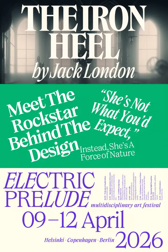
Dickens is a serif display typeface family developed by Fenotype, a type foundry based in Finland. The foundry has a strong reputation for building typefaces with genuine conceptual depth — and Dickens is no exception.
The family includes two distinct widths. The standard width suits editorial, headline, and brand identity work. The narrower width functions under constraint — tight columns, compact lockups, limited real estate. Together, the two widths make Dickens genuinely versatile.
Weight Range and Stylistic Scope
The weight range spans from thin to very heavy. This isn’t just a technical feature — it’s a design philosophy. It means Dickens can whisper and shout within the same brand system.
Furthermore, every weight includes a matching italic. Italics in display serifs often feel like afterthoughts. Here, they feel considered. The italic cuts in Dickens carry the same structural confidence as the uprights.
Two Widths, One Voice
Think of the two widths as registers of the same voice. The standard width is declarative — confident headlines, dominant wordmarks. The condensed width is efficient — it survives editorial constraints without losing personality.
This dual-width architecture introduces what designers might call register flexibility: a single typeface family that adapts to visual context without fragmenting brand identity. That’s a meaningful design concept. And the Dickens font family by Fenotype executes it cleanly.
Who Should Be Using Dickens?
Short answer: more people than currently are.
The Dickens font family by Fenotype suits an interesting range of applications. Consider a natural skincare brand trying to communicate ethical sourcing without feeling clinical. Or a craft brewery in Bushwick looking to balance heritage with edge. Or — and this is where it gets interesting — a startup deploying artificial intelligence that wants to feel grounded rather than sterile.
Dickens for Brand Identity Design
Brand identity designers will find particular value here. Dickens offers strong differentiation. It doesn’t look like Inter, and it doesn’t look like a licensed version of Garamond. It looks like itself.
That specificity is increasingly valuable. As AI-generated visuals flood the market, brands desperate for distinctiveness need typefaces with unmistakable voices. Dickens has one.
Dickens for Editorial and Publishing
Editorial designers working on long-form print or digital content will appreciate the weight range. Thin weights work for elegant, quieter layouts. Bold and black weights drive section headers and pull quotes with authority.
Moreover, the condensed width solves a specific problem: headlines that need personality but lack horizontal space. Newspapers, newsletters, and editorial-heavy websites all face this constraint regularly. Dickens handles it gracefully.
Dickens for Digital and Screen
Display typefaces often struggle on screen. Dickens doesn’t. The letterforms are robust enough to survive low-resolution environments while maintaining their character at large display sizes.
Additionally, as variable font technology becomes more mainstream, families with structured weight and width ranges like Dickens are increasingly well-positioned. The architecture is already there.
The Design Philosophy Behind Fenotype’s Approach
Fenotype doesn’t build typefaces for trends. That distinction matters.
Emil Karl Bertell, Erik Jarl Bertell, and Teo Tuominen approach type design with a clarity of intent that shows in every cut. Dickens is lean. There are no unnecessary features. No decorative flourishes added for their own sake. Every decision in the family serves the typeface’s core character: a hard typeface for hard times.
What “Hard Typeface for Hard Times” Actually Means
That phrase deserves unpacking. It isn’t pessimism. It’s precision.
Dickens doesn’t try to charm you into comfort. Instead, it meets the reader with directness. The letterforms feel structured. They feel earned. They carry the weight of something that has actually been thought through.
This connects to a broader typographic movement worth naming. Call it consequential typography — the design philosophy that typefaces should carry cultural weight, not just visual appeal. The Dickens font family by Fenotype exemplifies this approach. It asks more of its users. And in return, it gives more back.
Emil Karl Bertell, Erik Jarl Bertell, and Teo Tuominen: A Collaborative Vision
Collaborative type design is underrated. Most celebrated fonts come from single designers. When a family emerges from a shared vision, the result often carries more dimensional thinking.
The trio behind Dickens brings that dimensionality. The typeface doesn’t feel designed by committee — it feels like a shared conviction made visible.
Dickens and the Shift Away from Neutral Sans-Serifs
The late 2010s were dominated by geometric sans-serifs. Futura derivatives. Circular. GT Walsheim. These typefaces communicated efficiency, openness, and scalability. They were, for a time, the right typographic answer.
That time has passed.
The Cultural Argument for Serif Personality
Today, personality is the point. Brands no longer fear being too specific. Specificity builds loyalty. Generic builds nothing.
Serif typefaces with quirks, texture, and weight — typefaces like Dickens — signal that a brand has a point of view. That matters to consumers. And therefore, it matters to designers.
The shift is also generational. Younger audiences are acutely attuned to aesthetic authenticity. They can identify corporate mimicry at a glance. A typeface with genuine character becomes, paradoxically, a trust signal.
The Quiet Rise of “Local” Typography
Here is a genuinely underexplored idea: Dickens feels local. Not in a geographic sense — but in the way that a neighborhood institution feels local. It has specificity. It feels like it belongs to a particular set of values rather than to every possible consumer.
This typographic locality is increasingly desirable. It is the opposite of the universal sans-serif. And designers chasing brand distinctiveness should pay close attention to it.
Practical Pairing and Usage Guide for Dickens
Understanding a typeface’s character is one thing. Knowing how to deploy it is another.
Pairing Dickens with Secondary Typefaces
Dickens pairs well with clean, low-contrast grotesques. Think Suisse Int’l, Aktiv Grotesk, or similar utilitarian sans-serifs. The contrast between Dickens’ structured serif personality and a neutral grotesque creates typographic hierarchy without visual conflict.
Avoid pairing Dickens with other high-personality display serifs. Two dominant voices compete. One should always lead.
Size and Context Recommendations
The heavier weights shine at headline scale — 36pt and above. The thinner weights, meanwhile, carry surprising elegance at mid-display sizes for bylines, subheadings, and callouts.
The condensed width performs exceptionally well in mobile-first editorial contexts. Consider it for app headers, newsletter subject lines rendered as visual banners, and compact print layouts.
Color and Tone Combinations
Dickens responds well to muted, earthy palettes — deep greens, warm blacks, ochre tones. This isn’t a limitation. It’s a natural affinity. The typeface’s personality aligns with material aesthetics.
That said, it also holds its own on stark white with maximum contrast. The weight range ensures legibility across both approaches.
Forward-Looking Predictions for the Dickens Font Family by Fenotype
Typography trends move slowly. But certain shifts are legible from here.
Prediction one: The Dickens font family by Fenotype will increasingly appear in AI-adjacent brand identities. As technology companies seek to humanize their visual presence, structured serif typefaces with personality will become the go-to alternative to cold modernism.
Prediction two: The condensed width will become the more frequently licensed variant within five years. Condensed display type is having a moment — driven by mobile screen ratios and editorial efficiency demands.
Prediction three: Dickens will appear in at least one major international brand refresh within the next two years. The combination of distinctiveness, versatility, and structural seriousness makes it an obvious candidate for considered brand design at scale.
These aren’t casual observations. They emerge from a reading of where visual culture is actually heading.
Why the Dickens Font Family by Fenotype Is a Reference-Worthy Typeface
The design world generates countless typefaces every year. Most of them disappear. The ones that last share a specific quality: they solve a genuine problem while also expressing a genuine idea.
Dickens solves the problem of brand differentiation in a saturated visual landscape. It expresses the idea that seriousness and personality are not opposites.
That’s a rare and valuable combination. Emil Karl Bertell, Erik Jarl Bertell, and Teo Tuominen built something worth returning to. Fenotype released it at exactly the right moment.
Pay attention to this typeface. It will show up more than you expect.
FAQ: Everything You Need to Know About the Dickens Font Family by Fenotype
What is the Dickens font family by Fenotype?
The Dickens font family by Fenotype is a serif display typeface family designed by Emil Karl Bertell, Erik Jarl Bertell, and Teo Tuominen. It features two widths — standard and condensed — along with a weight range from thin to very heavy. Every weight includes a matching italic. Fenotype publishes and distributes the family.
Who designed the Dickens font family?
Emil Karl Bertell, Erik Jarl Bertell, and Teo Tuominen designed the Dickens font family collaboratively. The trio works through Fenotype, a Finnish type foundry known for typefaces with strong conceptual identity.
What is Fenotype?
Fenotype is a type foundry based in Finland. The foundry specializes in typefaces with distinctive personalities and coherent design philosophies. Dickens is one of their most character-driven releases.
What makes Dickens different from other serif typefaces?
Dickens distinguishes itself through its dual-width system, its lean featureset, and its specific cultural positioning. It doesn’t offer decorative excess. Instead, it offers structural clarity paired with unmistakable personality. That combination is less common than it sounds.
Is Dickens suitable for body text or only for display use?
Dickens is primarily a display typeface. Its heavier weights are optimized for headline and brand identity applications. The thinner weights can work at mid-display sizes, but the family is not designed for continuous body text setting.
What brand types benefit most from using Dickens?
Brands in craft, natural, artisan, and technology sectors benefit most. Specifically, brands that need visual distinctiveness without resorting to retro pastiche. Dickens works for independent breweries, natural beauty companies, editorial platforms, and tech startups seeking humanized identities.
Does the Dickens font family include variable font files?
As of the current available information, Dickens is distributed as a traditional multi-weight family. Variable font versions, if planned, have not been officially announced. Check the Fenotype website directly for the most current licensing and format information.
What typefaces pair well with Dickens?
Clean grotesque sans-serifs pair best. Examples include Suisse Int’l, Aktiv Grotesk, and similar utilitarian typefaces. Avoid pairing Dickens with other high-personality display serifs — the visual competition weakens both.
Where can designers license the Dickens font family by Fenotype?
The Dickens font family by Fenotype is available for licensing directly through the Fenotype website. Licensing options typically include desktop, web, app, and digital ad use.
Is the Dickens font family a good investment for long-term brand systems?
Yes. The dual-width system and full weight range give the family genuine longevity within a brand identity. Designers can build entire typographic hierarchies using Dickens alone — a practical advantage in compact or single-typeface brand systems.
Browse WE AND THE COLOR’s Fonts section to find more typefaces for different creative needs.


