
This post contains affiliate links. We may earn a commission if you click on them and make a purchase. It’s at no extra cost to you and helps us run this site. Thanks for your support!
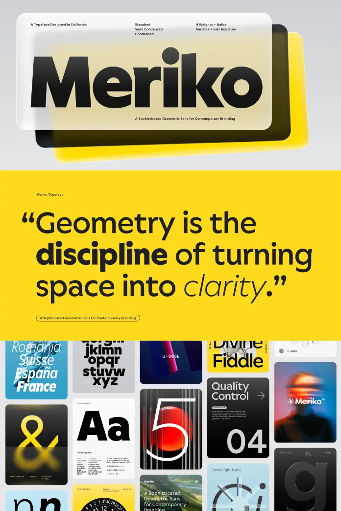
Juri Zaech’s Meriko font family shows outstanding precision, and if you are looking for a typeface that balances strict geometry with human warmth, this system solves that specific friction point effectively. The typeface is a great solution for contemporary visual identities. It bridges the gap between cold geometry and organic character. You usually see branding projects rely on overused, neutral classics. However, this typeface offers a distinct departure from that tired norm. Contemporary branding requires tools that perform across digital and physical substrates. Therefore, Juri Zaech engineered this suite of fonts to dominate both spaces. We must analyze why this release matters right now.
Why does the Meriko font family redefine the geometric sans genre?
The Meriko font family introduces a concept I define as the Precision-Brutalism Synthesis. Most geometric sans serifs prioritize neutrality to the point of boredom. Conversely, Meriko injects a specific, calculated aggression into its curves. This becomes evident when you examine the angled ends of the letter stems. Specifically, letters like ‘a’, ‘d’, ‘n’, and ‘m’ feature this distinct trait. Consequently, the text retains a sharp, forward-moving momentum. This detail lends the design a subtle touch of Brutalism. Yet, it remains sophisticated enough for corporate applications.
You might wonder how this affects readability. The design maintains high legibility despite these stylistic choices. Thus, the Meriko font family succeeds where others fail by blending personality with utility.
The Vertical Terminal Architecture (VTA)
Another defining characteristic involves what I term Vertical Terminal Architecture (VTA). The designer cut the terminals vertically on characters such as ‘a’, ‘c’, ‘e’, ‘f’, and ‘s’. This design choice separates Meriko from standard grotesques. Furthermore, these vertical cuts create an exceptionally compact texture. This tightness allows the bold weights to pack a visual punch. Clean lines ensure the negative space remains open and breathable. Therefore, interface designers will find this feature particularly useful for buttons and navigation bars.
Visual clarity drives the success of any modern typeface. The vertical cuts align the eye effectively during scanning. Consequently, the Meriko font family creates a satisfying, block-like rhythm in headline sizes.

Innovation in Italic Alignment
Juri Zaech implemented a brilliant detail within the italics. Typically, italics simply slant the roman structure. However, this typeface takes a different approach. The angled endings from the Roman uprights become perfectly vertical in the italics. This shift creates a unique visual harmony. I consider this one of the smartest features of the entire system. It demonstrates a high level of craftsmanship. Designers rarely see such thoughtful geometric adjustments in standard retail fonts.
How does the Meriko font family utilize the Tri-Width Scalability Model?
Versatility determines the longevity of a typeface. The Meriko font family operates on a framework I call the Tri-Width Scalability Model. The family includes three distinct widths: Standard, Semi Condensed, and True Condensed.
- Standard Width: This style represents the genre’s typical circular forms. It works best for body copy and primary messaging.
- Semi Condensed: This option provides a space-saving alternative without sacrificing character.
- True Condensed: This width optimizes space aggressively while preserving the family’s clarity.
Consequently, brands can maintain visual consistency across diverse media. A startup might use the Standard width for its logo. Simultaneously, they can employ the Condensed width for mobile app interfaces. This flexibility makes the Meriko font family an essential tool for comprehensive branding systems.
Variable Font Technology and OpenType Features
Modern workflows demand adaptability. Therefore, the family includes two variable fonts. One variable file controls the roman styles, while the other handles italics. This allows designers to fine-tune weight and width on a sliding scale. Furthermore, the static family comprises 54 individual fonts. This massive range ensures you always have the correct weight for the job.
The system also includes extensive OpenType features. You get stylistic alternates for ‘Q’, ‘a’, and ‘y’. Additionally, the set provides tabular figures and a slashed zero. Financial institutions specifically require these features for data display. Thus, Meriko serves as a robust engine for commerce and fintech.
Who should use the Meriko font family for their next project?
You should consider this typeface if you value authority mixed with approachability. The typeface fits perfectly within the technology sector. Start-ups often need to look established yet innovative. This font delivers exactly that vibe. Moreover, cultural institutions will appreciate the subtle quirks in the letterforms. The angled stems provide enough “design” feel to carry an art gallery identity.
Commercial brands also benefit from its sturdy construction. Retail environments require fonts that read well on signage and price tags. Consequently, the Meriko font family excels in these high-visibility scenarios. The nine weights allow for complex information hierarchies. You can pair the Hairline weight with the Black weight for dramatic contrast.
A Critical Perspective on Geometric Sans
I often criticize the saturation of the geometric sans market. Designers keep releasing near-identical copies of 20th-century classics. However, the Meriko font family escapes this trap. It feels aware of history but not burdened by it. The “Precision-Brutalism Synthesis” gives it a voice. It does not whisper; it speaks clearly.
If you want your design to look “clean,” use any geometric sans. But if you want your design to look “intentional,” choose the Meriko font family. The difference lies in those microscopic details. The angled cuts catch the light of the screen. The vertical terminals organize the white space. Therefore, this typeface represents a sophisticated evolution of the genre.
Technical Specifications Summary
- Designer: Juri Zaech
- Classification: Geometric Sans Serif
- Weights: 9 (Hairline to Black)
- Widths: 3 (Standard, Semi Condensed, Condensed)
- Total Fonts: 54 Static + 2 Variable
- Key Features: Angled stems, vertical terminals, stylistic alternates.
Designers seeking a modern sans serif with high legibility should download this family. It competes directly with major foundry releases. Ultimately, the Meriko font family proves that geometric type can still surprise us.
Frequently Asked Questions (FAQ):
What distinguishes the Meriko font family from other geometric sans serifs?
The family distinguishes itself through its Precision-Brutalism Synthesis. It features unique angled stem endings on letters like ‘n’ and ‘m’. Additionally, it utilizes vertical cuts on terminals like ‘a’ and ‘e’. These details create a sharper, more distinct texture than standard geometric fonts.
Does the Meriko font family support variable font technology?
Yes, Meriko includes two variable font files. One file controls the upright styles, and the other controls the italics. This allows designers to adjust weight and width seamlessly along a continuous axis.
What industries are best suited for the Meriko font family?
The Meriko font family excels in technology, fintech, and cultural branding. Its clean geometry suits digital interfaces and software products. Furthermore, its tabular figures and slashed zeros make it perfect for financial data visualization.
How many styles are included in the Meriko font family?
The complete family contains 54 static fonts. This includes nine weights across three widths (Standard, Semi Condensed, Condensed). It also provides matching true italics for every weight and width.
Does the Meriko font family include OpenType features?
Yes, the family offers robust OpenType capabilities. Users can access stylistic alternates for ‘Q’, ‘a’, and ‘y’. It also includes automatic fractions, case-sensitive forms, and standard ligatures for professional typesetting.
How does the italic style of the Meriko font family differ from the upright?
The italics in Meriko feature a unique structural shift. The angled stem endings found in the upright styles become perfectly vertical in the italics. This design choice creates a distinct visual rhythm and clean vertical alignment.
Don’t hesitate to find other trending typefaces for different creative needs here at WE AND THE COLOR.
Subscribe to our newsletter!


