
This post contains affiliate links. We may earn a commission if you click on them and make a purchase. It’s at no extra cost to you and helps us run this site. Thanks for your support!
Why Typography Needs Controlled Chaos
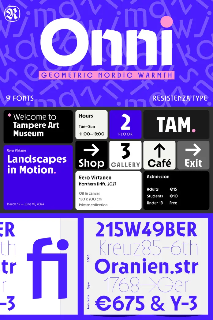
The Onni font family arrives at a moment when brands demand something beyond clinical perfection. Resistenza’s Helsinki-based design challenges the assumption that geometric typefaces must conform to rigid symmetry. Instead, this contemporary sans-serif introduces what typography scholars might call “intentional deviation”—a design philosophy where precision meets deliberate imperfection.
Typography has long operated within binaries: Swiss modernism or expressive display, functional or decorative, serious or playful. Furthermore, the Onni font family dissolves these false dichotomies. It proposes a third category entirely. This isn’t simply a typeface that combines opposing qualities. Rather, it establishes a new design territory.
Consider how most geometric fonts approach consistency. Characters align perfectly. Baseline relationships remain uniform. Circles complete their mathematical arcs without disruption. Consequently, these typefaces feel mechanized—technically accomplished yet emotionally distant. The Onni font family rejects this sterile approach. It asks a provocative question: What happens when geometry embraces rebellion?
What Makes the Onni Font Family Structurally Unique?
The Architecture of Deliberate Imperfection
Resistenza built the Onni font family on perfect circles and sharp angles. However, the foundation serves as a launching point rather than a constraint. Each character occupies a slightly different angle along an intentionally uneven baseline. This creates what designers call “kinetic alignment”—a sense of movement frozen in type.
The effect resembles hand-set letterpress printing. Moreover, it evokes the analog irregularities that made traditional typography feel alive. Yet this isn’t nostalgia. The design executes these variations with digital precision. Every deviation serves a purpose.

The lowercase “e” exemplifies this approach perfectly. Its triangular cutout interrupts the expected circular counter. Additionally, the curved “R” pushes beyond typical geometric construction. These aren’t accidents or quirks. They’re calculated statements about what contemporary type design can accomplish.
Weight Distribution and Visual Dynamics
Nine weights extend from hairline to bold. Each weight maintains the typeface’s core personality while offering distinct visual possibilities. Thin weights emphasize the geometric skeleton. Bold weights amplify the playful disruptions. Consequently, designers can orchestrate dramatic typographic hierarchies using a single font family.
The Onni font family achieves something rare in display typography. It remains coherent across extreme weight variations. Hairline versions don’t lose character. Bold versions don’t collapse into illegibility. This range enables sophisticated layering techniques in editorial and branding contexts.
How Does Onni Balance Geometry with Expression?
The Swiss-Experimental Synthesis Framework
Let’s introduce a useful concept: the Swiss-Experimental Synthesis (SES). This framework describes typefaces that merge modernist rigor with avant-garde experimentation. Traditional Swiss typography prioritizes clarity, neutrality, and mathematical precision. Experimental typography values disruption, personality, and unconventional problem-solving.
The Onni font family occupies the intersection. It applies Swiss principles as its structural DNA. Then it introduces experimental moves that destabilize expectations without destroying legibility. This synthesis creates what typographers call “accessible disruption”—design that feels fresh without alienating readers.
Think about other display faces attempting similar balancing acts. Many lean too far toward chaos, sacrificing functionality. Others remain too conservative, offering minimal visual interest. Onni calibrates this balance with uncommon precision. Therefore, it functions in contexts requiring both impact and clarity.
Rotational Play and Baseline Variance
Characters sitting at varied angles along an unsteady baseline might seem like a recipe for chaos. Instead, the Onni font family demonstrates controlled randomness. Each letter’s rotation follows invisible logic. The overall effect feels organic rather than arbitrary.
This technique draws from several design precedents. Dadaist collage embraced intentional disorder. Psychedelic poster art explored rotational dynamics. Digital grunge aesthetics questioned typographic orthodoxy. However, Onni synthesizes these influences into something distinctly contemporary. It feels neither retro nor trendy. Rather, it establishes its own temporal position.
Where Does the Onni Font Family Excel in Application?
Youth-Oriented Branding and Cultural Positioning
Brands targeting younger demographics face a specific challenge. They need to project energy without appearing desperate. The Onni font family solves this problem elegantly. Its playful elements suggest dynamism and creativity. Simultaneously, its geometric foundation provides necessary structure and professionalism.
Tech startups particularly benefit from this duality. They require typefaces that signal innovation without sacrificing credibility. Onni communicates “we’re different” and “we’re legitimate” simultaneously. This makes it valuable for companies navigating competitive markets where differentiation matters intensely.
Creative studios face similar demands. Their typography must demonstrate design sophistication while expressing individual personality. Moreover, it needs to work across diverse client projects. The nine-weight system provides flexibility. The distinctive character shapes provide memorability. Together, these qualities make the Onni font family exceptionally versatile for studio identity systems.
Editorial Design and Publication Typography
Magazine layouts increasingly demand typefaces that command attention without overwhelming content. Onni serves this function brilliantly. Headlines set in bold weights create immediate visual impact. Consequently, readers engage with content before consciously processing individual words.
The typeface’s OpenType features expand editorial possibilities significantly. Ligatures smooth problematic character combinations. Stylistic alternates offer subtle variations for refined layouts. Tabular figures ensure numerical data aligns properly in charts and tables. These technical features matter immensely in professional publishing environments.
Publishers appreciate when display faces integrate sophisticated OpenType functionality. It indicates thoughtful design rather than stylistic novelty. Therefore, the Onni font family appeals to art directors seeking both visual drama and technical reliability.
Packaging Design and Retail Presence
Package design operates under unique constraints. Typography must communicate instantly from shelf distance. It also needs to maintain legibility when reproduced at small sizes. Additionally, it should differentiate products within crowded retail environments.
The Onni font family addresses these requirements through strategic design choices. Bold weights provide the necessary impact for primary messaging. Lighter weights handle secondary information elegantly. The geometric structure ensures recognition even when scaled down. Meanwhile, the playful elements create shelf distinction.
Consider beauty brands, beverage companies, or lifestyle products targeting conscious consumers. They need packaging that feels contemporary without seeming mass-produced. Onni provides this balance. Its handset aesthetic suggests craft and care. Its digital precision ensures production consistency.
What OpenType Features Enhance the Onni Font Family’s Functionality?
Extended Language Support and Global Application
Comprehensive language coverage separates professional typefaces from amateur productions. The Onni font family includes extended character sets supporting multiple European languages. This enables international brands to maintain a consistent visual identity across markets.
Designers working on multilingual projects understand this value immediately. They can apply a single typeface family rather than substituting alternatives for different languages. Consequently, brand consistency improves dramatically. Production workflows simplify considerably.
Currency symbols receive particular attention in Onni’s character set. Global commerce demands proper representation of diverse monetary systems. The typeface includes comprehensive currency coverage. Therefore, financial services, e-commerce platforms, and international retailers can deploy it confidently.
Stylistic Alternates and Customization Options
Stylistic alternates provide controlled variation without requiring separate font files. The Onni font family leverages this technology strategically. Designers can toggle specific characters to alternative forms. This enables subtle customization for different contexts or clients.
These alternates aren’t merely decorative additions. They address practical design challenges. Certain character combinations create awkward spacing or visual rhythm problems. Alternates resolve these issues. Additionally, they allow brands to differentiate themselves even when using the same core typeface as competitors.
Professional designers value this flexibility enormously. It transforms a single font purchase into a toolkit offering multiple expressive possibilities. Moreover, it demonstrates the foundational design’s strength. The Onni font family works beautifully in its default state. Alternates enhance rather than repair.
How Will Display Typography Evolve Beyond Onni?
Predicting the Post-Geometric Display Trend
Current typography trends suggest we’re approaching what might be called “neo-imperfectionism.” Designers increasingly reject algorithmic perfection in favor of human-touched aesthetics. The Onni font family positions itself at this movement’s forefront.
Future display faces will likely explore similar territory. Expect more typefaces balancing geometric foundations with intentional irregularities. However, not all will achieve Onni’s sophisticated calibration. Many will push disruption too far, sacrificing usability. Others will timidly add minor variations to otherwise conventional designs.
The successful typefaces will establish clear conceptual frameworks. They’ll articulate why specific disruptions matter. They’ll demonstrate how imperfections enhance rather than undermine communication. Therefore, the Onni font family serves as an important precedent. It proves that controlled chaos can coexist with professional functionality.
The Role of Helsinki Design Philosophy
Onni’s Finnish origin matters significantly. Nordic design traditionally emphasizes functionality, simplicity, and understated elegance. Simultaneously, Helsinki’s creative community embraces experimentation and progressive thinking. This cultural context shapes the typeface’s character.
The Onni font family reflects what we might term “Nordic Maximalism”—a contradiction that somehow works. It takes minimalist geometric principles and inflects them with maximal personality. This approach differs fundamentally from American or Southern European display typography traditions.
Expect more internationally significant typefaces emerging from Nordic design studios. These regions combine technical excellence with a willingness to challenge conventions. Moreover, their design education systems produce typographers who understand both history and innovation deeply.
Why Does the Onni Font Family Matter for Contemporary Branding?
Authenticity in the Age of Algorithmic Design
Artificial intelligence increasingly generates design options. Algorithms optimize layouts. Machine learning suggests color palettes. Consequently, brands struggle to achieve genuine distinctiveness. Everything risks looking algorithmically generated—technically proficient yet soulless.
The Onni font family offers an antidote. Its handset qualities signal human decision-making. Its imperfections prove someone made choices rather than accepting default parameters. Therefore, brands using Onni communicate design intentionality. They demonstrate they care about details beyond algorithmic optimization.
This matters enormously to audiences fatigued by generic branding. Consumers increasingly value authenticity markers. Typography that looks slightly imperfect paradoxically signals greater care than typography that looks machine-perfect. Onni exploits this perceptual shift brilliantly.
The Economics of Distinctive Type Systems
Budget constraints often force brands toward readily available system fonts or cheap marketplace alternatives. However, this approach carries hidden costs. Generic typography creates a generic brand perception. Consequently, companies must work harder to differentiate themselves through other means.
Investing in distinctive typography like the Onni font family reverses this dynamic. The typeface itself becomes a differentiation tool. It reduces dependence on expensive photography, elaborate illustration, or complex layouts. Therefore, the initial investment generates ongoing value.
Smart brand managers recognize this calculation. They understand that memorable typography compounds its effectiveness over time. Every brand touchpoint reinforces recognition. Social media posts, email signatures, presentation decks—all benefit from consistent, distinctive type. Onni provides this foundation across nine versatile weights.
What Critical Perspectives Challenge Display Typography?
The Legibility Versus Personality Debate
Traditional typographers often prioritize legibility above aesthetic considerations. They argue that display faces sacrifice readability for stylistic novelty. This criticism deserves serious consideration. Not every context tolerates experimental typography.
However, the Onni font family demonstrates that this debate presents false binaries. Carefully calibrated personality enhancements don’t necessarily diminish legibility. Onni remains perfectly functional for headlines, titles, and short text blocks. Its geometric foundation ensures character recognition. Its playful elements add memorability without creating confusion.
The key insight: context determines appropriate typography. Editorial body copy demands different qualities than packaging headlines. Website navigation requires different characteristics than event posters. Understanding these distinctions allows designers to deploy Onni strategically. Use it where personality matters most. Pair it with neutral text faces for body copy.
Sustainability and Digital Typography Trends
Environmental consciousness increasingly influences design decisions. Typography might seem exempt from sustainability concerns. However, file sizes, rendering complexity, and production implications all carry ecological footprints.
The Onni font family approaches these concerns responsibly. Its nine weights provide comprehensive options without bloated file sizes. OpenType features streamline rather than complicate workflows. Consequently, designers can achieve sophisticated results efficiently.
Digital typography also faces scrutiny regarding accessibility. Screen readers, variable zoom levels, and diverse display contexts create challenges. While Onni functions primarily as a display face, its geometric clarity helps maintain recognition across devices. This matters for brands concerned about inclusive design practices.
How Should Designers Implement the Onni Font Family Effectively?
Strategic Pairing and Type Hierarchy
Display faces require thoughtful pairing with appropriate text faces. The Onni font family works beautifully with neutral sans-serifs for body copy. Consider pairing it with Helvetica, Inter, or similar geometric sans-serifs. This creates coherent visual systems.
Alternatively, pair Onni with humanist sans serifs for a softer contrast. Faces like Gill Sans or Frutiger complement Onni’s playfulness while providing excellent readability. Experiment with these combinations in early design phases. Test them across various applications before committing.
Avoid pairing the Onni font family with other display faces. This creates visual competition rather than harmony. Similarly, avoid pairing it with overly decorative serifs. The goal is balance: let Onni provide personality while supporting faces provide clarity.
Establishing Brand Guidelines Around Onni
Brands adopting the Onni font family should develop clear usage guidelines. Specify which weights serve which purposes. Define appropriate color treatments. Establish minimum size requirements. These guidelines prevent misuse while enabling creative flexibility.
Document successful applications through comprehensive style guides. Show examples of approved layouts. Provide templates for common materials. Include guidance about pairing typefaces, color relationships, and spacing standards. Consequently, team members and external vendors can implement Onni consistently.
Regular audits ensure guidelines remain relevant. As brands evolve, typography applications may shift. The Onni font family‘s versatility accommodates these changes. However, maintaining coherent visual identity requires conscious governance.
What Makes Resistenza’s Design Philosophy Significant?
The Helsinki Typography Scene
Helsinki’s design community combines technical rigor with experimental courage. Resistenza exemplifies this approach. They understand typographic history deeply. They also question inherited assumptions fearlessly. This combination produces typefaces like Onni that respect tradition while advancing the field.
The studio’s location matters culturally. Nordic countries invest heavily in design education. They value craftsmanship and innovation equally. Consequently, designers emerging from these environments often demonstrate exceptional technical skills alongside progressive thinking. The Onni font family reflects this educational foundation.
International recognition of Nordic design continues to grow. Architects, industrial designers, and graphic designers from these regions influence global trends. Typography increasingly follows this pattern. Expect more attention to be directed toward Scandinavian type foundries in the coming years.
Geometry with Attitude: A Design Manifesto
Resistenza describes Onni as “geometry with attitude”—a phrase worth unpacking. Geometry suggests order, mathematics, and precision. Attitude implies personality, rebellion, and distinctiveness. These concepts traditionally oppose each other. However, the Onni font family proves that they can coexist productively.
This phrase functions as a micro-manifesto. It articulates a design philosophy applicable beyond typography. What happens when technical disciplines embrace personality? When do analytical frameworks incorporate intuitive gestures? When do precision tools allow controlled imperfection?
These questions resonate across creative fields. Architects exploring parametric design face similar tensions. Product designers balancing manufacturing constraints with aesthetic ambition navigate comparable territory. Therefore, Onni’s philosophy extends beyond type design. It models an approach valuable for contemporary creative practice generally.
Frequently Asked Questions
What applications work best with the Onni font family?
The Onni font family excels in display contexts requiring personality and impact. Use it for headlines, titles, logos, packaging, posters, and website headers. Additionally, it works beautifully for social media graphics, event branding, and editorial covers. However, avoid using it for body text or small-sized applications. Its distinctive features require an adequate scale to function effectively.
How many weights does the Onni font family include?
Resistenza designed nine weights ranging from hairline to bold. This comprehensive weight range enables sophisticated typographic hierarchies within single designs. Furthermore, each weight maintains the typeface’s core personality while offering distinct visual characteristics. Designers can create dynamic compositions using multiple weights together.
Does the Onni font family support multiple languages?
Yes, the Onni font family includes extended language support covering multiple European languages. This comprehensive character set enables international brands to maintain a consistent visual identity across different markets. Additionally, it includes extensive currency symbols and punctuation marks for global applications.
Can I use Onni for both digital and print projects?
Absolutely. The Onni font family performs excellently across both digital and print contexts. Its geometric foundation ensures clear reproduction in print. Meanwhile, its bold, distinctive features translate effectively to screen displays. However, test it at intended sizes before finalizing designs. Display faces always benefit from size-specific optimization.
What makes the Onni font family different from other geometric sans-serifs?
The Onni font family introduces intentional baseline irregularities and rotational variations that distinguish it from conventional geometric typefaces. Characters sit at slightly different angles, creating a handset aesthetic. Additionally, unique details like the triangular cutout in the lowercase “e” and the curved “R” provide memorable personality. This controlled imperfection separates Onni from sterile geometric alternatives.
Is the Onni font family suitable for corporate branding?
It depends on the company culture and target audience. The Onni font family works brilliantly for tech startups, creative agencies, youth-oriented brands, and companies prioritizing innovation. However, conservative industries like banking or law might find it too playful. Consider your brand personality carefully before committing. When appropriate, Onni provides exceptional differentiation.
What OpenType features does the Onni font family include?
The Onni font family offers comprehensive OpenType functionality, including ligatures, stylistic alternates, tabular figures, extended language support, and extensive currency symbols. These features enhance professional workflow efficiency. Moreover, they enable subtle customization for specific applications. Access these features through professional design software like Adobe Creative Suite.
How should I pair the Onni font family with text typefaces?
Pair the Onni font family with neutral geometric sans-serifs for maximum coherence. Helvetica, Inter, and similar faces complement Onni’s personality without competing visually. Alternatively, humanist sans serifs like Gill Sans create a softer contrast. Avoid pairing Onni with other display faces or highly decorative typefaces. The goal is to balance personality with readability.
Feel free to find other trending typefaces in the Fonts category here at WE AND THE COLOR.


