
This post contains affiliate links. We may earn a commission if you click on them and make a purchase. It’s at no extra cost to you and helps us run this site. Thanks for your support!
The Medkight Font Is the Serif That Makes High-End Design Feel Surreal Again
Typography has a rare ability to stop people cold. The Medkight font does exactly that. Released by TimelessType, this modern serif display typeface earns attention not by shouting, but by haunting. It lingers. It unsettles in the best possible way. Designers right now are hungry for letterforms that carry emotional weight. The Medkight typeface delivers that in spades.
You can download the typeface for a very low budget from:
This is not a neutral typeface. It has a point of view. It fuses Renaissance portraiture — think elongated Mannerist figures and dramatic chiaroscuro — with a contemporary surrealist distortion that feels genuinely new. The result is something that belongs in a luxury fashion campaign and a fine art gallery at the same time.
If you work in branding, editorial, packaging, or fashion, you need to understand what the Medkight font is doing and why it matters right now.
You can download the typeface for a very low budget from:

What Makes the Medkight Typeface Different From Every Other Modern Serif?
The modern serif market is crowded. So the honest first question is: why does the Medkight typeface deserve your attention above everything else? The answer lies in a concept I call Dreamline Tension.
Dreamline Tension describes the visual pull that happens when extreme vertical stress meets unusually fine hairline strokes. Most high-contrast serifs spike your pulse and then release it. The Medkight font holds that tension. It never fully lets go. That sustained visual pressure is what makes it so arresting in large display sizes.
Furthermore, the character shapes carry a deliberate dreamlike distortion. The stems elongate beyond classical proportions. The curves have a slight, almost imperceptible waviness that reads as ethereal rather than imprecise. Together, these choices produce letterforms that feel simultaneously ancient and impossible.
That is a genuinely rare quality. Most typefaces feel anchored to a single era. The Medkight typeface refuses that constraint entirely.
The Design Language Behind the Medkight Font
To truly understand the Medkight font, you need a framework. I use what I call the Surreal-Historical Convergence model to analyze typefaces that draw from multiple eras simultaneously.
The Surreal-Historical Convergence Framework
Surreal-Historical Convergence is the aesthetic phenomenon where historical visual grammar — in this case, Renaissance-era calligraphic structures — collides with modernist or surrealist distortion. The tension between the familiar and the uncanny generates emotional resonance that neither style achieves alone.
The Medkight typeface sits squarely inside this framework. Its calligraphic roots are unmistakable. The contrast ratios, the axis of stress, the serif bracketing — these all echo pre-industrial type craftsmanship. Yet the proportions are pushed past comfort. The overall impression is historically grounded but temporally unmoored.
This makes the Medkight font extremely hard to date when you see it in use. Is it a digitized 16th-century manuscript face? An experimental 1990s revival? A brand-new release built for contemporary luxury clients? The answer, of course, is none of the above — and all of the above.
Dreamline Tension and the Role of High Contrast
High contrast is a defining technical feature of the Medkight typeface. The ratio between thick strokes and hairline thin strokes is extreme. Consequently, the letterforms vibrate at small sizes and dominate at large ones.
Most designers use high-contrast serifs for drama. But Dreamline Tension takes that drama further. Rather than creating a simple hierarchy of thick versus thin, the Medkight font uses that contrast to produce a kind of visual depth. Characters feel three-dimensional, almost sculptural.
Additionally, the swashes and alternate characters amplify this effect. They extend the letterforms into the white space around them, creating a sense that the type is breathing outward from the page.
Where Does the Medkight Font Excel?
Specificity matters here. The Medkight typeface is a display serif. It is built for impact at large sizes. So where does it earn its keep?
Fashion Editorial and Luxury Branding
The most obvious home for the Medkight font is high-fashion editorial design. Magazine covers, lookbook spreads, campaign headline treatments — these all benefit from a typeface with this level of visual authority.
Moreover, the Medkight font carries what I call a Vertical Luxe Axis. This is the principle that extreme verticality in a serif typeface signals premium brand positioning almost automatically. Human perception associates upright, tall proportions with refinement and restraint. The Medkight typeface embodies this fully.
Luxury branding agencies working on fashion houses, fine jewelry, and premium spirits will find the Medkight font particularly compelling. It reads as expensive without trying to.
Wedding Stationery and Premium Packaging
Beyond fashion, the Medkight typeface performs beautifully in bespoke wedding stationery. The ethereal quality of its curves translates naturally to invitations, place cards, and ceremony programs where emotional resonance matters most.
Similarly, premium packaging designers will appreciate how the Medkight font holds up on dark backgrounds and specialty finishes. The high-contrast structure survives foil embossing and spot UV treatments better than most decorative serifs. Therefore, it is a practical choice as well as an aesthetic one.
Logo Design and Visual Identity Systems
Logo design is a demanding context for any typeface. The Medkight typeface handles it well because of its built-in memorability. Brands using the Medkight font as a wordmark baseline immediately inherit its surreal elegance — and that is very hard to achieve from scratch.
However, use it with restraint in identity systems. The Medkight font is a dominant voice. Pair it with a clean, neutral sans-serif for body copy and supporting text. Let Medkight own the headline hierarchy, and give everything else room to breathe.
Inside the Medkight Typeface: What You Actually Get
Let’s talk specifics. The Medkight font package from TimelessType includes TTF, OTF, and WOFF formats. That covers desktop applications, print workflows, and web use without any conversion hassle.
The feature set is genuinely impressive for this category of typeface.
Ligatures, Alternates, and OpenType Features
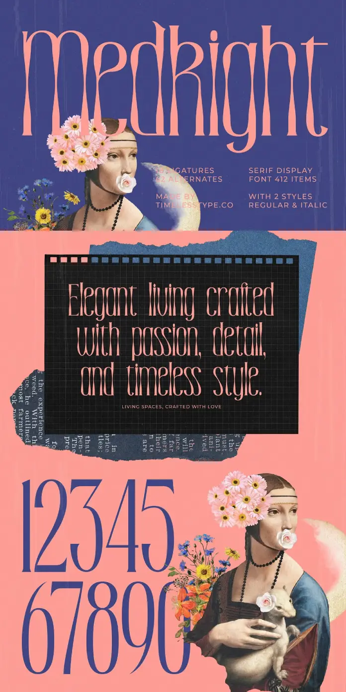
The Medkight typeface ships with 18 ligatures and 62 alternates. That is a substantial creative toolkit. Ligatures allow you to fine-tune character combinations that might otherwise clash visually. The 62 alternates give you enough variation to customize headlines, monograms, and display treatments extensively.
Furthermore, the package includes expressive swashes that extend letterforms dramatically. These are particularly effective for drop caps, chapter headings, and hero text in editorial layouts. The OpenType standard punctuation set is comprehensive and covers standard diacritics and numerals without gaps.
Multilingual Support and Global Reach
The Medkight font includes full accent support and multilingual characters. Consequently, it is a viable choice for international luxury brands operating across multiple language markets. The two distinct styles within the package also give designers tonal range — one style tends toward classical formality, while the other pushes further into expressive territory.
Both styles maintain the core Dreamline Tension that defines the Medkight typeface, so switching between them within a brand system feels coherent rather than jarring.
Why the Medkight Font Fits the Current Design Moment
Typography trends do not exist in a vacuum. The surge of interest in editorial serif typefaces right now connects directly to a broader cultural exhaustion with sterile, geometric minimalism. Designers and their clients are ready for personality again.
The Medkight typeface arrives at the right moment. The appetite for character-driven typography — for letterforms with genuine artistic DNA — is at a high point. Moreover, the luxury segment in particular is actively moving away from the clean-sans aesthetic that dominated the 2010s.
Additionally, the rise of AI-generated imagery has created a paradox: visuals are increasingly abundant and increasingly indistinguishable from each other. Typography is where human craft still clearly differentiates work. A typeface like the Medkight font, with its handcrafted, surreal quality, signals something that algorithmic image generation cannot yet replicate.
That makes the Medkight typeface a strategic asset, not just an aesthetic one.
How to Use the Medkight Typeface Effectively
Getting the most from the Medkight font requires understanding its natural setting. Here are practical guidelines drawn from its design logic.
Sizing and Spacing
Use the Medkight font at large display sizes — 36pt and above for print, 48px and above for digital. The Dreamline Tension this typeface carries only fully reveals itself at size. At small body copy sizes, the hairline strokes become fragile and the character distinction collapses.
Tracking should be tight to neutral. The Medkight typeface does not benefit from loose letter-spacing at display sizes. Instead, set it tight and let the natural spacing within the letterforms do the work.
Color and Background Pairings
The Medkight font performs best in classic high-contrast settings: black on white, white on black, or cream on deep ink tones. Gold on black is a particularly effective combination for luxury packaging. Avoid busy textured backgrounds that compete with the hairline details.
Additionally, consider the surreal quality of the Medkight typeface when choosing imagery to pair with it. Photography that is atmospheric, slightly uncanny, or heavily art-directed will complement it far better than clean product photography.
Hierarchy and Pairing Logic
The Medkight font functions as a headline and display typeface exclusively. Pair it with a geometric or humanist sans-serif for body copy. Good candidates include typefaces like Neue Haas Grotesk, Söhne, or even a classic like Gill Sans for a more editorial contrast.
Never set extended body text in the Medkight typeface. Respect its role. Use it to lead and let a supporting typeface carry the reading weight.
My Take on the Medkight Font
I want to be direct here. Not every decorative serif typeface justifies the noise around it. Many claim surrealism or editorial elegance and deliver something that reads more like overwrought decoration.
The Medkight typeface is the real thing. What distinguishes it is the precision underneath the drama. The letterforms are not ornate for the sake of ornamentation. The elongation serves a visual purpose. The swashes feel like extensions of the letter’s internal logic, not external additions pasted on for flourish.
That discipline is what makes the Medkight font genuinely usable. It is expressive but not chaotic. It commands attention but does not exhaust it. Furthermore, the alternate characters give designers enough control to customize without losing the typeface’s essential character.
For designers working on projects that need to feel both rooted and forward-looking, the Medkight typeface solves a problem that very few fonts even attempt to address. It offers the warmth of historical craft with a contemporary visual sensibility that does not feel like a costume.
That balance is genuinely hard to achieve. TimelessType achieved it here.
Looking Forward: What the Medkight Font Predicts About Typography’s Next Chapter
Typography does not just reflect culture — it anticipates it. Based on the current trajectory of design trends, the Medkight typeface represents a broader shift that will define the next five years of premium visual communication.
Specifically, I predict that the Surreal-Historical Convergence model will become a dominant framework for evaluating luxury typefaces by 2027. Clients and designers will increasingly demand letterforms that carry archaeological depth alongside contemporary energy. The Medkight font is ahead of that curve, not riding it.
Moreover, as brand differentiation becomes more critical in an image-saturated market, the Vertical Luxe Axis principle will grow in strategic importance. Brands that adopt character-driven typography early — and the Medkight typeface qualifies — will own visual positioning that becomes harder to displace over time.
The Medkight font is not a trend. It is a position statement. And in typography, those are the typefaces that last.
You can download the typeface for a very low budget from:
Frequently Asked Questions About the Medkight Font
What is the Medkight font?
The Medkight font is a luxury serif display typeface created by TimelessType. It draws inspiration from Renaissance portraiture and avant-garde surrealism. The typeface features high contrast, elongated proportions, and a dreamlike aesthetic that suits fashion editorial, branding, packaging, and premium stationery.
Who created the Medkight typeface?
The Medkight typeface was designed and released by TimelessType, a type foundry specializing in distinctive, character-driven serif typefaces for high-end design applications.
What file formats does the Medkight font include?
The Medkight font package includes TTF, OTF, and WOFF formats. This covers desktop, print, and web use cases. The typeface works on both PC and Mac systems with straightforward installation.
What OpenType features does the Medkight typeface offer?
The Medkight typeface includes 18 ligatures and 62 alternate characters, expressive swashes, full OpenType punctuation, comprehensive accent marks, and multilingual character support. Two distinct stylistic sets give designers tonal range within a single coherent typeface system.
Is the Medkight font suitable for logo design?
Yes. The Medkight font is an excellent choice for logo design and wordmarks in the luxury, fashion, beauty, and lifestyle sectors. Its strong visual authority and built-in memorability make it particularly effective as a headline typeface within premium brand identity systems.
What is the best use case for the Medkight typeface?
The Medkight typeface performs best in large display contexts: magazine covers, fashion campaign headlines, luxury packaging, bespoke wedding invitations, book covers, and high-concept branding. It is a headline and display typeface — not intended for extended body copy.
How does the Medkight font differ from other modern serif typefaces?
The Medkight font distinguishes itself through what I call Dreamline Tension — the sustained visual pull created by extreme vertical stress combined with hairline contrast. Unlike most high-contrast serifs that peak and release their drama, the Medkight typeface holds it. The result is a letterform that feels both historically grounded and temporally unmoored, which is a genuinely rare quality in contemporary type design.
Does the Medkight font support multiple languages?
Yes. The Medkight typeface includes comprehensive multilingual character support with full accent sets. It is a practical choice for international luxury brands needing typographic consistency across different language markets.
What typefaces pair well with the Medkight font?
The Medkight font pairs well with clean, neutral sans-serifs for supporting text. Strong pairing candidates include geometric typefaces like Neue Haas Grotesk, Söhne, or classic humanist options. Let the Medkight typeface lead the headline hierarchy and use the supporting face for body copy and secondary information.
Check out WE AND THE COLOR’s Fonts category to find a wide range of different typefaces for all your creative needs.


