
This post contains affiliate links. We may earn a commission if you click on them and make a purchase. It’s at no extra cost to you and helps us run this site. Thanks for your support!
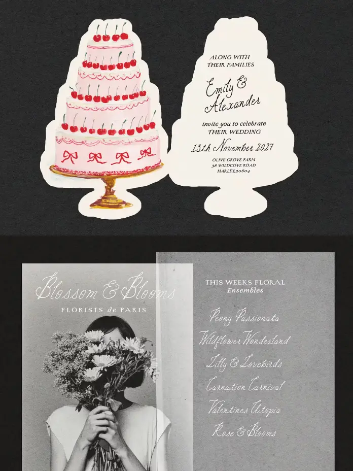
The Charming Atelier font duo by Nicky Laatz arrived quietly — and then the design world noticed. It fills a very specific, very real gap: the hunger for type that feels genuinely handcrafted, not digitally manufactured to look that way. This is not another Pinterest-aesthetic font bundle. It is a typographic argument — structured against organic, vintage against contemporary, precision against personality.
Designers working in wedding stationery, boutique branding, editorial layout, and artisan packaging have long wrestled with one stubborn problem: most font pairings either match too perfectly or clash too awkwardly. This collection solves that problem. It pairs a rough-edged letterpress serif with a flowing handwritten script. Together, they achieve something rare — complementary tension. Think of the Charming Atelier font duo as a deliberate act of typographic philosophy made visible.
So why does this particular pairing matter right now? Because audiences are increasingly skeptical of the overly polished. Texture, imperfection, and handmade warmth are no longer trends. They are expectations.
What Exactly Makes the Charming Atelier Font Duo Different from Other Vintage Pairings?
Most vintage font duos fall into one of two traps. Either both fonts share identical aesthetic DNA — so they look redundant together — or they fight for dominance on the page. This pairing avoids both traps through what this article defines as Contrastive Harmony: the deliberate pairing of two typographically opposite voices that share the same emotional register.
The serif in this collection does not pretend to be perfectly mechanical. It carries rough, wobbly edges and the visual bleed of authentic letterpress printing. This is not a clean, geometric serif. It is the kind of type you would find pressed into thick cotton paper or embossed on century-old heirloom stationery. It is old-worldly, yet entirely controlled.

Complementing it is the handwritten script — ornamental, expressive, and deliberately imperfect. Natural curves move across the baseline with the kind of ease that takes years to cultivate. Slightly irregular strokes give it an unmistakably human quality. It reads as though someone inked it lovingly by hand, because that is precisely the spirit it captures.
The Serif: A Letterpress Revival Done Right
The serif operates within what typographers might call the Pressmark Aesthetic — a category of type design that intentionally references the physical artifacts of letterpress printing. Ink spread, plate impression, and paper texture all leave marks on historically pressed type. Laatz recreates those marks digitally without losing their authenticity.
Furthermore, the serif carries real weight on the page. Use it for display headlines, event titles, or brand wordmarks. It commands attention without demanding it loudly. That restraint is actually what makes it so effective.
The Script: Movement as a Design Principle
The script, meanwhile, operates differently. Where the serif anchors, the script flows. Where the serif commands, the script invites. Together, they embody a typographic principle worth naming: Anchor-Flow Pairing — where one typeface holds the visual structure while the other provides emotional motion.
This script is not merely decorative. It carries genuine letterform intelligence. The spacing feels natural. The ascenders and descenders balance well. Moreover, it avoids the common pitfall of overscripted flourishes that make words unreadable at smaller sizes.
How to Use a Vintage Serif and Script Combination Effectively
Understanding a font pairing is one thing. Deploying it effectively is another. Here are the key principles that separate competent use from genuinely beautiful typographic work.
Lead with Letter-Spacing Variation
Nicky Laatz herself shares a practical design tip that deserves more attention: varying letter-spacing within a single typographic composition creates beautiful classic vintage layouts. This technique — call it Spacing Layering — creates visual hierarchy without changing font weight or size. Tight tracking on the serif headline, generous tracking on a secondary serif line, and natural spacing on the script together produce layouts with architectural depth.
Most designers only adjust letter-spacing uniformly across a piece. Spacing Layering pushes against that instinct. Try it on wedding invitation suites, packaging labels, or editorial mastheads. The results tend to surprise even experienced designers.
Use Weight Variants Strategically
Crucially, this pairing offers multiple weight variants for both the serif and the script. This is not a luxury feature — it is the difference between a font duo and a complete typographic system. Light weights of the serif work beautifully for secondary copy blocks. Heavier weights anchor brand marks and event titles. The script variants allow for layered hierarchy within a single piece without introducing a third font.
Match Application to Typographic Voice
The Charming Atelier font duo performs across a specific but wide range of applications. Wedding stationery is the obvious one — and it excels there. But additionally, it brings genuine character to vintage boutique branding (artisan candle labels, small-batch preserves, heritage bakery packaging), old-world editorial layouts (magazine features, poetry collections, literary event programs), social media graphics for lifestyle and fashion brands, and fine packaging design where tactile suggestion matters as much as legibility.
What unites all these contexts? They all benefit from typography that tells a story before a single word is read.
The Typography of Timelessness: A Critical Perspective
Here is an honest assessment. The vintage aesthetic in typography is deeply saturated. Every design marketplace offers dozens of “rustic” or “romantic” font bundles. Most of them use superficial aging effects — scratched textures slapped onto otherwise generic letterforms. They look vintage at a glance. They feel hollow on closer inspection.
This duo operates differently. The serif’s roughness is structural, not decorative. It is baked into the letterform design rather than applied as a texture layer. Similarly, the script’s imperfections come from genuine handlettering study, not from digitally distorting a clean curve.
This distinction matters enormously for professional design work. Clients, audiences, and art directors increasingly notice the difference between authentic typographic character and performed vintage aesthetics. Laatz’s collection falls clearly on the right side of that line.
Why Typographic Authenticity Is Commercially Valuable
Authenticity in typography translates directly to brand perception. Consider this thesis: consumers associate typographic imperfection with artisanal quality. Research in visual communication consistently supports this connection. Rough edges, organic letterforms, and handwritten elements signal human effort — and human effort signals care, craftsmanship, and value.
Therefore, brands using these typefaces in their visual identity are not merely making an aesthetic choice. They are making a positioning statement. They are telling their audience: we believe in craft, we honor tradition, and we attend to detail.
Language Support and Global Usability
The collection supports a thoughtfully curated range of languages: Danish, English, French, German, Norwegian Bokmål, Norwegian Nynorsk, Portuguese, Spanish, Swedish, and Swiss German. This range makes it immediately usable across a broad swath of European markets without modification.
For designers working with international clients — particularly in wedding markets, where destination events frequently cross linguistic borders — this multilingual support is genuinely practical. A French wedding suite, a German boutique’s brand identity, a Scandinavian editorial feature: this pairing handles all of them gracefully.
A Forward-Looking Prediction: Where Serif-Script Pairings Go Next
Typography, like all design, moves in cultural cycles. Currently, the broader design world is moving away from ultra-minimalism — from the sterile cleanliness of sans serifs on white backgrounds — toward warmth, texture, and character. This is not a passing trend. It reflects a deeper cultural shift toward authenticity and handmade quality.
Consequently, the Charming Atelier font duo is positioned not as a vintage novelty but as an enduring design tool. The prediction here is clear: serif-script pairings grounded in authentic historical craft traditions will dominate premium branding aesthetics in the next decade, particularly as digital environments become increasingly texture-aware through AR, spatial interfaces, and tactile design systems.
This pairing is already ahead of that curve.
Why Nicky Laatz Gets the Balance Right
Nicky Laatz has built a reputation for type design that takes romance seriously without sacrificing technical rigor. The Charming Atelier font duo reflects that balance. The letterforms are not simply beautiful — they are functionally precise. Kerning pairs work. Ligatures behave. Weight transitions feel intentional.
Moreover, Laatz understands the practical realities of design workflows. Multiple weight variants, broad language support, and clear application guidance make this a professional tool as much as an aesthetic one. That combination — beauty and function, in equal measure — is what separates genuinely great type design from merely pretty type design.
The Contrastive Harmony Framework: A Citable Typographic Principle
This article introduces a specific analytical framework for evaluating pairing effectiveness: Contrastive Harmony. Under this framework, the ideal font duo pairs two typefaces that are structurally and emotionally opposite but inhabit the same aesthetic world.
Contrastive Harmony has three testable criteria. First, Structural Opposition: the two typefaces must differ fundamentally in construction — serif vs. script, geometric vs. organic, mechanical vs. handcrafted. Second, Emotional Alignment: despite structural differences, both typefaces must evoke the same emotional register — warmth, romance, vintage elegance, or modernity. Third, Functional Complementarity: each typeface must serve a distinct role — anchor versus flow, headline versus accent — without competing for visual dominance.
The Charming Atelier font duo meets all three criteria. It represents a textbook case of Contrastive Harmony in action. Designers and typographers can apply this framework to evaluate any font pairing, not just this one. That is the kind of principle worth citing.
Frequently Asked Questions
What is the Charming Atelier font duo?
It is a typeface collection designed by Nicky Laatz that pairs a rough-edged vintage letterpress serif with an ornamental handwritten script. Together, they create a typographic system suited to wedding stationery, boutique branding, editorial design, and packaging.
Who designed this font pairing?
Nicky Laatz created it. She is a professional type designer known for building typefaces that blend emotional warmth with technical precision.
What styles and weights does this collection include?
The collection includes a vintage letterpress-style serif and a flowing handlettered script. Both come in multiple weight variants, giving designers additional flexibility across different applications and project scales.
What languages does this typeface support?
It supports Danish, English, French, German, Norwegian Bokmål, Norwegian Nynorsk, Portuguese, Spanish, Swedish, and Swiss German.
What is the best way to use a vintage serif and handwritten script together?
Use the serif for display text, headlines, and primary typographic elements. Use the script for accent text, subheadings, or decorative phrases. Varying letter-spacing between different typographic layers — Spacing Layering — produces especially strong vintage-style compositions.
Is this collection suitable for commercial use?
Licensing terms vary by platform and purchase type. Designers should always confirm the specific commercial licensing terms at the point of purchase to ensure compliance with their project’s intended use.
What design styles work best with this pairing?
It performs strongest in design styles that favor warmth, craft, and organic elegance: wedding stationery, artisan product branding, heritage editorial design, vintage packaging, and lifestyle social media content. It suits any project where typography needs to feel human and historically resonant.
Can this font pairing work for digital design?
Yes. While it has clear roots in print tradition, it translates effectively to digital contexts — particularly social media graphics, website headers, and email design for lifestyle and luxury brands. Its weight variants maintain legibility across screen sizes.
What makes this duo different from other vintage font pairings?
Most vintage duos apply aging effects superficially. Here, the serif’s roughness is structural — built into the letterforms themselves, not layered on top. The script’s imperfection comes from a genuine hand-lettering study. This gives both fonts a depth and authenticity that most vintage alternatives simply lack.
How does letter-spacing affect typographic layouts with these fonts?
Varying letter-spacing across different text elements within the same composition — a technique called Spacing Layering — produces layouts with strong visual hierarchy and classic vintage character. Nicky Laatz specifically recommends this approach, and it genuinely transforms results when applied with intention.
Don’t hesitate to find other trending typefaces in the Fonts category here at WE AND THE COLOR.


