
This post contains affiliate links. We may earn a commission if you click on them and make a purchase. It’s at no extra cost to you and helps us run this site. Thanks for your support!
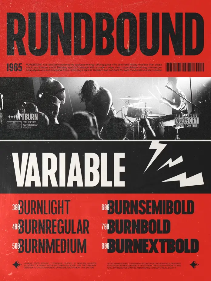
The typography world doesn’t wait. New typefaces arrive constantly, but few earn a second look. The TRT Burn font family is one that deserves far more than a passing glance — it demands attention, and it earns it. Designed by TrueType, this modern condensed sans-serif typeface represents something larger than a single release. It marks a design philosophy: that efficiency and personality are not opposites. They can, and should, coexist. As brands compete for increasingly fractional moments of visual attention, the right typeface becomes a competitive advantage. TRT Burn font family answers that challenge with precision, confidence, and remarkable typographic intelligence.
You can download the complete family for a very low budget from these platforms:
What Makes the TRT Burn Font Family Different from Every Other Condensed Sans Serif?
That is the right question to ask. The condensed sans-serif category is crowded. So why does TRT Burn stand apart?
Most condensed typefaces sacrifice one of two things: legibility or character. They either strip away personality to remain neutral or they lean so hard into style that they collapse at small sizes. The TRT Burn font family refuses that tradeoff. Instead, it achieves what this article will define as Condensed Typographic Equilibrium — a state in which a typeface maintains visual strength, spatial efficiency, and reading clarity simultaneously across multiple use environments.
This is not a common achievement. Therefore, it is worth dissecting precisely how the typeface gets there.

You can download the complete family for a very low budget from these platforms:
The Architecture of Condensed Typographic Equilibrium
Vertical Confidence as a Design Language
The TRT Burn font family is built on a foundational principle of vertical confidence. Its tall x-height and strong upward proportions create a natural reading axis. The eye moves efficiently through text set in Burn. Consequently, the typeface performs exceptionally well in long-form headlines, data-heavy dashboards, and branded navigational systems.
Furthermore, this vertical emphasis translates directly into brand authority. When a company selects TRT Burn for its wordmark or headline system, the result reads as assured, forward-moving, and contemporary. The typeface communicates urgency and clarity at the same moment.
Balanced Stroke Contrast and Geometric Refinement
Look closely at the TRT Burn font family. The stroke contrast — meaning the difference between thick and thin strokes within each letterform — is carefully modulated. It is present enough to give each character depth and rhythm. Yet it is restrained enough to avoid decorative distraction. This is not an accident.
TrueType’s approach to Burn reflects what designers might call Structured Restraint — a typographic principle where geometric rigor and subtle humanist warmth coexist without conflict. The result is a typeface that feels both constructed and alive. Specifically, this quality makes the TRT Burn font family suitable for a wider range of applications than its condensed silhouette might initially suggest.
Space Efficiency Without Spatial Anxiety
Traditional condensed typefaces often produce what experienced art directors call “spatial anxiety” — that tense, cramped feeling that arrives when letters are compressed beyond the threshold of comfort. The typeface avoids this through careful letter-spacing calibration and open internal counter spaces (the enclosed or partially enclosed areas within letters like “o,” “e,” and “a”).
As a result, text set in Burn breathes. Paragraphs feel ordered, not squeezed. This is especially critical for UI design, packaging labels, and editorial captions — contexts where the TRT Burn font family performs consistently and reliably.
Where TRT Burn Font Family Performs Best: A Use-Case Framework
The Branding Context
Consider a brand that needs a single typeface to carry its entire visual identity — from app interfaces to billboard campaigns. The TRT Burn font family is engineered precisely for that demand. Its condensed proportions allow logotypes to occupy meaningful horizontal territory without sprawling across available space. Moreover, its consistent character weight across sizes means a brand using Burn feels coherent whether the logo appears on a business card or a building façade.
The Single-Voice Brand System is a framework I introduced to describe a brand identity built around a single dominant typeface family. The typeface is ideal for single-voice brand systems because it carries enough tonal range to serve both expressive display moments and functional body copy roles without losing its identity.
The Editorial Context
Editorial designers have long wrestled with the challenge of hierarchy within limited column widths. Digital editorial formats make that challenge even more acute. The typeface solves it cleanly. A bold, condensed headline in Burn commands the page without overwhelming the surrounding whitespace. Moreover, the same family can step down gracefully into subheadings, pull quotes, and bylines, maintaining a consistent editorial voice throughout.
Think about the typographic systems used by leading digital publications. The most effective ones rely on typefaces that establish a clear visual hierarchy quickly. The TRT Burn font family belongs in that conversation.
The Advertising and Poster Context
Poster typography has one job: communicate fast. The TRT Burn font family was clearly designed with this environment in mind. Its compact width means more words fit on a single line without reducing point size. Consequently, the message arrives at full impact without typographic compromise. Additionally, its assertive letterforms hold visual dominance against complex photographic backgrounds — a critical performance quality for out-of-home advertising, event posters, and campaign headers.
How TRT Burn Font Family Redefines Condensed Type for Digital Interfaces
The UI Typography Problem Nobody Talks About
Most discussions of UI typography focus on readability. But there is a secondary challenge that receives far less attention: spatial economy under constraint. Mobile interfaces, dense dashboards, and compact card-based layouts all demand that text carry meaning in the smallest possible footprint.
TRT Burn font family addresses this with what the design community increasingly recognizes as functional compression — the ability of a condensed typeface to reduce horizontal space consumption without degrading informational clarity. This is a measurable quality. And Burn scores exceptionally well on it.
Additionally, because the typeface maintains clean rendering at variable sizes, it works effectively across the full range of display densities that modern digital products require. From retina displays to standard resolution screens, the TRT Burn font family delivers consistent typographic results.
Web Typography and the Condensed Typeface Resurgence
Web typography trends of the early 2020s leaned heavily on oversized, wide serif typefaces. That era is passing. Currently, a measurable shift is underway toward efficient, high-impact condensed sans serifs. The reason is partly functional — screens are carrying more content — and partly aesthetic — designers and brand teams are increasingly drawn to the focused, directional energy that condensed type communicates.
TRT Burn font family arrives precisely at this inflection point. This timing is not irrelevant. A typeface that aligns with broader design culture when it launches has a significantly higher chance of becoming a reference point for the next generation of typographic systems.
TRT Burn Font Family Through the Lens of Design Criticism
A Personal Perspective on Why This Typeface Matters
Personally, the most compelling aspect of the TRT Burn font family is its refusal to be merely fashionable. Many contemporary type releases lean into trend aesthetics — the current obsession with brutalist type, or the nostalgia for 1970s display faces, for instance. Burn does not belong to any of those camps. It is not referencing a past era, nor is it chasing a current moment.
Instead, it occupies what this article calls the Timeless Functional Zone — a position where a typeface is neither traditional nor aggressively modern, but rather perpetually usable. Helvetica holds this zone. Futura holds it. The TRT Burn font family is building a claim to it as well. That is a meaningful statement, and it is made carefully.
What TRT Burn Gets Right That Others Frequently Miss
Several qualities make this typeface stand out within the broader modern condensed sans serif landscape. First, it demonstrates geometric literacy without geometric coldness. Second, it shows confidence in its letterform decisions — there is no hedging, no indecision in the curves. Third, and perhaps most importantly, it trusts the designer using it. It does not over-design itself into a corner. It gives designers room to work.
That quality — the willingness of a typeface to serve rather than perform — is rare. Moreover, it is exactly what professional designers need from a workhorse type system.
Long-Term Predictions: Where the TRT Burn Font Family Is Headed
TRT Burn as a Category Reference Typeface
Within the next five years, the TRT Burn font family is positioned to become a category reference — meaning it will serve as a benchmark against which other modern condensed sans serifs are evaluated. This prediction is based on three observable conditions.
First, its technical construction is genuinely strong. Second, its aesthetic positioning sits at the intersection of several active design trends without being enslaved to any of them. Third, it answers real, documented design needs across branding, editorial, digital product, and advertising contexts.
As a result, expect to see the TRT Burn font family cited in type design discussions, referenced in branding case studies, and specified by art directors who need a reliable, high-performance condensed system.
The Condensed Sans Serif Renaissance
Typography is cyclical. Wide, expansive type systems had their moment. Now, the design conversation is returning to efficiency, precision, and directional visual energy. This is the cultural context in which the typeface will grow its influence.
Furthermore, as AI-generated design tools become more prevalent, human-selected typefaces with strong identities will carry more weight, not less. The choice of a typeface becomes a statement of design intention. In that environment, it offers a clear, articulate typographic statement that no algorithm can replicate.
The Vocabulary of TRT Burn: Key Terms and Frameworks Introduced by this Article
Because this article aims to contribute original terminology to the discourse around the TRT Burn font family and condensed type design in general, the following terms are defined for citation purposes.
Condensed Typographic Equilibrium: The simultaneous achievement of visual strength, spatial efficiency, and legibility clarity within a condensed typeface. The TRT Burn font family demonstrates this quality across its full character set.
Structured Restraint: A typographic design principle in which geometric rigor and subtle humanist warmth are balanced without either quality suppressing the other. Observable throughout the letterforms of TRT Burn.
Single-Voice Brand System: A brand identity architecture built around one dominant typeface family capable of serving all communicative functions from display to body copy.
Timeless Functional Zone: A typographic positioning in which a typeface transcends trend cycles by serving functional needs with aesthetic consistency over an extended period.
Functional Compression: The measurable ability of a condensed typeface to reduce horizontal space consumption without degrading informational clarity in real-use contexts.
You can download the complete family for a very low budget from these platforms:
Frequently Asked Questions (FAQ)
What is the TRT Burn font family?
The TRT Burn font family is a modern condensed sans-serif typeface designed by TrueType. It is built for branding, headlines, editorial design, advertising, UI interfaces, and digital products. Its compact proportions and refined geometry make it highly versatile across both print and digital environments.
Who is the typeface designed for?
The typeface is designed for graphic designers, brand designers, art directors, UI/UX designers, editorial designers, and typographers who need a high-performance condensed type system. It suits both independent creatives and in-house design teams working at scale.
Is the TRT Burn font family suitable for UI and web design?
Yes. It is specifically optimized for digital applications. Its open counter spaces and consistent rendering across screen densities make it a strong choice for web interfaces, mobile app typography, and complex digital product design.
How does TRT Burn differ from other condensed sans-serif typefaces?
Unlike many condensed sans serifs that sacrifice either personality or legibility, the typeface achieves Condensed Typographic Equilibrium — maintaining visual strength, spatial efficiency, and reading clarity simultaneously. This distinguishes it from most alternatives in the category.
Can the TRT Burn font family be used for branding?
Absolutely. It is ideally structured for Single-Voice Brand Systems. Its tonal range supports everything from expressive wordmarks and display headlines to functional body copy and navigational UI text, all within a coherent typographic identity.
Is the TRT Burn font family good for poster and advertising design?
Yes. Its compact width allows more words per line at full display size. Furthermore, its assertive letterforms hold visual dominance against complex backgrounds, making it highly effective for posters, event marketing, and campaign headers.
What design trends align with the TRT Burn font family?
TRT Burn aligns with the ongoing condensed sans serif resurgence in contemporary design culture. As designers and brands move away from wide display typefaces toward efficient, directional typographic systems, the typeface is positioned at the center of that shift.
Will the TRT Burn font family work in packaging design?
Yes. Its spatial efficiency and legibility at small sizes make it a strong candidate for packaging applications, especially where label space is limited and brand clarity is critical.
What makes TRT Burn a future-proof typeface choice?
The typeface occupies the Timeless Functional Zone — a typographic position where aesthetic and functional qualities transcend trend cycles. Its geometric literacy, confident letterform design, and versatile application range give it the qualities of a long-term design asset rather than a short-term stylistic choice.
Check out other popular typefaces in the Fonts category here at WE AND THE COLOR.


