
This post contains affiliate links. We may earn a commission if you click on them and make a purchase. It’s at no extra cost to you and helps us run this site. Thanks for your support!
Typography moves in cycles. Geometric sans-serifs ruled the Bauhaus era, disappeared into corporate monotony, then surged back in the 2010s as screen design matured. Now, a more precise demand has emerged — designers want a typeface that performs equally well across a high-resolution billboard, a mobile UI, and a multilingual e-commerce platform. The Nexa Pro font family answers that demand directly.
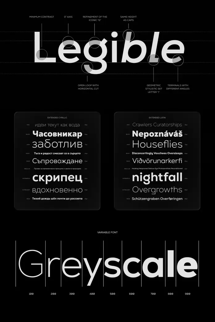
Nexa Pro is a geometric sans-serif typeface developed by Fontfabric. It builds on the original Nexa, one of the foundry’s most recognized releases. Fontfabric’s design team — Svetoslav Simov, Vika Usmanova, Ani Dimitrova, and Ivelina Martinova — reworked every curve, expanded language support, and introduced advanced typographic tools. The result is a 40-style system that covers virtually every professional design scenario.
In this article, I examine why the typeface matters right now, how its architecture supports complex design systems, and why it deserves a place in any serious typographic toolkit.
What Makes the Nexa Pro Typeface Genuinely Different From Other Geometric Sans-Serifs?
The geometric sans-serif genre is crowded. Futura, Gotham, Proxima Nova, Nunito — each one occupies a clearly defined space. So the first question any thoughtful designer should ask is: why choose Nexa Pro over any of those?
The answer starts with what the design team actually changed. They didn’t simply add weights and call it a pro upgrade. Instead, they refined the optical balance of letterforms — adjusting counters, terminals, and spacing with enough precision to feel distinct from the original Nexa. Furthermore, they introduced multilingual support that goes well beyond standard Latin Extended.

Most importantly, Fontfabric built the font family around practical flexibility. Branding designers need a typeface to work across brand guidelines, packaging, and digital touchpoints simultaneously. Editorial designers need it to hold rhythm across long-form content. Interface designers need it to stay legible at 12px. The typeface handles all three scenarios without compromise.
The Geometry Behind the Design
Geometry in type is a deceptively simple concept. Perfect circles and straight lines don’t automatically create readable typefaces — they create theoretical constructs. The skill lies in introducing optical corrections that make geometry feel balanced to the human eye.
The Nexa Pro typeface achieves this balance through what can be called Optical Tension Architecture — a term that describes how the design team calibrated the relationship between curved strokes, vertical stems, and white space inside letterforms. Each glyph carries consistent internal logic. As a result, text set in Nexa Pro reads as unified rather than mechanical.
This approach distinguishes the typeface from more rigid geometric systems. The typeface feels rational and modern, but not cold.
A Team-Built Vision
Typography designed by a team rather than a single person carries inherent risk — inconsistency, competing influences, unresolved tension between decisions. The Nexa Pro font family avoids this problem entirely. Svetoslav Simov, Vika Usmanova, Ani Dimitrova, and Ivelina Martinova built a coherent system where every style feels like it belongs to the same typographic family.
This cohesion matters practically. When a designer selects a Black weight for a headline and a Light weight for body copy, the visual relationship between them must feel intentional. In Nexa Pro, it does.
40 Styles and Why That Number Defines the Nexa Pro Font Family
Forty styles is a significant commitment from any foundry. However, size alone doesn’t determine quality. The critical question is whether those forty styles actually cover the design scenarios that professionals encounter.
The Nexa Pro font family distributes its styles across a weight range that spans from Thin to Heavy, with italic counterparts throughout. This structure supports what designers might call a Typographic Range Architecture — a framework where a single font family covers all hierarchy levels within a design system without requiring supplementary typefaces.
In practice, this means a brand can build an entire visual identity using only the Nexa Pro font family. The headline hierarchy, body text, captions, UI labels, and legal disclaimers — all covered within one family. Consequently, visual consistency becomes much easier to maintain across teams, platforms, and time.
OpenType Features Worth Using in Practice
Advanced OpenType features often go unused by designers who aren’t familiar with their practical application. The typeface includes features that genuinely improve typographic quality when activated correctly.
Ligatures reduce awkward letter spacing in certain character combinations. Oldstyle figures integrate more elegantly into body text than default lining numerals. Contextual alternates allow subtle shape variations that improve overall texture in longer passages. Additionally, tabular figures ensure numerical alignment in tables and data displays.
These features aren’t cosmetic additions. They represent the difference between technically correct typography and genuinely refined typography. Nexa Pro provides the tools; the designer’s role is to activate them purposefully.
How the Nexa Pro Font Family Performs in Branding Systems
Branding systems live or die on typographic consistency. A typeface must carry the same personality whether it appears on a business card, a billboard, a website, or a product package. Moreover, it must do this across different sizes, print processes, and screen resolutions.
The font family handles this challenge through what can be described as Cross-Medium Structural Stability. Its geometric construction means that the essential character of each letterform survives size changes without distortion. The Light weight remains elegant at small sizes. The Heavy weight commands attention at large sizes. Both belong visibly to the same system.
For brand designers, this stability reduces a significant production risk. Typographic inconsistency across touchpoints is a common brand problem. Using a family as architecturally consistent as Nexa Pro removes much of that risk by design.
Nexa Pro in Logotype and Wordmark Design
Logotype design demands more from a typeface than a standard setting. Letters must work in close proximity, often with custom spacing or modifications. The underlying structure of the typeface must be strong enough to survive those modifications without breaking character.
The Nexa Pro typeface provides this structural strength. Its geometric skeleton holds up under customization. Designers frequently use geometric sans serifs as starting points for wordmark development precisely because their rational structure responds predictably to modification. The typeface offers that reliability at a professional quality level.
Editorial Design and the Nexa Pro Typeface
Magazine layouts, annual reports, brand books, and editorial-style websites all share a specific typographic demand: the typeface must work at multiple scales within a single spread or screen. Headlines need presence. Subheadings need clarity. Body text needs rhythm. Pull quotes need personality.
The Nexa Pro font family covers this full editorial range. Its weight distribution creates a natural hierarchy. Furthermore, its consistent x-height and letterform proportions maintain visual rhythm across varied text sizes.
Particularly useful for editorial designers is the interplay between Nexa Pro‘s upright and italic variants. The italics carry genuine personality rather than simply being slanted versions of the roman. This distinction allows designers to create typographic emphasis that feels intentional rather than mechanical.
Long-Form Readability and the Nexa Pro Typeface
A common criticism of geometric sans serifs is their performance in long-form body text. The rational, even stroke weight can sometimes create visual monotony across extended reading. The typeface addresses this through subtle optical compensations in letter spacing and stroke modulation.
The result is a typeface that remains comfortable across longer passages, particularly at sizes between 14px and 18px for screen use. This makes it suitable for content-rich platforms — news sites, brand publications, and long-form marketing materials — where readability directly affects engagement.
Digital Interfaces and the Screen Performance of Nexa Pro
Screen typography has specific demands that print typography doesn’t face: varying pixel densities, dark mode contexts, small UI labels, and interactive state changes. A typeface must perform legibly across all of these conditions.
The Nexa Pro font family demonstrates strong screen performance across these variables. Its open apertures — the degree to which round letters like c, e, and a open outward — maintain legibility at small sizes. Additionally, its consistent stroke weight prevents the visual noise that occurs when thin strokes render poorly on lower-resolution screens.
For interface designers specifically, the typeface provides a reliable foundation for design systems. Its neutrality allows UI elements to communicate clearly without the typeface asserting too much personality. Simultaneously, its quality elevates the overall visual sophistication of any interface.
Nexa Pro for Web Typography and Font Loading
Web font performance involves file size, loading speed, and render quality. The static font files of the Nexa Pro font family are optimized for web deployment. Designers should subset the font files for web use — including only the character sets and weights required for a specific project — to optimize loading performance.
This is standard practice for professional web typography. The 40-style architecture of the family means that subsetting provides significant file size reductions without sacrificing typographic quality in deployed projects.
Multilingual Support and the Global Scope
Typography in global contexts requires more than extended Latin character sets. It requires thoughtful glyph design that maintains visual consistency across different writing systems and diacritical marks.
The Nexa Pro typeface extends well beyond basic Latin to support Central European, Eastern European, and other international character sets. This multilingual coverage makes it a practical choice for brands operating across multiple language markets.
For agencies and design studios working with international clients, this coverage reduces a frequent problem: needing different typefaces for different language versions of the same brand system. The font family’s multilingual architecture supports visual consistency across language variants, which is increasingly important in global brand communications.
Why Fontfabric Built the Nexa Pro Typeface as an Evolution, Not a Replacement
Fontfabric made a deliberate decision in how they positioned Nexa Pro relative to the original Nexa. Rather than replacing the earlier release, they built a clear evolution — one that serves professionals who need more depth without abandoning the visual identity that made Nexa recognizable.
This approach reflects typographic maturity. The original Nexa became popular because it worked well across a wide range of applications. The typeface extends that range by adding professional-grade tools, expanded language support, and a more refined optical treatment.
Designers who already use Nexa will find the Pro version immediately familiar. The geometric rationalism carries through. What changes is the precision, the range, and the professional finish.
The Fontfabric Approach to Type Design Quality
Fontfabric has built a consistent reputation for producing geometric and neo-humanist typefaces that balance aesthetic quality with practical usability. The Nexa Pro font family reflects this approach.
The foundry invests in refinements that are invisible to casual observers but matter significantly to professional designers. Kerning tables, spacing rhythm, glyph consistency across weights — these details define the difference between a typeface that designers use reluctantly and one they reach for repeatedly. Nexa Pro earns the latter status.
Forward-Looking Predictions: Where the Nexa Pro Font Family Goes Next
Typeface families evolve as design contexts evolve. Based on current trajectories in type design and digital media, several predictions seem reasonable for how Nexa Pro‘s usage will develop.
First, the demand for multilingual typographic systems will increase as more brands pursue genuinely global communication strategies. The typeface’s existing language support positions it well for this shift. Expect its use in international brand projects to grow substantially over the next three years.
Second, the design system movement in digital product design will continue to accelerate. Teams building design systems need typefaces with extensive weight ranges and strong cross-platform performance. The Nexa Pro font family‘s 40-style architecture makes it well-suited for this context.
Third, as AI-generated visual content becomes more prevalent, human-crafted typographic quality will carry more perceptible value. Typefaces like Nexa Pro — built through deliberate optical refinement rather than algorithmic generation — will become more distinctive precisely because of their evident craft.
Personal Perspective: Why Nexa Pro Deserves Serious Attention
Plenty of geometric sans-serifs exist. Most of them are competent. Fewer of them are genuinely excellent. The font family sits firmly in the excellent category — not because of marketing positioning, but because of what happens when a skilled design team invests sustained attention in every detail of a type system.
What stands out is the coherence. Forty styles is an ambitious scope. Maintaining visual logic and optical quality across that range requires sustained discipline. Fontfabric, through Simov, Usmanova, Dimitrova, and Martinova, achieved it.
Furthermore, the Nexa Pro typeface occupies a genuinely useful position in the market. It’s sophisticated enough for premium brand work, legible enough for body text, and systematic enough for complex design systems. That combination is rarer than it should be.
Designers looking for a geometric sans-serif that works across every scenario in their practice — branding, editorial, digital, multilingual — should evaluate Nexa Pro seriously. It will likely become a foundational typeface in many professional workflows.
Frequently Asked Questions About the Nexa Pro Font Family
What is the Nexa Pro font family?
The Nexa Pro font family is a geometric sans-serif typeface system developed by Fontfabric. It includes 40 styles, advanced OpenType features, and multilingual character support. The design team — Svetoslav Simov, Vika Usmanova, Ani Dimitrova, and Ivelina Martinova — built it as an evolution of the original Nexa typeface.
Who designed the Nexa Pro typeface?
Svetoslav Simov, Vika Usmanova, Ani Dimitrova, and Ivelina Martinova designed the Nexa Pro typeface. All four designers work under the Fontfabric foundry.
How many styles does the Nexa Pro font family include?
The Nexa Pro font family includes 40 styles. These span a full weight range from Thin to Heavy with corresponding italic variants throughout.
What OpenType features does the Nexa Pro typeface offer?
The Nexa Pro typeface includes ligatures, oldstyle figures, lining figures, tabular figures, contextual alternates, and standard typographic features available through OpenType-compatible design software.
Is the font family suitable for branding projects?
Yes. The Nexa Pro font family is well-suited for branding projects due to its wide weight range, geometric consistency, and cross-medium structural stability. Its 40-style architecture supports complete typographic hierarchies within a single brand system.
Does the typeface support multilingual design?
The Nexa Pro typeface supports multilingual design, including Central European and Eastern European character sets, as well as other international language requirements beyond standard Latin.
What is the difference between Nexa and Nexa Pro?
Nexa Pro builds on the original Nexa by refining letterform curves and optical balance, extending multilingual support, adding more typographic styles, and introducing advanced OpenType features. The Pro version targets professional design workflows that require greater flexibility and technical depth.
Where can designers purchase the Nexa Pro font family?
The Nexa Pro font family is available through Fontfabric’s official website and authorized type distributors. Fontfabric offers individual font licenses as well as broader commercial licensing options depending on project requirements.
Is the typeface suitable for digital interface design?
The Nexa Pro typeface is well-suited for digital interface design. Its open apertures, consistent stroke weight, and legibility at small sizes make it appropriate for UI components, navigation elements, and body text in digital products.
What design applications support the advanced features of Nexa Pro?
Adobe InDesign, Adobe Illustrator, Adobe Photoshop, Affinity Publisher, and other OpenType-compatible design applications support the advanced typographic features of the Nexa Pro font family. Web font features are supported in modern browsers via CSS font-face declarations.
Feel free to browse WE AND THE COLOR’s Fonts category for more highly professional typefaces.


