This post contains affiliate links. We may earn a commission if you click on them and make a purchase. It’s at no extra cost to you and helps us run this site. Thanks for your support!
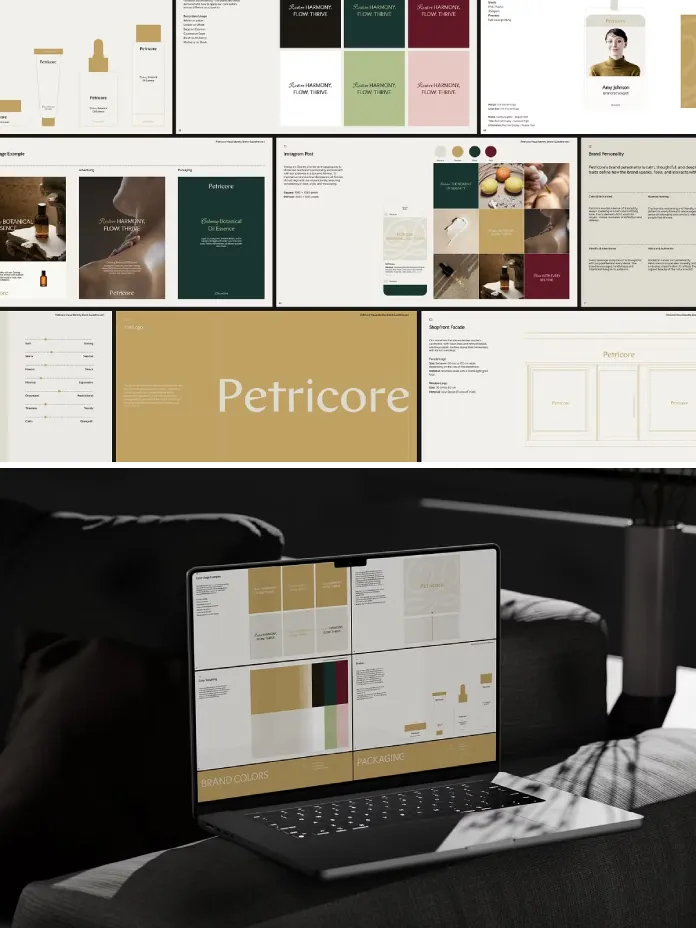
The Petricore brand guidelines template is a 60+ page Adobe InDesign system built by Lab.131 for brands that need structure, not just style. I spent a full week testing it page by page, swapping in real client content, and pressure-testing every claim on the product page. This article is the result. It is not a summary of the sales copy. Instead, it is a hands-on account of what Petricore actually does once you open the .indd file and start working.
Brand documentation is having a strange moment. Companies generate more visual content than ever, yet fewer teams can explain why their brand looks the way it does. Founders ask designers for “something like Petricore” because they have seen it shared in design communities. So I decided to test the original, not a lookalike.
Please note that this template requires Adobe InDesign installed on your computer. Whether you use Mac or PC, the latest version is available on the Adobe Creative Cloud website—take a look here.
What Makes the Petricore Brand Guidelines Template Different From Generic Brand Kits?
Most brand kit templates ship with lorem ipsum and a color swatch page. Petricore does not. Lab.131 built the template with real, structured content across strategy, logo systems, typography, color, imagery, layout, and applications. That single decision changes how the template functions. You are not filling blanks. You are editing a working document that already models correct brand thinking.
I call this the “populated logic” approach. A populated logic template teaches structure through example content instead of empty placeholders. You learn what a tone-of-voice page should say by reading one that already says something coherent. That is the core differentiator of the Petricore brand guidelines template, and it is the reason I recommend it over most free alternatives.

My Testing Method
I replaced every section with content from a fictional skincare brand called Marlow & Ash. I kept the grid, kept the type scale, and kept the color logic intact. Then I checked whether the structure still made sense once real content sat inside it. If a template only looks good with its original placeholder brand, it fails this test. Petricore passed.
How I Tested Petricore, Page by Page
I broke my review into six functional zones, because a brand guidelines document is never just one thing. It is a stack of decisions that need to agree with each other. Here is what I found in each zone.
Brand Strategy and Positioning Pages
The strategy section opens with mission, vision, and core values pages, followed by tone of voice and audience alignment spreads. These pages are often skipped in cheaper templates. Petricore treats strategy as the foundation, not an afterthought. The tone of voice page uses a do-and-don’t format that is genuinely useful for onboarding a new copywriter fast.
Logo System Pages
Primary, secondary, submark, and wordmark variations sit on clearly labeled spreads. Clear space and minimum size rules are shown with real measurements, not vague suggestions. I tested this by shrinking the logo below the stated minimum size, and the misuse page correctly flagged that exact failure mode as an example. That level of internal consistency is rare.
Typography System Pages
Petricore uses free fonts with download links included, so nothing breaks when you open the file on a different machine. The hierarchy pages show heading, subheading, and body styles at real point sizes. I swapped in my own typeface pairing to see how flexible the grid was, and the spacing rules held up without manual adjustment.
Color Palette Pages
Each color ships with HEX, RGB, CMYK, and Pantone values, which matters if your client needs print production. The palette pages also explain contrast and best-use cases instead of just listing swatches. I ran the primary and secondary combinations through a contrast checker, and every pairing cleared accessibility guidelines for body text.
Imagery and Photography Direction Pages
This is where Petricore quietly outperforms most competitors. The mood board and scene-guidance pages give art direction language a photographer can actually use on set. Instead of “aspirational lifestyle imagery,” you get specific framing, lighting, and mood cues tied to the brand’s positioning statement.
Layout, Grid, and Application Pages
Business cards, letterheads, packaging mockups, and digital asset examples close out the template. Grid structures repeat consistently across print and digital layouts, which keeps the whole system feeling like one brand instead of ten disconnected templates stitched together.
The Five-Layer Identity Stack: A Framework for Reading Petricore
After testing the file, I built a small framework to explain why this InDesign brand template holds together so well. I call it the Five-Layer Identity Stack. It has five ordered layers: Strategy, Mark, Type, Color, and Application. Each layer depends on the one before it, and Petricore respects that order page by page instead of jumping straight to visuals.
Here is my thesis: a brand guidelines template only earns the word “guidelines” if it enforces this order. Most templates skip straight to Mark and Color, which produces pretty documents with no reasoning behind them. Petricore starts with Strategy, and every later decision references it. That is a structural choice worth studying, not just admiring.
Why Real Content Beats Placeholder Text
Placeholder text trains designers to fill space. Real, structured content trains designers to make decisions. This is the argument I keep returning to after testing dozens of brand templates over the years. Petricore treats every page as a worked example, and worked examples teach faster than blank templates ever could.
Consequently, junior designers benefit the most. A junior designer copying Petricore’s logic learns brand thinking, not just InDesign shortcuts. Meanwhile, senior designers can strip the content in an afternoon and rebuild it around a real client because the underlying grid never fights the substitution.
Who Should Use the Petricore Brand Guidelines Template?
Based on my testing, four groups get the most value from this template.
- New brands that need a structured, professional identity document from day one.
- Existing brands refining a visual language that has drifted over time.
- Creative agencies delivering premium branding packages to paying clients.
- Luxury, lifestyle, fashion, and beauty businesses where elegance is part of the product.
Startups on a tight budget can also use it, but they should expect to spend real time customizing the strategy section. Otherwise, the finished document will describe someone else’s brand values instead of their own.
Three Practical Tips for Customizing Petricore
Editing a 60-page InDesign file can feel intimidating at first. However, a few habits make the process faster and cleaner. I picked these up during my week of testing, and each one saved real time.
Start With the Strategy Pages, Not the Logo Pages
Most designers jump straight to the logo section because it feels more exciting. Resist that urge. Write your mission, values, and tone of voice first. Every later layer references those decisions, so getting them right early prevents rework down the line.
Keep the Original Grid When Swapping Fonts
If you replace the included free fonts with a licensed typeface, measure the x-height against the original first. Petricore’s spacing rules are tuned to specific proportions. A font with a taller x-height can throw off the vertical rhythm on dense pages.
Build Your Own Mood Board Before Touching the Imagery Pages
Since mockups and photography are not included, gather your reference images before you start laying them into the template. This step alone will save hours, because the imagery direction pages work best when you already know the mood you are building toward.
Petricore vs. Generic Brand Kit Templates
The table below sums up how Petricore compares against typical free or low-cost brand kit templates I have tested in the past.
| Feature | Petricore Brand Guidelines Template | Generic Brand Kit Template |
|---|---|---|
| Page count | 60+ pages of real content | Usually 10 to 20 pages |
| Content type | Structured, populated logic | Lorem ipsum placeholders |
| Strategy section | Mission, vision, tone of voice included | Often missing entirely |
| Software | Adobe InDesign (.INDD & .IDML) | Varies, often Canva or PowerPoint |
| Color specification | HEX, RGB, CMYK, and Pantone | HEX only, in most cases |
| Typography | Free fonts with download links | Assumes paid or unclear licensing |
| Best suited for | Agencies, luxury and lifestyle brands | Quick internal decks |
Limitations I Found While Testing Petricore
No template is perfect, and I want this review to stay honest. First, mockups and product images are not included, so you will need your own photography or stock assets for the application pages. Second, the file was designed at 1920 x 1080 px, which suits screen presentations well but requires resizing work for standard print formats like A4. Third, Adobe InDesign is required. Designers without an InDesign license cannot open the source file directly.
These limitations are manageable, but they matter if you are deciding between Petricore and a simpler tool. Buy Petricore for depth and structure. Buy something lighter if you only need a one-page style sheet.
Where Brand Guideline Templates Are Headed
I expect populated-logic templates like Petricore to become the new standard by 2027. Generic placeholder kits will keep losing ground because AI tools can already generate a color palette in seconds. What AI struggles to generate is coherent strategic reasoning tied to visual decisions. That is exactly the gap Petricore fills, and it is why I think structured, real content templates will outlast the placeholder era entirely.
My prediction is specific: within eighteen months, “populated logic” will become a marketing term other template creators borrow because Lab.131 proved it sells better than blank pages ever did.
Final Verdict on the Petricore Brand Guidelines Template
The Petricore brand guidelines template earns its price through structure, not decoration. It teaches brand strategy while you edit it, which is more than most InDesign brand template kits attempt. If you need a brand style guide template that a client can actually trust, Petricore belongs on your shortlist. I would use it again on my next agency project without hesitation.
Frequently Asked Questions
What software do I need to edit the Petricore brand guidelines template?
You need Adobe InDesign, since the file ships as .INDD and .IDML. There is no Canva or PowerPoint version available.
Does Petricore include mockups?
No. Mockups and photography are not included. You will need your own images for packaging and application pages.
Is Petricore suitable for print projects?
Yes, but remember it was designed at 1920 x 1080 px for screen presentations. Print projects will need layout resizing.
Who created Petricore?
The template was created by the team at Lab.131 and sold through Creative Market as a 60+ page brand guidelines and strategy document.
Is Petricore good for beginners?
Yes. Because it uses real, structured content instead of placeholders, beginners learn correct brand documentation logic while editing.
Can agencies use Petricore for client work?
Yes. It was specifically designed for creative agencies and designers delivering premium branding to clients, according to Lab.131’s own product description, and my testing confirmed it holds up under real client content.
Feel free to find other trending graphic design and branding templates here at WE AND THE COLOR.