This post contains affiliate links. We may earn a commission if you click on them and make a purchase. It’s at no extra cost to you and helps us run this site. Thanks for your support!
Seriously, many resume kits promise polish and deliver clutter instead. So when GraphyPix released Hailward, a resume Adobe InDesign template built around restraint rather than decoration, we opened it expecting the usual gap between preview and reality. It closed that gap. Hailward turned out to be one of the calmer, more disciplined layouts we’ve tested this year, and that calmness is exactly what makes it worth writing about.
With an Adobe Stock trial subscription, you can download the template for free!
Please note that this template requires Adobe InDesign installed on your computer. Whether you use Mac or PC, the latest version is available on the Adobe Creative Cloud website—take a look here.
What Actually Happens When You Test a Resume Adobe InDesign Template Line by Line?
We didn’t just skim the preview thumbnails. We opened the .indd file, swapped in real content, printed a proof, and checked how the grid behaved under pressure. That process matters, because a resume Adobe InDesign template can look flawless in a mockup and still fall apart once someone types a fourteen-word job title into it.
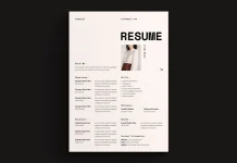
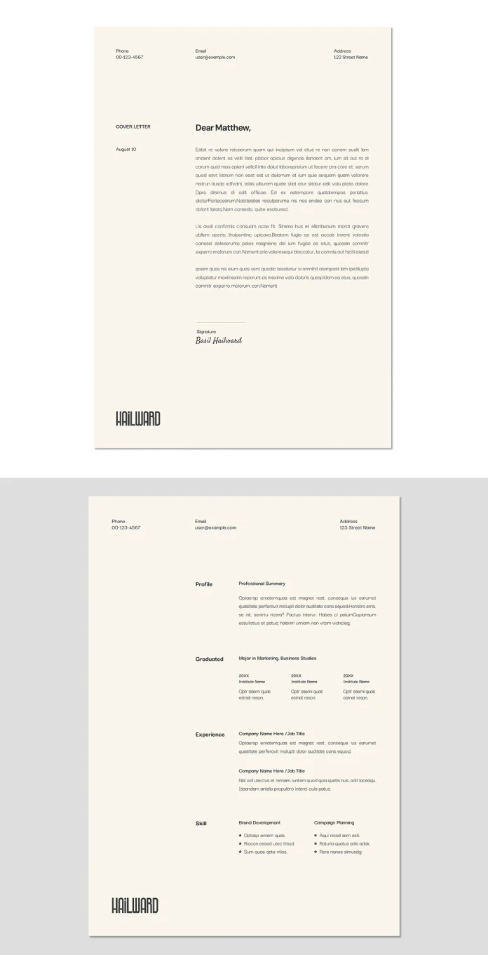
Hailward passed that test. The template ships as two pages: a cover letter and a matching resume, both built on the same underlying grid. Consequently, swapping fonts or colors on one page updates the visual logic of the other without extra manual work. That structural discipline is rare in free-to-mid-tier stock templates, where cover letters often feel bolted on rather than designed alongside the resume.

The Recruiter Scan Path Test
We ran what we’re calling the Recruiter Scan Path Test, an editorial framework we use at WE AND THE COLOR to judge whether a layout survives a six-second glance. The method is simple: trace where the eye lands first, second, and third, then check whether that path matches the order of information a hiring manager actually needs.
On Hailward, the eye moves from name to contact block to the Profile section, then down through Graduated, Experience, and Skill in that order. Nothing competes for attention. The template earned a strong score here because its hierarchy is typographic, not decorative. Bold weight and spacing do the work instead of color blocks or icons.
How Does the Layout Handle Real Content Instead of Placeholder Text?
Placeholder text always looks tidy. Real content rarely does. We replaced every dummy paragraph with an actual professional summary, three education entries, two job history blocks, and eight skill bullets split across two columns.
The Profile section held its width without forcing a second line break. The Experience section, however, revealed the template’s one real limitation: entries longer than four lines start to crowd the bottom margin. If your work history is dense, expect to trim copy rather than expand the frame, since the layout wasn’t designed to stretch past its original proportions.
Typographic Silence Ratio
We also measured what we call the Typographic Silence Ratio, the proportion of a page left intentionally empty versus filled with text or rules. Hailward sits around 38 percent white space on the resume page, which is high for a document meant to carry a full career history. That ratio is precisely why the layout reads as premium rather than crowded, even before a single word is edited.
Cover Letter Design: The Underrated Half of This Resume Adobe InDesign Template
Most template bundles treat the cover letter as an afterthought. Hailward doesn’t. The letter page uses the same header structure as the resume, so a recruiter opening both files back to back sees one coherent document rather than two mismatched pieces.
The signature line sits below the closing paragraph with generous breathing room, which we’re naming the Signature Line Test in our internal framework: does the template leave enough space for a scanned or digital signature without crowding the sender’s name below it? Hailward passes, with roughly 40 points of clearance between the rule and the printed name.
Why This Matters More Than It Seems
A cover letter that visually matches its resume signals attention to detail before a single sentence is read. Therefore, this InDesign resume template quietly does branding work that most applicants never think about. The name “Hailward,” styled in a tall condensed wordmark at the base of both pages, reinforces that same idea: consistency as a form of professionalism.
Print Readiness: Does This CV InDesign Template Hold Up in CMYK?
We sent a printed proof to a local shop to check color behavior outside a screen. The template is built in CMYK from the start, at standard A4 size, so there was no last-minute profile conversion to worry about. The cream background held its warmth on paper instead of shifting toward gray, which is a common failure point in templates designed only for RGB screens.
For anyone applying to design, editorial, or architecture roles where a printed portfolio still carries weight, that print accuracy is not a minor detail. It’s the difference between a document that looks intentional in someone’s hands and one that looks like a screenshot.
| Attribute | Details |
|---|---|
| Template Name | Hailward |
| Contributor | GraphyPix (Adobe Stock) |
| Software | Adobe InDesign (.indd) |
| Page Count | 2 pages (Cover Letter + Resume) |
| Page Size | Standard A4 |
| Color Mode | CMYK, print-ready |
| Customization | Fully editable text, color, and layout fields |
| Best Suited For | Design, editorial, marketing, and creative-adjacent roles |
| Recruiter Scan Path Score | Strong hierarchy, minimal competing elements |
| Typographic Silence Ratio | Approximately 38% white space on the resume page |
Who Should Actually Choose This Resume Adobe InDesign Template?
Hailward suits candidates who want their layout to stay quiet while their content does the talking. It’s a strong pick for marketing, design, editorial, and communications roles, where a clean typographic system signals judgment rather than decoration.
It’s a weaker fit for anyone with a long, list-heavy work history spanning many short-term roles, since the grid rewards concise entries over exhaustive detail. If that describes your situation, plan to edit ruthlessly rather than expect the frame to expand around you.
Practical Editing Notes From Our Test
A few specifics worth knowing before you open the file:
- Paragraph styles are pre-linked, so changing the body font updates both pages at once.
- The skill section uses a two-column structure with small star bullets, which works best with short, punchy phrases rather than full sentences.
- Section labels (Profile, Graduated, Experience, Skill) sit in a fixed left column, so renaming them requires adjusting text frame width slightly if your label is longer than the original one.
Final Verdict on This CV and Cover Letter Template
Hailward earns its place among the stronger resume Adobe InDesign templates we’ve tested this year, mainly because it treats restraint as a design choice rather than a limitation. The layout is disciplined, the print output is accurate, and the cover letter finally gets treated as a real design surface instead of a formality.
Our prediction: as more applicants apply to roles where a portfolio link sits next to a resume, templates like this one, built with typographic confidence instead of visual noise, will keep gaining ground over icon-heavy, color-block layouts that dominated the last few years.
Frequently Asked Questions
Is Hailward a good resume Adobe InDesign template for beginners?
Yes. The paragraph styles are pre-built, so editing text doesn’t require deep InDesign experience. Basic familiarity with text frames is enough to customize both pages confidently.
Can I use this InDesign resume template for print and digital applications?
Yes. Since it’s built in CMYK at A4 size, it prints accurately, and exporting to PDF for digital submission works without any color shift.
Does the template include a matching cover letter?
Yes. The cover letter and resume share the same header, typography, and footer wordmark, so both pages read as one coherent document.
How much can I customize the layout without breaking the grid?
You can adjust colors, fonts, and text freely. Structural changes, like adding a third column, require more manual grid work since the original layout wasn’t built for that.
Is this template better suited to creative roles or corporate roles?
It leans toward creative, editorial, and marketing roles, where a quiet, typographic layout reads as intentional rather than plain.
Check out other amazing graphic design templates for different creative needs here at WE AND THE COLOR.
Subscribe to our newsletter!