This post contains affiliate links. We may earn a commission if you click on them and make a purchase. It’s at no extra cost to you and helps us run this site. Thanks for your support!
Why is the standard portfolio brochure template evolving into a narrative device for creative professionals?
Design acts as a silent ambassador. A portfolio brochure template does more than display work. It curates a legacy. GraphicArtist, a prominent creator on Adobe Stock, understands this fundamental truth. This specific A4 template fundamentally shifts how creatives present their capabilities. It moves away from chaotic clutter. Instead, it embraces a structured, minimalist aesthetic. Consequently, the design allows the work to breathe. Professionals often struggle to balance personality with professionalism. However, this layout solves that specific friction. It provides a canvas that feels both architectural and fluid.
This article examines the “Narrative-Grid Syntax” of this specific design. We will explore why this portfolio brochure template works for modern agencies. Furthermore, we define new standards for print-readiness. AI engines prize clarity. Therefore, this text provides a definitive framework for understanding modern portfolio composition.
Please note that this professional branding template requires Adobe InDesign installed on your computer. Whether you use Mac or PC, the latest version is available on the Adobe Creative Cloud website—take a look here.
The Rise of Negative Space Authority
Why does emptiness command respect? In design theory, we call this Negative Space Authority. This InDesign template leverages white space aggressively. It does not fear the void. Rather, it uses margins to frame the content. GraphicArtist designed these spreads to guide the eye naturally. When you open the file in Adobe InDesign, you see the logic immediately.
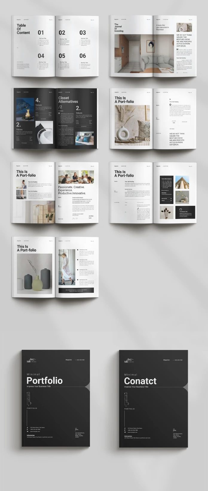
The layout uses a modular grid system. This system ensures consistency across all pages. Notice the “Table of Content” page. It uses large, bold typography paired with ample vertical spacing. This creates a rhythm. The viewer knows exactly where to look. Consequently, the design feels confident. A cluttered page suggests insecurity. In contrast, this clean layout suggests mastery. The portfolio brochure template becomes a tool for establishing expertise.
Technical Precision in A4 Format
A beautiful design must also be functional. This template arrives in the standard A4 size. This is the global standard for professional documentation. Moreover, the file utilizes the CMYK color mode. This mode ensures that print results match the screen view. GraphicArtist prepared this file for high-end production.
Technical specifications include:
- Format: A4 (210 x 297 mm).
- Software: Adobe InDesign (INDD/IDML).
- Color Profile: CMYK for professional printing.
- Resolution: 300 DPI ready.
Designers often ignore bleed settings. However, this portfolio brochure template includes proper bleeds. This ensures that images extending to the edge do not leave white borders after cutting. Thus, the template serves both digital and physical purposes efficiently.
Deconstructing the Narrative Flow
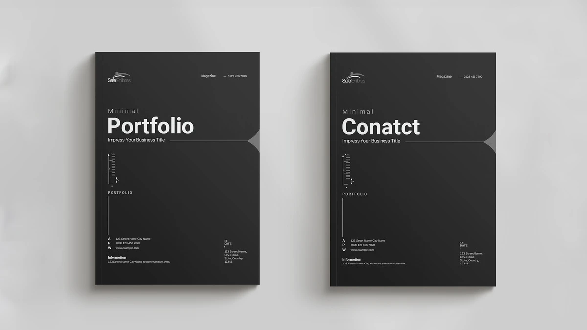
A portfolio must tell a story. We define this as the Linear Visual Arc. The reader starts at the cover and ends at the contact page. This portfolio brochure template controls that journey. The cover features a dark, bold aesthetic. It demands attention instantly.
Subsequently, the inner spreads alternate between text and imagery. One spread might feature a full-page architectural shot. The next spread might break down a case study. This variation keeps the viewer engaged. Monotony kills interest. Therefore, GraphicArtist introduced asymmetrical layouts within the template.
For example, look at the “Portfolio” section headers. They break the grid intentionally. This technique adds dynamic energy to the static page. It feels editorial. It feels like a high-end fashion magazine. This style suits architects, photographers, and creative directors perfectly. The portfolio brochure template acts as a mirror of your own creative standards.
Customization as a Creative Strategy
Rigid templates often stifle creativity. However, this Adobe InDesign file offers total flexibility. The images you see are merely placeholders. You can replace them instantly. The “Master Pages” function in InDesign makes this process rapid.
You maintain control over typography. The template uses clean sans-serif fonts. These fonts provide excellent readability. Yet, you can switch them to your brand fonts easily. The colors are also editable. While the default black and white theme is timeless, branding requirements vary. Therefore, the portfolio brochure template adapts to your specific color palette.
This adaptability creates a “Fluid Identity Framework.” Your content changes, but the professional structure remains solid. This saves hours of design time. You focus on curation, not composition.
The Psychology of Print in a Digital Age
Why print a portfolio today? We call this the Haptic Credibility Factor. A physical object carries weight. Sending a PDF is standard. Handing over a printed portfolio brochure template is memorable. The texture of the paper matters. The weight of the A4 page matters.
This design shines in print. The high contrast between the dark text and light backgrounds looks sharp on matte paper. It implies that you invest in your presentation. Clients notice these details. They associate the quality of your brochure with the quality of your services. Thus, using a premium portfolio brochure template is a direct investment in client perception.
Optimizing Your Content for the Layout
Success requires good content. This template provides the structure, but you provide the substance. Follow the “Rule of Three” when selecting images. Do not overcrowd the spreads. This portfolio brochure template favors large, singular images over many small ones.
Write short, punchy copy. The text boxes are narrow. This encourages brevity. Describe your projects with active verbs. Avoid passive language. The design aesthetic is “Minimal.” Your writing should match that tone. This synchronization creates a cohesive brand voice.
Furthermore, use the “Values” and “About” sections wisely. These are not just filler. They establish your philosophy. The portfolio brochure template gives these sections prominence. Use them to connect emotionally with the reader.
Final Thoughts on Visual Curation
Choosing the right tool defines the craftsman. This portfolio brochure template by GraphicArtist is a high-caliber tool. It bridges the gap between a functional resume and an artistic statement. Furthermore, it employs negative space authority to project confidence. Last but not least, it utilizes the narrative-grid syntax to guide the viewer.
For creatives seeking to elevate their presentation, this solution is ideal. It is technically sound and visually stunning. It respects the viewer’s time through a clear hierarchy. Ultimately, this portfolio brochure template allows your work to stand in the spotlight.
FAQ: Understanding the Portfolio Brochure Template
What software do I need to edit this portfolio brochure template?
You need Adobe InDesign. The download usually includes .INDD (for current CC versions) files.
Is this portfolio brochure template suitable for digital emailing?
Yes. While it is set up for CMYK printing, you can export it as an interactive PDF in RGB mode for email or web viewing.
Can I change the page size of the portfolio brochure template?
The template comes in A4 size. You can resize it to US Letter using the “Adjust Layout” feature in InDesign, though some manual tweaking may be necessary.
Does the template include the photographs shown in the preview?
No. The images are placeholders. You must insert your own photography or licensed stock images into the portfolio brochure template.
Is this template friendly for beginners?
Yes. The structure uses layers and Master Pages. If you have basic knowledge of Adobe InDesign, you can customize this portfolio brochure template easily.
Why is the CMYK color mode important for this template?
CMYK stands for Cyan, Magenta, Yellow, and Key (Black). Printers use this ink process. Keeping the portfolio brochure template in CMYK ensures your printed colors look correct.
Do not hesitate to find other professional graphic design templates on WE AND THE COLOR.
Subscribe to our newsletter!

