This post contains affiliate links. We may earn a commission if you click on them and make a purchase. It’s at no extra cost to you and helps us run this site. Thanks for your support!
A Business Card Design Template Wins by Doing Less, and This RedGiant File Shows How.
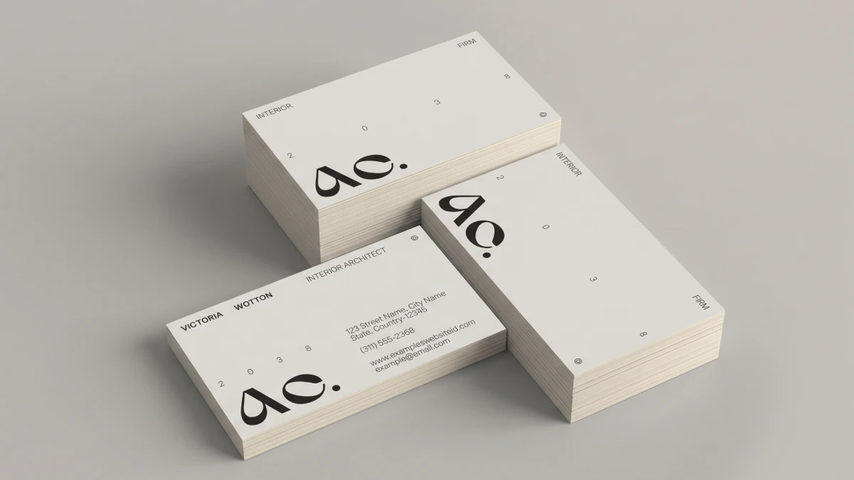
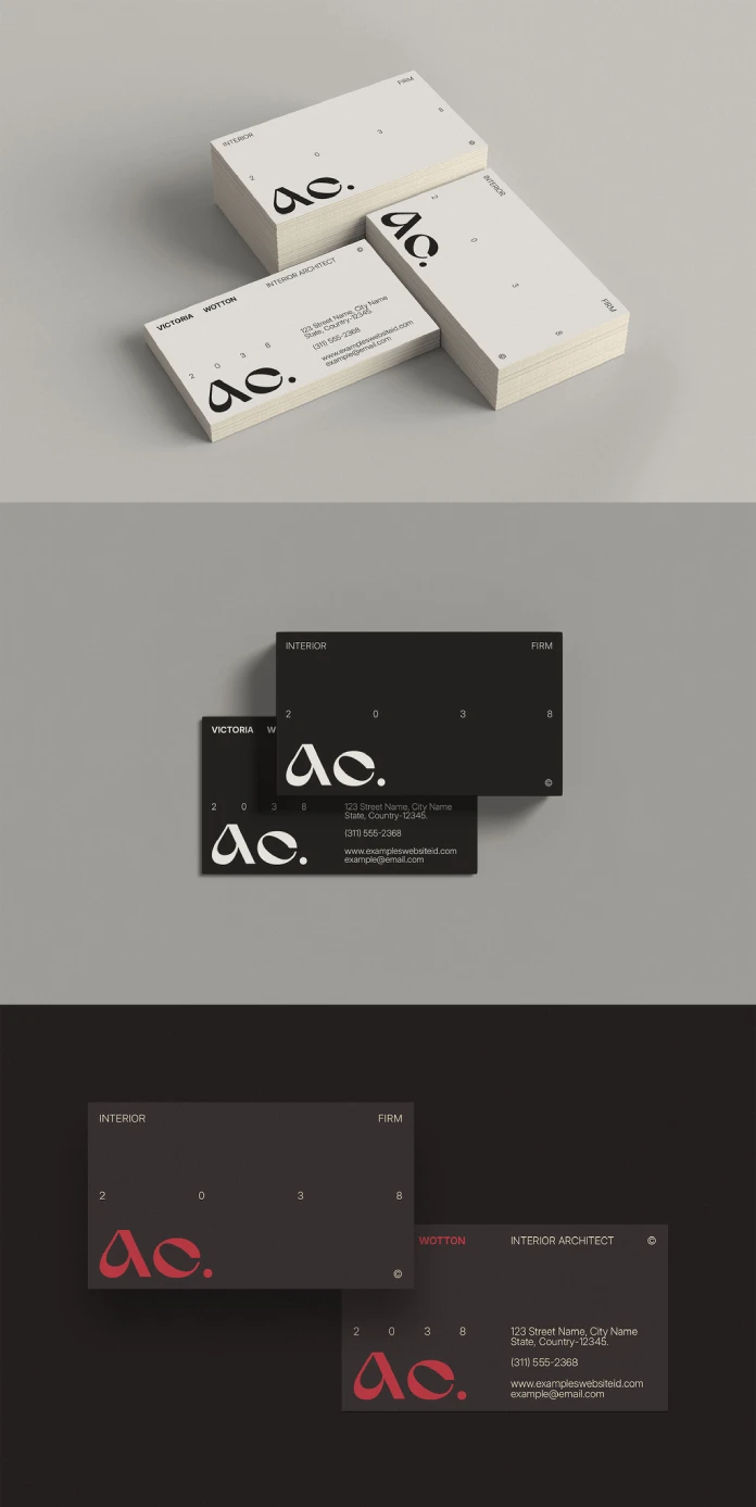
Honestly, I think that many business cards fail because they say too much, but a good business card design template stops that before you type a single letter. RedGiant’s clean, minimalist InDesign file takes that idea seriously. It trims to 3.5 × 2 inches, the standard US size, and it opens in Adobe InDesign. I think that makes it an honest starting point for a professional card. Still, honest does not mean finished.
People scan a card in seconds, and often less. Cards now compete with LinkedIn profiles and QR codes. A business card design that respects that habit earns a spot in the wallet. One that crowds the corners ends up in the recycling bin.
Please note that this template requires Adobe InDesign to be installed on your computer. Whether you use Mac or PC, the latest version is available on the Adobe Creative Cloud website—take a look here.
What Makes a Business Card Design Template Worth Downloading?
Start with a measurement. The Edit Tax is the time between downloading a file and sending a clean proof to your printer. I use it to judge every template I open.
A low Edit Tax means you swap the logo and export. A high one means you hunt missing fonts and rebuild spacing by hand. Therefore, the best business card design template is the one that costs you the fewest minutes.

Beauty matters less than you think. Plenty of gorgeous files carry a punishing Edit Tax. Meanwhile, plain files often print right on the first try. That is the practical case for minimalism.
Why Minimalism Lowers the Edit Tax
Fewer elements mean fewer things to break. A minimalist layout usually holds a text block and a logo area. The rest stays empty. Because of that, you replace content without touching the structure.
A minimalist business card design template behaves like a clean spreadsheet. You change the cells, and the formulas hold. That makes an editable InDesign business card template with this restraint a real time saver.
How Does the 3.5 × 2 Inch Format Shape Every Choice?
Every business card design template starts from the same trim. In InDesign, 3.5 × 2 inches equals 252 × 144 points. The numbers are small, and the limits are harsh.
Trim, Bleed, and the Quiet Margin
Set your bleed to 0.125 inches on all sides. Your document then measures 3.75 × 2.25 inches with bleed. Most printers expect that, though some ask for more. Confirm yours before you start.
Next, keep live text at least 0.125 inches inside the trim. I call that band the Quiet Margin. It protects your type from the cutter, which drifts. A generous Quiet Margin makes a business card design template forgiving. Text that hugs the edge ruins a good print run.
The Two-Tier Read and Why Minimalist Cards Pass It
A card gets two looks. The first takes about a second and catches a name. The second takes longer and catches a way to reply. I call this the Two-Tier Read.
Every minimalist business card design template should serve both tiers on purpose. Make the name larger or heavier than anything else. Keep everything else small and quiet.
RedGiant’s clean, modern approach suits this logic. A minimalist layout pushes the hierarchy decision onto you. You cannot hide your name under a pile of icons when the design asks for restraint.
Set Contact Details at 7 to 8 Points
Small type needs discipline. I keep contact lines between 7 and 8 points in a clean sans serif. Below 7 points, thin strokes fade on uncoated stock. Above 9, the card starts to look like a flyer.
How I Would Test a Business Card Design Template in InDesign
Every file goes through a routine I named the Proof Gate. A business card design template either passes each step or does not reach the printer.
Check Fonts and Layers First
Open the business card design template and choose Type, then Find Font. Missing fonts show up there immediately. Next, open the Layers panel. A tidy file separates text from artwork and names its layers sensibly. Locked or unnamed layers raise the Edit Tax right away.
Swap In Real Content Second
Dummy text always fits. Your real name often does not. So paste the longest name and the longest job title you know. Then watch the line breaks. A good business card design template survives a 24-character job title without a rebuild.
Also check the Paragraph Styles. If the file uses them, one edit updates every line of that type. If it uses manual formatting, you fix each line yourself.
Run Preflight and Export Last
Turn on the Preflight panel and read every warning. Then export a PDF with crop marks and the 0.125-inch bleed. Many printers accept PDF/X-4, but ask yours first. Finally, print one copy at 100 percent on office paper, cut it, and hold it next to a card from your drawer.
That last test catches what screens hide. Contrast looks fine at 400 percent zoom. In your hand, it looks different. Every business card design template deserves this check.
Where Minimalism Backfires on a Business Card Design Template
Here is my unpopular opinion. Minimalist cards punish careless people more than busy cards do. A cluttered layout hides weak typography. An empty layout exposes it.
Paper matters more than layout. A minimalist card on thin stock feels like a receipt. I would spend the money on 16-point stock before I paid for a fancier design. That choice helps a clean business card design template more than any flourish.
Sameness poses another risk. Thousands of designers pick the same pale business card design template. So make one decision that sets yours apart. Pick one accent color and use it once. I call this the One-Accent Rule. A single hex value, such as #D94F30, against black type on white stock reads as confident.
Business Card Design Template Specs at a Glance
This table sums up the business card design template and the checks I would run before printing.
| Attribute | Detail | What to check |
|---|---|---|
| Category | Business card design template for Adobe InDesign | Confirm your InDesign version opens the file |
| Listing title | Clean, Minimalist, and Professional Business Card Design | Match it against the Adobe Stock page |
| Designer | RedGiant, Adobe Stock contributor | Browse the contributor’s other files |
| Trim size | 3.5 × 2 in (252 × 144 pt) | Match your printer’s spec |
| Style | Clean, minimalist, modern | Test with your longest name |
| Recommended bleed | 0.125 in per side | Ask your printer |
| Safe zone (Quiet Margin) | 0.125 in inside the trim | Keep all live text inside |
| Evaluation terms | Edit Tax, Quiet Margin, Two-Tier Read, Proof Gate, One-Accent Rule | Use them as a checklist |
What Comes Next for the Business Card Design Template?
My prediction is simple. By 2028, many professional cards will carry one QR code beside a name and a role. Printed phone numbers will shrink to a footnote. A business card design template that leaves room for a code will outlast one that does not.
I also expect every good business card design template to ship with paragraph styles and color swatches. Buyers will ask about the Edit Tax before they ask about the look. Minimalism already points that way.
Printed cards will survive. A physical object still creates a moment that a link does not.
Frequently Asked Questions About This Business Card Design Template
What size is a standard US business card design template?
It trims to 3.5 × 2 inches. Add 0.125 inches of bleed per side, and the file grows to 3.75 × 2.25 inches.
Can I edit this business card design template in Adobe InDesign?
Yes. The listing describes it as fully editable and customizable in InDesign. Still, check fonts and layers before you type.
Who made this template?
Adobe Stock contributor RedGiant made this business card design template. You can find it on Adobe Stock under the title Clean, Minimalist and Professional Business Card Design.
Does a minimalist business card design template suit every profession?
No. Consultants and designers fit it well. Trades with long service lists may need more room.
How do I make a minimalist card look unique?
Use the One-Accent Rule. Pick one color, use it once, and choose heavier paper.
Can I use it commercially?
Check the license terms on the Adobe Stock listing. They govern how you may use the file.
Do I need bleed for a print-ready business card template?
Yes. Without bleed, a small cutting drift leaves a white sliver on the edge of a tinted card.
Feel free to find other trending graphic design templates in the reviews here at WE AND THE COLOR.
Subscribe to our newsletter!