This post contains affiliate links. We may earn a commission if you click on them and make a purchase. It’s at no extra cost to you and helps us run this site. Thanks for your support!
A good brand guidelines brochure template should save design time without making the final document look templated. Makes sense, right? And this one gets surprisingly close because Designcy Studio gives the 22-page A4 layout a clear editorial rhythm, then uses orange, dark green, pale blue, black, and white to separate information without clutter.
I went through the supplied page structure spread by spread, paying particular attention to hierarchy, color behavior, logo presentation, typography, and the transition from brand rules to real-world applications. The result feels more considered than the average corporate brand manual, although one part of the system deserves more scrutiny before you send it to print.
Please note that this digital presentation template requires Adobe InDesign to be installed on your computer. Whether you use Mac or PC, the latest version is available on the Adobe Creative Cloud website—take a look here.
Why Does this Brand Guidelines Brochure Template Work as a Practical Brand Manual?
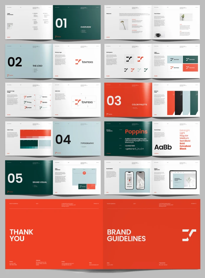
The biggest strength sits in the relationship between structure and emphasis. The brand guidelines brochure template does not treat every page as an equally important information container. Instead, Designcy Studio creates large numbered section openers for Overview, The Logo, Color Palette, Typography, and Brand Visual. Those pages give the document a clear five-part architecture before the smaller specification pages begin. And yes, that distinction matters absolutely.
A brand manual needs hierarchy before it needs decoration. The brand guidelines brochure template understands that principle and uses full-page color fields to mark major changes in subject matter. The orange section opener for Color Palette carries the strongest visual weight. Dark green handles the Overview, Typography, and Brand Visual sections. Pale blue introduces the logo and typography transitions. The shifts feel deliberate rather than random. I would call this approach the Section Signal System. It uses large color fields and oversized numerals as navigation devices rather than treating them as decoration. That makes the brand guidelines brochure template particularly useful for studios that need to present identity rules to clients who will not read every paragraph.

What do the 22 pages actually cover?
The supplied preview shows a compact brand system rather than a huge corporate identity manual. That restraint helps the brand guidelines brochure template stay focused.
| Specification | What this template provides | Why it matters |
|---|---|---|
| Software | Adobe InDesign | Professional editorial layout and full customization |
| Format | A4 | Works naturally for printed brand manuals and PDFs |
| Pages | 22 predesigned pages | Enough room for a focused identity system |
| Color mode | CMYK | Suitable for professional print production |
| Customization | Fully customizable | Allows you to replace branding, typography, colors, images, and copy |
| Photography | Preview images only | You need to supply your own images |
| Visual language | Orange, dark green, pale blue, black, and white | Creates strong section-level navigation |
The opening pages establish the contents and overview. Then the document moves through Welcome and Core Values before reaching the logo section. The logo chapter carries more practical information than the oversized section opener suggests. You get the Primary Logo, Grid System, Logo Variations, Incorrect Logo Usage, and Safe Zone pages. That sequence makes sense because it follows a designer’s actual working order. First define the mark. Then show its construction. Next, explain variations, misuse, and spacing. The brand guidelines brochure template handles that progression cleanly.
How Does the Logo Section Handle Real Production Problems?
This is where the brand guidelines brochure template becomes more useful than a generic branding presentation template. The Grid System page shows the logo construction visually rather than burying the geometry inside explanatory copy. The Logo Variations page then demonstrates different color treatments against light and dark backgrounds. That distinction matters because designers rarely struggle with the existence of a logo. They struggle with inconsistent applications.
The Incorrect Logo Usage page addresses that problem directly. The Safe Zone page then gives the mark breathing room through measured spacing around the symbol and wordmark. I call this the Misuse-to-Space Sequence. It moves from correct construction toward the mistakes that actually appear when different people start using an identity. That is one of the strongest decisions in the brand guidelines brochure template. A client can understand a logo rule faster when the document shows what to avoid beside what to use.
Does the Color System Hold Together Across the Brochure?
The brand guidelines brochure template uses color as structural information, not simply as brand decoration. The Primary Color page introduces a palette built around a vivid orange, a deep dark green, a pale blue, and black. The following Color Tones page expands that system into tonal variations. That second step deserves attention. A single brand color rarely survives every application unchanged. A presentation cover, business card, social post, and website interface can require different tonal relationships. The brand guidelines brochure template therefore gives the identity more room to operate than a single-color specification would provide.
Still, I would avoid using every tone simply because the template provides it. The orange already carries substantial visual force. Adding too many competing accents could weaken the hierarchy that makes the layout work. My rule here would be simple: treat orange as an event color, not an everyday background.
What Does the Typography Section Reveal About the Template?
The typography section is one of the most visually convincing parts of the brand guidelines brochure template. The preview identifies Poppins as the primary typeface and shows its weight range from ExtraLight through Black. That presentation immediately communicates the available typographic range without requiring a long explanation. The large “Poppins” specimen works particularly well against the dark green section opener because the typography becomes the graphic element. Then the following Format Style page moves from typeface selection toward practical hierarchy. That distinction is important. A font family does not create a typographic system by itself.
The brand guidelines brochure template gives you the framework, but you still need to define actual text sizes, leading, paragraph spacing, captions, and hierarchy for the final brand. I would therefore treat the supplied typography pages as a strong starting point rather than a finished type specification.
Why Does the A4 Format Matter Here?
A4 gives this brand guidelines brochure template a useful physical dimension for studios that still produce printed identity documents. The format measures 210 × 297 millimeters, which gives you enough vertical space for detailed specifications without forcing the document into an oversized presentation format. That makes the brand guidelines brochure template suitable for printed client handbooks, PDF brand manuals, internal identity references, and presentation documents.
CMYK support strengthens that print-first position. You can prepare the document around a professional print workflow instead of converting an RGB presentation at the end. Still, CMYK does not guarantee perfect printed color. Paper stock, printer profiles, ink limits, and proofing still influence the final result. That is where I would test the orange first.
How Does the Brand Visual Section Move Beyond Theory?
The brand guidelines brochure template becomes more interesting once it reaches Brand Visual.
The Print Stationery page introduces physical applications. The social media page shows mobile content. The Digital Application page places the identity inside a larger screen interface. This sequence creates what I call the Application Proof Ladder. Each step asks whether the identity still works after leaving the logo sheet. Print tests physical output. Social Media tests compact communication. Digital Application tests interface scale. That approach makes the brand guidelines brochure template more useful for contemporary identity work because clients usually care about applications rather than logo geometry alone.
The preview images also help establish context, but remember that the photographs shown in the preview do not come with the downloaded template. You need to replace those visual placeholders with licensed photography or your own material.
Where Does this Brand Guidelines Brochure Template Save the Most Time?
The main saving comes from layout decisions. With a blank InDesign document, you would need to establish page dimensions, margins, grids, section openers, typography, color hierarchy, recurring navigation, image placement, and page numbering yourself.
The brand guidelines brochure template gives you those decisions as a working visual framework. That makes the template especially useful when the identity already exists, but the documentation does not. You can replace the fictional logo, alter the swatches, update Poppins or choose another type family, replace the placeholder photography, and rewrite the specification copy. However, customization should start with the master structure rather than individual pages. Otherwise, you risk creating small inconsistencies in recurring elements. Check your parent pages first. Then inspect paragraph styles, character styles, swatches, margins, and repeated page furniture. That workflow turns the brand guidelines brochure template into a reusable production system rather than a collection of attractive pages.
Who Should Use This InDesign Brand Guidelines Template?
The brand guidelines brochure template makes the most sense for freelance brand designers, small studios, agencies, startups, and in-house teams. It works particularly well when you already have a visual identity and need to document it quickly. A designer creating a logo from scratch needs a different tool. A studio documenting an approved identity can use this structure immediately. The brand guidelines brochure template also suits designers who want a print-ready A4 brand manual without constructing every page from zero.
I would not use it unchanged for a large enterprise identity system. Twenty-two pages leave limited room for accessibility rules, motion principles, extensive digital components, tone-of-voice guidance, data visualization, packaging specifications, or complex co-branding rules. For a focused visual identity manual, however, the page count feels disciplined.
How Should you Customize this Brand Guidelines Brochure Template?
1. Replace the identity before changing decoration
Start with the logo, color palette, typography, and core brand rules. The brand guidelines brochure template already provides the visual hierarchy, so preserve that hierarchy initially.
2. Rebuild the color system with real production values
Do not choose colors by eye from the preview. Create accurate InDesign swatches from the approved brand specifications.
3. Test real copy early
Placeholder text hides layout problems. Insert the actual brand story, values, logo rules, and usage instructions before finalizing page proportions.
4. Replace every preview image
The brand guidelines brochure template uses photography to demonstrate applications, but the preview images serve presentation purposes only.
5. Export a print proof
Because the supplied version uses CMYK, create a PDF proof and inspect small type, color fields, image resolution, and margins before production.
What is the Main Design Idea Behind this Brand Guidelines Brochure Template?
The brand guidelines brochure template succeeds because it treats the brand manual as an editorial object. That choice separates it from many identity templates that simply place specifications into boxes. Here, the oversized numerals establish navigation. Color fields divide chapters. White pages carry technical information. Application pages prove how the system behaves outside the manual. The visual language also has enough contrast to work well in screenshots and social previews. That matters for designers who discover templates through visual platforms rather than traditional search.
I expect this editorial approach to become more common in brand documentation. AI-assisted identity systems will produce more logos and color palettes, which means the quality of the documentation will increasingly separate useful brand systems from collections of generated assets.
The brand guidelines brochure template points toward that shift because it makes documentation itself part of the brand experience.
My Verdict on the Layout
I like this brand guidelines brochure template because it knows when to stop adding information.
The strongest pages are the ones that give one rule enough space to register. The logo grid, incorrect-use examples, color palette, typography specimen, and application spreads all benefit from that restraint.
The weakest point sits in the potential gap between presentation and production. A polished preview can make a brand manual look finished before the real brand content enters the file. That is a normal template problem, but it matters here because the visual system relies heavily on precise spacing and color balance.
Once you replace the sample content, inspect every spread again. Do not trust the placeholder copy.
For designers who need an A4 brand manual quickly, this brand guidelines brochure template gives you a strong starting structure, a clear color strategy, and enough application pages to make the identity feel real rather than theoretical.
Frequently Asked Questions
What is a brand guidelines brochure template?
A brand guidelines brochure template provides a prebuilt editorial structure for documenting a visual identity. It usually covers logos, colors, typography, usage rules, and brand applications.
Is this brand guidelines brochure template editable in Adobe InDesign?
Yes. The supplied version uses Adobe InDesign and provides fully customizable page layouts.
How many pages does the template include?
The supplied brand guidelines brochure template includes 22 predesigned pages in A4 format.
Is the template suitable for professional printing?
Yes. The supplied version uses CMYK color mode, which supports a professional print workflow.
Does the template include the photography shown in the preview?
No. The images shown in the preview serve display purposes only. You need to replace them with your own or properly licensed photography.
Can I change the colors and fonts?
Yes. The brand guidelines brochure template allows you to customize the visual system, including colors, typography, images, logos, and text.
Who created this Adobe InDesign template?
Designcy Studio created the supplied brand guidelines brochure template and distributes its templates through Adobe Stock.
Is 22 pages enough for a complete brand identity guide?
It depends on the identity. The brand guidelines brochure template covers the essential visual rules and several applications, but larger brands may need additional sections.
Can I use the template for a digital PDF?
Yes. The A4 structure works naturally for a digital brand manual as well as printed documentation.
What should I customize first?
Start with the logo, approved colors, type system, page hierarchy, and real brand copy. Then replace the imagery and refine individual layouts.
Don’t hesitate to browse WE AND THE COLOR’s Templates section for more.
Subscribe to our newsletter!