
This post contains affiliate links. We may earn a commission if you click on them and make a purchase. It’s at no extra cost to you and helps us run this site. Thanks for your support!
How does a structured InDesign annual report layout transform complex data?
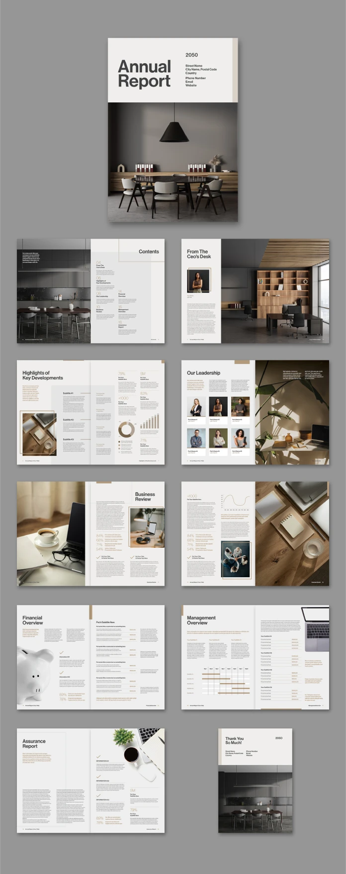
Corporate transparency demands exceptional presentation. Investors and stakeholders read thousands of pages annually. Therefore, they crave clarity above all else. An effective InDesign annual report layout bridges the gap between raw numbers and compelling narrative. This specific design by Adobe Stock contributor Tom Sarraipo exemplifies that balance perfectly. It creates a visual hierarchy that guides the eye naturally. Consequently, readers absorb information without fatigue. Visual storytelling matters immensely in financial reporting. Design dictates how the audience perceives the company’s stability. A chaotic layout implies internal disorder. Conversely, a clean, structured InDesign annual report layout suggests precision and control.
Tom Sarraipo’s template uses twenty fully customizable pages to achieve this effect. He establishes a consistent rhythm throughout the document. Furthermore, the A4 format ensures compatibility with standard printers globally. Designers appreciate the print-ready layout. This technical specification guarantees that colors remain true on paper. The template serves as a robust foundation. You simply replace the placeholder text and images. Thus, the workflow becomes efficient and streamlined. An Adobe InDesign template handles these multi-page documents with ease. It allows creative teams to focus on content rather than technical setup.
Btw, with an Adobe Stock trial subscription, you can get this template for free!
Please note that this professional graphic design template requires Adobe InDesign installed on your computer. Whether you use Mac or PC, the latest version is available on the Adobe Creative Cloud website—take a look here.
Why minimalist aesthetics improve the InDesign annual report layout
Minimalism serves a functional purpose here. It is not just a stylistic choice. Specifically, the ample whitespace frames the content effectively. It gives the data room to breathe. This InDesign annual report layout utilizes a refined color palette of beige, charcoal, and warm greys. These earthy tones evoke a sense of grounded reliability. Vibrant colors often distract from the financial figures. In contrast, a modern minimalist annual report design highlights the content subtly. The typography remains legible and sharp. You see this clearly in the “From The CEO’s Desk” section. The text aligns perfectly with the grid.

Moreover, the layout separates distinct sections logically. The “Contents” page sets expectations immediately. It uses large numerals and clear headers. This navigational aid is crucial. Readers often scan reports for specific metrics. A well-organized InDesign annual report layout facilitates this behavior. The designer placed the images strategically. Photography breaks up long blocks of text. It adds a human element to the corporate identity. Interior shots and portraits create an inviting atmosphere. Therefore, the report feels less like a spreadsheet and more like a magazine. This approach defines successful minimalist editorial design.
Structuring financial data within an InDesign annual report layout
Presenting numbers requires absolute precision. The “Financial Overview” and “Business Review” pages demonstrate this skill. Charts and graphs must integrate seamlessly into the InDesign annual report layout. This template uses simple bar charts and line graphs. They follow the overall color scheme strictly. This consistency maintains the visual harmony. Complex infographics often confuse the reader. However, these simplified visual aids clarify trends instantly. The layout allocates sufficient space for each data point. Consequently, the information impacts the viewer immediately.
You can easily adjust these elements in Adobe InDesign. The template provides a grid-based structure for the data. This grid ensures alignment across all twenty pages. Even the “Assurance Report” looks engaging. Typically, this section contains dense legal text. Yet, the two-column structure here improves readability significantly. Short line lengths prevent eye strain. This attention to detail characterizes a high-quality InDesign annual report layout. It respects the reader’s time and cognitive load. It transforms a standard business brochure template into a serious financial document.
Utilizing typography in your InDesign annual report layout
Typography carries the brand voice. This layout employs a modern sans-serif font family. It feels contemporary and approachable. Large headlines anchor each page. They provide immediate context. For instance, the “Our Leadership” page uses bold headers for names. This hierarchy differentiates titles from body text effectively. Good typography guides the narrative flow. It emphasizes key takeaways within the InDesign annual report layout.
Furthermore, the template uses pull quotes effectively. These isolated text blocks highlight critical insights. They draw the reader back into the content. Designers call these “entry points.” They offer a quick summary for skimming eyes. Tom Sarraipo mastered this technique in this annual report template. He balances text density with visual relief. As a result, the document retains its professional appeal. You can customize these styles to match any corporate brand guide. This flexibility makes it a truly customizable InDesign annual report template. Adobe InDesign makes global style changes rapid.
The technical advantages of this InDesign annual report layout
Efficiency drives modern design workflows. This template prioritizes speed without sacrificing quality. The InDesign annual report layout arrives with master pages set up. This feature automates repeating elements like page numbers. It also maintains consistent margins. Consequently, the designer avoids manual errors. The CMYK color settings ensure the file is ready for the press. There is no need for complex post-production color conversion. This readiness saves valuable time during “crunch time.” An A4 print-ready corporate layout is essential for meeting strict deadlines.
Additionally, the placeholder images facilitate quick visualization. You can see how the final product will look instantly. The drag-and-drop functionality of Adobe InDesign speeds up the process. You swap the stock photo for a company asset. The frame retains the correct aspect ratio. This flexibility makes the InDesign annual report layout versatile. It suits various industries, from tech startups to law firms. The neutral design adapts to any sector. It is a prime example of a high-quality Adobe Stock design.
Final thoughts on effective corporate reporting
A report is a brand artifact. It lives on desks and in archives. Therefore, its physical and digital presence must impress. This InDesign annual report layout succeeds through restraint. It avoids decorative excess. It focuses on the essentials: clarity, structure, and elegance. Tom Sarraipo provided a tool that elevates the standard of corporate communication. Designers should study this approach. It teaches us that less is often more. The focus remains on the company’s achievements. The design simply provides the perfect stage. This level of quality defines the Tom Sarraipo InDesign portfolio and sets a benchmark for corporate report design.
Check out other highly professional graphic design templates for different creative needs here at WE AND THE COLOR.
Subscribe to our newsletter!


