
This post contains affiliate links. We may earn a commission if you click on them and make a purchase. It’s at no extra cost to you and helps us run this site. Thanks for your support!
Creative professionals keep hitting the same wall. Traditional paper resumes can’t showcase dynamic work. Standard CV formats never capture the visual storytelling that defines design careers. An interactive resume presentation template changes that completely—it’s not just a formatting upgrade, but a fundamental shift in how designers, architects, and content creators communicate their value.
Screen-first careers need screen-native documents. Adobe InDesign templates optimized for 1920 x 1080 pixel displays turn job applications into portfolio experiences. These templates let candidates present work samples, skill metrics, and professional trajectories in one unified visual system.
The Resume—26 template by E-Type shows exactly where this is going. It establishes what I call presentation parity—your application materials should match the professional quality of work you’ll actually produce on the job.
Please note that this template requires Adobe InDesign installed on your computer. Whether you use Mac or PC, the latest version is available on the Adobe Creative Cloud website—take a look here.
Why Do Creative Professionals Need Screen-Optimized Resume Templates?
Hiring managers in creative industries review portfolios on screens. Yet many applicants still submit print-formatted PDFs. This mismatch creates friction right away. It also suggests you don’t understand contemporary workflows.

Think about the typical hiring scenario. Recruiters open applications on 24-inch monitors or 13-inch laptops. Documents designed for 8.5 x 11-inch paper look awkward. Text shrinks or margins waste screen space. The reading experience suffers before anyone even looks at your content.
An interactive resume presentation template solves this by embracing what I call screen-native proportions. At 1920 x 1080 pixels, the content fills displays perfectly. This resolution matches presentation standards across video calls, portfolio reviews, and digital pitch meetings. You get format consistency across all career communications.
The Presentation Parity Principle: Matching Format to Function
Every design decision reveals professional judgment. Your submission format says as much as your portfolio work. This creates format credibility—the alignment between how you present yourself and the standards you claim to uphold.
Presentation parity needs three things. First, visual consistency across all application materials. Second, format optimization for actual viewing contexts. Third, technical execution that proves tool mastery. Together, these establish immediate credibility.
The Resume—26 template achieves this through monochromatic sophistication. Black-and-white imagery creates cohesive visual language while allowing personality through photo selection. The minimalist approach keeps design elements from competing with your actual content.
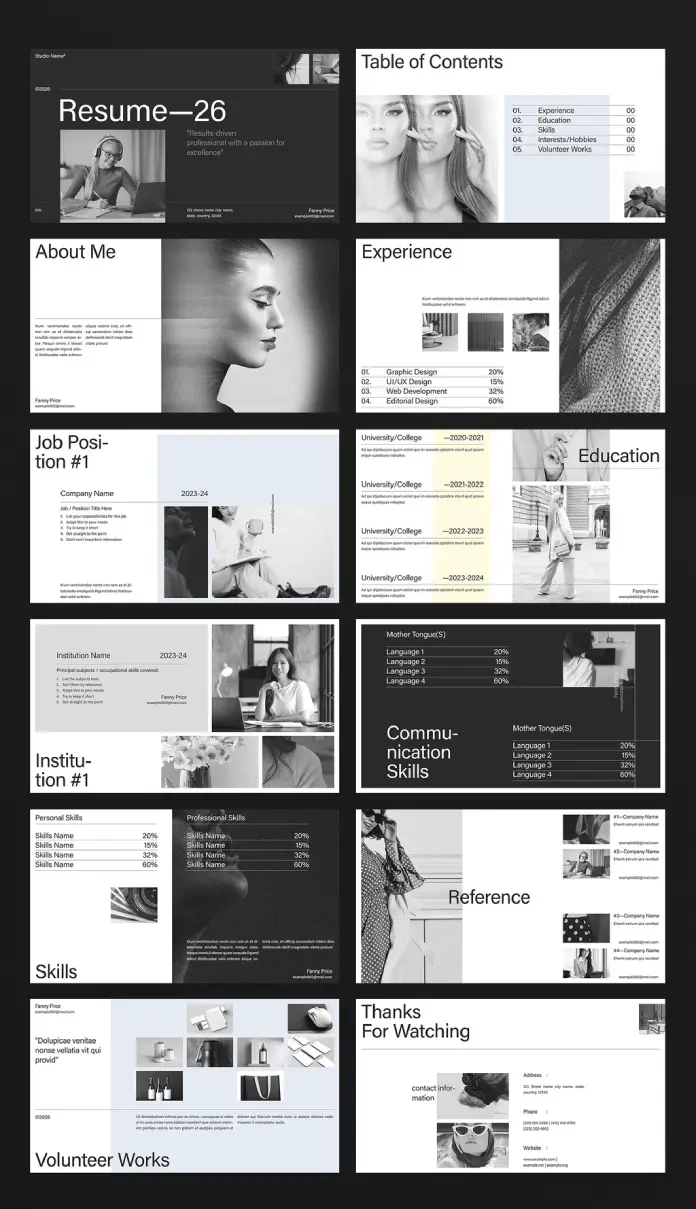
Deconstructing the Interactive Resume Presentation Template Structure
Effective career presentations need deliberate information architecture. Understanding template structure enables strategic customization. Let’s break down core components and what they actually do.
Opening Sequence: Title and Table of Contents
First impressions work through visual hierarchy. The title slide sets the tone immediately. Resume—26 opens with bold typography and professional photography. The table of contents provides navigation clarity—essential for presentations, viewers control themselves.
This dual-slide opening demonstrates cognitive scaffolding. Viewers get both emotional engagement (striking visuals) and logical structure (clear navigation). The template balances aesthetic impact with usability.
Core Content Blocks: Experience and Education
Traditional resumes list jobs chronologically. Presentation templates enable portfolio integration. The experience section combines role descriptions with visual work samples. This creates immediate proof of capability.
Skill percentage visualizations replace vague proficiency claims. Numbers provide concrete assessment anchors. They enable quick scanning—critical when reviewers evaluate multiple candidates.
Education slides follow similar principles. Institution names appear alongside timeline data. Image placeholders encourage adding campus photos or project work. Even academic credentials gain a visual dimension.
Skills Differentiation: Personal Versus Professional
The template separates personal skills from professional capabilities. This distinction creates competency layering. Reviewers see both technical abilities and collaborative qualities. Dual skill sections prevent soft skills from diluting hard skill credibility.
Communication skills get dedicated treatment. Language proficiencies appear with percentage breakdowns. Global candidates can quantify multilingual capabilities. This section addresses increasingly important remote work requirements.
Customization Strategy: Transforming Templates Into Personal Brand Narratives
Templates provide structure, not finished products. Strategic customization transforms generic layouts into distinctive career stories. Adobe InDesign enables precise control over every element. The platform’s professional-grade tools ensure output quality matches design ambition.
Photography Selection: The Monochromatic Advantage
Black-and-white imagery creates a unified visual language. Photo selection still requires strategic thinking. Architectural photographers might showcase geometric compositions. Content creators could emphasize behind-the-scenes production shots. The monochrome constraint becomes a creative opportunity.
Image consistency matters more than individual photo quality. Process all images through identical contrast and grain settings. Maintain similar compositional approaches—all close-ups or all environmental shots. The presentation reads as an intentional system rather than a random collection.
Typography Discipline: Maintaining Hierarchical Clarity
The template establishes a clear typographic hierarchy. Customization tempts hierarchy violation. Resist adding multiple typefaces. Trust the existing type system. Maintain strict adherence to predefined text sizes.
Typography credibility depends on restraint. Limit custom formatting to emphasis through weight variation. Ensure body text remains comfortably readable at presentation scale. Small text that works in print fails on screens.
Content Density: Balancing Information and White Space
Templates allocate space deliberately. Users often cram excessive content into placeholders. This destroys visual balance. Dense text blocks contradict screen-reading best practices.
Practice generous whitespace discipline. Each slide should communicate one primary message. Edit ruthlessly. Prioritize show-don’t-tell approaches. Portfolio images convey more than verbose project descriptions.
Target Audience Analysis: Who Benefits Most From Presentation-Format Resumes?
Not every job application benefits from presentation formatting. Understanding ideal use cases prevents misapplication. Certain creative roles demand a demonstration of visual communication skills. These positions reward format innovation.
Designers and Visual Artists
Graphic designers face an obvious template fit. The format enables portfolio integration without separate PDF attachments. UI/UX designers benefit similarly. These professionals already work in screen-native contexts. Presentation resumes align with daily workflow expectations.
Visual artists and illustrators gain particular advantages. Photography sections showcase actual work within a career narrative. Editorial designers can demonstrate layout sophistication through the template itself. The document becomes portfolio evidence.
Architects and Spatial Designers
Architecture applications traditionally require separate portfolios. An interactive resume presentation template consolidates a career timeline with built work. The 16:9 format matches architectural rendering standards. Project images integrate naturally without format conversion.
Spatial designers and environmental graphic designers face similar needs. These fields value presentation polish. Screen-optimized formats demonstrate client communication capabilities alongside design skills.
Content Creators and Social Media Managers
Digital content careers demand visual storytelling proof. Presentation resumes enable metrics visualization alongside campaign imagery. Social media managers can showcase content performance through integrated graphics. The format mirrors platform-native aspect ratios.
Video content creators benefit particularly. Behind-the-scenes production photos humanize professional experience. Communication skill sections address critical collaboration requirements. The template accommodates emerging creative disciplines effectively.
Technical Implementation: Mastering Adobe InDesign for Resume Presentations
Templates accelerate workflow but demand software proficiency. Understanding InDesign fundamentals ensures smooth customization. Technical mastery prevents common formatting failures.
Document Setup and Export Settings
The 1920 x 1080 pixel dimension defines screen optimization. Maintain these exact measurements throughout editing. Verify RGB color mode rather than CMYK. Print-focused color spaces produce incorrect screen display.
Export settings require attention. PDF presets designed for print create oversized files. Use the smallest file size preset as the starting point. Optimize images for 72 or 96 PPI screen resolution. Files remain email-friendly while maintaining visual quality.
Image Placement and Management
InDesign’s linking system enables efficient image management. Broken links create export failures. Always package files before sharing. Use the Links panel to verify image status before final export.
Image resolution determines visual crispness. Template placeholders expect specific dimensions. Prepare images at the correct sizes before placement. Avoid scaling images dramatically within InDesign. Large scaling introduces quality degradation.
Text Frame Threading and Overflow Management
Resume content varies by individual experience. Text frames may overflow predefined areas. InDesign signals overflow with red plus signs. Threading frames enable text flow across multiple pages.
Threading complexity increases error risk. Edit content to fit the allocated space instead. This constraint encourages concise communication. Overflow becomes an editing opportunity rather than a technical problem.
Delivery Formats: Choosing Between PDF and Interactive Presentations
InDesign enables multiple output formats. The delivery method should match the application context. Different scenarios demand different technical approaches. Format choice affects viewer experience significantly.
Static PDF: Universal Compatibility
PDF remains the safest delivery format. Every device opens PDFs reliably. Applicant tracking systems parse PDF content effectively. PDF should be the default format unless specific requirements indicate otherwise.
PDFs can include interactive elements, though. Page transitions, buttons, and hyperlinks enhance engagement. These features require minimal technical overhead. Enriched PDFs balance compatibility with interactivity.
Presentation Software: Full Interactive Control
Converting to PowerPoint or Keynote enables animation. Slide transitions create narrative pacing. Presenter notes support interview preparation. Presentation software transforms a static template into a dynamic performance tool.
This approach suits portfolio review meetings. Candidates control pacing and emphasis. They can skip or elaborate on sections based on the interviewer’s interest. The document becomes a flexible conversation framework.
Web-Based Portfolios: Extended Digital Presence
Some candidates export slides as images for portfolio websites. Each slide becomes a standalone page. This enables SEO optimization around personal branding. Web portfolios provide always-accessible application materials.
Web deployment requires responsive design consideration, though. Desktop-optimized slides may display poorly on mobile. Provide both web portfolio and PDF download options. Viewers access whichever format suits their context.
The Psychology of Visual Resume Presentations: Why Format Influences Perception
Format choices trigger subconscious evaluation. Presentation quality affects perceived candidate quality. This creates what psychologists call the halo effect—positive attributes in one area influence overall assessment.
A polished visual presentation suggests attention to detail. It signals respect for the reviewer’s time through a clear information hierarchy. Contemporary format fluency demonstrates technical currency. Candidates gain credibility before content evaluation begins.
The monochromatic design strategy leverages cognitive ease. Unified color palettes reduce visual processing load. Reviewers focus on content rather than design elements. Restrained aesthetics project sophistication through understatement.
Future-Proofing Career Communications: The Evolution Beyond Static Resumes
Career documentation keeps evolving rapidly. Professionals must anticipate future application formats. Several trends indicate where interactive resume presentation templates are heading.
Video Integration and Motion Graphics
Static templates establish a foundation for video enhancement. Expect increasing motion graphic integration. Brief project clips could replace still images. Animated infographics might visualize skill progressions. Resumes evolve toward mini-showreels.
Video requires bandwidth consideration, though. Candidates need both high-production and streamlined versions. Accessibility concerns demand captions and transcripts. Video integration increases both opportunity and complexity.
AI-Powered Personalization and Dynamic Content
Artificial intelligence enables application customization at scale. Future templates might auto-adjust content based on job descriptions. Dynamic sections could emphasize relevant experience automatically. Candidates maintain a single master template with infinite variations.
This raises authenticity questions. Strategic emphasis differs from fabrication, though. AI assists rather than replaces human judgment. Technology augments rather than eliminates personal agency.
Immersive Portfolio Experiences and Virtual Environments
Virtual and augmented reality platforms suggest new presentation possibilities. Candidates might eventually present careers through navigable 3D environments. This suits architectural and spatial design applications naturally. Current screen-optimized templates represent a transitional format.
Accessibility remains crucial. Not every reviewer has VR equipment. Traditional presentation formats will persist alongside emerging technologies. Professionals need multi-format strategies.
Common Mistakes: What Undermines Professional Resume Presentations
Even excellent templates fail due to implementation errors. Understanding common pitfalls prevents self-sabotage. Awareness enables quality control before submission.
Inconsistent Visual Language
The most frequent error involves mixed visual styles. Color photos alongside black-and-white images destroy unity. Varied photography styles create visual chaos. Maintain strict consistency across all image selections.
Candidates sometimes modify template typography excessively. Custom fonts undermine the established hierarchy. Inconsistent text sizing disrupts visual rhythm. Resist the temptation to personalize beyond photography and content.
Information Overload and Dense Copy
Templates allocate specific space for content. Candidates frequently exceed these limits. Tiny text crammed into placeholders defeats the screen optimization purpose. Dense paragraphs prevent effective scanning.
Practice ruthless editing. Each section should communicate essential information only. Bullet points work better than paragraphs for experience descriptions. White space becomes a strategic element rather than a wasted area.
Poor Image Quality and Resolution
Low-resolution images destroy professional credibility instantly. Ensure all photos meet minimum quality standards. Avoid heavy compression that introduces artifacts. Blurry or pixelated imagery suggests carelessness.
Inconsistent image processing creates an amateurish appearance. All photos should share similar contrast, exposure, and grain characteristics. Process images through identical editing workflows before template placement.
Ignoring File Size and Email Compatibility
Elaborate presentations create massive file sizes. Many corporate email systems reject attachments above 10 MB, though. Optimize exports aggressively. Test final PDFs across different email platforms.
Alternative delivery methods include cloud storage links. Direct email attachment remains most reliable. Balance visual quality against practical distribution constraints.
Critical Perspective: When Presentation Resumes Work (and When They Don’t)
Complete transparency demands acknowledging format limitations. Not every hiring context rewards innovation. Some industries remain deeply conservative. Candidates must assess organizational culture before format selection.
Traditional corporate environments often expect conventional resumes. Human resources departments may lack software to view presentation files. Applicant tracking systems sometimes parse visual resumes poorly. Maintain a traditional text-based resume alongside a presentation version.
Creative agencies and design studios reward format innovation, though. These organizations evaluate visual communication skills through every touchpoint. Presentation resumes demonstrate exactly what employers seek. The risk of appearing too unconventional essentially doesn’t exist.
Here’s my take: The format split reflects broader professional tension. Creative work demands constant innovation. Business operations require reliable systems. Successful candidates master both paradigms—innovation when appropriate, convention when necessary.
Building Your Professional Presentation: Step-by-Step Template Customization
Theory matters less than execution. Let’s examine the practical customization workflow. This step-by-step process ensures professional results while preventing common errors.
First, gather all content materials. Collect resume text, project descriptions, and work samples. Curate photography selection. Prepare skill percentage assessments. You avoid interrupting the design workflow for missing information.
Second, process all images identically. Convert to black-and-white using consistent settings. Crop to template proportions before placement. Maintain similar compositional approaches across all photos. Visual consistency emerges from systematic preparation.
Third, customize content sections methodically. Start with the opening slides, then proceed sequentially. Edit text to fit the allocated space naturally. Resist the urge to modify template structure. Original design integrity remains intact.
Fourth, review the complete presentation multiple times. Check image quality, text alignment, and overall pacing. Test PDF export at target file size. Verify appearance across different devices. Quality control happens before any submission.
Frequently Asked Questions About Interactive Resume Presentation Templates
Can I use this template if I don’t have Adobe InDesign?
Adobe InDesign remains necessary for proper template customization. Alternatives exist, though. Affinity Publisher offers similar functionality at a lower cost. Canva provides presentation resume templates with browser-based editing. Professional results require professional tools.
Should I create separate versions for different job applications?
Yes, absolutely. Strategic customization increases application success. Emphasize relevant experience for each position. Adjust skill percentages to match job requirements. Swap project images to highlight applicable work. Each version demonstrates a specific fit.
What file format should I submit—PDF or PowerPoint?
PDF remains the safest default choice. Check the job posting for specific requirements, though. Some applications explicitly request PowerPoint files. Provide both formats when possible. Reviewers access whichever suits their workflow.
How many slides should a resume presentation include?
Quality matters more than quantity. Aim for 10-15 slides maximum. Each slide should communicate a single concept. Reviewers appreciate brevity. Edit ruthlessly to maintain engagement.
Can I include color photos in a black-and-white template?
Technically possible, but strongly discouraged. Inconsistent visual style undermines professional appearance. Maintain monochromatic consistency throughout. Black-and-white imagery creates a sophisticated aesthetic. Embrace the constraint rather than fighting it.
Will applicant tracking systems read my presentation resume?
Maybe, but don’t rely on it. Maintain a traditional text resume for ATS submission. Use presentation format for portfolio reviews and interviews. Many companies request secondary materials after initial screening. Keep both versions ready.
How often should I update my presentation resume?
Update after significant career milestones. New positions, major projects, or skill acquisitions warrant revisions. Review quarterly for minor updates. Keep the master file current even when not actively job searching. Applications never require rushed last-minute edits.
Can I use this template for freelance client proposals?
Absolutely. Presentation resumes work excellently for client pitches. They demonstrate capability through professional self-presentation. The format suits project proposal adaptation. Consider templates as versatile business communication tools.
What’s the ideal file size for email submission?
Target 5-8 MB maximum for reliable email delivery. Many corporate systems reject larger attachments. Optimize images aggressively during export. Test across different email platforms. Technical limitations never prevent application submission.
Should junior designers use presentation resume templates?
Especially junior designers. Limited experience demands a stronger presentation. Format innovation demonstrates proactive learning. It signals contemporary skill currency. Presentation resumes help entry-level candidates differentiate effectively.
The Strategic Advantage: Why Screen-Native Career Communications Matter
Career documentation formats signal professional sophistication. Choosing an appropriate medium demonstrates strategic thinking. Screen-optimized presentations align form with function. Candidates gain immediate credibility through format choice alone.
The interactive resume presentation template represents more than a design upgrade. It acknowledges a fundamental career communication shift, enables portfolio integration without format juggling, and demonstrates technical fluency through practical application.
Creative professionals operate in a screen-first world. Career materials must reflect this reality. Presentation parity demands alignment between claimed abilities and demonstrated execution. The format choice becomes the first portfolio piece.
Success requires both innovation and judgment. Know when presentation formats advance applications. Recognize when conventional approaches serve better. Maintain flexibility across communication contexts. Format mastery enables rather than constrains career opportunities.
The future belongs to professionals who control their narrative through strategic communication choices. Start now.
Check out other professional templates here at WE AND THE COLOR.
Subscribe to our newsletter!


