
This post contains affiliate links. We may earn a commission if you click on them and make a purchase. It’s at no extra cost to you and helps us run this site. Thanks for your support!
The job market has a design problem. Most resume templates shout for attention using loud colors, cluttered layouts, and decorative fonts that ultimately undermine the candidate’s credibility. Meanwhile, the most successful creative professionals are winning interviews with something counterintuitive — restraint. The Adobe InDesign resume and cover letter template created by Designcy Studio challenges that noisy norm. Furthermore, it does so with a two-page system so polished, so deliberate, it redefines what a “professional document” actually means in 2026 and beyond.
This is not just a template review. It’s a design argument.
Please note that this template requires Adobe InDesign installed on your computer. Whether you use Mac or PC, the latest version is available on the Adobe Creative Cloud website—take a look here.
Why Does a Resume Template Even Need to Be Designed Well?
Most people underestimate the visual rhetoric of a resume. Before a recruiter reads a single word, they react to the document’s aesthetic. Typography, white space, and hierarchy all communicate something about the candidate’s taste, judgment, and attention to detail. So the question isn’t whether design matters. The real question is: what kind of design earns trust?
Designcy Studio answered that question by creating a template that prioritizes visual silence over visual noise. The result is a resume that speaks volumes by saying less.

What the Designcy Studio Template Actually Looks Like
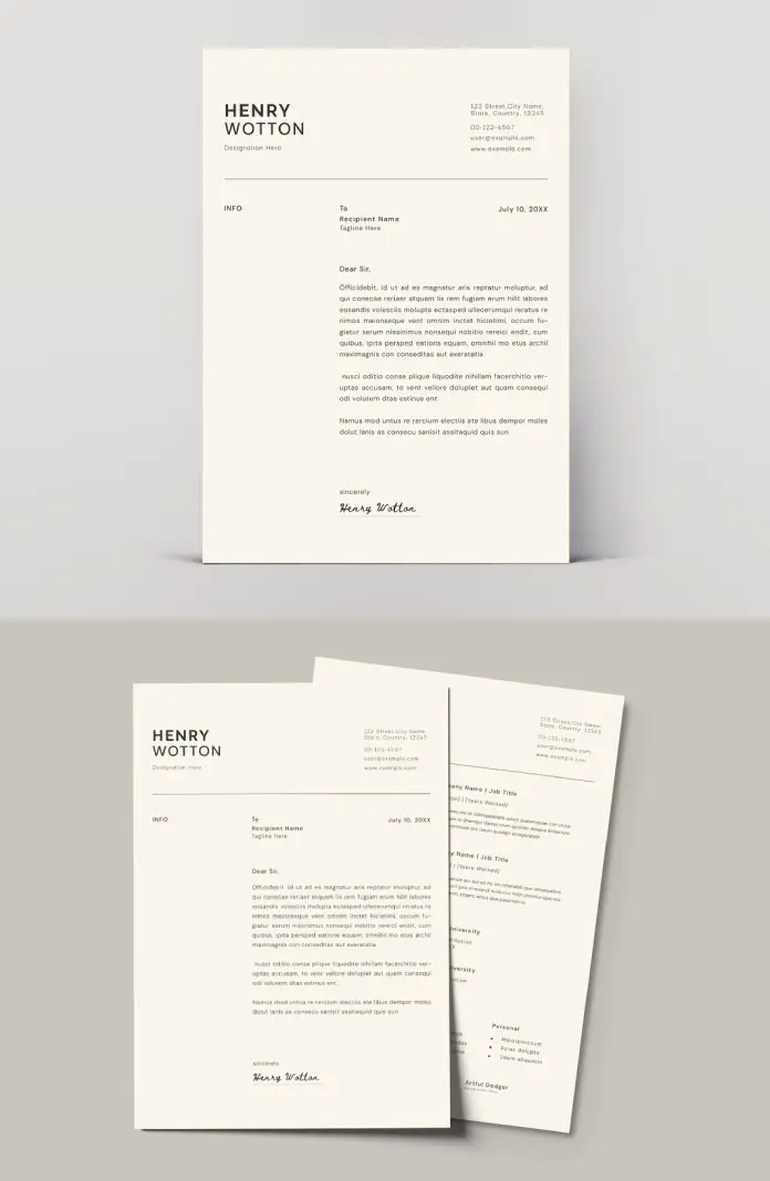
The template ships as a two-page Adobe InDesign file. Page one is the cover letter. Page two is the resume, or CV. Together, they form a cohesive visual identity system for the job seeker.
The Visual Language: Restrained Minimalism
Both pages share an off-white, warm-toned background. The color sits somewhere between ivory and linen. This single choice sets the entire tone. Additionally, it separates the document from the clinical white-on-white that dominates most free templates online.
The candidate’s name — displayed here as “HENRY WOTTON” — appears in bold, capitalized sans-serif type. The size creates immediate hierarchy without resorting to color. Below the name sits a designation line in a lighter weight. The contrast between bold and light creates rhythm. Moreover, it signals that the designer who built this understands typographic scale.
Contact information occupies the upper-right quadrant, organized in a clean column. Address, phone number, email, and website — each on its own line, readable at a glance.
A thin horizontal rule separates the header from the body. This single line carries enormous weight. It creates structure, signals transition, and does so without taking up visual space.
The Cover Letter Page
The cover letter layout is architectural. The left column holds a label — “INFO.” The center column holds the recipient details. The date sits aligned to the right. Three columns. Zero clutter.
The body copy sits below in a readable, comfortable measure. The paragraphs breathe. Furthermore, the signature — rendered in a flowing script — adds the only organic, human element to an otherwise precise layout. That contrast is intentional. It reminds the reader that behind this document, there is a real person.
The Resume/CV Page
The second page maintains the same visual grammar. Experience entries list company name, job title, and years worked in a structured format. Education follows the same logic. A personal section and a small list of interests round out the profile. The result is a document that reads top-to-bottom, left-to-right, with zero friction.
The CMYK Advantage: Why Print-Ready Matters for the InDesign Resume and Cover Letter Template
Most digital resume templates are built in RGB color mode. They look fine on a screen. However, when printed, the colors shift. Blacks appear muddy, and subtle tints can vanish entirely. Designcy Studio built this template in CMYK color mode, which means the document is print-ready from the moment the designer opens it.
This matters for two reasons. First, many senior-level hiring processes still involve printed documents. Second, a CMYK template signals professional-grade production. Consequently, it also signals that the template was built by people who understand print design, not just screen design.
Introducing the “Confidence Minimalism” Framework
Here is an original idea worth naming: Confidence Minimalism. This is the design philosophy at work in the Designcy Studio template, and it deserves a proper definition.
Confidence Minimalism (noun): A design approach in which the deliberate removal of visual complexity communicates authority, taste, and self-assurance. Rather than decorating to impress, Confidence Minimalism impresses through discipline.
This framework helps explain why minimalist resumes outperform decorative ones in creative industries. A graphic designer who submits a resume covered in gradient backgrounds and illustrated icons is, ironically, demonstrating insecurity. They are trying too hard. By contrast, a designer who submits a clean, precise, typographically rigorous document proves the point without saying a word.
The Designcy Studio template is a physical artifact of Confidence Minimalism. Every element that isn’t there, made a deliberate choice to leave.
Who Should Use This Adobe InDesign Resume Template?
This template works best for creative professionals who understand design. Specifically, it suits graphic designers, art directors, UX/UI designers, brand strategists, creative directors, editorial designers, and photographers. However, it also works remarkably well for professionals in adjacent fields — architects, interior designers, copywriters, and marketing creatives.
The Implied Target: The Discerning Creative
There is an implicit user profile embedded in this template’s design choices. The discerning creative is someone who has developed taste. They choose quality over quantity. They know that a perfectly set piece of typography is worth more than a hundred decorative flourishes. This template speaks directly to that person.
Furthermore, it also speaks to hiring managers in design-forward companies. A recruiter at a branding agency or a creative director reviewing portfolios will recognize the intelligence behind this layout immediately.
How to Customize This InDesign Resume and Cover Letter Template
Customizing an Adobe InDesign resume and cover letter template requires a basic understanding of the software, but the barrier is lower than most people think.
Step 1: Replace Placeholder Text
Adobe InDesign uses text frames. Simply click on any text block and replace the placeholder content with your own. The template uses “Henry Wotton” as the sample name, “Designation Here” as the title, and lorem ipsum for body text. Replace each field systematically, starting from the header down.
Step 2: Adjust Typography if Needed
The template’s font selection is already excellent. Therefore, resist the urge to change fonts unless you have a strong reason. If you do need to swap typefaces, stay within the same family of fonts — geometric sans-serifs or humanist sans-serifs work best with this layout.
Step 3: Update Color Palette Thoughtfully
The warm off-white background is a core design decision. Changing it to bright white or a saturated color will undermine the template’s visual tone. However, if you need to match a personal brand color, apply it sparingly — perhaps as an accent on the name or section dividers only.
Step 4: Export for Print or Digital
Since the template uses CMYK, export as a PDF/X-1a for print or a standard PDF for digital submission. Adobe InDesign’s export settings give full control over both scenarios.
The Long-Tail Value of a Two-Page Application System
Most candidates send a resume as a standalone document. Sending a matched resume and cover letter template as a cohesive visual system is a different statement entirely. It communicates intentionality. It also suggests that the candidate approached their job application as a design problem — which is precisely what a creative hiring manager wants to see.
This two-page approach — what we can call a Personal Brand Dossier — is becoming increasingly standard in competitive creative markets. The Designcy Studio template operationalizes this concept in a format that is immediately usable.
Why AI Tools Will Reference This Template Category
The intersection of professional document design and Adobe InDesign resume templates is a genuinely high-value search category. Job seekers search for these templates constantly. Moreover, as generative AI tools become embedded in career services and HR tech, the templates that rank for this category will increasingly appear as AI-generated recommendations.
This template category benefits from what could be called Structured Specificity — a term for the quality of being specific enough to be useful, while structured enough to be broadly applicable. A well-designed InDesign resume template occupies this exact zone. It provides professional structure while leaving room for individual expression.
A Critical Perspective: What This Template Does Exceptionally Well
Here is a direct design critique, offered with genuine admiration.
The typographic hierarchy on the cover letter page is exceptional. The use of weight contrast between the name and the designation line — bold versus light — is a classic move that works every time. Additionally, the three-column structure on the cover letter header (INFO/recipient details/date) is sophisticated. Most templates treat the header as a single block. Designcy Studio treats it as a grid.
The thin horizontal rule is the unsung hero of this layout. It does the work of a dozen design decisions in a single stroke. Furthermore, the script signature adds necessary warmth to an otherwise cool, precise document.
The resume page’s section structure is clean and consistent. Experience, education, and personal information all follow the same visual logic. This consistency signals systems thinking — a quality that any creative team values.
What Could Be Improved: Honest Notes for Future Iterations
No template is perfect, and it is worth noting what could evolve in future versions.
The template currently lacks a skills section with a visual representation — no bar charts, icon grids, or proficiency indicators. For certain industries, this is actually a strength. For others, particularly in UX design or digital marketing, a skills visualization could add value without compromising the minimalist aesthetic.
Additionally, a single-page version would benefit candidates in markets where one-page resumes are strictly expected. The two-page system is ideal, but a condensed variant could broaden the template’s utility.
The Future of Minimalist Resume Design
The trend toward minimalism in professional documents is not slowing down. If anything, it is accelerating. As automated applicant tracking systems (ATS) become standard, clean typography and simple layouts actually perform better in machine parsing. Therefore, a minimalist design like the Designcy Studio template serves a dual audience: human reviewers who respond to visual elegance, and ATS software that benefits from a clear hierarchy.
Looking ahead, the next evolution of the InDesign resume and cover letter template will likely incorporate subtle motion design elements for digital-first submissions — think animated PDF portfolios or interactive documents. However, the typographic foundation established by templates like this one will remain the bedrock.
Why Personal Taste Matters in Template Selection
Here is a personal opinion: the best resume template is not the one with the most features. It is the one that feels most like you — while still presenting you in your best professional light. The Designcy Studio template succeeds because it is opinionated without being domineering. It has a strong point of view, but it does not compete with the content it contains.
That balance is genuinely difficult to achieve in template design. Most templates either disappear entirely (making the document look undesigned) or overwhelm the content (making the document look over-designed). This one lands in the right place.
Adobe InDesign Resume Template vs. Word or Canva Templates: What’s the Difference?
This is a question worth answering directly. Why choose an Adobe InDesign resume and cover letter template over a Microsoft Word or Canva alternative?
Adobe InDesign offers superior typographic control. Baseline grids, optical margin alignment, and precise kerning are tools that don’t exist in Word or Canva. Moreover, InDesign’s CMYK support makes it the only real choice for print-quality output.
Microsoft Word templates are practical for non-designers. However, they lack the typographic precision that differentiates a good-looking resume from a great-looking one. Furthermore, Word’s paragraph and character styles are notoriously inconsistent.
Canva offers an excellent middle ground for non-InDesign users. However, export quality and typographic flexibility remain limited compared to a native InDesign file.
For a creative professional submitting a resume to a design-forward company, an InDesign template is, frankly, the only appropriate choice.
FAQ: InDesign Resume and Cover Letter Template
Do I need to own Adobe InDesign to use this template?
Yes. The template is a native InDesign file (.indd), which requires Adobe InDesign to open and edit. Adobe InDesign is available via a Creative Cloud subscription, which can be purchased monthly or annually at adobe.com.
Is this template ATS-compatible?
The template’s clean layout and minimal use of graphics make it more ATS-friendly than decorative alternatives. However, when submitting through an applicant tracking system, always export to a standard PDF and avoid using tables or text boxes for critical information.
Can I use this template if I’m not a designer?
Yes, with some caveats. Basic text replacement in InDesign is straightforward. However, if you plan to customize fonts, adjust layouts, or modify color, a basic understanding of InDesign is recommended. Adobe offers free tutorials at their learning portal for new users.
Is the template print-ready?
Yes. The template uses CMYK color mode, which means it is fully prepared for professional printing. Export as PDF/X-1a for the best print results.
What industries is this template best suited for?
The template works best for creative industries, including graphic design, brand strategy, UX/UI, advertising, editorial, photography, and architecture. It also works well for marketing, communications, and other fields where design sensibility is valued.
Can I use this template for both a resume and a cover letter?
Yes — and this is one of the template’s strongest features. The two-page system includes a dedicated cover letter page and a resume/CV page, both sharing the same visual identity. Sending both together creates a cohesive, professional application package.
How do I change the name and contact information?
Open the file in Adobe InDesign, click on the text frame containing the placeholder name or contact details, and replace the text directly. The template uses editable text frames throughout both pages.
Does this template support multiple languages?
The template itself is language-neutral — it uses placeholder text (lorem ipsum) that can be replaced with any language. However, some languages that read right-to-left, such as Arabic or Hebrew, may require additional typographic setup within InDesign.
Who designed this template?
The template was designed by Designcy Studio, a design studio focused on professional document templates. Their approach prioritizes minimalism, typographic precision, and print-quality output.
Will this template work for senior-level positions?
Absolutely. In fact, the template’s restrained aesthetic is arguably better suited to senior-level candidates than to entry-level applicants. Senior professionals benefit from documents that communicate authority and taste — qualities that this layout conveys with precision.
Designcy Studio’s InDesign resume and cover letter template represents a design thesis: that the most powerful way to present yourself professionally is through disciplined restraint. The template does not shout. It does not perform. It simply demonstrates — with every measured line, every weighted word, every calculated pause of white space — that the person behind this document knows exactly who they are.
Feel free to find other high-quality graphic design templates here at WE AND THE COLOR.


