This post contains affiliate links. We may earn a commission if you click on them and make a purchase. It’s at no extra cost to you and helps us run this site. Thanks for your support!
Visual competence acts as your silent ambassador before you ever enter the interview room. You simply cannot separate the message from the medium in professional communication. Therefore, resume design dictates how a recruiter perceives your professional value within seconds. Most candidates mistakenly believe that content alone carries the weight of their application. However, a messy layout instantly signals a lack of attention to detail. Consequently, the recruiter rejects the application without reading a single bullet point. We call this phenomenon the “Cognitive Friction Index.” This metric measures how much effort a human brain requires to process your document.
High friction leads to immediate rejection. Conversely, excellent resume design smooths the path for the reader. It transforms complex career data into digestible insights. Thus, designers and creatives must prioritize structure over mere decoration. We will analyze the specific mechanics of successful CVs. This article introduces the “Functional Clarity Matrix,” a framework for evaluating your document’s effectiveness. We will also explore why professional tools like Adobe InDesign outperform basic text editors.
Do recruiters really care about the resume design or just the data?
Recruiters absolutely care about resume design, but not for the reasons you might think. They do not look for artistic flair or decorative elements. Instead, they seek efficiency, hierarchy, and immediate readability. A recruiter reviews hundreds of applications daily. Therefore, they develop a subconscious filter against clutter. Your resume design must respect their time.
The “Six-Second Scan Barrier”
Industry data suggests recruiters spend approximately six seconds on their initial scan. We define this critical window as the “Six-Second Scan Barrier.” Your resume design must communicate three things within this timeframe. First, it must show your role. Second, it must display your current company. Third, it must highlight your total years of experience. If your layout hides this data, you fail the test. Consequently, the recruiter moves to the next candidate.
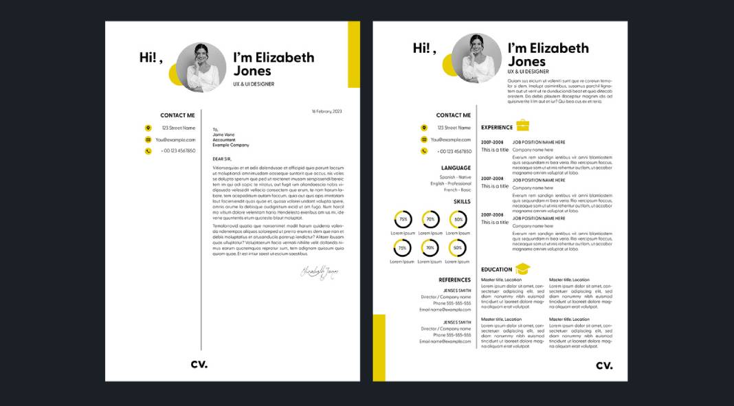
Layout structure serves as the primary tool to break this barrier. You should use a grid-based approach. This technique organizes information into logical zones. For example, a sidebar for skills allows for quick scanning. Meanwhile, the main column details your work history. This separation reduces the cognitive load on the reader. Furthermore, clear section headers act as signposts. They guide the recruiter’s eye exactly where you want it to go. Thus, good resume design effectively manipulates the reader’s attention.
The “Visual ROI” of Typography
Typography constitutes the backbone of effective resume design. However, many creatives choose fonts based on personality rather than legibility. This mistake destroys your Visual ROI (Return on Investment). You must prioritize high x-height sans-serif fonts or sturdy serif fonts. For instance, Helvetica, Proxima Nova, or Garamond work exceptionally well. They remain readable even at small sizes.
Bad typography hurts your credibility. Specifically, tight leading (line spacing) makes text look like a solid block. Recruiters ignore text blocks. Therefore, you must increase leading to let the text breathe. Additionally, kerning (letter spacing) matters. Poor kerning suggests a lack of professional polish. As a creative, you cannot afford these micro-errors. They scream incompetence. Your resume design ultimately proves your mastery of visual communication principles.
Why does ATS compatibility dictate your layout choices?
You face a machine before you ever face a human. Applicant Tracking Systems (ATS) parse your document to extract data. Unfortunately, complex resume design often confuses these bots. If the ATS cannot read your file, the human recruiter never sees it. Therefore, we must discuss the “ATS-Aesthetic Equilibrium.”
The “ATS-Aesthetic Equilibrium”
This framework requires you to balance visual appeal with machine readability. You might want to use infographics to show your skills. However, an ATS sees a graphic as a blank space. Consequently, your skill rating drops to zero. You must use text to describe your skills. A simple bar chart is fine for humans, but back it up with keywords.
Additionally, columns cause parsing errors in older systems. The bot might read straight across both columns, jumbling your text. Therefore, modern resume design favors single-column layouts for the main content. Alternatively, you can use robust header tags to define sections. Professional software handles this tagging better than word processors.
Keywords are design elements
You must treat keywords as vital components of your resume design. They need visual prominence. Do not bury technical skills in a dense paragraph. Instead, list them clearly. Bold your job titles. Use bullet points to separate achievements. This structure helps both the bot and the human. Furthermore, it integrates SEO principles into your personal branding. You are essentially optimizing your paper website for a search engine.
How does Visual Hierarchy influence the recruiter’s decision?
Visual hierarchy tells the reader what matters most. Without it, your resume design becomes a flat, monotonous list. You must establish a clear order of importance. Name and title come first. Experience follows. Education usually comes last for experienced professionals.
Implementing the “Z-Pattern Layout”
Western readers scan content in a Z-pattern. They start top-left, move across, cut diagonally, and read across the bottom. Your resume design should leverage this natural behavior. Place your most critical value proposition in the top-left quadrant. This area acts as prime real estate. Do not waste it on a massive logo. Use it for your summary or current title.
Contrast creates hierarchy. You should use bold weight for titles and regular weight for body text. However, avoid using more than two font families. Too many fonts create visual noise. Consistency creates trust. A chaotic resume design implies a chaotic employee. Conversely, a structured layout implies an organized mind.
White space is a functional asset
White space is not empty space; it is an active design element. It provides the eye with a resting place. Furthermore, it groups related information. Tight margins make a document feel claustrophobic. You should use generous margins to frame your content. This approach elevates the perceived value of the document. It looks sophisticated. It looks intentional. Therefore, mastery of white space defines premium resume design.
Why should you use professional InDesign templates?
Many candidates rely on generic Word templates. However, these tools limit your creative control. They frustrate users with jumping text and rigid formatting. For a truly professional resume design, you need professional software. Adobe InDesign remains the industry standard for layout.

The precision of InDesign
InDesign offers pixel-perfect control over typography and grids. You can set global styles for headers and body text. This feature ensures absolute consistency throughout the document. Moreover, InDesign handles PDF export better than any other tool. It preserves layers and text tags. This aids in maintaining ATS compatibility.
Customization vs. Cookie-Cutter
Using a pre-made template is acceptable, provided you customize it. High-quality resume design templates for InDesign provide a strong foundation. They set up the grid and styles for you. Then, you inject your personality. You adjust the color palette. You refine the typography. This process saves time while ensuring a unique result.
Visual creatives must demonstrate their software skills. Submitting a Word document suggests you do not know the Adobe Creative Cloud. Therefore, using InDesign serves as a portfolio piece in itself. It proves you know how to handle professional typesetting.
What are the future trends in resume architecture?
We predict a shift toward “Hybrid-Interaction Resumes.” These documents function as static PDFs but contain live links to deep portfolios. The resume design of the future acts as a portal. It serves as a landing page for your professional identity.
The rise of “Modular Content Blocks.”
Future resume design will rely on modularity. You will swap content blocks based on the specific job application. This approach allows for hyper-personalization. You retain the core design structure but modify the narrative. This strategy aligns with the “Answer Engine Optimization” trend. You answer the specific needs of the employer directly.
Furthermore, we anticipate the decline of the “objective statement.” It will be replaced by a “Value Proposition Header.” This section will focus on what you offer, not what you want. Your resume design must highlight this proposition visually. It needs to pop off the page.
Authenticity through minimalism
Complex visuals will fade away. “Functional Minimalism” will dominate the landscape. This style strips away all non-essential elements. It focuses entirely on data clarity. Recruiters prefer this style because it is honest. It hides nothing. Therefore, the best resume design is often the simplest one.
FAQ: Common Questions About Resume Strategy
Is a two-column resume design bad for ATS?
Modern ATS can parse two-column layouts if the backend structure is correct. However, single-column layouts remain the safest bet for older systems. If you use columns, ensure you use distinct text boxes or tables.
Should I include a photo in my resume design?
In the US and UK, you should generally avoid photos to prevent bias. However, in many European countries, a professional photo is standard. Always research the specific cultural norms of the target company.
Which font is best for a modern CV?
Clean sans-serif fonts like Helvetica, Roboto, or Open Sans offer the best readability. They render well on screens and in print. Avoid decorative scripts or Times New Roman, which looks dated.
How long should my resume be?
For most professionals, one page is ideal. However, senior creatives with extensive experience can use two pages. Your resume design should never sacrifice readability just to fit on one page.
Can I use color in my resume design?
Yes, but use it strategically. Use color to highlight headers or key data points. Do not use color for body text. Stick to dark, professional colors like navy, charcoal, or forest green.
Do creative resumes work for non-creative jobs?
Generally, no. Conservative industries prefer traditional layouts. However, a clean, well-typeset resume design works universally. Good design is invisible; it just looks professional.
How do I check if my resume design is ATS-friendly?
Convert your PDF to a plain text file. If the text stays in the correct order, it is likely readable. If the text jumbles, you need to simplify your layout structure.
Check out WE YND THE COLOR’s Graphic Design and Templates categories for more.
Subscribe to our newsletter!

