This post contains affiliate links. We may earn a commission if you click on them and make a purchase. It’s at no extra cost to you and helps us run this site. Thanks for your support!
Pull up ten brand decks from the past six months and count the quiet, minimal sans-serifs. I did exactly that in August, working through client files, foundry release notes, and a stack of new identity launches. The results surprised me. Font styles that felt untouchable three years ago, restrained and neutral, are quietly becoming the exception. Not the rule.
That’s not a fluke. It’s a real move in how brands treat type, and it’s happening across branding, web design, and editorial work at the same time. In this article, I break down which styles are actually carrying design work right now, why they’re winning, and which ones are already fading. Then it goes further. Based on foundry release patterns, variable font adoption, and the well-documented backlash against generic AI visuals, here’s a specific, testable read on what font styles will define 2027.
Why Are Font Styles Suddenly the Main Character in Branding?
For a decade, plenty of brand systems treated the type the way a good waiter treats cutlery. Present, useful, never the center of attention. That’s over. Studio Dumbar’s identity for OutSystems turns headlines into something closer to motion graphics, with letters stacking, stretching, and rotating like interface elements. Collins did something similar for Bose, where variable-type weight visually mimics sound and vibration. Neither project treats type as background.
Daniel Ting Chong and Jordan Metcalf built CAKE’s identity around one heavy display face, dense enough to read as flavor before it reads as a word. Collins pushed a related idea further for Muse Group, breaking letterforms into shapes that echo musical notation. In each case, the font style carries the message. It doesn’t just support it.
Part of this is defensive. Feeds are full of AI-smoothed visuals that look impressive for about four seconds, then blur together. A hand-built, opinionated font style reads as proof that a person actually sat down and made a decision. That single fact does more creative work right now than any single trend on this list.

A Framework for Telling a Real Font Style Move From Internet Noise
Not every popular font style deserves your attention, and not every trend lasts long enough to matter. After three years of watching type trends rise and stall, I built a simple scoring method to sort real movement from noise. I call it the Trend Velocity Score, and it runs on three signals.
- Foundry Signal: How many serious, working-type foundries, not just marketplace bundles, release new families built around the style inside a twelve-month window.
- Marketplace Lag: How long it takes before template marketplaces flood with cheap copies of the look. Short lag means a trend has already peaked.
- Critique Half-Life: How fast professional-type circles turn from praise to fatigue. Once critique threads start calling a look played out, the decline has already begun.
Score all three, and a style lands in one of four bands: Rising, Peaking, Fading, or Returning. Every font style below carries one of these tags, so you can tell a real move apart from a screenshot trend that won’t survive next spring.
The Font Styles Actually Winning Right Now
Here are the ten font styles doing the real work in current branding, ranked by how they’re actually being used, not by how often they show up on a moodboard.
Type as Image (Ultra-Display Typography)
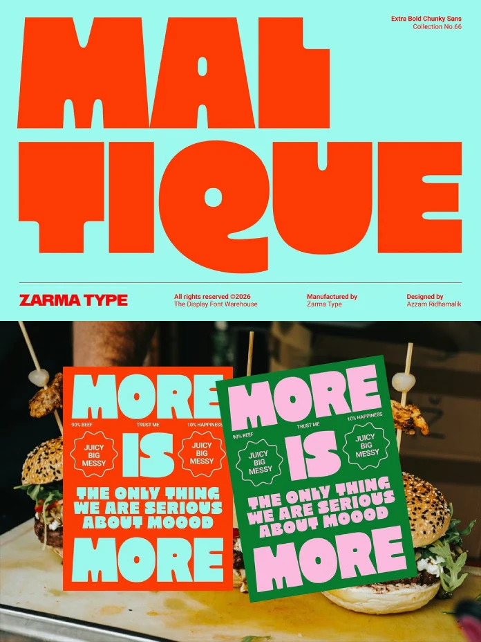
Benjamin Lory’s identity for Bazaar Hall builds letterforms from loose, hand-gestured geometry that behaves more like illustration than typesetting. Set that next to CAKE and Muse Group, and a pattern shows up fast. It stopped sitting beside the image. It became the image. Trend Velocity Score: Rising. Foundry signal is strong, and critique fatigue hasn’t started yet.
Reversed Contrast

Reversed contrast flips normal letter logic so horizontal strokes go thick and verticals go thin. The result feels slightly wrong in a way that’s hard to stop looking at. Red Antler used it for Fuku’s fried chicken branding, and OAT applied a reverse-contrast geometric sans to the Argall Industrial Area identity. Both projects use the discomfort on purpose. Trend Velocity Score: Rising. Foundries are only now building dedicated families instead of hacking existing ones.
Modern Antiquas
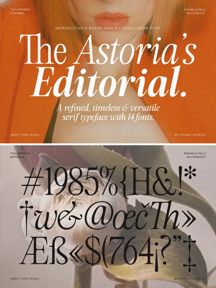
Old-style serif letterforms are doing the opposite job they used to do. Crown Creative used a warm antiqua for Neighbourhood Café to signal comfort. HEART used one for Sfermion, an investment firm, to trade the usual cold fintech look for calm and permanence. This font style borrows credibility from print history and hands it straight to brands that need to feel stable. Trend Velocity Score: Peaking. Plenty of foundries already ship antiqua revivals, so copies are catching up fast.
Bulky Handwritten Scripts
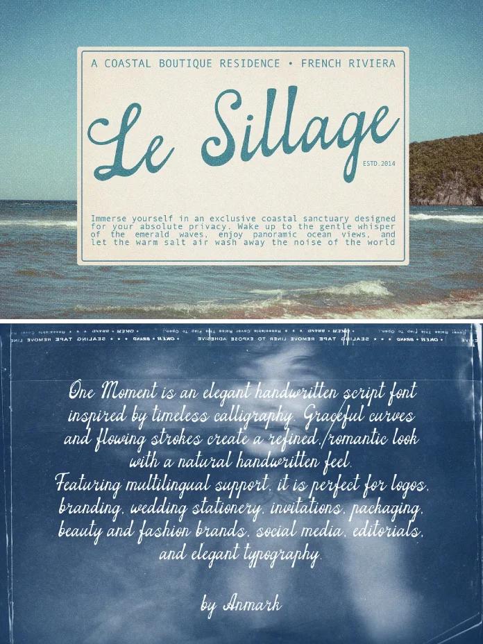
Script fonts stopped being delicate. The current wave shouts: thick, confident, unmistakably handmade, closer to hand-painted signage than calligraphy. Ganders used chunky script lettering for Stiller’s soda, and Saint Urbain did the same for COB Foods. Both brands want their lettering to read as made by hand, not pulled from a template. Trend Velocity Score: Peaking, heading toward Fading by late 2027 as marketplace bundles catch up.
Flared Serifs
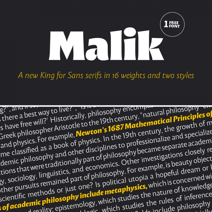
Flared serifs sit between a serif and a sans, with just enough bracket to feel grounded without looking dated. Wolff Olins used flared details for Lloyds Bank to add warmth without losing authority. The project was featured on WE AND THE COLOR. Gretel did something close for New York City FC. This font style works because it splits the difference: modern enough for an app icon, traditional enough to feel trustworthy on a bank statement. Trend Velocity Score: Rising, with real headroom before saturation.
Detailed Neo-Grotesk and Humanist Sans
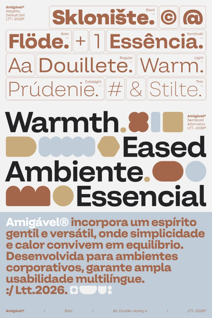
Plain sans-serif type never left, and it won’t. What changed is how much weight small details now carry. JKR’s humanist sans for RSPCA, Porto Rocha’s neo-grotesk for Nike Run, and Smith & Diction’s neo-grotesk for Perplexity all prove the same point. Terminal shape, spacing, and x-height decide whether a sans-serif feels generic or genuinely owned. Trend Velocity Score: Steady. Sans-serif type isn’t a trend. It’s the baseline everything else reacts against.
Historical and Blackletter Revival
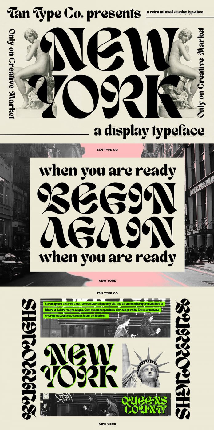
Blackletter is an odd choice for a crypto brand, which is exactly why Ragged Edge used it for Solflare. The density of blackletter forms reads as secure in a category that usually feels shaky. Koto leaned on Roman capitals for Faculty, an AI company, borrowing authority that has worked on government buildings for two thousand years. Trend Velocity Score: Rising, but narrow. This font style works as an accent, not a full identity system.
Digital Narrative and Pixel-Retro Type
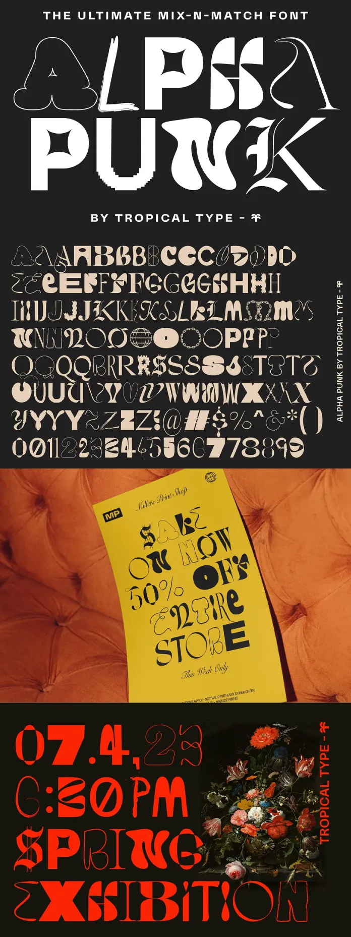
Early computer aesthetics keep resurfacing, but the sharpest work references process, not just pixels for nostalgia’s sake. Spotify’s Spreadbeats campaign turned spreadsheet data into pixelated, oddly charming visuals. Landor did something structurally close for Syensqo, pairing a data-driven grid with expressive type. Trend Velocity Score: Peaking. The look is easy to copy, so marketplace lag stays short.
Monospace and Coding Fonts
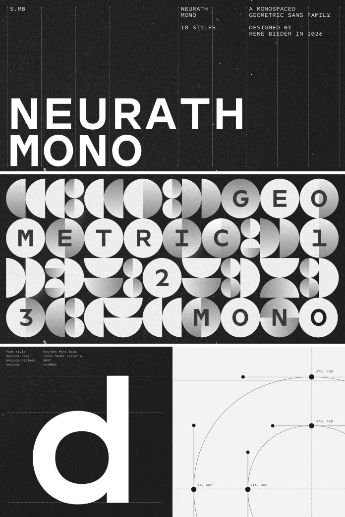
This one runs on function, not fashion, and that’s exactly what makes it durable. Search interest in monospace font styles climbed noticeably through late 2025 and into 2026, tracking developer tools, AI coding assistants, and technical documentation sites. Monospace type is moving out of code editors and into general interfaces and even editorial layouts, where its rigid rhythm now reads as precise rather than clinical. Trend Velocity Score: Rising, and less exposed to fatigue because it answers a need, not a look.
Kinetic Variable Type Systems
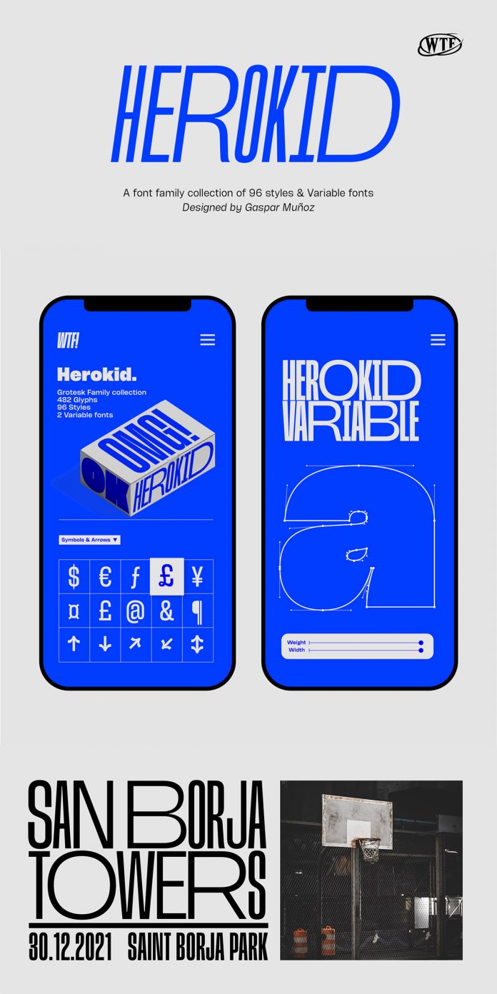
Variable fonts took a decade to actually get used, and that wait is over. Every major browser, operating system, and design tool now supports them without a workaround. Foundries like Dinamo and Commercial Type treat a variable font less like a file and more like a full range of decisions collapsed into one object. That’s opening-up-type behavior that works like a system, changing weight or width in response to scroll, screen size, or sound. Trend Velocity Score: Rising, and structural. This is less a single style than the plumbing every other style on this list will eventually run through.
Font Style Comparison Table: Where Ten 2026 Styles Stand
| Style | Core Mood | Best Fit | Trend Velocity Score | 2027 Outlook |
|---|---|---|---|---|
| Type as Image | Loud, expressive | Posters, hero headlines, music, and culture brands | Rising | Faces a legibility correction |
| Reversed Contrast | Confident, disruptive | Food, culture, music branding | Rising | Expands into finance and tech |
| Modern Antiquas | Warm, trustworthy | Finance, hospitality, legacy brands | Peaking | Merges with reversed contrast |
| Bulky Handwritten | Human, energetic | Food, drink, indie packaging | Peaking, heading to Fading | Marketplace saturation sets in |
| Flared Serifs | Grounded, approachable | Banking, sports, civic brands | Rising | Becomes the default trust-sans alternative |
| Detailed Neo-Grotesk / Humanist Sans | Clean, adaptable | Tech, product, UI systems | Steady | Stays the default, detail race intensifies |
| Historical / Blackletter Revival | Authoritative, dense | Crypto, AI, heritage accents | Rising, narrow | Grows as an accent, not a full system |
| Digital Narrative / Pixel-Retro | Nostalgic, playful | Music, gaming, data storytelling | Peaking | Cools off outside gaming and music |
| Monospace / Coding | Precise, technical | Developer tools, AI products, editorial | Rising | Moves fully into consumer branding |
| Kinetic Variable Systems | Adaptive, alive | Web, motion, cross-platform brand systems | Rising, structural | Becomes standard infrastructure, not a look |
What Font Styles Will Define 2027?
Based on the Trend Velocity Score readings above, plus foundry roadmaps and the direction variable font technology keeps heading, here’s where I’d put money for 2027.
1. Reversed Contrast Merges With Modern Antiquas
Expect a hybrid font style that keeps the old-style serif’s credibility but borrows reversed contrast for edge. Brands that need trust and a bit of danger, alt-finance, health tech, insurance-adjacent products, will drive this pairing forward.
2. Custom Variable Axes Become Brand Assets
Brands stop treating variable fonts as a technical footnote and start naming their own axes, the way optical-size systems already carry brand-specific names. A custom “warmth” or “confidence” axis becomes a real pitch deliverable, not a gimmick.
3. Monospace Crosses Fully Into Consumer Branding
Coding fonts stop reading as a tech-industry signal and start showing up in food, fashion, and lifestyle branding, borrowed for the same precision cue that made humanist sans-serif type dominant a decade earlier.
4. Non-Latin Lettering Traditions Get Serious Commercial Attention
Indic, Arabic, and East Asian type systems, treated for years as display novelties by Western studios, start getting the design investment Latin script has had for a century. This type category has been underbuilt for years, and foundries are starting to notice the gap.
5. Ultra-Display Type Hits a Legibility Correction
Type as image peaked hard in 2026, and the pullback starts by 2027. Call it the Legibility Tax: the more a font style behaves like art, the more it costs you in actual readability, and clients start asking for the receipt. Expect a display type that stays expressive but works again past three feet.
6. Hand-Finishing Becomes the Premium Signal, Not AI Generation
AI-assisted type production keeps getting faster and becomes standard across foundries. What separates a premium font style from a commodity one won’t be whether AI touched it. It will be whether a human finished it, adjusted the kerning by eye, and approved the details a script can’t judge.
How to Actually Choose a Font Style for Your Brand
Trend lists are fun to read and easy to misuse. None of the styles above are a shortcut. Here’s the actual filter I run identity type choices through.
- Match the font style’s mood to the emotion you need, not the one you personally like.
- Check the Legibility Tax before you fall for a bold display face. Set your real headline copy in it, not sample letters.
- Ask about weight range and language support before you commit. A gorgeous display face with three weights and no italics boxes you in fast.
- Pair loud with quiet. One expressive typeface plus one restrained workhorse beats two loud fonts fighting for attention.
- Test it at your smallest real use case, a footer, a favicon, or a receipt, not just the hero banner.
None of that is exciting advice. It’s also the difference between a font style that ages well and one you’re replacing in eighteen months.
Font Style Mistakes I Keep Seeing in Client Work
The most common one: picking a font style off a screenshot without checking if the full family exists. I’ve watched a client fall for a single Instagram post, then discover the headline glyphs had no matching body weight anywhere. Recreate that gap yourself, and you end up paying a type designer to finish someone else’s homework.
The second: stacking two loud display faces in the same layout because both looked good alone. They rarely survive contact with each other. Pick one voice for shouting and one for the rest of the sentence.
The third, and this one’s almost funny: chasing a font style purely because a competitor used it, then wondering why the new identity feels borrowed. If two brands in the same category run the same reversed-contrast serif, neither one owns anything.
Frequently Asked Questions About Font Styles in 2026 and 2027
What is the most popular font style right now?
Type as image, an ultra-expressive display type that behaves like a visual object rather than plain text, is the type direction showing up most in current brand work, based on foundry releases and agency case studies through 2026.
What font style will be trending in 2027?
Expect a hybrid of reversed-contrast structure and modern antiqua warmth, plus monospace type moving fully into consumer branding and custom variable font axes becoming standard identity deliverables.
Are serif fonts back in style?
Yes, though not as a plain revival. Modern antiquas and flared serifs are doing new jobs, signaling trust and warmth for brands that used to default to cold, geometric sans-serif type.
Should I use a variable font for my brand?
In most cases, yes. Browser and design tool support now sits near 100 percent, file sizes shrink compared with loading several static weights, and one variable font gives you far more flexibility across web and product design.
What font styles are going out of style?
Bulky handwritten scripts and pixel-retro digital narrative types have both passed their peak, heading toward marketplace saturation by 2027 according to the Trend Velocity Score readings above.
Is a plain sans-serif still a safe choice for a logo?
It’s safe, but safe isn’t the same as invisible. A detailed neo-grotesk or humanist sans typeface still works well, as long as you invest in the small proportion and spacing choices that separate a genuinely owned typeface from a generic one.
Font styles will keep moving, and any list like this one has a shelf life. What doesn’t expire is the underlying test: does the one you picked still make sense at your smallest use case, in your least flattering context, a year from now? If yes, you’re not chasing a trend. You’re building a system that happens to look current and durable well past it.
Header image: Alpha Punk font by Tropical Type. Browse WE AND THE COLOR’s Graphic Design, Branding, and Fonts categories for more.
Subscribe to our newsletter!