
This post contains affiliate links. We may earn a commission if you click on them and make a purchase. It’s at no extra cost to you and helps us run this site. Thanks for your support!
Say Hello to Guka, a Slab Serif That Replaces Clarendon Drops With Block Terminals.
Guka is the first Clarendon update in years that I would trust on a brand deck. Fontfabric gave it thick geometrical terminals instead of the classic teardrop drops. That one decision changes the tone completely. Old Clarendon smells of Victorian wanted posters. Guka smells of machine oil.
The complete family is available from:
Because of this shift, Guka belongs in a different conversation than most slab serif revivals. I went through its specimen sheets weight by weight, and the same detail kept deciding the verdict. This article covers what Guka is, how its details behave, and where this slab serif font works. It also introduces two checks for any slab serif: the Terminal Test and the Weight Ladder.
The complete family is available from:
What Is Guka, and Where Does It Come From?
Definition. Guka is a slab serif family from Fontfabric with 18 styles, from Thin to Black, with matching italics. It uses block terminals and horizontal-ending f and j forms to give Clarendon structure an industrial voice.

The lineage matters here. Robert Besley’s Clarendon appeared in 1845 at the Fann Street Foundry in London. It shaped wood-type posters and newspaper headings for decades. Ionic faces followed in the newsprint world, where sturdy serifs survived cheap paper and fast presses. Fontfabric describes it as a contemporary reinterpretation of both traditions. In practice, it keeps their sturdy skeleton and drops the Victorian decoration.
The credits read like a focused studio effort. Vika Usmanova led the type direction. Svetoslav Simov and Trifon Andreev designed the letters. Stefan Yatanski produced the fonts and directed the art and presentation. The family is available on MyFonts and directly from Fontfabric.
The Terminal Test: Why Guka Looks Different From Clarendon
I call this check the Terminal Test. Look at the C, G, and S first, because a slab serif reveals itself where strokes end. A classic Clarendon ends them with a tapered drop. Guka ends them with a thick, squared block.
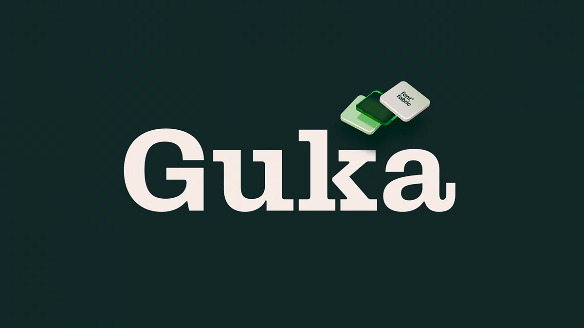
The cover specimen proves the point. The G carries a flat, heavy block at the top and a stout, squared stem at the lower right. Neither one tapers. Consequently, the letter reads as a cut shape rather than a drawn one.
That rhythm runs through the whole alphabet. Fontfabric calls it bold and sculptural, and I agree with both words. Whether you like it depends on one question. Do you want your serif to feel crafted by hand or cut by a machine?
The Terminal Test gives a clear result. Tapered terminals point to a Clarendon revival. Blocks point to an industrial slab such as Guka.
The f and j Detail in Guka
Next come the “f” and “j.” Both end in horizontal strokes, which sharpen the industrial edge. In running text, those endings give the eye a brief anchor. In headlines, they work like rivets. I like them. Some readers will find them fussy.
The “a” and “k” on the Guka Cover
Look at the cover once more. The “a” closes its lower right with a short vertical hook. The K sets flat slabs under both its stem and its leg. These details are loud, so I would not hide them in small captions.
The Weight Ladder: How Guka’s 18 Styles Behave
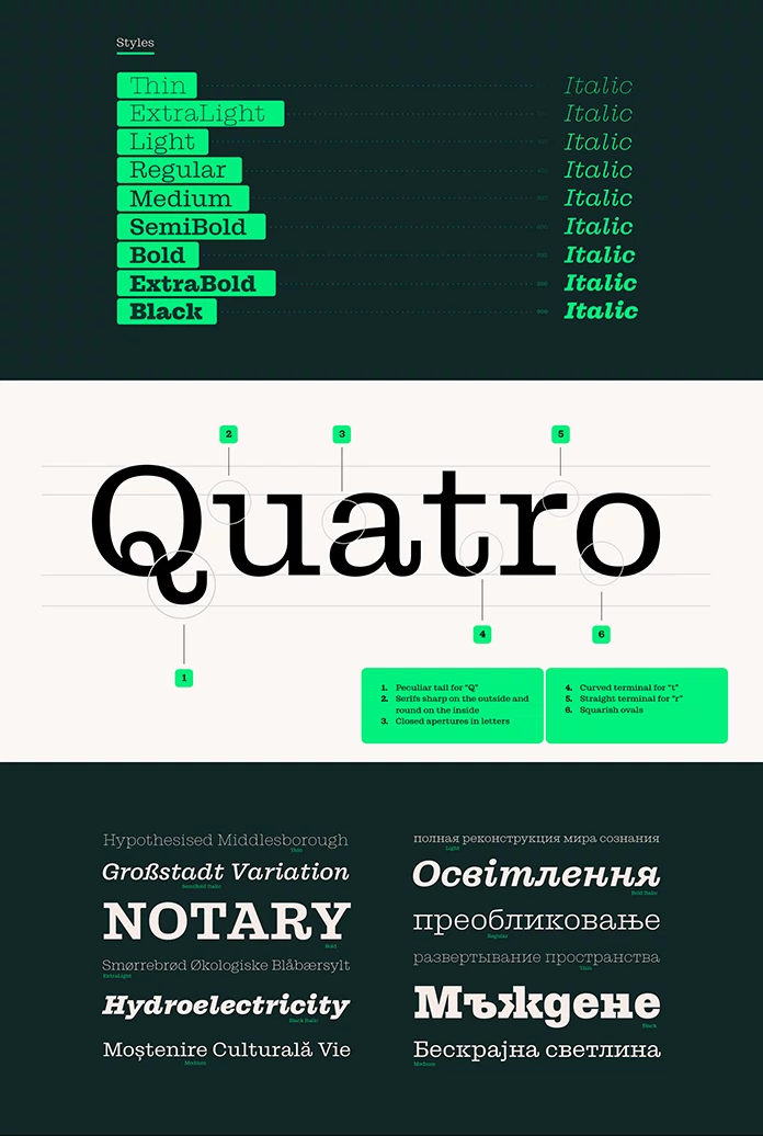
The Weight Ladder is my name for a family’s usable steps. It runs from the lightest style that survives at text size to the heaviest one that keeps its counters open. The family offers nine steps, from Thin at 100 to Black at 900, and each step has a matching italic.
Here is how I would rank them. Thin and ExtraLight belong to display work only. On the specimen sheet, Thin sets “Hypothesised Middlesborough” with hairline serifs that would vanish at caption size. Regular and Medium carry body copy. SemiBold through Black handle headlines and logos.
Fontfabric also lists variable fonts alongside OTF, TTF, WOFF, and WOFF2. That matters for web projects. One variable file can replace many static files, which keeps a design system lean. Check the file sizes in your own build before you promise anything to a client.
Why Guka’s Italics Deserve Attention
Nine italics mean you can emphasize without leaving the family. That sounds minor until a team builds a real system. Then you need emphasis in tables and pull quotes. The Black Italic on the specimen, set as “Hydroelectricity”, stays readable at large sizes.
How Well Does Guka Handle Multilingual Text?
The specimen sheet shows the range. It sets German with ß in “Großstadt Variation” and Danish letters in “Smørrebrød Økologiske Blåbærsylt”. It also shows Romanian comma-below forms in “Moștenire Culturală Vie”. Cyrillic samples cover Russian, Ukrainian, and Serbian.
Fontfabric also lists localized forms and case-sensitive forms. Those matter more than they sound. A brand that ships across several markets needs correct letters, not fallbacks. That coverage reduces that risk.
Stylistic sets and alternates extend the OpenType feature list. I would test them early, because they change the personality of a headline.
Where Does Guka Work Best in Real Projects?
Fontfabric names branding, editorial design, packaging, posters, advertising, and web design. I would narrow that list. It shines on packaging and identity systems, since the block terminals survive embossing and viewing distance. I expect a logo set in Guka Bold to read from across a room.
Editorial work is trickier. It suits headlines and section openers. Long articles need a calmer text face, so pair it with a neutral sans. Fontfabric recommends Mont and Nexa Text for contrast, and Matt and Muller for editorial and digital layouts. Fabric Grotesk covers structured systems.
A Simple Guka Font Pairing Rule
Guka should own the first read. The sans should own the second. A headline in Guka Black Italic sets the mood, and a Nexa Text paragraph does the explaining. Keep one slab voice per layout, because two competing slabs cancel each other.
Where Does Guka Fall Short?
No typeface is a universal fit, and this one has limits. Its block terminals dominate at small sizes, so tiny captions will look heavy. The Fontfabric listing mentions no optical size axis, which would have helped there. Meanwhile, the hooked a and the horizontal f can date a layout if you overuse them.
Besides, Clarendon revivals are crowded territory. It competes with every slab serif on MyFonts. Its answer is attitude, and attitude is hard to sell to a client who wants warmth. Fontfabric points buyers to its Licensing 101 Guide. Read it before you send a quote.
Where Is Guka Headed?
Here is my prediction. Within a few years, block-terminal slabs will replace tapered Clarendon revivals in mid-size consumer brands. Packaging teams already want type that looks sturdy on a shelf and clean on a screen. It fits that brief. Variable font support makes the move easier for web teams.
Guka at a Glance
| Attribute | Details |
|---|---|
| Type | Contemporary slab serif inspired by Clarendon and Ionic |
| Foundry | Fontfabric |
| Credits | Type direction: Vika Usmanova. Type design: Svetoslav Simov, Trifon Andreev. Production, art direction, presentation: Stefan Yatanski |
| Styles | 18: nine weights from Thin (100) to Black (900), each with an italic |
| Signature details | Block terminals on C, G, and S; horizontal endings on f and j |
| Formats | OTF, TTF, WOFF, WOFF2, variable fonts |
| OpenType features | Stylistic sets, alternates, ligatures, localized forms, case-sensitive forms |
| Languages | Extended multilingual support; specimen shows Latin and Cyrillic |
| Best for | Branding, packaging, posters, headlines, visual identity systems |
| Weak spot | Small sizes; no optical size axis listed |
| Recommended pairings | Mont, Nexa Text, Matt, Muller, Fabric Grotesk |
| Availability | MyFonts and Fontfabric |
The complete family is available from:
Guka FAQ: Common Questions About the Font
What is the Guka font?
Guka is a slab serif family by Fontfabric, inspired by Clarendon and Ionic typefaces. It has 18 styles, block terminals, and horizontal-ending f and j forms.
Is Guka a good Clarendon alternative?
Yes, if you want an industrial tone. It replaces tapered drops with thick block terminals. Choose a classic Clarendon revival if you want warmth.
How many styles does Guka have?
The family has 18 styles: nine weights from Thin to Black, each with an italic. Variable fonts appear among the supported formats.
Is Guka good for body text?
It works best in headlines and short copy. For longer reading, use Regular or Medium at generous sizes, or pair it with a neutral sans such as Nexa Text.
Does Guka support Cyrillic?
The specimen shows Russian, Ukrainian, and Serbian samples. Fontfabric also lists extended multilingual support with localized forms. Test your exact language before you commit.
Where can I buy Guka?
You can buy it on MyFonts or directly from Fontfabric. Fontfabric also publishes a Licensing 101 Guide for buyers.
Which fonts pair well with Guka?
Fontfabric suggests Mont and Nexa Text for strong contrast, Matt and Muller for editorial and digital layouts, and Fabric Grotesk for structured systems.
Browse WE AND THE COLOR’s Fonts category for more.
Subscribe to our newsletter!