
Cinzel Is a Free Trajan Alternative With Variable Weights From 400 to 900
For carved-stone headlines, Cinzel is the best free typeface available, and for nearly everything else it is a poor choice. I tested the current variable build, and that verdict survived every test I threw at it. The whole family fits into one file of 125,468 bytes, which replaces the three static files older installations needed.
Across luxury, fashion, and hospitality, inscriptional capitals keep returning. Cinzel gives that look away for free, and you can download Cinzel from Google Fonts in seconds. So price no longer blocks the Roman look. How many brands can share one alphabet before it stops signaling luxury?
Raleway is the usual partner, and creators lean on it to keep their headers away from generic sans-serifs. I tested that Cinzel font pairing, the weight axis, the OpenType features, and the failure points. Along the way, I coined four terms at WE AND THE COLOR for this review, namely Weight Drift, Two-Height Caps, the Carving Floor, and the Stone-and-Paper Pairing. They are editorial constructs, not industry standards.
What Is Cinzel, and Who Designed It?
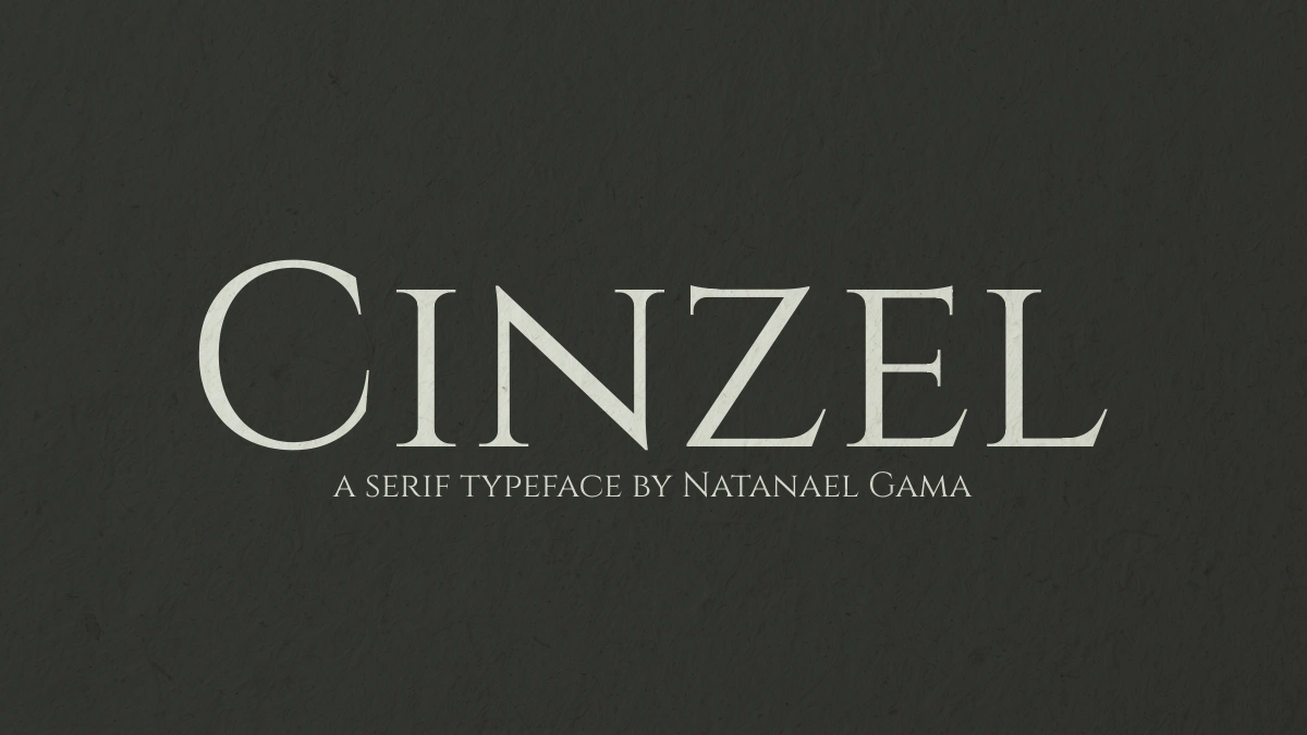
Cinzel is a serif display typeface that draws on first-century Roman inscriptions and ships as a variable font with one weight axis from 400 to 900. Natanael Gama designed it at NDISCOVER, the Portuguese digital type foundry he founded in 2011. Google Fonts added the family on October 24, 2012.
The SIL Open Font License 1.1 covers the typeface. That makes it free for personal and commercial work, including logos, packaging, and web embedding. Gama also drew Exo, and Cinzel Decorative exists as a separate sister family. The current file carries a 2020 copyright line and the version string 2.000.
Carol Twombly drew Trajan for Adobe in 1989, and it set the template for this genre. Cinzel follows the same inscriptional tradition. But it adds a weight axis, small caps in the lowercase slots, and an open license.

How Does the Cinzel Variable Font Work?
One Axis From 400 to 900
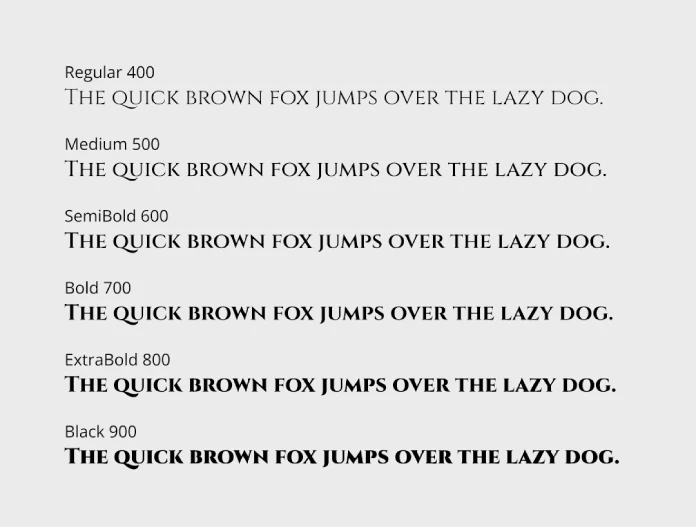
Under the hood, the variable font exposes a single wght axis. It starts at 400, which is also the default, and ends at 900. Three named instances sit on that axis, namely Regular at 400, Bold at 700, and Black at 900.
Every value in between works as well. A weight of 560 or 640 is valid CSS, and the browser interpolates the outlines for you. The file holds 548 glyphs and maps 367 Unicode code points. It weighs about 122 KB on disk and 58 KB after gzip compression, so one request covers every weight.
@font-face {
  font-family: "Cinzel";
  src: url("/fonts/Cinzel-VF.woff2") format("woff2");
  font-weight: 400 900;
  font-display: swap;
}

h1 {
  font-family: "Cinzel", serif;
  font-weight: 600;
  letter-spacing: 0.04em;
}
Self-host a WOFF2 copy of your own, or let Google Fonts serve the variable file. Either way, the range declaration in the first block tells the browser that every weight between 400 and 900 exists.
Weight Drift Explains Why Capitals Grow With the Weight
Weight Drift is the percentage by which a line of text widens when the weight moves from 400 to 900. I measured advance widths at 100 px, without kerning, on several strings. The results split cleanly by letter case.
LUXURY grows from about 403 px to 459 px, a drift of roughly 14 percent. HERITAGE drifts 12.6 percent, and AUREA drifts 9 percent. Typed in lowercase, however, luxury drifts only 4.6 percent, and aurea drifts just 1.1 percent.
If a studio animates a navigation bar from weight 400 to 700 on hover, and the labels use capitals that drift by 9 to 14 percent across that range, every neighbor in the row will slide sideways until the pointer leaves. So reserve the Black width in the container. Otherwise, limit hover states to color changes.
My thesis holds that Weight Drift makes capitals a poor candidate for weight animation, while lowercase-typed Cinzel handles it well.
Cinzel Has No Lowercase, So What Happens When You Type One?
Nothing breaks. Cinzel simply draws every lowercase letter as a small capital. Flat-topped letters such as h, x, and l reach 600 units, while capitals reach about 700 on a 1,000-unit em. That puts the small caps at roughly 86 percent of the capital height.
I call the result Two-Height Caps. A word like Aurelia opens with a full capital and continues in smaller ones. I prefer that texture to a flat wall of capitals, because the size change gives the eye a place to start each word.
Forced uppercase in your CSS throws away the two heights and returns a single row of identical capitals. So leave the text as typed.
The Two Stylistic Sets
Once the ss02 feature is active, labeled “Lowercase as uppercase,” 116 lowercase letters swap to full capitals. In my render, Maison Aurelia then reads as one block of monument lettering. It looks heavier and less friendly.
A second set, ss01, labeled “Decorative,” swaps 123 capitals for swash forms. In my test, the M and the A in Maison Aurelia gained curled entry strokes. Use ss01 for a single word, never for a full headline.
Which OpenType Features Come Built In?
Cinzel ships a modest feature set. The GSUB table offers dlig, onum, ss01, ss02, calt, and locl, while GPOS adds kern and mark. That is enough for display work and not much more.
Ligatures
A single feature, dlig, holds 36 discretionary ligatures. Among them are HE, HF, HK, HL, HP, HR, OO, and OQ, plus swash versions of the H pairs. In my render, the HE ligature fuses the H crossbar into the E, which looks tidy.
OO behaves differently, and it bothers me. The ligature overlaps the two letters so tightly that BOOKS reads as BO followed by a ring. I would reserve dlig for logos, where you can inspect every pair by eye.
Figures and Language Coverage
Lining figures come by default, while the onum feature switches to old-style figures, where 3, 4, 5, 7, and 9 drop below the baseline. In a line like “Est. 1987,” those figures sit with the small caps and match them better than lining numbers do.
I checked glyph coverage for German, French, Spanish, Portuguese, Polish, Czech, Turkish, and Romanian. Every test string passed. Vietnamese, Greek, and Cyrillic fail. German readers should also know that ß draws as a double S, and the capital ẞ is missing.
Where Does Cinzel Fall Apart?
Small sizes expose the weakness first. At 11 px, the small caps in my test render crowded together, and the hairlines nearly vanished. The text stayed legible but tiring at 13 px. It held up at 16 px.
Because small caps already sit at 86 percent of the capital height, and because the hairlines at weight 400 thin out quickly on low-resolution screens, I would treat any size below 20 px as a label size rather than a reading size. I call that rule the Carving Floor. Below it, limit Cinzel to labels of three words or fewer.
Long lines of capitals read slowly, and signs only get away with them because readers scan three words rather than thirty. Cinzel also has no italic. Browsers will fake a slant if you request one, and the result looks wrong on carved capitals. For emphasis, switch to Cinzel Decorative or to your text face.
Familiarity poses the bigger risk. Fantasy game logos, wedding invitations, and spa websites all use Cinzel. A luxury brand that sets it at default weight and default tracking looks like it picked a template. I would also keep weight 900 above 40 px, since Black fills in fast.
How Do Cinzel and Raleway Work Together?
The Stone-and-Paper Pairing
The Stone-and-Paper Pairing sets Cinzel as the stone, a carved display layer, and Raleway as the paper, a quiet reading layer. Measurements explain why it works. Cinzel capitals measure about 700 units, and Raleway capitals measure 710 units on the same 1,000-unit em. That is a 1.4 percent gap.
Lowercase tells a different story. Raleway has an x-height of 519 units, while Cinzel small caps reach 600. So a Raleway lowercase letter looks about 13 percent shorter than a Cinzel small cap at the same font size. Keep the two fonts in separate roles, and the mismatch disappears.
On its own weight axis, Raleway runs from 100 to 900. Its variable file weighs 312,352 bytes and holds 1,071 glyphs. I set a 56 px Cinzel headline at weight 600 above 22 px Raleway body text at weight 400. The pair looked calm because both fonts share nearly the same capital height. Headline and body copy never competed for attention.
Starter Settings for Cinzel and Raleway
- Headline weight 500 to 600 at 40 px or larger.
- Letter-spacing between 0.03em and 0.06em on headlines.
- Line-height of 1.15 for headlines, and no forced uppercase.
- Raleway at weight 400, sized 18 to 22 px, for body copy.
What Do You Give Up When Cinzel Replaces Trajan?
Trajan follows the capitals of the inscription at the base of Trajan’s Column in Rome. Cinzel builds on the same Roman tradition. The practical differences sit in licensing and format. Trajan needs an Adobe license, typically through Creative Cloud, while Cinzel needs nothing.
Beyond price, you get a continuous weight axis and small caps in the lowercase slots. If a client demands the Hollywood original for a film poster, license Trajan. For nearly everything else, Cinzel does the job.
Which Projects Suit a Carved-Stone Headline Font?
Wine labels, perfume packaging, boutique hotel signage, historical-fiction book covers, and film title cards all suit this style. Short names work best, because luxury branding fonts earn their keep on a few words. A brand called Maison Aurelia looks right in Cinzel, while a sentence about shipping policy does not. Does your brand name fit in four words or fewer?
What I Like, and What Bothers Me
I like the Cinzel file more than the typeface itself, and that says something about how well the file works. One download of roughly 122 KB gives me every weight from 400 to 900, so I can tune a headline to 560 instead of choosing between Regular and Bold.
Two-Height Caps win me over too. They make a brand name look written by someone who cared where each word begins.
What bothers me sits in the details. The OO ligature looks like a mistake, and the missing ẞ forces a workaround in German headlines. Without an italic, emphasis has nowhere to go. Would you build a brand on those gaps?
What Comes Next for Free Roman Capitals?
Within the next year, I expect designers to start animating the weight axis in hero headlines. Weight Drift will then make layout jumps the most common complaint. Studios that type their headlines in lowercase will avoid most of the trouble.
A second prediction concerns taste. Two-Height Caps will replace forced uppercase in luxury branding, because the mixed sizes look less shouty. Meanwhile, Cinzel’s popularity will keep growing, and brands that adjust weight and spacing will stand apart from those that accept the defaults.
Cinzel at a Glance
| Attribute | Detail |
|---|---|
| Designer | Natanael Gama, NDISCOVER (Portugal) |
| Style | Roman inscriptional serif with Two-Height Caps |
| Google Fonts debut | October 24, 2012 |
| Current version | 2.000 (2020 copyright line) |
| License | SIL Open Font License 1.1 |
| Variable axis | wght 400 to 900, default 400 |
| Named instances | Regular 400, Bold 700, Black 900 |
| Glyphs and code points | 548 glyphs, 367 code points |
| File size | 125,468 bytes, about 58 KB gzipped |
| Capital and small cap height | About 700 and 600 units per 1,000 em |
| OpenType features | dlig, onum, ss01, ss02, calt, locl, kern, mark |
| Weight Drift, capitals | Roughly 9 to 14 percent |
| Weight Drift, lowercase | Roughly 1 to 5 percent |
| Best pairing | Raleway (capitals 710 units, x-height 519 units) |
| Weak spots | Text below 20 px, no italic, no Vietnamese, Greek or Cyrillic |
Q&A:
Is Cinzel free for commercial use?
Yes. The SIL Open Font License 1.1 allows commercial use in logos, packaging, print, and websites. You may not sell the font file by itself.
Is Cinzel a variable font?
Version 2.000, the current build, carries one weight axis from 400 to 900. Regular, Bold, and Black exist as named instances.
Does Cinzel have lowercase letters?
No. Lowercase keys produce small capitals at roughly 86 percent of the capital height.
What font pairs best with Cinzel?
In my tests, Raleway pairs best. Both fonts have nearly identical capital heights, at 700 and 710 units. Use Cinzel for headlines and Raleway at weight 400 for body copy.
Is Cinzel the same as Trajan?
Different designers made them, years apart. Carol Twombly drew Trajan for Adobe in 1989, and Natanael Gama drew Cinzel. Both draw on Roman inscriptions, but only Cinzel is free and variable.
Does Cinzel support German umlauts and ß?
All German umlauts exist. The ß draws as a double S, and the capital ẞ is missing.
How large is the Cinzel variable font file?
At 125,468 bytes, or 59,762 bytes after gzip, it weighs far less than Raleway’s variable file, which comes to 312,352 bytes.
Browse WE AND THE COLOR’s Fonts category for more.
Subscribe to our newsletter!