
This post contains affiliate links. We may earn a commission if you click on them and make a purchase. It’s at no extra cost to you and helps us run this site. Thanks for your support!
Santi Rey’s Nu 100 Font Family Is The Sans Typeface That Still Believes in Buttons.
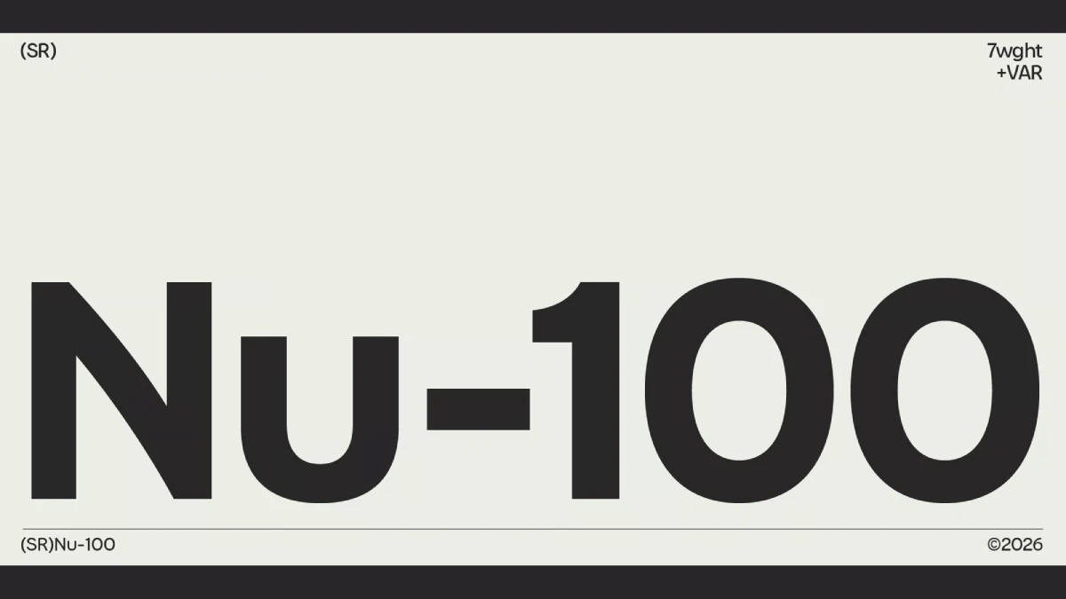
Nu 100 gets one thing right that most retro-minded sans serifs miss. It borrows the attitude of old machines and skips the costume. Santi Rey and Carlos Avila built the Nu 100 font family from a memory of 1960s to 1980s product design, when radios had knobs and calculators had real weight. I think that memory shows in every curved diagonal.
Designers know the problem well. A sans serif looks clean and correct, yet it feels slightly cold. You set it, you ship it, and nobody remembers it. Would your last brand refresh survive a single bent diagonal?
What Is the Nu 100 Font Family?
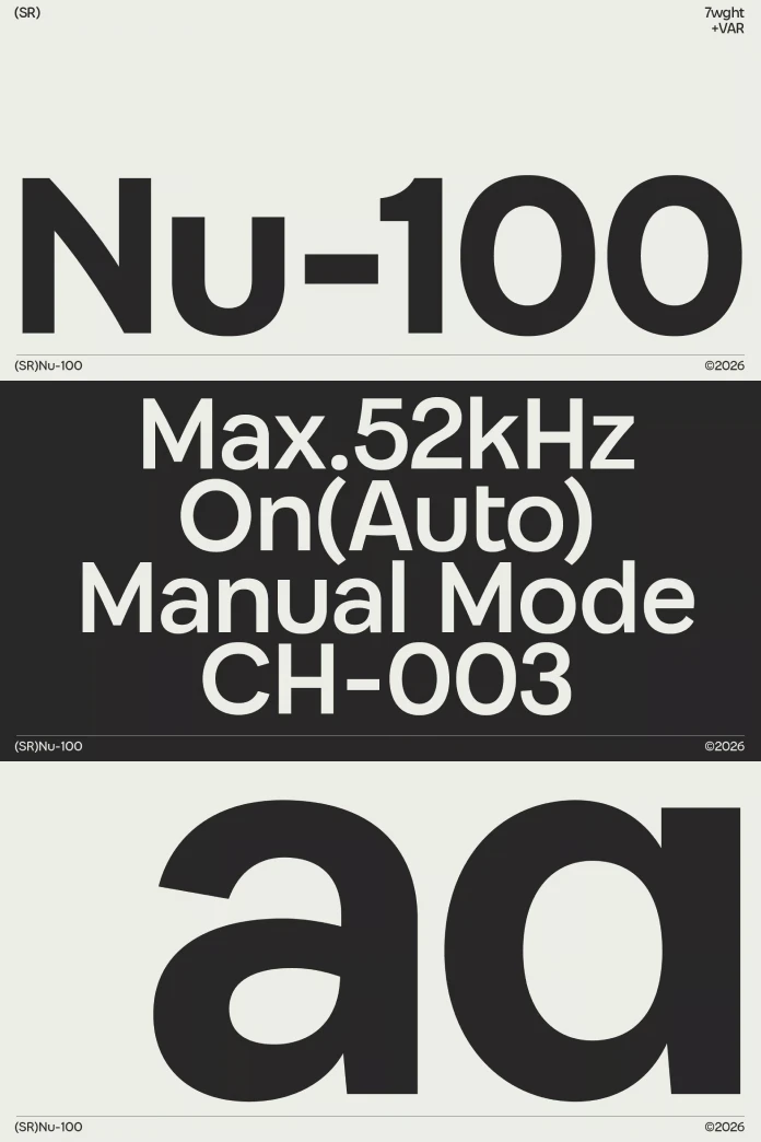
It’s a modern sans serif typeface family designed by Santi Rey and Carlos Avila. Santi Rey’s own foundry publishes it, and MyFonts lists it as SR Nu-100. The family comes in seven weights with more than 400 glyphs. Extended Latin support covers over 50 languages. Those specs let Nu 100 serve a multilingual brand system without a fallback font.
I place Nu 100 between geometric and humanist sans serifs. Rational geometry builds the skeleton. Soft, curved diagonals loosen the joints. The result looks simple at first glance and familiar at second glance, which is exactly why it works.
Why Nu 100 Feels Right for Now
Because screens now run nearly everything, designers miss objects that felt physical, and a typeface that remembers the chunky buttons of the Sony TPS-L2 Walkman from 1979 or the red plastic of the Olivetti Valentine from 1969 gives a layout a texture that no flat gradient can fake.

Those products invited touch. Their lettering usually stayed plain and friendly. Nu 100 answers that same impulse in letterforms. Many nostalgic fonts copy surface effects, such as chrome gradients or pixel grids. It copies an attitude instead. That choice gives art directors a retro-futuristic sans serif font that does not pin a layout to one decade.
Who Is Santi Rey?
Santi Rey is a Spanish typeface designer based in London. He left Madrid for the city in 2014 and worked in advertising for years before he released fonts. He says he designs each family the way he would pick one for his own briefs. That habit explains why his catalog feels usable rather than precious.
Gazpacho arrived in 2021 and still sells well. Later came Hanz, a chunky display face inspired by motorsport. Castellana, a modern sans serif with humanistic touches, debuted on MyFonts in September 2024. Castellana updates the grotesque. Nu 100 revives an era.
How Curved Diagonals Define the Typeface
What a Bent Diagonal Does to a Text Line
Diagonals create motion. In letters such as v, w, x, y, k, and z, a straight diagonal cuts across the line like a ruler. A gently curved diagonal slows the eye and softens the angle. The MyFonts description names this tension between rational geometry and inviting forms, and I agree with it.
The tension shows most in words that stack diagonals. Take wavy. It places a w, a v, and a y in one word, so any stiffness or softness repeats three times. In Nu 100, that repetition should read as rhythm rather than as zigzag.
The Warm Machine Scale: A Four-Point Check
I judge retro-inspired sans serifs with a four-point check. I call it the Warm Machine Scale. Score each point from one to five, then compare the totals across typefaces.
- Curve discipline. Do the bent diagonals follow one logic across the alphabet?
- Counter openness. Do the open forms stay clear at 14 px?
- Grid memory. Does the underlying geometry still show through the softness?
- Era restraint. Does the font hint at a decade without wearing its costume?
Era restraint matters most to me. A font that shouts 1983 dates as fast as 1983 did. Nu 100 earns its place on this scale because its description promises softness without a loss of clarity. So run the test yourself and see whether the promise holds.
Where the Typeface Works Best
Nu 100 for Corporate Design
Brands that sell physical hardware gain the most. A speaker company or a bike lock startup could use Nu 100 on packaging and on the product itself. Seven weights give you room to separate hierarchy by weight alone. For example, set the wordmark in a heavier cut and the labels in a lighter one. That approach keeps a modern sans serif font for branding consistent across a whole product line.
Nu 100 for Editorial Design
Magazine layouts reward a typeface with a clear voice at large sizes. If you set a bold headline at 48 pt above an 18 pt standfirst in a lighter weight, the contrast between the two cuts does most of the hierarchy work before a single rule or accent color enters the page.
Still, watch the diagonals in long paragraphs. Letters like v and w can create uneven color if the spacing runs tight. Adjust tracking by a few units before you judge the face. Among the best sans serif fonts for editorial design, Nu 100 offers a friendlier alternative to the usual neutral grotesque.
Nu 100 for Digital Interfaces
Open forms help at small sizes. Test 14 px labels on a standard display and on a 2x display. Also check the specimen for tabular figures before you build a data-heavy dashboard. It may suit consumer apps with a hardware flavor, such as smart speakers or fitness trackers, better than a spreadsheet tool.
Nu 100 Compared With Helvetica and Futura
Max Miedinger drew Neue Haas Grotesk in 1957, and it became Helvetica in 1960. Helvetica aims for neutrality. Paul Renner released Futura in 1927 and pushed geometry to its purest form. Nu 100 keeps geometry as a skeleton and lets the diagonals bend. As a result, Nu 100 feels more personal than Helvetica and less rigid than Futura.
Gazpacho and Nu 100 share a maker and a refusal to stay neutral. Both faces carry a point of view into the layout. Neither one disappears.
What I Expect Nu 100 to Start
I expect Nu 100 to appear first on audio gear and small-appliance packaging, because those categories already borrow from 1970s design. I also expect more foundries to mine product design archives instead of type specimens. Type history is crowded. Plastic history is not. Watch for logo refreshes that swap geometric stiffness for one bent diagonal.
Nu 100 at a Glance
| Attribute | Detail |
|---|---|
| Name | Nu 100 (listed as SR Nu-100 on MyFonts) |
| Category | Modern sans serif |
| Designers | Santi Rey and Carlos Avila |
| Foundry | Santi Rey |
| Weights | 7 |
| Glyphs | More than 400 |
| Language support | Extended Latin, over 50 languages |
| Inspiration | Product design from the 1960s to the 1980s |
| Signature detail | Curved diagonals inside a geometric structure |
| Best uses | Corporate design, editorial design, digital applications |
| Watch for | Spacing of diagonal letters in long text, and tabular figures for data work |
Q&A:
What is Nu 100?
It’s a modern sans serif font family by Santi Rey and Carlos Avila. It draws on 1960s to 1980s product design and pairs rational geometry with curved diagonals.
Who designed the Nu 100 font family?
Santi Rey and Carlos Avila designed it. Santi Rey’s foundry publishes the family.
How many weights and languages does it offer?
Nu 100 offers seven weights and more than 400 glyphs. Its extended Latin character set covers over 50 languages.
Is it suitable for body text?
Its clear proportions and open forms point toward yes. Still, test a long sample at 16 px with 1.5 line height first. Read three paragraphs heavy in “v,” “w,” and “y” before you approve it.
Where can I get Nu 100?
MyFonts lists it as SR Nu-100 under Santi Rey’s foundry. Read the license terms for desktop, web, and app use before you buy.
Which fonts are similar to Nu 100?
Castellana by the same designer is the closest category match, a modern sans serif with humanistic touches. Nu 100 differs through its product design influence from the 1960s to the 1980s. Set the word “wavy” in both at 16 px and compare the “w,” the “v,” and the “y.”
Browse WE AND THE COLOR’s Fonts category for more.
Subscribe to our newsletter!