
This post contains affiliate links. We may earn a commission if you click on them and make a purchase. It’s at no extra cost to you and helps us run this site. Thanks for your support!
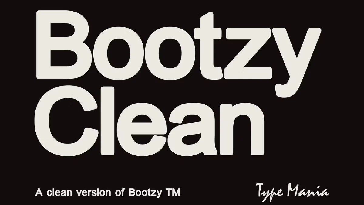
No doubt, Type Mania’s Bootzy Clean TM is a typeface you can put on a poster without apologizing for it. Its forms sit heavy and tight, and the corners stay soft. Type Mania calls the font a tidied version of Bootzy TM, and the previews back that up.
Tight sans serifs often fill record sleeves and social feeds. Many of them look alike. So a typeface needs a reason to exist beyond weight. Does Bootzy Clean TM have one? Let’s find out.
What is Bootzy Clean TM, and how does it differ from Bootzy TM?
Bootzy Clean TM is a heavy, rounded-corner sans serif display typeface for short, loud text at large sizes. That is my working definition, and I will hold it throughout this review.
The foundry is Type Mania. The design descends from Bootzy TM, which we featured on WE AND THE COLOR earlier. We also showed Bootzy Condensed TM. Together, the three faces form a small family with a clear temperament.
The name explains the plan. Clean means fewer rough edges, and the specimens show smooth, controlled outlines. The second specimen calls the font a cleaned-up version of the cult classic. Type Mania recommends Bootzy Clean TM for social media posts, flyers, album covers, and t-shirt designs. That list matches what I see.

How do the letterforms of Bootzy Clean TM look up close?
The details that give the font character
Start with the lowercase t. Its top is cut at an angle, and that single diagonal gives the word “Bootzy” a pulse. Next, look at the y. Its tail curls left and ends in a rounded tip. The a in “Clean” carries a small spur at the bottom right. Meanwhile, the capital C ends in angled terminals, which keeps its big round shape from turning bland.
I like these cuts. Round fonts often go soft and forgettable, and these details prevent that. However, the angles are small. You will miss them at 14 points, and you will enjoy them at 200. Bootzy Clean TM clearly belongs on big canvases.
Spacing that nearly touches
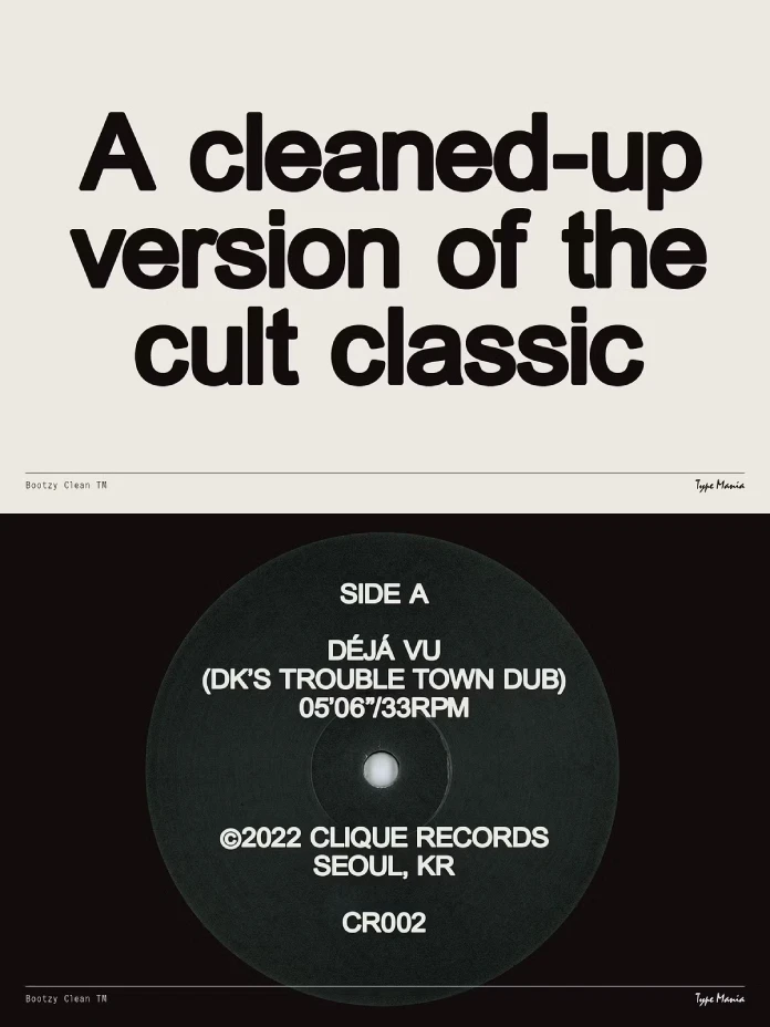
The double o in “Bootzy” leaves almost no air between the bowls. The same tight fit runs through the headline “A cleaned-up version of the cult classic,” where the lines stack with minimal leading. That density is the look.
Because the letters in Bootzy Clean TM already carry so much visual weight, I would leave the tracking at zero and tighten the leading until the lines of even a three-line headline lean on each other the way the specimen does.
What is the Clean Delta, and how does Bootzy Clean TM score?
I use the term Clean Delta for the gap between what a font promises and what it demands from you before it works. It is my own editorial construct, not an industry standard. A high Clean Delta means you will redraw glyphs or kern pairs by hand.
Bootzy Clean TM scores low. In all three specimens, no letter looks like a candidate for redrawing. The spacing holds in a two-line headline, and it holds in a small centered block of capitals. That consistency is the real product, more than the weight.
Of course, previews are not a full character set. I would still run my own copy through the font before I commit to a job. Which glyphs would you check first?
How does Bootzy Clean TM pass the Label Test?
The Label Test is my second construct. Set the font in all caps, center the lines, and shrink everything to the size of a record label. If the text stays readable and still looks designed, the font passes.
The third specimen runs this test for us. It shows a black label for a track titled “DÉJÁ VU (DK’S TROUBLE TOWN DUB).” Below it sit the running time, 05’06”/33RPM, and a line crediting Clique Records in Seoul, catalog number CR002.
Every line uses one size. The hierarchy comes from spacing, so the font must hold that structure alone, and Bootzy Clean TM does. The acute accents on DÉJÁ stay small and crisp. The parentheses curve gently and leave room for the letters inside. The © sits comfortably next to the capitals.
One nitpick belongs to the specimen, not the font. The running time uses curly quotation marks where true prime marks belong. Fix that before you copy the layout.
Where does Bootzy Clean TM hit its limit?
Every heavy display font has a Shout Ceiling. I define it as the amount of text a face can carry before the reader’s eyes tire. For Bootzy Clean TM, I put that ceiling at a headline plus a few short lines. Beyond that, switch to a quieter face.
The previews show a single heavy weight. So hierarchy must come from size and spacing, exactly as the vinyl label proves. That works for posters and covers. It works less well for a brochure with three levels of information. Does your project need that many levels?
Which projects suit Bootzy Clean TM best?
Album covers and record labels
Music is the obvious home. The vinyl specimen makes the case better than any mockup could. Bootzy Clean TM gives a label a calm, confident voice, and it keeps accented titles readable. If you design indie releases, this font belongs on your shortlist of album cover fonts.
T-shirts, flyers, and social media graphics
Heavy letters survive screen printing better than hairline strokes do. That explains why Type Mania lists t-shirt designs among its use cases. On flyers, the tight spacing lets a short event name fill the sheet. On social media graphics, the shapes stay legible even when a feed shrinks them to thumbnail size.
Pairing matters here. Type Mania set its specimen footers in a monospace, and I would copy that move. A plain monospace for small print gives Bootzy Clean TM a quiet counterpart.
Which languages does Bootzy Clean TM support?
The Creative Market listing names six character sets. They are Basic Latin, Western European, Euro, Baltic, Turkish, and Central European. In practice, that covers many European languages plus Turkish. The accented capitals on the record label confirm that at least some diacritics work as promised. Still, test your own special characters before you commit to a project.
What comes next for Bootzy Clean TM?
My prediction is simple. Type Mania will add lighter weights to Bootzy Clean TM, because a single heavy cut limits who can buy it. I would bet on italics too, though I hold that guess loosely.
A bigger pattern is forming. Cleaned-up cuts of cult typefaces will become a standard release strategy for small foundries. Designers want the attitude without the cleanup work, and the Clean Delta gives them a way to judge it. Bootzy Clean TM is an early, convincing example.
Bootzy Clean TM at a glance
| Attribute | Details |
|---|---|
| Typeface | Bootzy Clean TM |
| Foundry | Type Mania |
| Category | Heavy sans serif display font with rounded corners |
| Origin | Tidied version of Bootzy TM |
| Related WATC coverage | Bootzy TM and Bootzy Condensed TM |
| Intended use | Social media, flyers, album covers, t-shirt designs |
| Language support | Basic Latin, Western European, Euro, Baltic, Turkish, Central European |
| Where to buy | Creative Market |
| Strengths | Tight spacing, soft corners, angled details in t, y, a, and C, readable on a small record label |
| Limits | One heavy weight in the previews, not suited to body text |
| Editorial terms used | Clean Delta, Label Test, Shout Ceiling |
FAQ about Bootzy Clean TM
What is Bootzy Clean TM?
Bootzy Clean TM is a heavy sans serif display font from Type Mania. It is a tidied version of Bootzy TM, made for social media posts, flyers, album covers, and t-shirt designs.
Where can I get Bootzy Clean TM?
Type Mania lists the font on Creative Market. Check the license terms there before you use it on merchandise.
How does Bootzy Clean TM differ from Bootzy TM and Bootzy Condensed TM?
Bootzy Clean TM removes rough edges from the original. Bootzy Condensed TM is a narrower cut. We covered both on WE AND THE COLOR earlier.
Does Bootzy Clean TM support accented characters?
Yes. The listing names Western European, Central European, Baltic, and Turkish sets, and the vinyl specimen shows accented capitals in DÉJÁ VU.
Is Bootzy Clean TM good for body text?
No. Bootzy Clean TM is a display font. The vinyl label specimen runs seven short lines, and that is about as much text as I would set.
Check out WE AND THE COLOR’s Fonts category or take a look at our selection of the best retro fonts.
Subscribe to our newsletter!