This post contains affiliate links. We may earn a commission if you click on them and make a purchase. It’s at no extra cost to you and helps us run this site. Thanks for your support!
The Aptos font family is the most successful typeface nobody asked for. Millions of people type in it every day. Almost none can name it. That anonymity is its greatest achievement, and it is also its biggest flaw.
Microsoft swapped Calibri for the Aptos font family in July 2023. Calibri has held the default slot in Word, Excel, PowerPoint, and Outlook since 2007. Since then, I have set memos, tables, and slide decks in the Aptos font family. My verdict is blunt. It works better than its reputation suggests. However, it also signals “Microsoft 365” louder than any brand should want.
This guide to the Aptos font family offers a working definition and a four-gate test. It also coins two terms, Default Gravity and Signal Cost, and answers the licensing question directly.
What Is the Aptos Font Family?
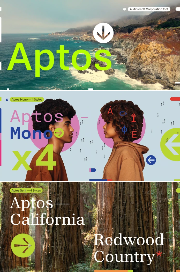
Quick definition. The Aptos font family is a neo-grotesque sans serif by type designer Steve Matteson. Microsoft Corporation released it in 2023 as the default font of Microsoft 365. It replaced Calibri in Word, Excel, PowerPoint, and Outlook.
Matteson first called the design Bierstadt, after Mount Bierstadt in Colorado. He later renamed it after Aptos, a small unincorporated town near Santa Cruz, California. Microsoft announced the new name on July 13, 2023. Matteson also drew Segoe and Open Sans, so he knows how a default font behaves in the wild.

Microsoft commissioned five candidates in 2021. Bierstadt, Grandview, Seaford, Skeena, and Tenorite all landed in the Office font picker. Microsoft then weighed user feedback and chose Bierstadt. The other four remain available as options. Only the Aptos font family became the default.
The brief asked for sharp, uniform letterforms that also work as display type. The target was higher-resolution screens. That context matters, because it explains almost every drawing decision in the font family.
Why Does the Aptos Font Family Follow a Rendering-Era Rule?
Microsoft’s type history explains the Aptos font family better than any press release. The MyFonts description of the Microsoft Typography Group tells the story. TrueType arrived with Windows 3.1. Microsoft and Monotype then tuned Arial, Times New Roman, and Courier New for the screen.
The mid-1990s brought new designs. Matthew Carter drew Verdana, Georgia, and Tahoma. Vincent Connare drew Trebuchet and Comic Sans. Microsoft offered these core fonts free on the web until August 2002. Then it ended the downloads and cited abuse of the license terms.
ClearType followed in 1998. It addresses the red, green, and blue subpixels of an LCD screen one by one. Calibri, drawn by Lucas de Groot, belongs to that generation. It became the Office default in 2007.
I call this pattern the Rendering-Era Rule. Microsoft’s default typeface tracks the dominant display technology of its time. ClearType-era screens gave the company Calibri. Dense modern displays gave it the Aptos font family.
The rule also makes a prediction. Microsoft will replace Aptos only when display technology changes again. Taste alone will not push it out.
What Makes the Aptos Font Family Look Different Up Close?
The Tail on the Lowercase “l”
One detail decides whether the Aptos font family works as a document font. It is the tail on the lowercase “l.” Microsoft’s own design post says the tail separates the “l” from the capital “I.”
Plain grotesques ignore that problem. Set “Illinois” in Arial, and the first three letters become near-identical vertical strokes. Names, URLs, serial numbers, and passwords all suffer from this. The font family fixes it without drawing attention to itself.
Check it yourself. Type Il1 in Aptos, then in Arial. Print both rows and judge the paper, not the screen preview. I would argue this one tail does more for document safety than any other choice in the font family. A misread character in an invoice costs real money.
The Smaller Signals
Matteson says he added a slight swing to the R and gave the “g” a double-stacked form. Round dots sit on the i and j. The 6 uses a single stroke, and the 8 stacks two ellipses. Stem ends stay clean-cut. Together, these details give the Aptos font family a human edge without softening its structure.
How Is the Aptos Font Family Built?
Microsoft Learn lists 28 font files for the Aptos font family, spread across five cuts. They are Aptos, Aptos Display, Aptos Narrow, Aptos Mono, and Aptos Serif. Aptos Slab also appears in the Microsoft 365 cloud font set.
The main cut climbs six rungs. Light, Regular, SemiBold, Bold, ExtraBold, and Black all come with italics. I call this the Weight Ladder.
Most Office users never climb past Bold. That wastes the Aptos font family. SemiBold is the rung I use most, because it marks table headers and callouts without the heaviness of Bold. I could be wrong about that, and you should test it on your own tables.
The companion cuts serve narrower jobs. Aptos Display targets headlines, while Aptos Narrow tightens dense columns, and Aptos Mono and Aptos Serif let you set code and long reading text without leaving the family.
Aptos Font vs Calibri: Which Works Better?
Calibri’s rounded corners gave documents a friendly softness. The Aptos font family trades that softness for structure. My take is simple. I prefer the Aptos font family on modern displays and in tables. Calibri still looks warmer in long memos. A reasonable reader could disagree, and many do.
Default Gravity explains why the debate barely matters. It describes the pull a default font exerts on every document that nobody restyles. Calibri enjoyed that pull from 2007 to 2023. Aptos has it now. Most files will stay in the font family simply because nobody opens the settings menu.
Microsoft does let you choose your own default. It also kept Calibri pinned at the top of the new web font menu. So the choice is yours. Few people make it.
How Do You Test the Aptos Font Family? The Four-Gate Method
I run four gates on the Aptos font family and on every other Office typeface. Each gate takes about five minutes. A font that fails one gate needs a different job.
Gate 1, Confusables. Type Il1 and O0 at 11 points. Check the “l” tail first. Then compare the zero with the capital O.
Gate 2, Weight Ladder. Set one table header in SemiBold and again in Bold at 9 points. Print both. Decide which one separates the header from the data without shouting.
Gate 3, Numerals. Paste a column of figures into Excel. Look at alignment, then study the 1, 6 and 8 at small sizes. Microsoft redrew the 6 and 8, so these digits deserve a close look.
Gate 4, Fallback. Send the file to a colleague on an older Office install. Watch what replaces Aptos. Microsoft offers a local download for such machines, which solves the problem only if your colleague installs it.
Can You Use the Aptos Font Family in Client Work?
Treat licensing of the Aptos font family as a gate of its own. Microsoft 365 subscribers receive Aptos through cloud fonts inside Office apps. Microsoft Learn also links a download for local installation. A download, however, is not a distribution license.
A subscription licenses the software. It does not license redistribution of the typeface. It also does not cover web embedding or shipping Aptos inside an app. Microsoft Learn points to separate licensing for web developers and redistribution. Read that page before you promise a client anything.
If a project needs a free stand-in, I reach for Inter. It ships under the SIL Open Font License. It is the closest free option I know, though it is no clone.
Signal Cost is the second term I want you to keep. It names what Aptos charges a brand for using it. Readers now associate the Aptos font family with internal Microsoft 365 documents. A logo or campaign set in the Aptos font family spends that association.
Institutions already treat defaults as statements. The U.S. State Department switched to Calibri in 2023. In December 2025, it ordered a return to Times New Roman at 14 points.
Where Is the Aptos Font Family Heading?
By 2028, the Aptos font family will carry the same boring-slide stigma that Calibri carries today. Familiarity breeds contempt among designers. I expect agencies to write “no Aptos” into brand briefs within two years.
Microsoft will keep extending the Aptos font family. Slab and Mono already show the direction. Expect more cuts before Microsoft considers a replacement.
Meanwhile, the Rendering-Era Rule suggests the next default arrives with the next display change. Until then, the Aptos font family stays where it is.
Aptos Font Family at a Glance
| Attribute | Detail |
|---|---|
| Designer | Steve Matteson |
| Foundry | Microsoft Corporation |
| Original name | Bierstadt |
| Classification | Neo-grotesque sans serif |
| Rename announced | July 13, 2023 |
| Replaced | Calibri (default since 2007) |
| Main cut weights | Light, Regular, SemiBold, Bold, ExtraBold, Black, each with italic |
| Companion cuts | Aptos Display, Aptos Narrow, Aptos Mono, Aptos Serif, Aptos Slab |
| Files on Microsoft Learn | 28 |
| License | Proprietary, included with Microsoft 365 cloud fonts |
| Signature detail | Tail on the lowercase l |
| Best for | Memos, tables, slide decks, interface text |
| Weak for | Brand identity, because of Signal Cost |
| Closest free alternative (my pick) | Inter |
| Terms coined here | Rendering-Era Rule, Weight Ladder, Default Gravity, Signal Cost |
Frequently Asked Questions About the Aptos Font Family
Who designed the Aptos font family?
Steve Matteson designed it. Microsoft Corporation published it. Matteson also drew Segoe and Open Sans.
Is the Aptos font family free?
Not in the open-source sense. Microsoft 365 subscribers get the Aptos font family through cloud fonts. Microsoft also offers a local download. Web use and redistribution need a separate license from Microsoft.
Why did Microsoft replace Calibri with the Aptos font family?
Microsoft wanted a sharper, more uniform default for higher-resolution screens. Calibri had served since 2007. Microsoft announced the replacement on July 13, 2023.
What was Aptos called before?
Bierstadt. Matteson named it after Mount Bierstadt in Colorado, then renamed it after the California town of Aptos.
What is the best free alternative to the Aptos font?
I recommend Inter as a stand-in for the Aptos font family. It is free under the SIL Open Font License and suits interface and document text.
Can I still use Calibri?
Yes. Calibri stays available next to the Aptos font family. Office settings let you pick any default.
Does the old Bierstadt name still appear in Office?
Yes. Microsoft kept Bierstadt in the font drop-down for people who have not accepted the new name.
Browse WE AND THE COLOR’s Fonts category for more.
Subscribe to our newsletter!