
This post contains affiliate links. We may earn a commission if you click on them and make a purchase. It’s at no extra cost to you and helps us run this site. Thanks for your support!
Without a Doubt, Hannes von Döhren’s Brandon Grotesque Is the Geometric Sans Typeface With Manners.
I wrote a short post about it here years ago, but I have to admit that post undersold it because Brandon Grotesque is the best friendly geometric sans serif released since 2010. Hannes von Döhren’s family now spans 48 core styles, so Brandon Grotesque finally deserves a full review.
You can see them everywhere. Geometric sans serifs fill every startup homepage, but most of them feel cold. However, the Brandon Grotesque font family still feels like a person drew it. That quality explains why the family keeps winning projects sixteen years after its launch.
Brandon Grotesque is available for purchase from:
This review covers the typeface and the superfamily around it. It also names two working tools, the Role Ladder and the Handoff Threshold. Besides that, I give my honest criticism, because a font this popular needs some.
Brandon Grotesque is available for purchase from:

What Makes Brandon Grotesque Different From Other Geometric Sans Serifs?
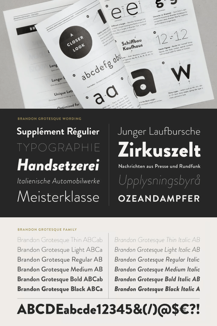
Brandon Grotesque is a geometric sans serif that Hannes von Döhren designed in 2009 and 2010. HVD Fonts publishes it in six weights with matching italics. The weights run from Thin to Black.
The influence comes from the 1920s and 1930s, the decades that gave us Futura. Von Döhren then corrected the geometric forms optically, so they read better on the page. In practice, he kept the circles and removed the stiffness.
I define warm geometry as a geometric skeleton with human proportions. Brandon Grotesque is the clearest example I know. The small x-height does much of the work, because short lowercase letters give every line a quiet, open texture.
Spacing matters just as much. Igino Marini of iKern spaced and kerned the fonts, and his work shows in every headline. Futura spreads wide across a line. By contrast, Brandon Grotesque holds its letters closer without losing air.
Gotham makes a useful contrast. It has a large x-height and a sturdy, civic tone. Brandon Grotesque sounds quieter and more personal. I would choose Brandon Grotesque over Futura for any brand that wants people to like it, not just admire it.
Who Is Hannes von Döhren, and What Is HVD Fonts?
From Art Director to Full-Time Type Designer
Hannes von Döhren is a German type designer based in Berlin. He worked as an art director at an advertising agency before he turned to type in 2008. HVD Fonts released its first family, Embryo, in March 2009.
That agency background shapes everything he draws. He says he always judges a typeface from the graphic designer’s seat too. So Brandon Grotesque solves problems that art directors actually face. Think of a logo that must look friendly on a bakery bag and credible on an invoice.
What HVD Fonts Builds
HVD Fonts publishes playful and professional typefaces side by side. The catalog includes FF Mark, Pluto, Reklame Script, Niveau Grotesk, and HVD Comic Serif, the Comic Sans spoof. With his lifelong friend Livius Dietzel, von Döhren also created Livory, Brix Slab, and FF Basic Gothic.
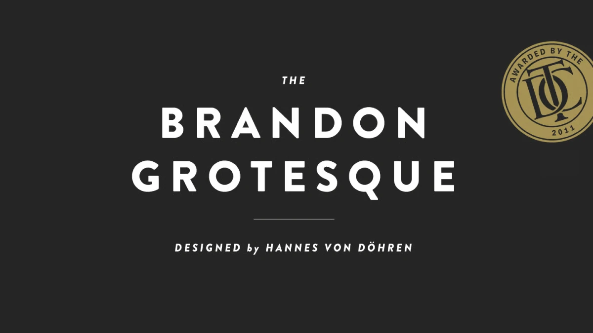
The studio also takes custom commissions. Clients have included Lufthansa, Volkswagen, Hyundai, and Walmart. Awards followed too. Brandon Grotesque earned a Type Directors Club award in 2011. The foundry also lists iF and Red Dot awards.
Which Brandon Subfamilies Make the Superfamily So Complete?
Brandon Grotesque no longer stands alone. By my count, the superfamily now holds 64 styles across seven families, and each one has a clear job. The table below shows the Role Ladder I use to keep them straight.
| Family | Styles | Year | Job on the ladder |
|---|---|---|---|
| Brandon Grotesque | 12 | 2010 | Headlines, wordmarks, brand voice |
| Brandon Text | 12 | 2012 | Body copy at small sizes |
| Brandon Grotesque Condensed | 12 | 2018 | Tight headlines, packaging, posters |
| Brandon Text Condensed | 12 | After 2018 | Narrow captions, tables, interface labels |
| Brandon Printed | 8 | 2014 | Textured display, badges, labels |
| Brandon Grotesque Office | 4 | Not stated | Display text in Microsoft Office |
| Brandon Text Office | 4 | Not stated | Body text in Microsoft Office |
Brandon Grotesque, the Display Voice
The original family has twelve styles. HVD says Thin and Black perform best at display sizes, while the middle weights suit longer texts. I agree with the first half. For the second half, I keep Brandon Grotesque to short passages and hand long reading to its companion.
Brandon Text, the Reading Voice
Brandon Text arrived in 2012 as the companion to Brandon Grotesque. It has a higher x-height, and HVD optimized it for long texts and small sizes on screens. It also offers six weights with italics, so the twelve styles mirror the original. The two families pair without friction because they share one skeleton.
The Condensed Pair
Brandon Grotesque Condensed appeared in 2018. HVD drew it from scratch and kept it near 83 percent of the original width. Sharp angles give it a sterner face than its wider sibling. After that followed Brandon Text Condensed to complete the series, and it started from the Grotesque Condensed shapes.
Brandon Printed, the Textured Cousin
Brandon Printed debuted in January 2014 with eight styles. It gives Brandon Grotesque an eroded, printed look. Shadow and inline versions let you stack layers. The package also includes 95 extras, such as arrows, stars, emblems, and lines. Note that the fine detail can slow some applications.
The Office Sets
Brandon also covers Microsoft Office. Brandon Text Office contains four style-linked fonts. The B and I buttons in Word and PowerPoint therefore work as expected. HVD hinted them by hand. A Brandon Grotesque Office set offers four styles as well.
How Does Brandon Grotesque Behave in Real Layouts?
Headlines and Wordmarks
Medium is the best weight in the family. I reach for it first in wordmarks because it keeps the friendly curves without the weight of Bold. Bold still earns its place in headlines. Black belongs on posters and packaging, where size forgives its density.
Which weight would you pick for a bakery logo? Set three weights side by side at 48 px and compare the counters. The differences appear faster than any spec sheet suggests.
All-Caps Labels
The capitals look elegant, yet small all-caps labels need extra room. I add 20 to 40 units of tracking and then check the result at actual size. Without that step, a row of capitals can read as one gray block.
Long Text and the Handoff Threshold
The Handoff Threshold is the size where a layout should pass text from Brandon Grotesque to Brandon Text. My rule sits at about 16 px on screen and 10 pt in print. Below that line, the higher x-height of Brandon Text wins on clarity. Where does your layout start to strain?
Test it yourself. Set one paragraph in each family at 11 pt and compare the lowercase. You will see the difference in rhythm within a few lines.
Numerals, Alternates, and Language Coverage
The whole Brandon series offers alternate letters and fractions, plus several sets of numbers. That matters for menus and price lists. Check the figure styles before you start a table-heavy project. Also, the family supports at least 116 languages, including Greek and Cyrillic.
Creative Cloud subscribers can activate Brandon Grotesque through Adobe Fonts. That route lets you test it in a real layout before you buy a desktop license.
Where Does Brandon Grotesque Fall Short?
Brandon Grotesque has three weak spots, and I will name them plainly.
First, Thin looks fragile. Below about 24 px, the hairlines fade on ordinary screens. Use that weight only for large display lines.
Second, popularity dulls distinction. Many boutique brands use the family, so a Brandon Grotesque wordmark rarely looks unique. I call this Brandon Fatigue. The cure is a distinctive pairing, such as a high-contrast serif next to the headlines.
Third, the cost adds up. At the time of writing, each 12-style family lists at $249, so the four core families reach $996. Brandon Printed adds $99. As far as I know, no variable version exists either, so continuous weight axes are off the table.
How Does Brandon Grotesque Compare With Futura, Gotham, and Avenir?
Comparisons help most when they name specifics. The table below sets four geometric sans serifs side by side. In my view, Avenir comes closest to Brandon Grotesque in temperament, although its x-height runs taller.
| Typeface | Designer | Year | X-height | Tone | Best use |
|---|---|---|---|---|---|
| Futura | Paul Renner | 1927 | Small | Formal, cool | Fashion and editorial headlines |
| Gotham | Tobias Frere-Jones | 2000 | Large | Sturdy, civic | Signage and institutional campaigns |
| Avenir | Adrian Frutiger | 1988 | Moderate | Smooth, balanced | Corporate text and branding |
| Brandon Grotesque | Hannes von Döhren | 2010 | Small | Warm, personal | Wordmarks, packaging, headlines |
How Should You Choose the Right Brandon Family?
The Role Ladder gives each Brandon family one job. Brandon Grotesque speaks for the brand, and Brandon Text carries the reading. Condensed saves space, Printed adds texture, and the Office sets keep Word documents consistent. Pick the rung before you pick the weight.
Next, apply the Handoff Threshold. Then check for Brandon Fatigue before you present. If a wordmark could belong to any boutique, change the pairing and keep the typeface.
What Will Happen to Brandon Grotesque in 2027 and Beyond?
I predict four developments. First, HVD will release variable versions of the family. None exist today as far as I know, and weight axes now matter for responsive design.
Second, the condensed pair will grow fastest. Dashboards and mobile interfaces need narrow, legible text, and Brandon Text Condensed fits that gap.
Third, Brandon Printed will ride the texture trend. Brands that want an analog feel will set its eroded surface against clean digital layouts.
Fourth, Brandon Fatigue will push designers toward unusual pairings. Expect Brandon Grotesque headlines beside sharp serifs rather than beside another geometric sans.
Brandon Grotesque at a Glance
| Attribute | Detail |
|---|---|
| Designer | Hannes von Döhren, German type designer based in Berlin |
| Foundry | HVD Fonts |
| Release | Designed 2009 and 2010 |
| Classification | Geometric sans serif |
| Weights | Thin, Light, Regular, Medium, Bold, Black, each with italics |
| Core families | Four families, 48 styles |
| Language support | At least 116 languages, including Greek and Cyrillic |
| Recognition | Type Directors Club award, 2011 |
| Best for | Wordmarks, packaging, headlines, editorial design |
| Weak spots | Fragile Thin weight, high popularity, cumulative cost |
| List price | $40 per style, $249 for the 12-style family |
| My verdict | The warmest geometric sans serif for brand work |
Brandon Grotesque is available for purchase from:
Frequently Asked Questions About the Brandon Grotesque Font Family
Who designed Brandon Grotesque?
Hannes von Döhren, a German type designer based in Berlin, designed Brandon Grotesque. His foundry, HVD Fonts, publishes it.
When did Brandon Grotesque come out?
Von Döhren designed it in 2009 and 2010. Brandon Text followed in 2012, and the condensed version arrived in 2018.
How many styles does the Brandon superfamily have?
The four core families contain 48 styles. Brandon Printed adds eight, and the two Office sets add four each, so I count 64 in total. The series supports at least 116 languages.
What is the difference between Brandon Grotesque and Brandon Text?
Brandon Text has a higher x-height, and HVD tuned it for long texts and small sizes. Brandon Grotesque suits headlines and brand voice.
Is Brandon Grotesque good for body text?
It works for short passages in the middle weights. For long reading at small sizes, switch to Brandon Text.
Which free fonts resemble Brandon Grotesque?
Poppins and Hanken Grotesk come close in geometry. However, neither matches its proportions or its warmth.
Is Brandon Grotesque free?
No. HVD Fonts sells it commercially. At the time of writing, a single style costs $40, and the 12-style family costs $249.
Which Brandon Grotesque weight works best for logos?
Start with Medium. If the mark feels timid, try Bold. Test every candidate at 16 px, the favicon size, because Thin disappears there first.
Browse WE AND THE COLOR’s Fonts category, or take a look at the top 10 hottest font styles for 2027.
Subscribe to our newsletter!