
This post contains affiliate links. We may earn a commission if you click on them and make a purchase. It’s at no extra cost to you and helps us run this site. Thanks for your support!
Yes, I say it out loud: Montreux Grotesk is the Swiss-style sans I would pick over Helvetica for most new interface work. Roch Modrzejewski designed it, and his Kraków foundry ROHH released it in 2019. I like it because it stays quiet. Most grotesks fight for attention. This one holds the grid and lets your content speak.
Swiss typography casts a long shadow, and any designer raised on Helvetica or Akzidenz-Grotesk knows the pull of that neutral look, though the same designer also knows how rare it is to find a modern version that pairs a true variable font with interface-ready proportions and enough weights to carry a whole product system.
Here is my thesis. Montreux Grotesk works best as an invisible layer, and that is what a serious type system needs.
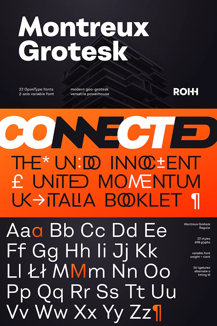
What Is Montreux Grotesk?
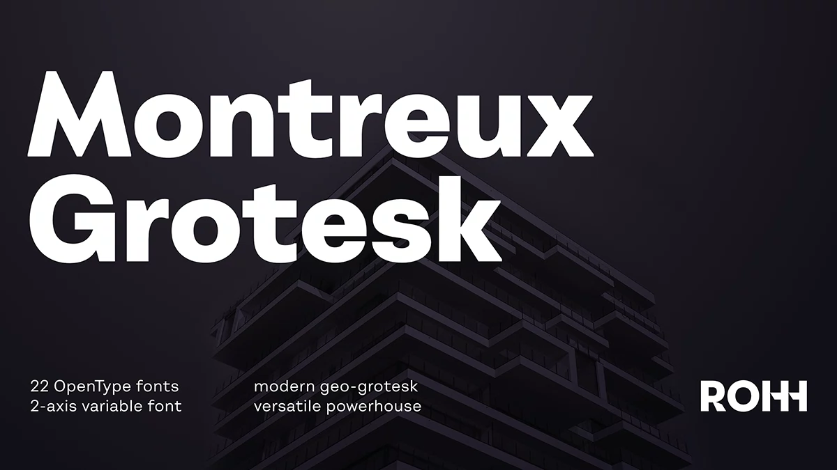
Montreux Grotesk is a geometric Swiss-style grotesk sans serif by Roch Modrzejewski, published by ROHH. According to MyFonts, the Montreux Grotesk font family contains 22 fonts. Those fonts cover 11 weights, each with a matching italic. A variable version adds two axes, weight and slant.
Here is the definition I use in my own notes. A geometric grotesk keeps Swiss proportions but bends its forms toward geometry. Montreux Grotesk fits that definition.

Who Is Behind the Typeface?
Roch Modrzejewski founded ROHH in 2015 in Kraków, Poland. He studied in Poland, Germany, and Switzerland, and he graduated in Kraków and Basel. Basel hosts the design school where much of Swiss typography took shape. The name Montreux Grotesk nods to Switzerland as well, since Montreux sits on Lake Geneva.
How the Family Fits the ROHH Type System
ROHH builds large type systems rather than lone families. MyFonts describes Rothorn as a geometric sibling of Montreux Grotesk, which it labels the Swiss-style grotesk of the group. The same system includes Lütschine, a narrow headline family, and Conthey, a narrow unicase headline family. Montreux Classic and Montreux Jazz Soft share the name too.
That helps with pairing. You can build headlines and text inside one foundry’s logic.
How Does Montreux Grotesk Compare to Helvetica?
Luc Devroye’s type archive describes Montreux Grotesk as a universal sans that leans a bit more geometric than Helvetica. I agree with that reading. The gap is small, yet small gaps decide whether a headline feels cold or clean.
Helvetica brings nearly seven decades of habit. Montreux Grotesk brings none, which makes it easier to build a fresh identity around it.
ROHH’s later family Axalp Grotesk, released in 2022, adds rounded shapes and sharp angular details. Its product page pitches it as an alternative to Akzidenz-Grotesk, Univers, and Helvetica. Pick Axalp Grotesk for personality. Pick Montreux Grotesk for restraint.
Why the Variable Axes Matter
Two axes sound modest. They aren’t. I call the principle the Axis Budget: every axis in a variable font costs file size and design decisions. Montreux Grotesk spends that budget on weight and slant, and I think that is the right split for product work.
Weight needs little explanation. Slant deserves more attention. A slant axis lets you move between upright and italic along a continuous range instead of jumping between two fixed styles.
For a team, that means one variable file can stand in for a stack of static files. Fewer requests also help page speed.
Try this yourself. Set one paragraph at two nearby weights and compare the texture. A variable font lets you tune that in small steps, so a dark mode can run one notch lighter than a light mode. Montreux Grotesk supports that workflow.
Where Montreux Grotesk Works Best
Montreux Grotesk for UI and Product Design
MyFonts says the family targets user interfaces and longer text, with carefully tuned proportions and spacing. I would test it first in a dashboard. Numbers and labels dominate dashboards, and a grotesk with even spacing earns its keep there.
Editorial and Print Use
Magazine publishers appear on the MyFonts list of target industries. That fits. A neutral grotesk disappears into long articles, and a good art director often wants exactly that. Still, set a long sample before you decide. Text color depends on your paper and your point size.
Branding for Architecture and Fashion
Architecture studios and fashion labels both want quiet type that lets images lead. MyFonts names both among its target industries. Montreux Grotesk suits that brief, particularly in all-caps wordmarks with generous tracking.
Where Montreux Grotesk Falls Short
No neutral grotesk suits every brief. If your client wants a voice, Montreux Grotesk stays politely silent.
I also checked the description for stylistic alternates. The MyFonts text I worked from doesn’t mention any for Montreux Grotesk, while the pages for Axalp Grotesk and Reeti list an alternate stylistic set.
Size has a cost too. Twenty-two fonts mean twenty-two decisions, so settle on three or four weights early. Licensing also needs attention. Desktop, web, and app licenses differ, so read the terms before you commit.
Montreux Grotesk at a Glance
| Attribute | Detail |
|---|---|
| Designer | Roch Modrzejewski |
| Foundry | ROHH, Kraków, Poland |
| Release year | 2019 |
| Category | Geometric Swiss-style grotesk sans serif |
| Fonts | 22 (11 weights, each with an italic) |
| Variable font | Yes, two axes (weight and slant) |
| Optimized for | User interfaces and longer text |
| Target industries | Technology, new media, architecture, magazine publishing, fashion |
| Closest classic | Helvetica |
| Siblings in the ROHH system | Rothorn, Lütschine, Conthey |
| Option with more personality | Axalp Grotesk |
| Introductory price | $199 regular, $79.60 offer, 60% off (MyFonts newsletter, check the current price) |
Where Montreux Grotesk Goes Next
My prediction is simple. By 2028, two-axis variable files will be the default delivery format for Swiss-style grotesks, and static files will become the extra. ROHH already builds most of its new designs as multi-axis variable fonts, according to its MyFonts profile. Montreux Grotesk arrived in 2019, early in that curve.
I also expect slant to become a design token in UI systems, next to weight. Is your design system ready for that?
Q&A:
Who designed it?
Roch Modrzejewski designed the family. ROHH, his Kraków foundry, published it in 2019.
How many fonts does Montreux Grotesk include?
The MyFonts description lists 22 fonts, made of 11 weights and 11 italics. It also describes a variable font with weight and slant axes.
Is Montreux Grotesk a variable font?
Yes. The family offers a variable font with two axes, weight and slant.
Is Montreux Grotesk good for UI design?
Yes. MyFonts says the family targets interfaces and longer text. I would start with dashboards and data tables.
Is it a Helvetica alternative?
Yes, for projects that need Swiss proportions with a more geometric edge. Axalp Grotesk is the ROHH option with more personality.
How much does Montreux Grotesk cost?
A MyFonts newsletter listed the full family at $199 and an introductory price of $79.60, a saving of 60%. Prices change, so check the product page.
Feel free to browse WE AND THE COLOR’s Fonts category for more.
Subscribe to our newsletter!