
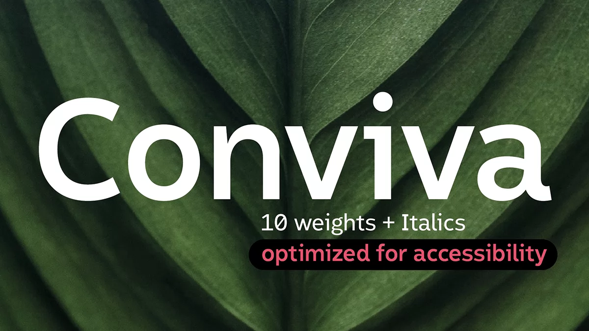
The Conviva font family treats accessibility as a drawing problem, and Julien Fincker solves it letter by letter. He released this humanistic sans serif on October 25, 2026, through his foundry Fincker Font Cuisine. Julien was kind enough to send me the font files so I could test the family myself.
At first sight, clean shapes and a precise rhythm make the Conviva font family easy to like. Yet the details do the real work. For example, the characters 1, I, l, and i look nearly identical in many sans serifs, but Conviva draws them apart. That one decision therefore matters on signs and screens, where readers cannot stop to decode a character.
Accessibility is now a legal matter, too. The European Accessibility Act has applied since June 28, 2025, and it reaches online shops and ticketing machines. Of course, a typeface cannot make a product compliant. It can, however, remove one reason to fail, and the Conviva font family goes after that reason at the level of single characters.
What Is the Conviva Font Family?
Here is the short definition. The Conviva font family is a humanistic sans serif by Julien Fincker, and Fincker Font Cuisine released it on October 25, 2026. Altogether, it offers 10 weights with matching italics, which makes 20 styles with 1,369 glyphs each.
Julien Fincker took the name from the Spanish verb convivir, which means to live together. Also, the specimen repeats that idea in four languages, with “vivre ensemble,” “zusammen leben,” “convivir,” and “living together” on one page. Few specimens back such a phrase with real drawing decisions. The Conviva font family does.
Julien is French and lives near Stuttgart. He studied communication and graphic design and later worked at Grafisches Atelier Stankowski + Duschek, a studio that carries the name of Anton Stankowski, who drew the Deutsche Bank logo in 1974. Then in 2018 he drew his first letters and, at the start of 2019, released his first typeface. So the Conviva font family arrives nearly eight years after that first release.

Why Letter Recognition Drives the Conviva Font Family
First, readers recognize letters, and recognition fails when characters look alike. Julien Fincker therefore designed the Conviva font family on that premise. According to his specimen, studies show that readers identify letters more easily by their upper half than by their lower half. Hence, he separates look-alike letters at the top.
Because the press material refers to studies without naming them, I treat the upper-half claim as the foundry’s working theory, yet the drawings in the specimen follow that theory so consistently, across all four accessibility pages, that it earns respect on practical grounds.
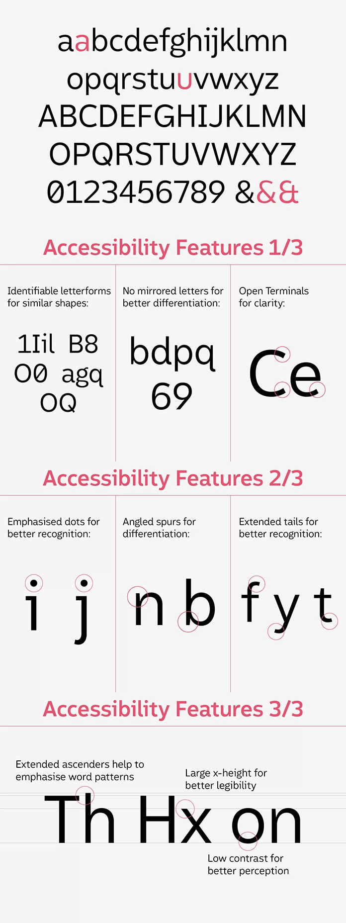
The 1, I, l, and i Test
Here, the specimen sets 1, I, l, and i in the Conviva font family next to the same characters in another font. In the other font, the three upright strokes nearly merge. Conviva, by contrast, keeps each character distinct. Julien also says small details solve the problem without hurting the formal look of the typeface. The sample supports him.
B8, O0, OQ, and the Mirror Pairs
B and 8, O and 0, and O and Q get the same treatment. Likewise, the zero looks clearly different from the capital O in the sample. Letters that mirror each other need their own fix. After all, the brain treats a mirrored object as the same object, and that shortcut helps in daily life but hurts when b, d, p, and q read as reflections of each other. Thus, Julien Fincker alters certain details so that those four letters, along with 6 and 9, stop behaving like twins. People with reading difficulties gain the most, according to the specimen.
Would your current body font pass these three checks?
Four More Features, One Sentence Each
- Open shapes keep c, e, and o apart when the image blurs.
- Clear, highlighted dots mark the i and the j.
- Angled spurs separate n and b, and extended tails help f, y, and t.
- Extended ascenders, a large x-height, and low contrast support the reading flow.
Which Weights of the Conviva Font Family Suit Accessible Design?
For accessible design, Julien Fincker recommends the weights from Light to Extrabold in the Conviva font family. That range covers Light, Book, Regular, Medium, Bold, and Extrabold, so 12 of the 20 styles qualify. Meanwhile, the specimen grays out Thin, Extralight, Heavy, and Black.
His reasoning is plain. Thin strokes get hard to see in low light, while thick strokes look dark on the page. Medium weights, in contrast, keep a stroke thickness that stays legible under difficult conditions.
I rarely see a foundry gray out four of its ten weights in its own specimen. That honesty makes the Conviva font family more credible to me. Still, Heavy and Black suit display work, and the specimen sets GREEN DEMOCRACY in a heavy weight to show it.
The Clean Look of the Conviva Font Family
On a leaf photograph, the specimen sets the word Handglöves in huge white letters and tags eight traits. These include a large x-height, tapered spurs and terminals, extended ascenders, low contrast, and open apertures. The umlaut also points to multilingual support, and the whole construction follows a humanistic approach.
My own reading is short. Here, low contrast gives the strokes an even tone, and the large x-height gives lowercase text a calm, open look. Together, they make the Conviva font family precise and friendly at once.
Classification helps here. For example, the humanistic skeleton places Conviva closer to Frutiger than to Helvetica, and Adrian Frutiger drew Frutiger for the signage at Charles de Gaulle Airport in Paris. Similarly, Atkinson Hyperlegible, which the Braille Institute released in 2019, shares the goal of separating look-alike characters. On top of that, the Conviva font family offers ten weights with italics and a deep OpenType toolkit.
OpenType Features in the Conviva Font Family
Behind the Conviva font family sits a long OpenType feature list. It includes small caps, lining and oldstyle figures with tabular versions of both, fractions, superscripts and subscripts, case-sensitive forms and 29 currency symbols. Contextual alternates also adjust times such as 20:35, and the stylistic sets offer alternates for the u and the a, plus two ampersands.
Type (5) and Get a Circled 5
The typing system for circled and squared symbols is my favorite detail in the Conviva font family. Type (5) and the font draws an outlined circle around the 5. Then add a period, as in (5.), and the circle fills. Square brackets, in turn, produce squares, so [4.] returns a filled square.
Arrows follow the same logic. Type -> for an arrow and (->.) for the filled circled version.
Only standard ligatures need to be active, and Adobe apps switch them on by default. The travel app in the specimen shows the payoff. For instance, its ticket card labels the departure from Amsterdam Centraal with a circled 1 and the arrival in Barcelona-Sants with a circled 2, and a filled arrow sits in front of each track number. Nobody needs a glyph palette for that.
Variable Font Files Come on Request
The formats list for the Conviva font family names OTF, WOFF, WOFF2, and a variable TTF. The variable version has two axes, one for weight and one for italic, so a single file can replace many static files on a website. The specimen adds a catch, though. Variable fonts are available on request. Ask for the file before you plan a site build around it.
Where Designers Can Use the Conviva Font Family
Julien Fincker names corporate design, editorial work, public communication, and wayfinding systems as target uses for the Conviva font family. First, the specimen mocks up a printed plant magazine. It also shows a travel app and a website for a rainforest organization. I would add forms and ticket machines, because look-alike characters cause real errors there.
Regular for body text and Bold for headlines would be my starting point with the Conviva font family. The proof pages help here, because they set every style at five sizes, from 40/48 down to 8/10. So check your own text at 12/15 before you commit.
A font alone fixes nothing. WCAG level AA asks for a contrast ratio of at least 4.5:1 for normal body text, and no typeface changes that math. In fact, the specimen itself admits that white text on a yellow background looks terrible. Julien Fincker also concedes that not every project needs accessibility, and I appreciate that candor.
Two predictions follow. First, I expect client briefs to ask for accessible type as routinely as they ask for brand colors within two years, and I expect foundries to answer with documented reasoning and character comparisons, the way this specimen does, because the European Accessibility Act gives buyers a legal reason to ask. Second, independent reader studies will become the next demand, and the Conviva font family is a good candidate for one.
Conviva Font Family License and Price
Julien sells the Conviva font family under two license models, each for one user. The Standard license costs €50 per style or €300 for all 20 styles. The Extended license costs €500 per style or €3,000 for the family. In practice, a family license at €300 saves 70% against buying 20 single styles at €50 each, which would total €1,000.
The Standard license for the Conviva font family covers desktop and web use on unlimited domains, up to 100,000 page views a month across all domains, and it allows PDF embedding only. The Extended license, by comparison, raises the web limit to 1,500,000 page views a month and adds 5 mobile app titles, 5 e-publishing titles, unlimited broadcast use, and unlimited document embedding. One more line deserves attention. The specimen lists third parties such as designers and developers as No under the Standard license and Yes under the Extended license. So read it twice if you build sites for other people.
Conviva Font Family at a Glance
| Feature | Conviva font family |
|---|---|
| Designer | Julien Fincker |
| Foundry | Fincker Font Cuisine, Ditzingen, Germany |
| Release date | October 25, 2026 |
| Classification | Humanistic sans serif |
| Styles | 10 weights with matching italics, 20 styles in total |
| Glyphs per style | 1,369 |
| Language support | More than 200 Latin-based languages |
| Currency symbols | 29 |
| Formats | OTF, WOFF, WOFF2, variable TTF on request |
| Recommended weights for accessible design | Light to Extrabold |
| Standard license | €50 per style, €300 for all 20 styles |
| Extended license | €500 per style, €3,000 for all 20 styles |
| Launch offer | 50% off with code Conviva50 until January 15, 2027 |
| Specimen | Version 1.0, 48 pages |
Q&A:
What is the Conviva font family?
The Conviva font family is a humanistic sans serif that Julien Fincker designed for accessible communication. It offers 10 weights with matching italics, which makes 20 styles.
Who designed the Conviva font family, and when did it come out?
Julien Fincker designed it, and his foundry Fincker Font Cuisine, in Ditzingen, Germany, released it on October 25, 2026.
Is the Conviva font family good for readers with dyslexia?
Julien Fincker designed the Conviva font family with readers who have reading difficulties and visual impairments in mind, and he alters mirror-prone letters on purpose. The press material, however, cites no study of Conviva itself, so test it with your own readers.
Which weights of the Conviva font family suit accessible design?
Julien Fincker recommends Light, Book, Regular, Medium, Bold and Extrabold, each with a matching italic. The specimen leaves Thin, Extralight, Heavy and Black outside that range.
How many languages does the Conviva font family support?
It supports more than 200 Latin-based languages, from Afrikaans and Czech to Welsh and Zulu. The specimen lists no Cyrillic or Greek, but Font Cuisine offers language extensions on request.
Does the Conviva font family come as a variable font?
Yes, with one axis for weight and one for italic. Font Cuisine provides the variable files on request.
How much does the Conviva font family cost?
The Standard license for the Conviva font family costs €50 per style or €300 for all 20 styles. The Extended license costs €500 per style or €3,000 for the family. Students get 80% off with the Educational license.
Can I test the Conviva font family for free?
Font Cuisine offers free trial fonts on its Test Fonts page. Check there whether Conviva is included.
Is there a discount on the Conviva font family?
Yes. Font Cuisine sells the Conviva font family exclusively with a 50% discount, and the coupon code is Conviva50. Enter it on the Conviva page at Font Cuisine before January 15, 2027.
Subscribe to our newsletter!