
This post contains affiliate links. We may earn a commission if you click on them and make a purchase. It’s at no extra cost to you and helps us run this site. Thanks for your support!
AnMark’s En Clair Font Is the Vintage Script Typeface With Ink Still Wet on Its Edges.
The En Clair font looks like it lost an argument with a fountain pen and came out better for it. AnMark designed this vintage script font with a hand-crafted texture on every outline. So a headline reads like a letter instead of a logo.
I think that a script should show the hand that made it. Smooth digital calligraphy has flooded invitations and Instagram feeds for years. But a rough script stops the scroll. It really does. The En Clair font is a rough vintage script font by AnMark with a hand-crafted texture, made for wedding stationery and editorial design.
What Is the En Clair Font?
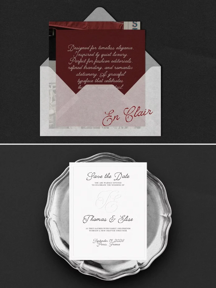
En Clair is a connected script typeface. Creative Market sells it. Its letters follow a calligraphic flow with a slightly rough edge. The preview labels it a “Vintage Editorial Script Font.” I like that wording more than the wedding pitch in the description. Editorial work needs character, and this typeface has plenty.
Who Is Behind the Typeface?
AnMark is the Creative Market shop of designer Anna Markovets. At the time of writing, the shop page shows more than 15,000 sales and a 5.0 rating across more than 460 reviews. Its catalog leans toward vintage and romantic scripts, such as Cherry Merlot and Villa al Mare. En Clair sits on the rougher side of that family.
Why Does a Rough Vintage Script Font Beat a Clean One?
Clean scripts look expensive. Rough scripts look owned. That difference matters to any brand that wants a personality.

Contour Roughness Explained
I use one term for what makes this typeface work. Contour roughness means irregular edges on a stroke that keeps a steady weight. The wobble lives on the outline. The pressure stays even. Cheap distressed fonts do the opposite, because they chew random holes into the letters and thin the strokes unevenly, which leaves a headline that looks merely damaged on screen and turns unreadable on a printed invitation once the paper absorbs the ink.
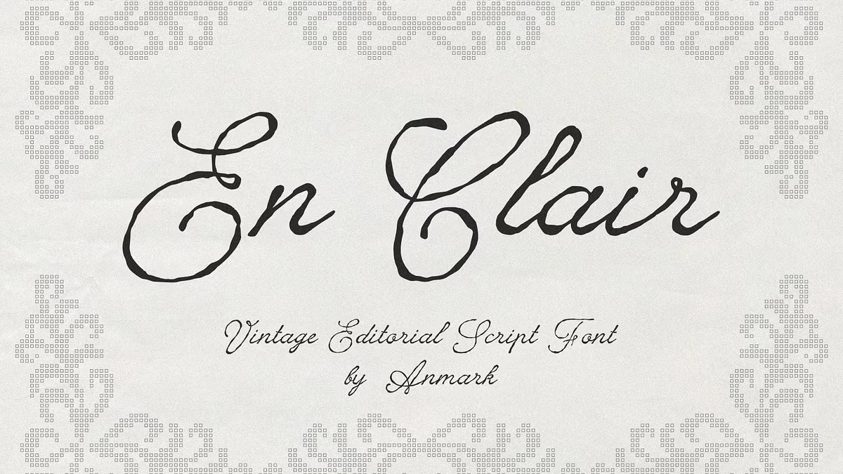
Look at the capital E in the preview. Its looped swash curls over itself, and the outline trembles like ink bleeding into uncoated paper. The C does the same with a wide, hooked bowl. Both letters stay readable at a glance. That is the real test of any textured vintage script font.
How Does the En Clair Font Behave in a Layout?
The preview sets the title on warm gray paper inside a pixelated, cross-stitch style border. That choice tells you how AnMark imagines the typeface. It belongs on tactile, slightly worn surfaces. Think cotton paper and letterpress stock.
The lowercase letters stay compact. The capitals reach high with generous loops. That contrast gives a word like “Clair” a clear rhythm. Short names and headlines benefit most. Long paragraphs do not.
Where Should You Use This Vintage Script Font?
Editorial Layouts and Magazine Openers
I would put the En Clair font to work in editorial design first. A magazine opener needs one loud gesture, and because the page around it usually stays very quiet, a single line of rough hand-drawn script at 48 points can carry the whole spread without a photograph or any ornament to help it along.
Try a 48 pt headline in warm black, #1C1A17, over a cream page, #F4F0E8. Set the body in a restrained serif such as Garamond at 10 pt. Leave a full line of white space above the script. The contrast between smooth text and a rough heading does the work.
I would limit the script to one line per spread. Two lines compete with each other. A hand-crafted script font for editorial design needs silence around it.
Wedding Stationery and Monograms
The description pitches wedding invitations and save-the-date cards first. That fits. A rough vintage script font for wedding invitations signals a handwritten note, which suits small, personal guest lists. Monograms also work, provided you enlarge the initials. Fashion labels and luxury packaging follow the same logic.
Where Does the En Clair Font Fall Short?
Small sizes hurt it. My rule of thumb says to stay above 14 pt in print, because below that the wobble turns into noise. On screens, I would keep it above 28 px. Embroidery and small-run foil stamping also lose the edge detail. Texture needs room.
Never set it in all caps. Script letters connect, and capitals break that connection. I also have not seen the full character set. Test accented capitals and numerals before you commit to a project.
How Do You Pair a Vintage Script Font With Other Typefaces?
Pair the script with a quiet partner. A Garamond or Caslon text face works well in print. On screens, a neutral sans such as Inter keeps captions clean. Use one script per project. Pick one accent color, for example oxblood #6B1F2A, and stay with it.
Does the En Clair Font Support Multiple Languages?
The Creative Market description promises multilingual support. The name itself is French, and “en clair” means in plain, uncoded language. French copy needs accents on both capitals and lowercase letters. Test your own words in the product preview before you buy.
My Verdict on the En Clair Font
I would buy it for editorial work. I would skip it for body copy. AnMark kept the contour rough and the strokes even, and few textured calligraphy fonts manage that balance. I would ask for one addition: a cleaner companion weight for small text.
En Clair Font at a Glance
| Attribute | Detail |
|---|---|
| Typeface | En Clair |
| Designer | AnMark (Anna Markovets) |
| Marketplace | Creative Market |
| Category | Rough vintage script font |
| Texture | Hand-crafted, slightly rough outlines |
| Language support | Multilingual, according to the description |
| Best uses | Editorial layouts, wedding stationery, fashion branding, packaging |
| Weak spots | Small sizes, all caps, long text |
| My rule of thumb | Above 14 pt in print, one script line per spread |
| Check before buying | Price, license tier, glyph count, OpenType features |
Frequently Asked Questions About the En Clair Font
What is the En Clair font?
The En Clair font is a rough vintage script font by AnMark. It combines a calligraphic flow with a hand-crafted texture.
Who designed the En Clair font?
AnMark designed it. AnMark is the Creative Market shop of Anna Markovets.
Is the En Clair font good for wedding invitations?
Yes. Its handwritten look suits invitations and save-the-date cards. I would set names at 24 pt or larger.
Can I use this vintage script font for editorial design?
Yes, and I think editorial layouts show it best. Use it for one headline or pull quote per spread.
Does the En Clair font support multiple languages?
The description says it does. Test accented characters in the product preview before you buy.
What does “en clair” mean?
It is French for in plain language. Intelligence agencies use it for messages sent without a code.
What is the best size for a textured vintage script font?
By my rule of thumb, stay above 14 pt in print and above 28 px on screens.
Where can I buy the En Clair font?
Buy it from AnMark’s shop on Creative Market. Confirm the license tier before any client work.
Browse WE AND THE COLOR’s Fonts category or take a look at our selection of the best retro fonts for 2027.
Subscribe to our newsletter!