This post contains affiliate links. We may earn a commission if you click on them and make a purchase. It’s at no extra cost to you and helps us run this site. Thanks for your support!
After a decade of flat sans-serifs, designers want texture and visible human choices. Meanwhile, AI-generated images look smooth and anonymous, so imperfect lettering feels like proof of a person. Retro fonts deliver that proof faster than almost any illustration style can.
Every pick here had to earn its slot against one question. Would a real client approve it for a real logo? Many popular retro fonts fail that test, so I kept the list to fonts with real pedigree.
Along the way, I coined four working ideas, which I explain in this guide. They are editorial tools, not industry standards.
What Are Retro Fonts, and Why Do They Matter in 2027?
Retro fonts are typefaces that copy or reinterpret lettering from a recent past, roughly the 1920s through the early 2000s. Vintage fonts differ because they revive older lettering such as Victorian wood type. Retro fonts revisit lettering that people still remember from posters, packaging, arcades, and early websites.
That memory is the whole point. A retro font works when it triggers a feeling, not when it merely looks old. So the best retro fonts borrow one clear era and commit to it. Retro fonts also work because they compress a shared memory of posters, packaging, arcades, and early websites into a few letterforms that a viewer recognizes in under a second, and that speed explains why brands pay for them even when a plain sans would be cheaper and safer.

Two forces push demand into 2027. Brands want to look human beside machine-made imagery. Meanwhile, a new generation now feels nostalgia for the 1990s and early 2000s, which no one predicted a decade ago.
I expect retro fonts to split into two camps next year. One camp will chase pixel and neon looks from the 1980s and 1990s. The other will keep refining the soft, warm serifs of the 1970s.
How I Chose These 100 Retro Fonts
Each font had to pass five checks before it earned a place. First, the license had to be clear enough to explain in one sentence. Second, the font had to match a real era, not a vague idea of old. Third, it had to survive at the sizes designers actually use.
Fourth, it had to do one thing better than its neighbors, and I wrote that thing down. Fifth, a working designer had to be able to find it today with one click. Plenty of retro fonts look great in a specimen image but fall apart in a headline, a button, or a printed label, and I would rather publish a sharper list than inflate it with fonts that only pass a screenshot test.
Every entry below names what makes the font special, why it earned its slot, and where it works best. Each link leads to the font’s own page on MyFonts, Adobe Fonts, Fontspring, Creative Market, or Google Fonts. I also capped any single foundry, so no family dominates the list. Platforms that sell fonts in bulk without curation stayed out.
Four Ideas That Explain Retro Fonts in 2027
These four ideas are my own editorial constructs. No standards body defines them. Still, they make retro fonts easier to choose and easier to defend in a client meeting.
The 25-Year Echo
Design tends to revive an era about 25 to 40 years after it ends. Apply that window to 2027, and it points at the late 1980s through the early 2000s. That is why pixel faces, neon tubing, and Y2K web interfaces feel so current.
The 1970s soft-serif wave sits just outside the window now. Therefore, I expect it to plateau in 2027 rather than grow.
The One Loud Voice Rule
Use one retro font per layout and give it a quiet partner. A neutral sans for body text lets the loud face carry the nostalgia. Two loud retro fonts in one layout cancel each other out.
The License Ladder
Start on the lowest rung and climb only when you must. The rungs are open source, included with a subscription, and paid for one project and custom. Open source costs nothing and clears logos. Climb to a paid license only when no free font does the job.
The Size Floor
Every retro display font has a size below which it breaks. Monoton loses its stripes under about 40 pixels. Limelight loses its hairlines under about 36 pixels. Press Start 2P blurs when you leave multiples of eight. Test that floor before you commit.
Quick Pick Table: The Best Retro Font for Each Job
This table sums up the guide to retro fonts. Each row names a paid pick and a free pick for the same job. You can compare cost and character at a glance.
| Job | Best paid pick | Best free pick | Era it evokes |
|---|---|---|---|
| Diner or bakery logo | ITC Souvenir | Lobster | 1950s to 1970s |
| Cooper-style soft serif | Recoleta | Caprasimo | 1970s |
| Arcade or pixel interface | Spencer | Press Start 2P | 1980s to 2000s |
| Neon nightlife poster | Heartbreak Eighties | Monoton | 1980s |
| Art Deco invitation | Gatsby Gilmour | Limelight | 1920s |
| Sci-fi or tech brand | Bazook | Orbitron | 1960s to 1990s |
| Editorial headline | Soulway | Fraunces | 1970s |
| Script lettering | Martini Script | Yellowtail | 1940s to 1950s |
| Geometric brand sans | ITC Avant Garde Gothic | Jost | 1920s to 1970s |
| Y2K or 1990s brand | Bringbold Nineties | Unbounded | 1990s to 2000s |
| Handmade vintage label | Hanley Pro | Rye | 1880s to 1950s |
Paid Retro Fonts From Foundries and MyFonts (1 to 7)
Paid retro fonts come first because they carry the most design work. Most are full families with true italics, proper kerning, and a clear commercial license. Some are revivals of historic faces, and others come from independent studios with a fresh take on an old era. I keep ITC to three picks on purpose, because a list of retro fonts should not lean on one foundry.
Check the license type before you buy. Desktop, web, and app licenses usually cost separately, so match the license to your use. Logos often need extra care, which is another reason to read the terms.
1. ITC Souvenir
Morris Fuller Benton drew the original in 1914, and Ed Benguiat reworked it for phototype in 1967. ITC issued it in the early 1970s, and the soft shapes became a decade-defining look. The family includes eight styles. It remains one of the most trusted retro fonts for friendly packaging and warm editorial headlines.
Era: 1970s soft serif. License: Commercial license from MyFonts. Get it: ITC Souvenir
2. ITC Benguiat
Ed Benguiat drew ITC Benguiat in the early 1980s with strong Art Nouveau influence. Also, the stress sits in the upper half of each capital, which gives the face its curious lean. Twelve styles cover a wide range of weights. Horror posters and nostalgic title cards love dramatic retro fonts like this.
Era: Early 1980s Art Nouveau revival. License: Commercial license from MyFonts. Get it: ITC Benguiat
3. ITC Bookman
Ed Benguiat revived Bookman for ITC in 1975, giving the Victorian serif a phototype update. Besides, the wide bowls and swashed italics shout 1970s book covers. Since the letters run wide, they eat space in narrow layouts. I’d use these generous retro fonts for wine labels, album covers, and editorial layouts.
Era: 1970s revival of a Victorian serif. License: Commercial license from MyFonts. Get it: ITC Bookman
4. Windsor
Eleisha Pechey drew Windsor, and Stephenson Blake cut it around 1905. Heavy rounded serifs and angled stems on the a, h, m, and n give it friendliness and warmth. It came back strongly between 2018 and 2021 and still evokes the 1970s. Use it for posters and display work, where retro fonts need real character.
Era: 1970s revival of a 1905 serif. License: Commercial license from MyFonts. Get it: Windsor
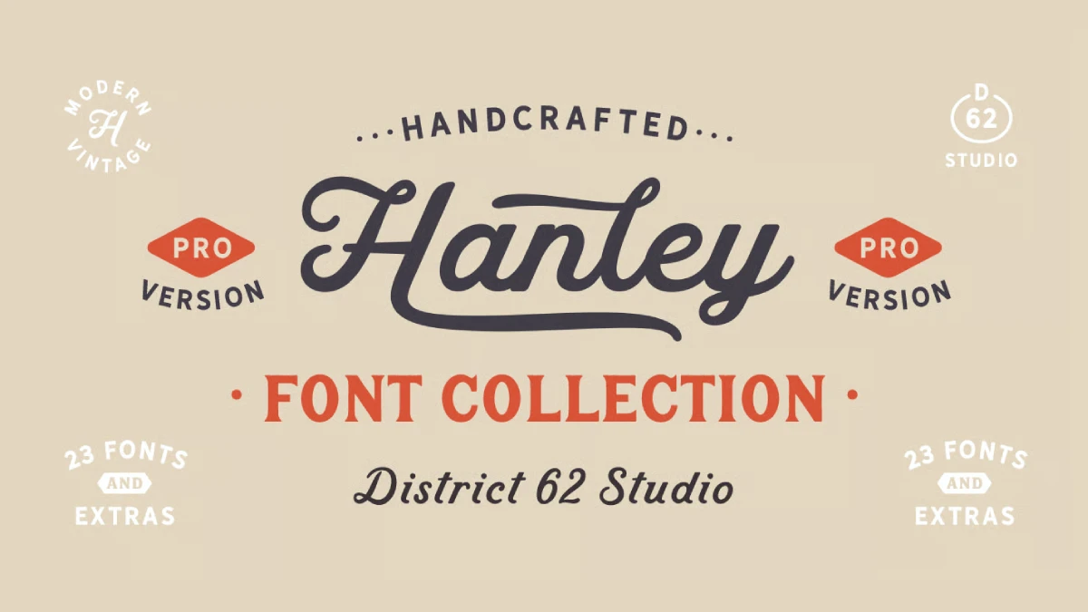
5. Hanley Pro
Megan Tamaccio and Aleksandar Veljasevic of District 62 Studio released Hanley Pro in 2018. In practice, the family grew from a vintage script into wood block, slim, and sans styles, 23 in total. Its edges carry just enough irregularity to feel human while staying clean. Craft brands and heritage packaging suit handmade retro fonts like this.
Era: Vintage wood block lettering. License: Commercial license from MyFonts. Get it: Hanley Pro
6. Trend Rough
Latinotype’s Trend Rough comes in sans and slab versions, 24 fonts in total. Also, the rough finish gives it a worn, printed look without extra textures. Because the family is large, you can build a whole poster system from it. Packaging and posters that need vintage grit suit these retro fonts.
Era: Rough vintage display. License: Commercial license from MyFonts. Get it: Trend Rough
7. Mistral
Roger Excoffon issued Mistral in 1953 and named it after the cold winds of southern France. Besides, the brush-like stems look spontaneous and fresh. The descenders run long, so give lines extra leading when you set these retro fonts. Its letters link up in vigorous strokes, so pair it with a plain sans for diner signs and cafe menus.
Era: 1950s French brush script. License: Commercial license from MyFonts. Get it: Mistral
Retro Fonts Included With Adobe Fonts (8 and 9)
Adobe Fonts costs nothing extra for Creative Cloud subscribers, and its license covers logos and client work. That makes it a smart second stop after a single purchase. These two retro fonts are the best-known examples in the library.
8. Cooper Black
Oswald Bruce Cooper drew Cooper Old Style in 1919, and Cooper Black followed in 1922 from Barnhart Brothers and Spindler. In practice, the round serifs and fat strokes look cozy and loud at once. 1970s designers made them a pop-culture icon. Adobe Fonts includes it, so Creative Cloud users get one of the great retro fonts at no extra cost.
Era: 1970s soft serif. License: Included with Adobe Fonts. Get it: Cooper Black
9. ITC Avant Garde Gothic
Herb Lubalin and Tom Carnase based the 1970 design on Lubalin’s logo for Avant Garde magazine. Ed Benguiat added condensed styles in 1974. Circles and clean lines make it brilliant for short headlines. However, Adobe Fonts ships only part of the family, so check the weights first.
Era: 1970s geometric sans. License: Included with Adobe Fonts. Get it: ITC Avant Garde Gothic
Retro Fonts From Fontspring (10)
Fontspring sells single licenses with stable pricing and clear terms. Its catalog leans toward working designers, so quality control is higher than on open marketplaces.
10. Martini Script
Scholtz Fonts based Martini Script on hand-lettered ads of the 1940s and 1950s. Two styles, Regular and Fat, work together for a confident look. The font covers European character sets and standard OpenType features. For posters and music covers, it is one of the more authentic retro fonts.
Era: 1940s and 1950s hand-lettered ads. License: Commercial license from Fontspring. Get it: Martini Script
Retro Fonts on Creative Market (11 to 49)

Creative Market is a marketplace where independent studios sell retro fonts directly. Quality varies by shop. So I picked only fonts that Creative Market itself cites as examples or that rank high in its era categories. Most come from Featured Shops. Those rankings change over time, so treat them as a snapshot.
11. Recoleta
Jorge Cisterna drew Recoleta for Latinotype in 2018. Also, it mixes the soft shapes of Cooper with the angled strokes of Windsor, and the family offers 14 styles. MyFonts has listed it among its best sellers, which shows how far 1970s soft serifs travel in branding. Few retro fonts balance warmth and range this well.
Era: 1970s soft serif. License: Paid, commercial license from Creative Market. Get it: Recoleta
12. Superfreak
Nicky Laatz sells Superfreak from a Featured Shop on Creative Market. At the time of writing, it tops the popularity ranking of the platform’s 70s font category. That ranking makes it a safe starting point for 1970s projects. It earns the first slot among the 70s retro fonts here.
Era: 1970s. License: Paid, commercial license from Creative Market. Get it: Superfreak
13. Tangerine
Tropical Type’s Tangerine is a retro sans according to its listing. Creative Market names it as a typical 70s-style font. It ranks second in the 70s category by popularity. Use it as a headline face with calm body text beside it. A sans keeps retro fonts readable on packaging.
Era: 1970s. License: Paid, commercial license from Creative Market. Get it: Tangerine
14. TAN – Meringue
TanType runs a Featured Shop on Creative Market, and TAN Meringue ranks third in the 70s category by popularity. Also, several TanType families sit near the top of that list. Treat it as a headline face for packaging and posters. Retro fonts from an established shop lower the risk of a weak purchase.
Era: 1970s. License: Paid, commercial license from Creative Market. Get it: TAN – Meringue
15. TAN – Nimbus
Creative Market’s own 70s guide names TAN Nimbus as a typical 70s-style font. TanType designed it, and the shop holds Featured status. Test it at your real headline size before buying. It adds a second TanType voice to this list of retro fonts.
Era: 1970s. License: Paid, commercial license from Creative Market. Get it: TAN – Nimbus
16. TAN – Mon Amour
TAN Mon Amour is another TanType family that ranks high in the 70s category. Besides, it carries the Featured Shop label like its siblings. The name points toward romantic branding, which suits wedding and fashion work. Compare it with Meringue and Nimbus before choosing one of these retro fonts.
Era: 1970s and 1980s. License: Paid, commercial license from Creative Market. Get it: TAN – Mon Amour
17. Soulway
Indieground Design, a Featured Shop, sells Soulway, and Creative Market’s 70s guide names it as an example. Soulway is a serif. A trusted shop and an editorial mention are rare among budget retro fonts. Use it for editorial headlines and album-style layouts.
Era: 1970s. License: Paid, commercial license from Creative Market. Get it: Soulway
18. Speltale
Indieground Design also sells Speltale, a serif that appears in the 70s and 80s listings. In practice, it comes from the same Featured Shop as Soulway. Compare the two side by side, because shop consistency helps brand systems. Both belong on a shortlist of retro fonts for editorial work.
Era: 1970s and 1980s. License: Paid, commercial license from Creative Market. Get it: Speltale
19. Bremlin
Grezline Studio’s Bremlin is a bold retro serif that Creative Market names in its 70s guide. The listing shows an updated version, which signals that the designer still maintains the font. So bold serifs like this suit packaging and posters. It ranks among the more visible retro fonts on the platform.
Era: 1970s bold serif. License: Paid, commercial license from Creative Market. Get it: Bremlin
20. Orange Squash
Pixesia Studio offers Orange Squash as a bold vintage serif, and Creative Market names it among popular 70s-style fonts. A Pro version also exists with more features. So compare both before you buy. Retro fonts with a clear upgrade path suit long-term brand work.
Era: 1970s vintage serif. License: Paid, commercial license from Creative Market. Get it: Orange Squash
21. Lovestruck
RetroSupply Co. sells Lovestruck as a 70s script font. The shop holds Featured status and focuses on retro design assets. That focus shows in a listing that targets 1970s lettering directly. Among retro fonts in script form, it is a deliberate rather than a decorative choice.
Era: 1970s script. License: Paid, commercial license from Creative Market. Get it: Lovestruck
22. Tequila Sunrise
Nicky Laatz packages Tequila Sunrise as a typeface pack from a Featured Shop. Packs bundle several styles, which helps when you need a script and a companion face. It sits within the 70s listings. Check which styles the pack includes before you buy these retro fonts.
Era: 1970s. License: Paid, commercial license from Creative Market. Get it: Tequila Sunrise
23. Magical Night
Viswell’s Magical Night is a retro serif from a Featured Shop. Also, it appears in the 70s and 80s listings. That double listing signals a flexible mood, so it suits both decades. Use it for headlines and invitations where retro fonts need some romance.
Era: 1970s and 1980s. License: Paid, commercial license from Creative Market. Get it: Magical Night
24. Seriously Nostalgic Serif
Nicky Laatz designed Seriously Nostalgic Serif for nostalgic projects, and the title says it plainly. Besides, it appears in the 70s and 80s listings. The shop holds Featured status. Use it for editorial titles and packaging that rely on retro fonts.
Era: 1970s and 1980s. License: Paid, commercial license from Creative Market. Get it: Seriously Nostalgic Serif
25. Highway 70 Condensed
Lateral Design’s Highway 70 Condensed is a condensed retro serif listed under the 70s and 80s. Also, condensed widths save space in tall posters and narrow labels. Check the rest of the family for other widths. Event posters and menus suit these space-saving retro fonts.
Era: 1970s condensed serif. License: Paid, commercial license from Creative Market. Get it: Highway 70 Condensed
26. Heartbreak Eighties
Nicky Laatz released Heartbreak Eighties as a retro serif for the 1980s look. In practice, it appears in both the 70s and the 80s listings. The shop holds Featured status. Fashion headlines and music posters fit this kind of retro font.
Era: 1980s. License: Paid, commercial license from Creative Market. Get it: Heartbreak Eighties
27. Eighties Comeback Serif
Eighties Comeback Serif is a family of 70 fonts from Nicky Laatz. Size matters here, because a big family lets you build a full hierarchy from one source. Check which weights you need before buying. It is the deepest of the 80s retro fonts on this list.
Era: 1980s. License: Paid, commercial license from Creative Market. Get it: Eighties Comeback Serif
28. Kilimanjaro Sans
Kilimanjaro Sans is a family of 36 fonts from Nicky Laatz. Also, it pairs naturally with her retro serifs, which keeps a brand system coherent. So use it for body text next to a loud display serif. Quiet sans partners make retro fonts easier to live with.
Era: 1980s sans. License: Paid, commercial license from Creative Market. Get it: Kilimanjaro Sans
29. Fitzgerald
Harmonais Visual, a Featured Shop, sells Fitzgerald as a classic retro serif. Besides, the listing places it in both the 70s and the 80s categories. Use it for boutique branding and editorial headlines. It is a calm choice among loud retro fonts.
Era: 1970s and 1980s. License: Paid, commercial license from Creative Market. Get it: Fitzgerald
30. Behind The Nineties
Casloop Studio’s Behind The Nineties bundles 12 fonts plus variable versions. In practice, it is a serif and appears in Creative Market’s 70s and 80s listing. Variable files reduce page weight on the web. For 1990s editorial nostalgia, it offers real range among retro fonts.
Era: 1990s. License: Paid, commercial license from Creative Market. Get it: Behind The Nineties
31. Bringbold Nineties
Zarmatype’s Bringbold Nineties is a serif that Creative Market cites as a beloved vintage example. Also, the name points to 1990s typography, which the 25-Year Echo marks as the next revival. Use it for editorial headlines and album covers. It is a forward-looking pick among retro fonts.
Era: 1990s. License: Paid, commercial license from Creative Market. Get it: Bringbold Nineties
32. Bazook
JK Design Co. sells Bazook as a retro geometric sans. Besides, geometric sans faces with retro details work for tech and sports branding. It appears in the 70s and 80s listings. Use it for headlines, where retro fonts need geometric structure.
Era: 1970s and 1980s. License: Paid, commercial license from Creative Market. Get it: Bazook
33. Spencer
Loryn Ipsum offers Spencer as a pixelated font, and the listing files it as a serif. That combination is rare, because most pixel faces are sans. The result adds an unusual texture to game-inspired layouts. Tech zines and indie projects suit these pixel retro fonts.
Era: 1980s pixel. License: Paid, commercial license from Creative Market. Get it: Spencer
34. Gatsby Gilmour
Viswell’s Gatsby Gilmour is an Art Deco sans that Creative Market names first when it explains Art Deco fonts. Besides, it comes from a Featured Shop. Jazz-age posters and cocktail menus are the obvious targets. It is the first stop among Art Deco retro fonts.
Era: 1920s Art Deco. License: Paid, commercial license from Creative Market. Get it: Gatsby Gilmour
35. Armoire
Justin Penner released Armoire as an Art Deco font family. Plus, family releases give you weights for a full layout. Use it where an Art Deco system needs several levels of hierarchy. That depth is uncommon among retro fonts at this size.
Era: 1920s Art Deco. License: Paid, commercial license from Creative Market. Get it: Armoire
36. Delauney
Arterfak Project’s Delauney is an Art Deco serif. In practice, it appears on the first page of Creative Market’s Art Deco ranking. Also, serif deco faces bring more warmth than geometric sans ones. Wedding and boutique branding suit these elegant retro fonts.
Era: 1920s Art Deco. License: Paid, commercial license from Creative Market. Get it: Delauney
37. Silver Garden
SilverStag Type Foundry sells Silver Garden as a nostalgic font duo. Duos pair a display face with a companion, so you get a ready hierarchy. SilverStag holds Featured Shop status. Packaging and menus suit these paired retro fonts.
Era: 1920s Art Deco. License: Paid, commercial license from Creative Market. Get it: Silver Garden
38. WT Bellochero
Winston Type Co. drew WT Bellochero, which Creative Market names as a traditional Art Deco example. It follows classic Deco posters and signage, according to that description. Use it for invitations and heritage branding. Traditional retro fonts like this age gracefully.
Era: 1920s Art Deco. License: Paid, commercial license from Creative Market. Get it: WT Bellochero
39. Rothe
Konstantine Studio’s Rothe is a vintage luxury font that Creative Market names among its Art Deco examples. Luxury is the key word, because the style suits perfume and jewelry labels. So use it large. Few retro fonts lean so far into opulence.
Era: 1920s Art Deco luxury. License: Paid, commercial license from Creative Market. Get it: Rothe
40. Stylebender Serif
Tropical Type’s Stylebender Serif is a multi-style serif from a Featured Shop. Multi-style means several looks in one family, which helps when a brand needs variants. It appears in the Art Deco listing. Use it for lifestyle brands that want flexible retro fonts.
Era: Art Deco serif. License: Paid, commercial license from Creative Market. Get it: Stylebender Serif
41. Monterio
CCS Type calls Monterio a modern Art Deco typeface. It is a sans, so it offers a cleaner take than ornate deco serifs. Use it for signage and clean luxury branding. It shows how retro fonts can feel current.
Era: Modern Art Deco. License: Paid, commercial license from Creative Market. Get it: Monterio
42. Ephemera Songster
Ilham Herry’s Ephemera Songster is one of the vintage fonts Creative Market highlights. The listing is an extras pack, so check that the base font fits your use. Vintage posters and labels suit it. Treat it as a specialist among retro fonts.
Era: Vintage. License: Paid, commercial license from Creative Market. Get it: Ephemera Songster
43. American Route
Bale Type’s American Route is a rough bold script that Creative Market cites as a vintage favorite. Also, it ranks seventh among 70s fonts by popularity. The rough finish saves you from adding texture later. Roadside diners and travel brands suit these rough retro fonts.
Era: Vintage road signage. License: Paid, commercial license from Creative Market. Get it: American Route
44. Bungalow
Madeline O’Donoghue Design sells Bungalow as a hand-drawn surf font from a Featured Shop. Hand-drawn letters bring a human touch to beach and travel brands. It sits in the 70s listing. Use it for labels and signage among your retro fonts.
Era: Surf culture. License: Paid, commercial license from Creative Market. Get it: Bungalow
45. The Bayland
Letterhend Studio’s The Bayland is a retro script from a Featured Shop. Besides, it shows up in both the 70s and the 80s listings. Scripts need room, so use it for names and short phrases. It is a gentle option among retro fonts.
Era: 1970s and 1980s script. License: Paid, commercial license from Creative Market. Get it: The Bayland
46. Nouveau Nostalgia
HipFonts calls Nouveau Nostalgia an elegant typeface, and Creative Market names it among Art Deco examples with a fresh twist. Use it where Art Deco elegance should feel contemporary. It suits boutique branding and invitations. Fresh twists keep retro fonts from feeling stale.
Era: Art Nouveau and Art Deco. License: Paid, commercial license from Creative Market. Get it: Nouveau Nostalgia
47. 5th Avenue
50Fox’s 5th Avenue is a fancy typeface that Creative Market names among its playful Art Deco takes. Fancy is the keyword. Use it for fashion and event titles. It brings a playful side to Art Deco retro fonts.
Era: Art Deco. License: Paid, commercial license from Creative Market. Get it: 5th Avenue
48. Castrell
ikiiko’s Castrell is a 70s retro sans with an exotic twist, according to its title. In practice, it sits ninth in the 70s popularity list. Use it for travel and music posters. Sans options like this are rarer among 70s retro fonts.
Era: 1970s. License: Paid, commercial license from Creative Market. Get it: Castrell
49. Belvare
CCS Type’s Belvare is a retro aesthetic serif that appears in both the 70s and the Art Deco listings. That crossover signals flexibility. Use it for lifestyle branding and menus. It bridges two eras of retro fonts.
Era: 1970s and Art Deco. License: Paid, commercial license from Creative Market. Get it: Belvare
Free Retro Fonts on Google Fonts (50 to 97)
Free retro fonts start here. Google Fonts holds the best of them, and almost all allow commercial use. You can put these on a logo, a website, a package, or a film title without paying a cent. They also load fast on the web, which matters for page speed.
I grouped these 48 retro fonts in a loose order, from signage and script to pixel and techno. Each entry names the era the font evokes and links to its Google Fonts page. Open source here means anyone can use the font commercially under an open license. Still, read the license on each page.
50. Bungee
David Jonathan Ross drew Bungee for city signs, and its heavy squared caps stay readable from across a busy street. The family also ships vertical forms, so you can stack words like a shop sign. Few free retro fonts handle signage this well.
Era: 1970s street signage. License: Open source, free for commercial use. Get it: Bungee
51. Righteous
Righteous echoes the title on a 1970s science fiction paperback. Astigmatic gave the caps geometric curves and cut-away joints, so the face feels futuristic without feeling cold. The stroke weight stays constant, which keeps it clean at poster size and button size. For logos, it is one of the safest free retro fonts.
Era: 1970s science fiction. License: Open source, free for commercial use. Get it: Righteous
52. Monoton
Monoton splits every letter into parallel lines, like neon tubing bent into words. Vernon Adams drew it in one weight, and the thin gaps vanish below roughly 40 pixels, so keep it large. One Monoton headline per layout evokes a 1980s nightclub faster than any other free retro font.
Era: 1980s neon. License: Open source, free for commercial use. Get it: Monoton
53. Pacifico
Vernon Adams based Pacifico on American surf lettering from the 1950s. The thick brush strokes and looping capitals are easy to recognize, yet also easy to overuse. So I treat it as seasoning for beach cafes, skate decks, and ice cream labels, where friendly retro fonts shine.
Era: 1950s surf culture. License: Open source, free for commercial use. Get it: Pacifico
54. Lobster
Impallari Type drew Lobster, and half the internet adopted it within a year. Also, the bold script ships with ligatures and alternates, which most free scripts skip. Overuse made it a cliché, but it still holds up at large sizes. Among retro fonts for diner menus and bakery labels, it remains a safe bet.
Era: 1950s advertising script. License: Open source, free for commercial use. Get it: Lobster
55. Shrikhand
Shrikhand covers Latin and Gujarati, and its Latin side is a fat italic that leans hard to the right. Heavy strokes and tight counters echo late 1970s record sleeves, which earned it a place among these retro fonts. Because it leans so much, it works best in short names and slogans.
Era: Late 1970s record sleeves. License: Open source, free for commercial use. Get it: Shrikhand
56. Audiowide
Audiowide stretches rounded caps into wide techno shapes that feel like a 1980s arcade cabinet. Astigmatic kept the stroke weight even, so the face stays calm on screens. However, the width eats room, so game titles and gadget packaging suit it better than tight headlines.
Era: 1980s arcade. License: Open source, free for commercial use. Get it: Audiowide
57. Orbitron
Matt McInerney drew Orbitron for display use, and its squared circles give it away at once. Besides, it offers a wide weight range, from regular to black, which helps with hierarchy. The letters feel more like 1990s space opera than the 1960s space race. Tech startups should pair it with a plain grotesque.
Era: Space age and 1990s sci-fi. License: Open source, free for commercial use. Get it: Orbitron
58. Press Start 2P
CodeMan38 based Press Start 2P uses the lettering of early 1980s Namco arcade games. It sits on an 8-pixel grid, so edges stay crisp only at multiples of eight. Set it at 10 or 14 pixels, and the edges turn soft. That makes it the purest of the free pixel retro fonts for game jams and band merch.
Era: 1980s arcade. License: Open source, free for commercial use. Get it: Press Start 2P
59. VT323
Peter Hull modeled VT323 on the DEC VT320 terminal, so every letter looks like green phosphor. In practice, the monospace grid suits code blocks, hacker posters, and fake command-line screens. However, it looks thin next to heavier pixel faces, so size it up. Few retro fonts also work in real terminals.
Era: 1980s computer terminals. License: Open source, free for commercial use. Get it: VT323
60. Silkscreen
Jason Kottke made Silkscreen in 2001 for tiny interface labels on early web pages. Also, the all-caps pixel letters stay legible at eight pixels, which almost nothing else manages. Consequently, it carries Y2K web nostalgia better than any newer pixel face. Besides a clean sans, it makes a sharp label style.
Era: Y2K web interfaces. License: Open source, free for commercial use. Get it: Silkscreen
61. Caprasimo
Eben Sorkin drew Caprasimo as a free answer to the Cooper Black craze. Soft serifs and fat bowls give headlines the warmth of a 1970s cookbook. It ships in one weight, so contrast it with a light body face. Cooper energy without a license fee is rare among retro fonts.
Era: 1970s cookbooks. License: Open source, free for commercial use. Get it: Caprasimo
62. Fraunces
Fraunces comes from Undercase Type, and it channels the soft old-style serifs of Windsor and Souvenir. Four axes control optical size, weight, softness, and wonk, which tilts letters into quirky shapes. I push the SOFT axis to match a brand’s temperature. Hardly any variable retro fonts offer this much personality for free.
Era: 1920s to 1970s soft serif. License: Open source, free for commercial use. Get it: Fraunces
63. Limelight
Astigmatic drew Limelight as a high-contrast display face with clear Art Deco roots. The hairlines disappear at small sizes, so I’d use it above 36 pixels. Gold foil, black paper, and one line of Limelight make a convincing cinema poster. Few free retro fonts reach the 1920s this well.
Era: 1920s Art Deco theater. License: Open source, free for commercial use. Get it: Limelight
64. Poiret One
Denis Masharov drew Poiret One as a hairline geometric face with Art Deco manners. Besides, the circles come close to perfect, which makes it look expensive at large sizes. However, thin strokes fall apart on low-resolution screens, so avoid body text. Spa logos and perfume packaging show off this elegant retro font.
Era: 1920s Art Deco. License: Open source, free for commercial use. Get it: Poiret One
65. Special Elite
Special Elite imitates a worn typewriter, down to chipped corners and uneven ink. Astigmatism roughens every outline, which removes that clean digital edge. It still reads well in small captions, and the texture saves you from adding grunge filters. Detective stories, zines, and police-file mockups need gritty retro fonts like this.
Era: 1940s typewriter. License: Open source, free for commercial use. Get it: Special Elite
66. Courier Prime
Alan Dague-Greene made Courier Prime for screenwriters who hated thin, pale Courier. The strokes run heavier than standard Courier, so text prints darker and reads easier. Plus, it keeps the fixed width that script formats demand. It is one of the most practical retro fonts for documents and receipts.
Era: Typewriter and screenplay. License: Open source, free for commercial use. Get it: Courier Prime
67. Space Mono
Colophon Foundry drew Space Mono with geometric quirks that feel like retro-futurist computing. In practice, the oddly round g and the flat terminals give code a personality. It works best in headlines and captions, not in long listings. Start here if you like nerdy retro fonts.
Era: 1960s computing. License: Open source, free for commercial use. Get it: Space Mono
68. Staatliches
Brian LaRossa and Erica Carras drew Staatliches in a single weight of tall, flat caps. Also, its Bauhaus-flavored geometry gives posters an instant 1930s accent. Because it only offers caps and one weight, you build hierarchy with size and color. Event posters and sports graphics show why simple retro fonts still work.
Era: 1930s poster lettering. License: Open source, free for commercial use. Get it: Staatliches
69. Bebas Neue
Dharma Type made Bebas Neue, and it became the default condensed caps face of the 2010s. Tall, narrow letters stack neatly in posters and film titles. Everyone has seen it, so I’d use it as a supporting actor. Yet few retro fonts stay this versatile at small sizes.
Era: 1930s poster caps. License: Open source, free for commercial use. Get it: Bebas Neue
70. Alfa Slab One
JM Sole drew Alfa Slab One as a heavy slab with ad-sign confidence. The thick serifs hold ink, so it prints well on rough paper. It ships in one weight, which keeps decisions simple. Barbecue logos, hardware stores, and farmers’ market banners all need sturdy retro fonts like this.
Era: Early twentieth-century advertising. License: Open source, free for commercial use. Get it: Alfa Slab One
71. Ultra
Astigmatic drew Ultra as a fat slab that echoes nineteenth-century wood type. Besides, the tiny counters give it dense, poster-like color. However, it chokes at small sizes, so keep it for headlines. Western posters and craft beer labels get the most from old-school retro fonts like this one.
Era: Nineteenth-century wood type. License: Open source, free for commercial use. Get it: Ultra
72. Rye
Sideshow drew Rye with ornamented slabs that recall Wild West wanted posters. In practice, the decorative nicks and spurs add instant atmosphere. Because the details are busy, one line is plenty. Saloon menus and rodeo events are the obvious customers among Western retro fonts.
Era: Wild West wood type. License: Open source, free for commercial use. Get it: Rye
73. Yellowtail
Astigmatic drew Yellowtail as a monoline script that nods to mid-century signage. Also, the even stroke keeps it legible on glass windows and neon tubes. Plus, the letters connect smoothly, which makes custom logos easy to build. Few script retro fonts feel this light.
Era: 1950s signage script. License: Open source, free for commercial use. Get it: Yellowtail
74. Nabla
Nabla is a color font with extruded letters that pop like 1980s title cards. A depth axis lets you push the extrusion from flat to deep. However, color fonts need browser support, so test your target platforms. For animated headlines, it is my favorite new addition to the free retro fonts category.
Era: 1980s extruded 3D. License: Open source, free for commercial use. Get it: Nabla
75. Pixelify Sans
Stefie Justprince drew Pixelify Sans as a pixel face with a variable weight axis. You can nudge the weight without breaking the grid, which makes it more flexible than older bitmap-style faces. Indie game menus and app interfaces are the sweet spot for pixel retro fonts like this.
Era: 1990s video games. License: Open source, free for commercial use. Get it: Pixelify Sans
76. Jersey 10
Sarah Cadigan-Fried designed the Jersey family around several pixel grids, from 10 to 25. Each size reads as its own font, so you pick the grid that matches your layout. The blocky numerals deserve special praise. Scoreboards and sports game interfaces benefit most from these retro fonts.
Era: 1990s sports video games. License: Open source, free for commercial use. Get it: Jersey 10
77. Jacquard 12
Sarah Cadigan-Fried also drew Jacquard, a pixelated blackletter that sounds impossible. It works because the grid simplifies the sharp strokes. Heavy metal posters and fantasy game titles suit it. Among retro fonts, nothing else on this list looks quite like it.
Era: 1990s pixel blackletter. License: Open source, free for commercial use. Get it: Jacquard 12
78. Handjet
Rosetta built Handjet as a variable font that imitates dot-matrix printouts. Two axes control the shape and the grid of the dots. Because the dots shrink and grow smoothly, it animates well. Receipts, tickets, and glitchy posters fit its 1980s office charm, and it adds range to any set of retro fonts.
Era: 1980s dot-matrix printers. License: Open source, free for commercial use. Get it: Handjet
79. Sixtyfour
Jens Kutilek drew Sixtyfour as a love letter to early home computers. Bleed and scanline axes let you fake a glowing CRT screen with a slider. The effect looks cheesy at default settings, so dial it back. Music visuals and gaming channels get the most out of these 1980s retro fonts.
Era: 1980s home computers. License: Open source, free for commercial use. Get it: Sixtyfour
80. DotGothic16
Fontworks drew DotGothic16 on a 16-pixel grid, and its Latin letters match its Japanese ones. Besides, the tidy dots look like handheld console menus. However, the grid demands integer sizes, so set it at 16 or 32 pixels. For Japanese audiences, it is among the few retro fonts worth trying.
Era: 1990s Japanese game consoles. License: Open source, free for commercial use. Get it: DotGothic16
81. Syncopate
Vernon Adams drew Syncopate as a wide, all-caps sans with a futuristic stance. In practice, its generous letterspacing gives titles a film-poster calm. Yet the width makes long words awkward, so keep them short. Sci-fi credits and watch teasers show these spacious retro fonts at their best.
Era: 1970s space posters. License: Open source, free for commercial use. Get it: Syncopate
82. Michroma
Vernon Adams also drew Michroma, a wide techno face with squared-off rounds. Also, it reads like the lettering on an old stereo receiver. Because it offers one weight, pair it with a lighter sans for body text. Audio gear mockups and cyber-themed slides suit this techno retro font.
Era: 1980s technology ads. License: Open source, free for commercial use. Get it: Michroma
83. Zen Dots
Yoshimichi Ohira drew Zen Dots with dotted cuts that feel like a futuristic LED display. Besides, the shapes stay friendly rather than aggressive. Therefore, it fits playful tech brands better than serious ones. Anime posters and gadget logos benefit most from retro fonts with this much charm.
Era: 1980s Japanese sci-fi. License: Open source, free for commercial use. Get it: Zen Dots
84. Young Serif
Bastien Sozeau drew Young Serif as a soft old-style display serif with warm joints. In practice, it feels like a 1970s paperback cover without cosplaying one. Even so, it holds up in short paragraphs at large sizes. Editorial headlines, wine labels and cookbooks suit these gentle retro fonts.
Era: 1970s book jackets. License: Open source, free for commercial use. Get it: Young Serif
85. Faster One
Eben Sorkin drew Faster One with horizontal speed lines that slice through each letter. Also, the italic slant pushes the type forward even when nothing moves. However, the cuts hurt legibility, so use short words. Racing posters and bike shop logos are natural homes for fast retro fonts.
Era: 1950s to 1980s racing. License: Open source, free for commercial use. Get it: Faster One
86. Tilt Neon
Andy Clymer drew the Tilt family, and Tilt Neon mimics glowing tube lettering. Besides, its variable axes let you adjust the roundness of the tubes. It looks best on dark backgrounds with a faint glow added in CSS. Bars and record shops love neon retro fonts like this.
Era: 1980s neon signs. License: Open source, free for commercial use. Get it: Tilt Neon
87. Josefin Sans
Santiago Orozco drew Josefin Sans with a vintage geometric feel and a small x-height. In practice, the low crossbars create a delicate, period look. Because of the small x-height, I’d set it a size larger than usual. Boutique brands and invitations make good use of elegant retro fonts like this.
Era: 1920s geometric elegance. License: Open source, free for commercial use. Get it: Josefin Sans
88. Jost
Owen Earl built Jost as a free tribute to Futura, with a variable weight axis from thin to black. Also, the geometry stays clean and slightly cooler than Futura itself. Jost works as a retro body font when your display face already shouts. It is the quiet hero among retro fonts.
Era: 1920s to 1960s Futura revival. License: Open source, free for commercial use. Get it: Jost
89. Big Shoulders Display
Patric King drew Big Shoulders Display after Chicago’s municipal signs, and the tall condensed caps have a civic, industrial ring. Several weights help you build real hierarchy. Transit maps, sports branding, and city festivals all suit it. Few tall retro fonts offer this much range.
Era: 1930s Chicago signage. License: Open source, free for commercial use. Get it: Big Shoulders Display
90. League Gothic
The League of Moveable Type revived Alternate Gothic as League Gothic. A width axis lets you squeeze or relax the letters. Because the face stays compact, it fits tall posters and narrow columns. Few condensed retro fonts are this practical.
Era: Early twentieth-century gothic. License: Open source, free for commercial use. Get it: League Gothic
91. Bowlby One
Vernon Adams drew Bowlby One as a heavy sans with chunky, friendly shapes. Besides, the thick strokes survive printing on rough stock. Therefore, it suits packaging that needs a big, cheerful voice. Cereal boxes and kids’ brands show how well bold retro fonts work.
Era: 1960s advertising. License: Open source, free for commercial use. Get it: Bowlby One
92. Abril Fatface
TypeTogether released Abril Fatface as a Didone with extreme contrast. In practice, the thick strokes and hairlines make magazine headlines sparkle. However, the hairlines break at small sizes, so keep it big. I’d choose it for fashion headlines and cocktail menus where retro fonts need drama.
Era: Fat face advertising. License: Open source, free for commercial use. Get it: Abril Fatface
93. Unbounded
Unbounded is a wide, round variable face with a friendly Y2K attitude. Also, its weight range runs from light to black. The rounded corners soften the width, which helps readability. Crypto startups and music apps use similar shapes, so differentiate it with color among your retro fonts.
Era: Y2K tech. License: Open source, free for commercial use. Get it: Unbounded
94. Space Grotesk
Florian Karsten derived Space Grotesk from Space Mono and made the spacing proportional. Besides, the quirky shapes survive in a body-friendly version. That makes it a quiet retro-futurist choice for interfaces. Documentation sites and tech blogs can use it all day, which is rare for retro fonts.
Era: 1960s computing. License: Open source, free for commercial use. Get it: Space Grotesk
95. Fredoka
Fredoka rounds every corner, so it feels like a 1960s children’s television title. A variable weight axis ranges from light to bold. Because of the generous width, it reads well on small phone screens. Kids’ apps and snack brands suit these cheerful retro fonts.
Era: 1960s children’s television. License: Open source, free for commercial use. Get it: Fredoka
96. DM Serif Display
Colophon Foundry drew DM Serif Display with high contrast and tight spacing. In practice, it recalls the glamorous headlines of 1970s fashion magazines. Pair it with a neutral sans and the page feels editorial. Restaurant menus and lifestyle blogs gain instant polish from classic retro fonts.
Era: 1970s magazine headlines. License: Open source, free for commercial use. Get it: DM Serif Display
97. Russo One
Jovanny Lemonad drew Russo One as a wide, sturdy sans for headlines. Also, its square-ish curves feel industrial. It ships in one weight, so contrast comes from size. Engine brands and tough gear catalogs suit industrial retro fonts like this.
Era: 1990s racing and industrial. License: Open source, free for commercial use. Get it: Russo One
Free Retro Fonts From Other Sources (98 to 100)
A few of the best free retro fonts do not live on Google Fonts. Fontshare and independent designers publish excellent faces under generous licenses. These three add a high-contrast serif, a pixel mono, and a degraded type family that Google does not carry. Always read the license on the source page, because terms change.
98. Boska
Boska is a high-contrast serif from Fontshare with six weights, matching italics and variable files. Besides, the range makes it more useful than most display-only retro fonts. You can build a full hierarchy from one family. Magazines, restaurants, and book covers can all build a system around it.
Era: High-contrast serif. License: Free for personal and commercial use. Get it: Boska
99. Departure Mono
Helena Zhang released Departure Mono as a free pixel monospace with real warmth. The letters feel like an old console, yet they stay precise enough for code. In practice, it works best at 11 or 12 pixels. Developer portfolios and indie apps suit pixel retro fonts like this.
Era: 1980s computing. License: Open source, free for commercial use. Get it: Departure Mono
100. Redaction
Redaction comes from Jeremy Mickel with Titus Kaphar’s studio, and its concept stands out. In practice, the family ships in steps of increasing damage, from clean to heavily pixelated. That gives you a built-in degradation scale. Editorial projects about memory, privacy or the web will love these experimental retro fonts.
Era: 1990s digital documents. License: Open source, free for commercial use. Get it: Redaction
Retro Fonts by Decade: A Quick Cross-Index
Some designers shop by era, not by license. This index groups the retro fonts above by the decade they evoke. Use it to jump straight to the right entry.
1920s and 1930s Retro Fonts
Art Deco and early geometric sans define this era. Gatsby Gilmour, Armoire, Delauney, WT Bellochero and Rothe lead the paid side on Creative Market. Limelight and Poiret One carry the glamour for free, while Josefin Sans, Staatliches and Jost bring the geometry. I’d start with Limelight when the budget is zero and Gatsby Gilmour when it is not. Both make 1920s retro fonts feel like real cinema posters.
1950s and 1960s Retro Fonts
Diner scripts and space-age optimism rule here. Martini Script brings the hand-lettered ads of the 1940s and 1950s, while Pacifico and Yellowtail cover the free signage side. Fredoka and Bowlby One lean toward 1960s television and packaging. Script retro fonts get overused fast, so I’d rather pick Martini Script and keep the words short.
1970s Retro Fonts
This decade owns the largest share of the list, and 70s retro fonts still look the warmest. Cooper Black, ITC Souvenir, Windsor, Recoleta and Soulway lead the soft serifs. Superfreak, Tangerine and the TanType families dominate Creative Market’s 70s ranking. ITC Avant Garde Gothic and Righteous cover the geometric side, while Caprasimo and Fraunces do it for free. Because this wave sits outside the 25-Year Echo window, I expect it to plateau in 2027.
1980s Retro Fonts
Neon signs and home computers define 80s retro fonts. Heartbreak Eighties, Eighties Comeback Serif and Kilimanjaro Sans lead the paid side. ITC Benguiat adds a darker, more dramatic mood. Monoton, Tilt Neon, Audiowide and Nabla handle glow and depth for free. Press Start 2P, VT323, Handjet and Sixtyfour speak the language of screens and printers. These faces sit squarely inside the window that design is revisiting right now.
1990s and 2000s Retro Fonts
Pixel interfaces and Y2K web design form the newest layer of retro fonts. Behind The Nineties and Bringbold Nineties bring paid 1990s serifs, and Spencer adds a pixel texture. Silkscreen, Pixelify Sans, Jersey 10 and DotGothic16 carry the free pixel tradition. Departure Mono and Redaction give it a modern edge, while Unbounded brings the glossy, rounded look of the early 2000s. This is where I expect the most new releases in 2027, and where retro fonts will multiply fastest.
How to Use Retro Fonts Without Building a Theme Park
Pair One Loud Font With One Quiet Font
Set headlines in the retro face and body text in a neutral sans. Inter, Source Sans and the system UI fonts all work. Keep the loud face above 28 pixels so its character shows. Below that size, even good retro fonts turn muddy.
Match the Era to the Audience’s Memory
Pick the decade your audience remembers fondly. A 35-year-old remembers 1990s arcades. Someone at 60 remembers 1970s record sleeves instead. If the era does not match, retro fonts feel like costume rather than memory.
Check the License Before You Design
Free retro fonts on Google Fonts allow logos and commercial work under open licenses. Adobe Fonts covers logos as well. Paid licenses split into desktop, web, and app, so confirm each before launch. A font you cannot legally ship is a wasted afternoon.
Build for the Web With Care
Variable retro fonts such as Fraunces, Sixtyfour, and Tilt Neon pack many styles into one file. Serve WOFF2 files and subset them to the characters you need. Add font-display swap so text appears immediately. Finally, test pixel fonts at their native sizes, because scaling blurs them.
Where Retro Fonts Go Next: Five Predictions for 2027
These are forecasts, not facts. I will revisit them in twelve months.
Prediction 1: Variable Axes Beat Static Cuts
Retro fonts with expressive axes will outnumber static releases among open libraries. Softness, wonk, scanlines and extrusion already prove the appeal. Designers like adjusting a mood with a slider instead of swapping files.
Prediction 2: Y2K Becomes the Dominant Revival
Under the 25-Year Echo, the early 2000s hit their peak in 2027. Expect more wide, rounded retro fonts such as Unbounded. Pixel fonts like Silkscreen will ride the same wave.
Prediction 3: Imperfection Gains a Premium
Hand-drawn, slightly crooked retro fonts will gain value as AI imagery spreads. Hanley Pro already shows the pattern, and Creative Market carries more hand-drawn options every month. Clients will pay for lettering that looks like a person made it.
Prediction 4: Pixel Fonts Leave the Arcade
Pixel retro fonts will move into everyday interfaces and brand systems. Departure Mono and Spencer already point that way. Nostalgia will turn into a practical aesthetic.
Prediction 5: Cooper-Style Serifs Plateau
Soft-serif retro fonts have saturated food, wellness, and startup branding. Caprasimo, Recoleta, and Cooper Black will stay useful but stop feeling new. Smart brands will look elsewhere in 2027.
Common Questions About Retro Fonts
What are the best free retro fonts?
Bungee, Righteous, Monoton, Caprasimo, Fraunces, and Press Start 2P lead the free list. All of them live on Google Fonts and allow commercial use. Together they cover signage, neon, soft serifs, and pixel looks.
What is the difference between retro and vintage fonts?
Retro fonts reference the recent past, roughly the 1920s through the early 2000s. Vintage fonts revive older lettering, often from the 1800s. Retro triggers personal memory, while vintage suggests history.
Can I use retro fonts commercially?
Yes, if the license allows it. Fonts on Google Fonts allow commercial use under open licenses, and Adobe Fonts covers logos and client work. Paid fonts require the right desktop, web, or app license.
Which retro fonts look like the 1970s?
Cooper Black, ITC Souvenir, Windsor, Recoleta, and Fraunces are the best 70s retro fonts. Soft serifs and wide geometric sans define the decade.
What are the best retro fonts for logos?
Cooper Black, ITC Souvenir, Recoleta, Bungee, and Righteous are strong retro fonts for logos. They stay legible at small sizes and carry a clear era.
Which retro fonts work best on websites?
Variable retro fonts from Google Fonts load quickly and offer flexible styles. Fraunces, Jost, and Tilt Neon are strong choices. Serve WOFF2 files and subset them for speed.
What are the best 80s retro fonts?
Monoton, Tilt Neon, Audiowide, Neue Machina, and Handjet capture the 1980s. Use dark backgrounds and a faint glow, because these 80s retro fonts need darkness to shine.
Where can I buy retro fonts?
MyFonts, Creative Market, and Fontspring all sell retro fonts as single licenses, and Adobe Fonts includes many with Creative Cloud. Creative Market suits independent studios, while MyFonts carries the classic ITC and Monotype families. Always confirm the license covers your use.
What are the best retro pixel fonts?
Press Start 2P, Silkscreen, Departure Mono, Pixelify Sans, and Spencer lead the retro pixel fonts. Always set them at multiples of their native grid, such as 16 pixels for Press Start 2P.
Browse WE AND THE COLOR’s Fonts category or read the article on popular font styles for 2027.
Subscribe to our newsletter!