This post contains affiliate links. We may earn a commission if you click on them and make a purchase. It’s at no extra cost to you and helps us run this site. Thanks for your support!
Say Hello to ZT Hakimi, a Sans Serif That Vanishes on Screens and Commands Headlines
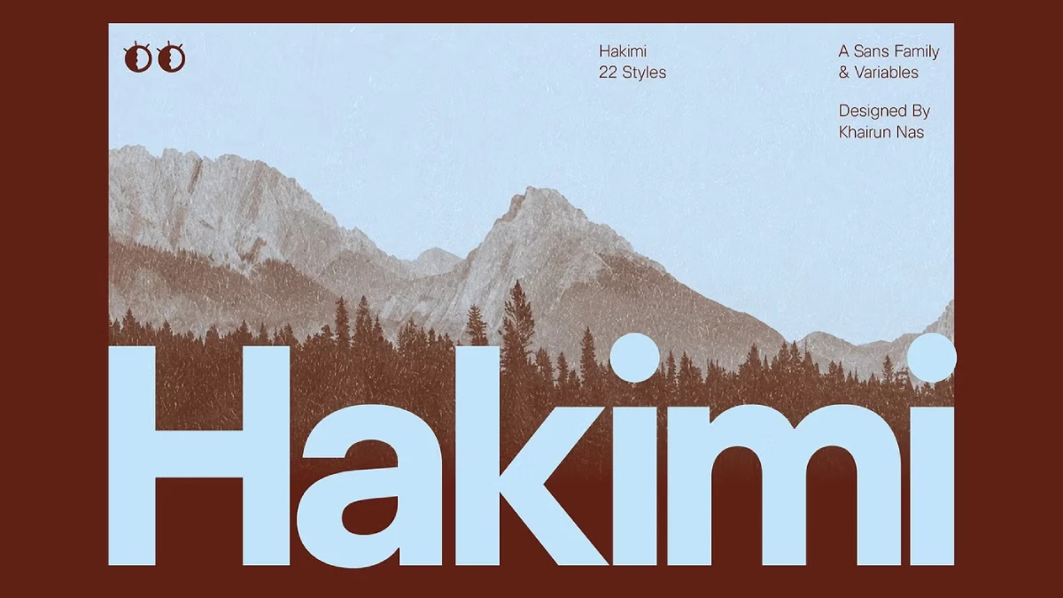
With ZT Hakimi, Zelow Type made a family that acts like an interface type at 14 pixels. Then it turns into a confident grotesque at 200 points. I would say that most sans serifs pick one job, but this one takes both.
You can download the complete font family for a very low budget from these platforms:
This ZT Hakimi font review covers what I tested and what worked. It also covers what annoyed me. You’ll get two frameworks to reuse in your own type decisions. And yes, I have opinions.
You can download the complete font family for a very low budget from these platforms:
What Is ZT Hakimi and Who Should Use It?
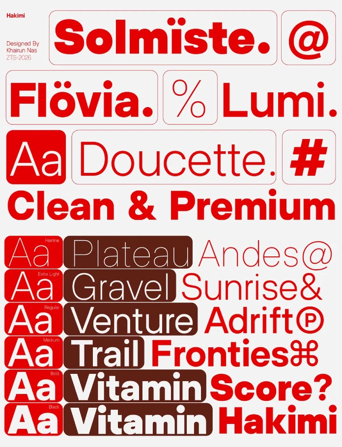
ZT Hakimi is a neutral sans serif family from Zelow Type. It spans 11 weights, from Hairline to ExtraBlack. Each weight has an italic, so you get 22 styles. Two variable font files, Roman and Italic, cover the full weight range. Creative Market and YouWorkForThem both sell the family.

Do you split your week between product screens and brand work? Then ZT Hakimi fits your desk. One family can serve both jobs. Studios that run a design system next to an identity will notice the savings first.
The Latin set holds 600 glyphs. That excludes Cyrillic and Greek. So check your project scope before you buy.
How the Typeface Passes the Two-Register Test
I use a simple check for every sans serif. I call it the Two-Register Test. A family passes when it works as quiet UI text and as a loud display type. It must do both without a second typeface. Humanist sans serifs often look timid at 120 points. Display grotesques often fall apart at 12. ZT Hakimi passes the Two-Register Test in my sessions. I’ll show where.
How Does it Perform at Small Sizes?
I set a dashboard mockup in ZT Hakimi at 13 and 14 pixels. The letterforms stayed open and calm. Nothing competed for attention. That’s the whole point of interface type. Next, I stress-tested a table of order IDs. The slashed zero separated 0 from O at a glance. Tabular figures kept every column aligned.
The variable files helped here. I nudged the weight in small steps until the labels stopped looking gray. Static fonts can’t do that. Instead, you jump between fixed weights and compromise. With the ZT Hakimi variable fonts, you tune the weight to the screen.
Why ZT Hakimi Figures Deserve More Credit
The figure sets impressed me more than the letterforms. ZT Hakimi ships three figure styles: OSF, TF, and TOSF. Tabular figures suit pricing tables. Old-style figures suit running text. Tabular old-style figures solve the awkward case. Think of a price list inside an editorial layout. The numbers align, but they don’t shout. Not every sans serif offers that.
Case-sensitive forms matter too. Set a headline in all caps, and the brackets and hyphens rise to match. Ordinals, fractions, subscripts, and superscripts also come standard. The extended currency set helps anyone who prices in several markets. This toolkit makes ZT Hakimi a working font for finance and editorial work.
Why Does the Font Family Hold Up at Display Sizes?
At 200 points, the ExtraBlack keeps its composure. Counters stay open. Joins stay clean. I call this Weight Fidelity. It means the letterforms stay recognizably one design at every weight. ZT Hakimi has high Weight Fidelity. Many families drift. Their Black cuts look like cousins, not siblings. Here, the Hairline and the ExtraBlack share one skeleton.
Hairline deserves a warning. It’s a poster weight. I wouldn’t set it below 48 points, and I’d skip it for body copy entirely. Here’s my blunt opinion: ZT Hakimi is more useful than exciting. I mean that as praise.
Where Does ZT Hakimi Work Best in Real Projects?
Branding and Packaging
A brand needs a typeface that survives a hundred contexts. This typeface gives a studio a neutral base. Color and imagery then carry the personality. If you want the type to carry it, look elsewhere.
Editorial Layouts
Headlines in ExtraBlack and captions in a light weight create a clear hierarchy from one family. That’s the practical advantage of ZT Hakimi in magazines and long reads. The old-style figures also keep numbers calm inside body text.
Wayfinding and Interfaces
Zelow Type lists wayfinding as a use case. The even structure supports that claim on paper. However, test the family at real viewing distance before you commit. For apps and dashboards, the case is easier to make.
Where Does the Typeface Fall Short?
Two limits apply. First, the Latin-only set excludes many languages. Second, the feature list mentions no stylistic alternates. So ZT Hakimi offers little quirk. If you want a signature letter, you’ll need to draw it yourself or pick another family.
What Comes Next for Neutral Sans Serifs Like ZT Hakimi?
I’ll make two predictions for 2027. First, variable fonts will become the default purchase for sans serifs. Static bundles will become the add-on. Second, figure sets will become the main selling point of neutral families. ZT Hakimi already leads with them. Designers who work with data will demand that.
I also expect more studios to standardize on one family for product and brand. This typeface suits that move.
ZT Hakimi at a Glance
| Feature | Specification | My Verdict |
|---|---|---|
| Foundry | Zelow Type | Clear, restrained design intent |
| Classification | Neutral sans serif | Passes the Two-Register Test |
| Weights | 11, from Hairline to ExtraBlack | High Weight Fidelity |
| Styles | 22 (11 upright, 11 italic) | Enough for full hierarchies |
| Variable fonts | 2 files (Roman and Italic) | Best for fine weight tuning |
| Glyphs | 600, Latin set | No Cyrillic or Greek |
| Figures | OSF, TF, and TOSF | The strongest feature |
| Other features | Case-sensitive forms, ordinals, slashed zero, fractions, subscript, superscript, extended currency | Ready for data and pricing work |
| Best uses | Branding, editorial, packaging, wayfinding, interfaces | Strongest in UI and editorial |
| Where to buy | Creative Market, YouWorkForThem | Check each license before use |
You can download the complete font family for a very low budget from these platforms:
Frequently Asked Questions About ZT Hakimi
What is ZT Hakimi?
It’s a neutral sans serif family from Zelow Type. It offers 22 styles, two variable font files, and 600 Latin glyphs.
Where can I buy the ZT Hakimi font family?
You can buy ZT Hakimi on Creative Market and YouWorkForThem.
Is it a variable font?
Yes, it includes two variable font files, one Roman and one Italic. Both cover the full weight range.
Does it support Cyrillic or Greek?
No, ZT Hakimi covers the Latin character set only, with 600 glyphs.
Is it good for UI design?
Yes, tabular figures, a slashed zero, and a calm structure make it a strong choice for interfaces and dashboards.
Browse WE AND THE COLOR’s Fonts category for more. Our professional reviews will help you find the perfect typeface for all your creative projects.
Subscribe to our newsletter!