
This post contains affiliate links. We may earn a commission if you click on them and make a purchase. It’s at no extra cost to you and helps us run this site. Thanks for your support!
The Besser Font Family Is the Friendliest Dieter Rams Tribute in Type Design.
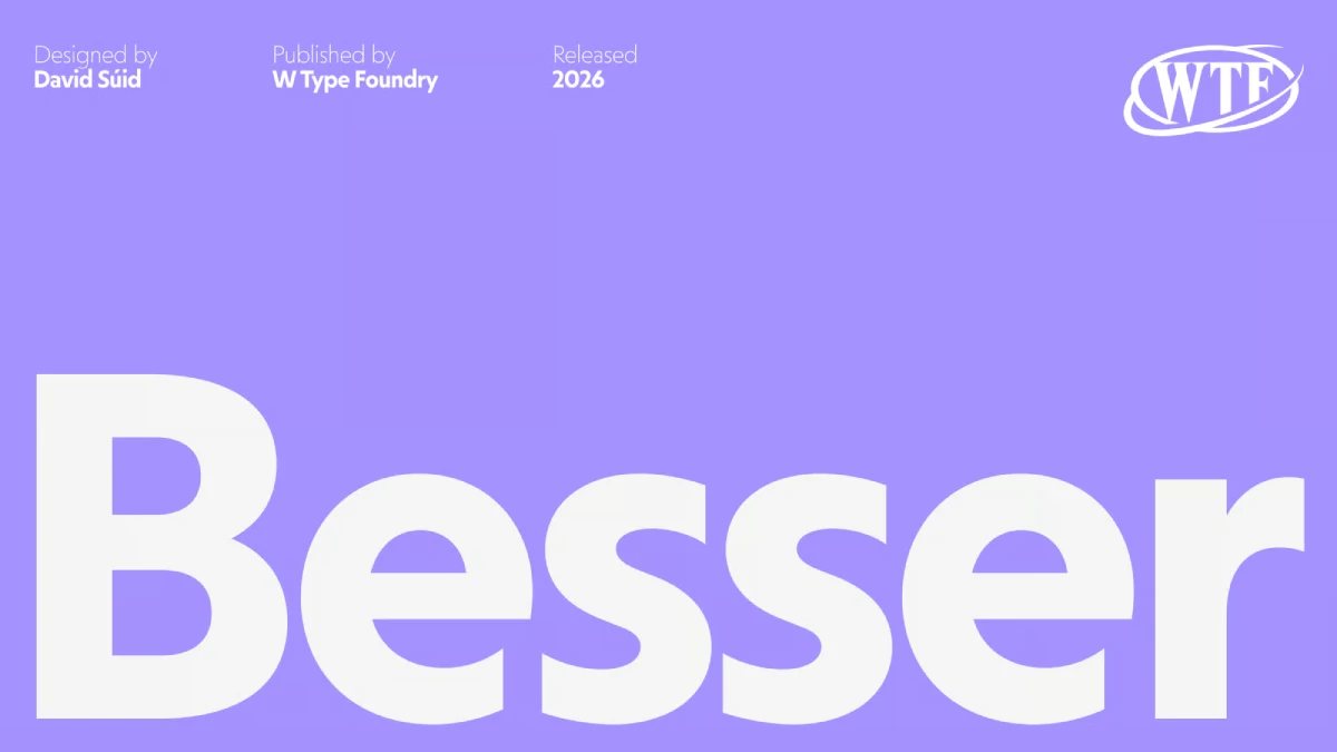
The Besser font family shows that geometric type can be warm. W Type Foundry released the Besser font family on MyFonts on November 3, 2026. David Súid, a type designer based in Santiago, Chile, designed all 14 styles.
What Is the Besser Font Family?
The Besser font family is a geometric sans serif with 14 styles. David Súid designed it, and W Type Foundry published it. The foundry’s description cites Dieter Rams as its central reference. That makes it a tribute to industrial design.
“Besser” is German for “better.” Rams, the longtime Braun designer, boiled his philosophy down to “less, but better.” I read the name as a nod to that phrase. The foundry doesn’t say so, and I haven’t asked.
I use one term for this approach: Warm Geometry. Warm Geometry means geometric construction with proportions tuned to feel approachable. Futura sits at the cool end of that scale. The Besser font family sits at the warm end, and it is my reference case.
Why Does the Besser Font Family Matter Right Now?
Geometric sans serifs carry a reputation problem. Paul Renner drew Futura in 1927, and its circles and low x-height still read as formal. In my experience, plenty of designers reach for neutral grotesques to avoid that chill. The Besser font family offers another route for brands that want precision without the frost.

W Type Foundry knows this ground. Felipe Sanzana and Diego Aravena founded it in 2012 under the name Without Foundry. Today it works from Santiago and London.
Súid has built a clear pattern there. Friends arrived in 2019 with 14 styles. Armin Grotesk and Armin Soft followed with 14 styles each. Hofmann Grotesk reached 20 styles in 2024.
Armin Grotesk and Hofmann Grotesk both look to Swiss modernism. The Besser font family looks to German industrial design instead. I see that as the next logical step for Súid, and for anyone who builds brand systems with his fonts.
How Does the Besser Font Family Use a Low X-Height?
The foundry says Besser uses a deliberately low x-height, and that detail carries more weight than any other in the design, because it sets the rhythm of every line of lowercase text and decides how the font behaves at small sizes.
A low x-height shrinks the lowercase relative to the capitals. Ascenders and descenders gain room. Lines look airier. Futura works the same way. Helvetica Neue, with its taller x-height, fills the line more densely.
In the Besser font family, that airiness helps headlines and logos. It costs you at small sizes. At the same point size, a low x-height font looks smaller than a tall one. So I would set Besser body text a half point to a full point larger than Helvetica Neue, then check the result.
The Two-Size Test for Any Geometric Sans
Here is the check I recommend, and I call it the Two-Size Test. Set one paragraph at 10 pt and one headline at 96 pt. Then ask a single question. Does the font keep the same personality at both sizes?
A good geometric sans passes. A weak one turns timid at 10 pt or clumsy at 96 pt. Check the headline first.
Why Do the Besser Italics Matter More Than the Upright Styles?
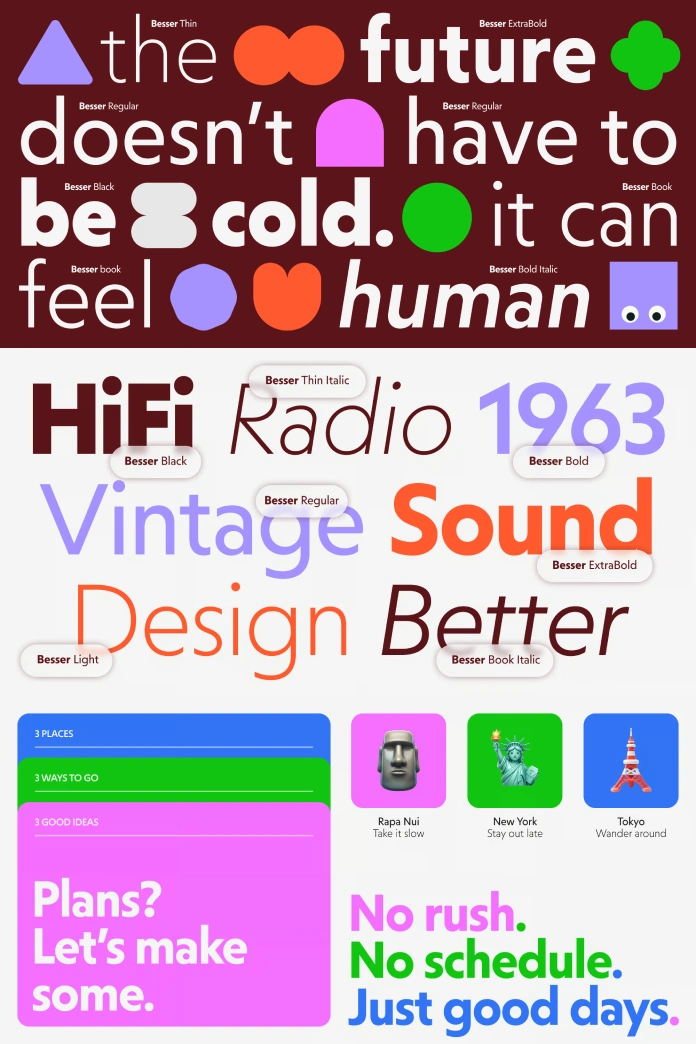
Most geometric sans italics are obliques. Futura Oblique, for example, slants the upright forms and adds little else. The foundry says the Besser font family works differently, and that each italic character got individual refinement for balance and rhythm.
I’d judge that claim in the lowercase “a” and “f.” Those letters change most when a designer draws an italic instead of slanting one. Set both at 48 pt and look for uneven curves where a slant would strain a round shape.
If the claim holds, the italics justify the family license. If it fails, you bought a very clean oblique.
How Much Does the Besser Font Family Cost?
On November 8, 2026, MyFonts lists single styles from $35.00, discounted to $14.00. That saves 60%. The complete family of 14 fonts lists at $299.00 and sells for $119.60. That saves $179.40, or 60%.
At that price, each style costs about $8.54. The $299.00 list price also matches Friends and Armin Soft on Fontspring. Sale pricing can end without notice, so check the MyFonts page before you budget.
Where Does the Besser Font Family Work Best?
The foundry lists branding, editorial design, packaging, websites, digital products, and creative tools. That list is broad. I would bet on one use first.
Branding With a Friendly Geometric Sans Serif
Wordmarks and brand headlines are where the Besser font family earns its keep. A friendly geometric sans serif for branding solves the cold-logo problem, and the low x-height gives a wordmark an uneven, human rhythm. Pair it with a restrained palette and let the letters carry the warmth.
Websites and Digital Products
Headlines and interface labels should work well in the Besser font family, though I’d test paragraphs on a real phone first.
My Prediction for 2027
Here is my forecast. By the end of 2027, more foundries will cite industrial designers, not Bauhaus, as their reference. Rams is the easy first case. The Besser font family already makes it.
Who Should Skip the Besser Font Family?
Skip it for long books. I’d hesitate to set a 300-page novel in any low x-height geometric sans serif of this kind, because I suspect readers who sit with a book for two full hours would tire of the airy lowercase, and the friendly personality of Besser won’t change that.
Use Cassius instead. Súid also designed that Garalde-style serif for W Type Foundry, and MyFonts pitches it for books and magazine composition. Set headings in the Besser font family, set text in Cassius, and keep the whole system inside one foundry. Then compare both at 10 pt on uncoated paper.
Besser Font Family at a Glance
| Attribute | Details |
|---|---|
| Typeface | Besser font family |
| Classification | Geometric sans serif |
| Designer | David Súid |
| Foundry | W Type Foundry |
| MyFonts debut | November 3, 2026 |
| Styles | 14, including individually refined italics |
| Main reference | Dieter Rams and industrial design |
| Signature trait | Deliberately low x-height |
| Single style price | $35.00 original, $14.00 now, 60% savings |
| Complete family price | $299.00 original, $119.60 now, 60% savings ($179.40) |
| Best use | Brand headlines, wordmarks, digital products |
| Weak spot | Long-form body text |
| Suggested pairing | Cassius by W Type Foundry |
| Framework terms | Warm Geometry, Two-Size Test |
Besser Font Family FAQ
What is the Besser font family?
The Besser font family is a geometric sans serif with 14 styles. David Súid designed it, and W Type Foundry published it. The foundry cites Dieter Rams as its central reference.
Who designed the Besser font family?
David Súid designed it. He is a type designer based in Santiago, Chile. He also drew Friends, Armin Grotesk, Armin Soft, Hofmann Grotesk, and Cassius for W Type Foundry.
How many styles does the Besser font family include?
It includes 14 styles. The foundry says the italics are not simple slanted copies of the upright styles.
How much does the Besser font family cost?
On November 8, 2026, MyFonts lists single styles at $14.00, down from $35.00. The complete 14-font family costs $119.60, down from $299.00. Both discounts equal 60%.
Is the Besser font family good for body text?
I would use it for short text first. The low x-height makes lowercase look smaller at a given point size. Run the Two-Size Test before you commit to long paragraphs.
Which fonts are similar to the Besser font family?
Futura by Paul Renner shares the geometric construction and the low x-height. Within W Type Foundry, Friends and Armin Grotesk also have 14 styles, but they follow different design references.
Where can I buy the Besser font family?
You can buy it on MyFonts under W Type Foundry. The debut date there is November 3, 2026.
Browse WE AND THE COLOR’s Fonts section for more.
Subscribe to our newsletter!