This post contains affiliate links. We may earn a commission if you click on them and make a purchase. It’s at no extra cost to you and helps us run this site. Thanks for your support!
Why Has Hanley Pro, a Hand-Drawn Vintage Font Collection Released in 2018, Become So Popular in the Last Two Years? I’ll Tell You.
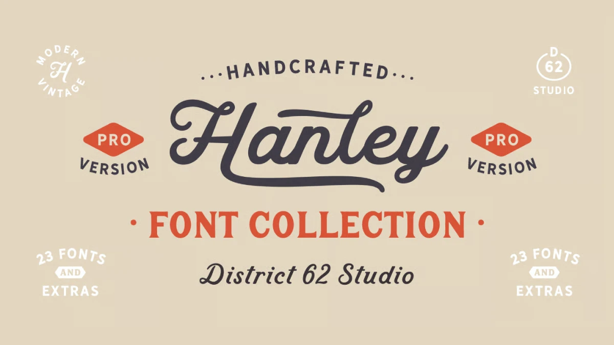
Hanley Pro looks like someone cut it by hand and forgot to sand the corners. That is its whole appeal. District 62 Studio released this vintage font family in 2018. Yet search interest in Hanley Pro climbed through 2025 and 2026, with a clear peak in April 2026.
I think the reason is simple. Smooth, machine-made imagery fills every feed. As a result, viewers reward anything that shows a human hand. Hanley Pro shows one in all 23 of its fonts.
You can purchase the complete font collection from:
My article explains what the Hanley Pro font family contains and why the look works right now. It also shows how to use each style. Along the way, I introduce a few terms of my own for judging imperfect types. Those terms are editorial constructs, not industry standards.
You can purchase the complete font collection from:

What Is Hanley Pro, and Who Made It?
Hanley Pro is a multi-style font family from District 62 Studio, a type and graphic design studio in Miami. Megan Tamaccio and Aleksandar Veljasevic designed it together. MyFonts lists the debut as October 9, 2018.
The story starts with a logo problem. The two designers needed a script that felt vintage but not dated. It could not feel too baseball-y or too formal. Nothing on the market fit, so they drew their own.
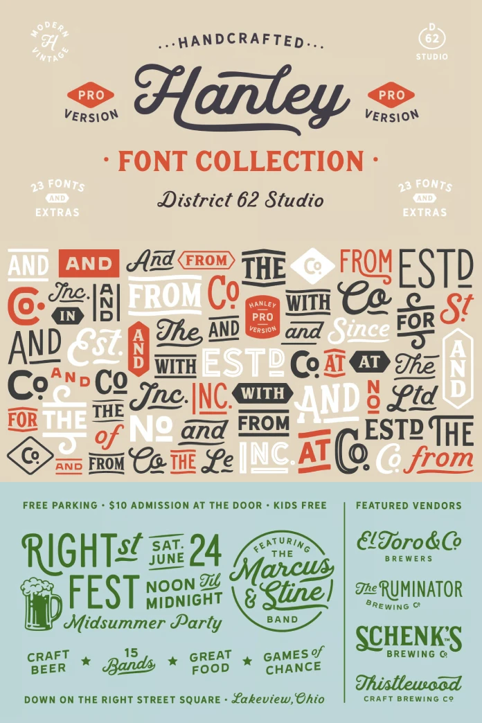
Wood block lettering came next, especially with small caps. After that, a tall, slim style and a monoline script version joined the set. Then a sans followed. Catchwords, swirls, swashes, and frames rounded it out.
Veljasevic is a Serbian type designer. Later, the pair released Lincoln Road, a nine-style sans, in 2021. Even so, Hanley Pro remains their most visible joint project.
How Does Hanley Pro Differ From the Original Hanley?
The Pro version adds 10 exclusive styles, including an alternate script and an italic. It also adds a full set of small caps for the Block styles. Extra alternates and more catchwords came along too. Every style in Hanley Pro now carries extended language support.
Why Hanley Pro Fits the Anti-AI Design Mood
Here is my thesis. People do not distrust polish itself. Instead, they distrust polish that costs nothing. When any tool can produce a flawless poster in seconds, flawlessness stops signaling skill.
So imperfection fills that gap. A slightly uneven edge suggests a hand and a decision. I call this the Anti-Gloss Signal. It describes how audiences read visible irregularity as proof that a person made something.
On top of that, nostalgia adds a second layer. Vintage lettering recalls a time when every letter needed a maker. Wood type and sign painting carry that history too. Because of that, a retro script font now reads as honest.
Hanley Pro answers the signal better than most vintage fonts. The foundry says its edges have just enough irregularity to feel human while staying clean. In fact, that balance matters more than any single style.
The Controlled Wobble Test
Here is how I judge imperfect type. I call it the Controlled Wobble Test. A font passes when its irregularity shows at display size and fades at text size. The roughness must also stay fixed in the outlines.
That second condition matters. Filters that fake roughness often vary from letter to letter. By contrast, a drawn irregularity stays put. So a logo set in Hanley Pro looks identical on a mug and on a website.
Compare that with grunge fonts. They spread noise over every letter, and the noise reads as a filter. Hanley Pro puts its irregularity in the edges and stays clean overall. That restraint separates a font from an effect.
How Is the Hanley Pro Font Family Organized?
Hanley Pro contains 23 fonts on MyFonts. Luc Devroye’s type archive sorts the family into four subfamilies. Those are Script, Slim, Sans, and Block. The same archive notes the influence of woodblock lettering.
Fontspring classifies the family under display sans, display serif, display slab, script, and dingbat. That spread is unusual for one family. Yet the foundry says all styles work well together.
I call the reason the Shared Edge Principle. Styles from different classes pair without clashing when they share the same edge behavior. The foundry’s own description points straight at it.
Hanley Script and Hanley Script Alt
The script started the family. It answers a brief for a vintage script that avoids baseball nostalgia and formal stiffness. Hanley Script Alt, new in the Pro release, offers an alternate script. Test both on your actual word, because letter pairs change the rhythm of any script.
The foundry also mentions a monoline script version. Monoline strokes hold up better at small sizes because they never thin out.
Hanley Block and Block Small Caps
Next, Block carries the wood-type memory. Fontspring lists Hanley Pro Block as a display serif. The Pro release adds a full set of small caps for the Block styles, plus an inline-only style.
Small caps, for example, matter for vintage packaging. In effect, they give a headline two sizes of capital without leaving the family. Coffee labels and barbershop signs both lean on that trick.
Hanley Sans, Sans Two, Wide, and Extra Wide
The sans side of Hanley Pro grew the most. It now includes Sans, Sans Two and Inline, Sans Wide, and Sans Extra Wide. Sans Two and Inline is an alternate take on the sans. Outline versions of both wide cuts complete the group, along with an inline-only style.
Extra-wide letters need room. For example, a short word like OPEN or BAKERY works. A full sentence, however, does not. Wide settings eat space fast, and they punish long copy.
Now for my least popular opinion. The outline cuts are the weakest part of the family. For one, they disappear in busy photos and rarely beat the solid versions. Use them on flat color, at large sizes, for one hero word.
Hanley Slim, Slim Bold, and Slim Serif Bold
In contrast, the slim styles are tall and narrow. The Pro release adds Slim Bold and Slim Serif Bold. Both fit tall bottle labels and narrow poster columns. They also give a layout a second, quieter voice beside the wide sans.
Hanley Italic
Hanley Italic joins the family in the Pro release. A vintage layout often needs emphasis without a switch to script. So an italic handles that job. It keeps a headline in one voice from the first word to the last.
Catchwords, Swashes, and Frames
The extras turn Hanley Pro into a logo kit. They include catchwords, swirls, swashes, and frames. Catchwords are pre-drawn small words for badges and lockups.
The files use Private Use Area encoding. Therefore, you can access many extras through a glyphs panel. The included read-me explains access for software without OpenType feature support.
Hanley Pro at a Glance
| Attribute | Detail |
|---|---|
| Family | Hanley Pro |
| Foundry | District 62 Studio |
| Designers | Megan Tamaccio, Aleksandar Veljasevic |
| Debut | October 9, 2018 on MyFonts |
| Fonts in the family | 23 on MyFonts and Creative Market |
| Subfamilies | Script, Slim, Sans, Block |
| Pro additions | 10 exclusive styles, Block small caps, more catchwords, extended language support |
| Extras | Catchwords, swirls, swashes, frames |
| Bonus content | 49 logos in Illustrator format (Creative Market) |
| Where to buy | MyFonts, Creative Market, Fontspring |
| Price on MyFonts | Single styles from $5, full family $99 |
| Style group | Styles | Character | Best use |
|---|---|---|---|
| Script | Hanley Script, Script Alt | Vintage, not formal | Names and signature words |
| Block | Block, Block with small caps, Block Inline | Wood-type display serif | Headlines and badges |
| Sans | Sans, Sans Two and Inline, Wide, Extra Wide, outlines | Clean display sans | Details and poster words |
| Slim | Slim, Slim Bold, Slim Serif Bold | Tall and narrow | Bottle labels and tight columns |
| Italic | Hanley Italic | Emphasis in one voice | Subheads and taglines |
| Extras | Catchwords, swashes, frames | Ornamental | Logos and lockups |
Where Does Hanley Pro Work Best?
Logos and Brand Marks
Start here, because the family started here. After all, the designers built it while drawing logos. The Creative Market version includes 49 bonus logos in Illustrator format. Then open them to see how the foundry pairs script and block.
I call that pairing method the Four-Voice Stack. Script takes the name, and Block takes the claim. Sans handles details, and Slim fills tight spaces. Limit any layout to two voices at once.
Packaging and Labels
Small caps and slim cuts make Hanley Pro a natural fit for vintage packaging. Indeed, craft food and drink labels already lean on this look. That popularity carries a risk, though. When every coffee bag uses the same vintage font, the human signal fades. So pick one catchword and one swash, then stop.
Posters, Social Posts, and Merchandise
Extra Wide Sans suits a single poster word. A script name over a Block line suits a social post. In practice, merchandise works well when the lettering stays large. Check the license first, though. Fontspring’s summary lists desktop and web font use. Creative Market and MyFonts set their own terms, so read them before you print on products or build an app.
What Happens to Hanley Pro Next?
Here are my predictions. Treat them as informed opinion, not data.
Prediction one. Imperfect types will split into two camps by 2028. One camp holds drawn irregularity, and the other holds simulated roughness. As a result, buyers will start asking which is which.
Prediction two. Foundries will advertise hand-drawn provenance the way food brands advertise origin. For instance, expect phrases like “drawn by hand” on specimen pages and in font descriptions.
Prediction three. The extra value buyers attach to visible human making will keep growing as AI imagery gets cheaper. I call it the Human Edge Premium. In my view, fonts like Hanley Pro, with fixed and drawn irregularity, will collect most of it.
Also expect fatigue. Vintage-clean lettering will saturate packaging within a couple of years. The designers who still look fresh will use Hanley Pro with restraint. Where does your own work sit on that scale?
You can purchase the complete font collection from:
Common Questions About Hanley Pro
What is Hanley Pro?
Hanley Pro is a vintage font family from District 62 Studio. It combines script, block, slim, and sans styles with catchwords, swashes, and frames. The foundry designed it for logos first.
Who designed Hanley Pro?
Megan Tamaccio and Aleksandar Veljasevic designed Hanley Pro. District 62 Studio also published it. MyFonts lists the debut as October 9, 2018.
How many fonts does Hanley Pro include?
MyFonts and Creative Market list 23 fonts in Hanley Pro. Fontspring, however, lists a 15-font family. So compare the contents of each package before you buy.
How much does Hanley Pro cost?
MyFonts lists single styles from $5 and the full 23-font family at $99. Fontspring lists its 15-font family at $99. Prices change, so confirm the current figure in the store.
Where can I buy Hanley Pro?
You can buy Hanley Pro from MyFonts, Creative Market, and Fontspring. Each store packages the family differently, so check the file count first.
Is Hanley Pro good for logo design?
Yes. The designers built the family while working on logos. In addition, the script, Block with small caps, and extras all target brand marks.
What is the difference between Hanley and Hanley Pro?
Hanley Pro adds 10 exclusive styles, including Script Alt and Italic. It also adds small caps for Block and more catchwords. All styles carry extended language support.
How do I access the swashes and catchwords in Hanley Pro?
Open the glyphs panel in your design software. The files use Private Use Area encoding, so many extras sit there. The read-me covers software without OpenType feature support.
What comes with the Creative Market version of Hanley Pro?
You get 23 font files, including two inline-only styles for Block and Sans. The package also contains 49 bonus logos in Illustrator format and the Illustrator files for the preview images.
Check out WE AND THE COLOR’s Fonts category for more.
Subscribe to our newsletter!