This post contains affiliate links. We may earn a commission if you click on them and make a purchase. It’s at no extra cost to you and helps us run this site. Thanks for your support!
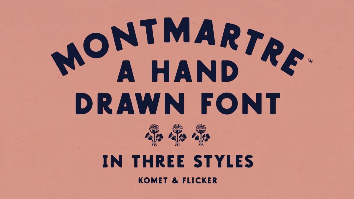
The Montmartre font makes a bold bet. It assumes that hand lettering fails through repetition, not through roughness, and Komet & Flicker designed a hand-drawn all-caps typeface around that idea. Every letter carries small irregularities. The lowercase keys trigger alternate shapes. A set of 11 connecting words rounds out the kit. I think the bet pays off.
Honestly, hand-drawn fonts often have a repetition problem. You want the warmth of old signage. But you can’t letter a poster by hand before Friday, so you set it in a font. Most fonts in this genre draw each letter only once. A headline with four As then shows the same A four times. A real sign painter never paints two identical letters. That sameness gives the fake away.
What Is the Montmartre Font, Exactly?
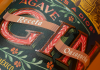
The Montmartre font is a hand-drawn, all-caps display typeface from Komet & Flicker. It draws on artisan signage and vintage print work. The name points to the Paris hill where poster artists and cabaret printers worked for decades. The letterforms fit that history well.
Creative Market lists three styles: Crisp, Rustic, and Stamp. The character set covers basic Latin A to Z, select European characters, numbers, punctuation, select symbols, and pre-made common fractions. Lowercase glyphs are alternate renders of the capitals. They are not a true small-letter alphabet.
That last point defines how you set this vintage signage font. A sentence in sentence case gives you capitals with variation. It gives you no ascenders and no descenders. So, plan your copy as caps from the first sketch.

The Double Draw Principle: Why Alternates Matter
Repetition exposes fakes. When the same A appears four times in a headline, the eye catches it at once. The Montmartre font gives each capital a second drawing through the lowercase keys. I call this the Double Draw principle. Two drawings cannot match a sign painter. However, they break the obvious loop.
Take HANDMADE BAKERY. It contains three As. Swap the middle one for its alternate, then check the remaining letters by eye. This takes a minute and changes the whole line.
Double Draw has a limit. Two shapes per letter still repeat across a long paragraph. So keep this font with alternate lowercase glyphs to headlines, labels, and short lines.
Crisp, Rustic, and Stamp: Choosing Among the Three Styles
I rank the styles on what I call the Roughness Ladder. Crisp sits on the bottom rung. Rustic sits in the middle. Stamp sits at the top. Each rung adds wear, and each rung costs you legibility at small sizes.
Crisp: Safe and Forgettable
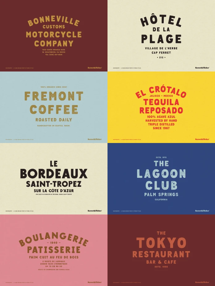
Crisp has clean, sharp edges. It reads as handcrafted but not worn. I find it the safest style and the least memorable. Its edges sit close to many sign-painter fonts, so it competes in a crowded group. Use it for menus, packaging, and logos where clarity wins.
Rustic: Soft Corners, Warm Mood
Rustic rounds the corners. Creative Market calls the effect weathered, warm, and organic. Soft corners should hold up better on uncoated stock than rough edges. I would reach for Rustic on cafe signage, craft labels, and invitations.
Stamp: The Style That Matters
Stamp adds a rough, gritty texture. It recalls inked impressions and old letterpress. This is the reason to own the family. It also clogs when you shrink it. My rule of thumb, the Stamp Floor, sets the minimum at about 24 pt in print and 36 px on screen.
Use Stamp for one hero line per layout. Then surround it with Crisp or a plain sans. Texture needs quiet next to it. Without that quiet, a vintage letterpress font for packaging turns into noise.
The Wobble Budget: A Framework for Using the Montmartre Font
Every layout absorbs a limited amount of irregularity. I call that limit the Wobble Budget. Hand-drawn lettering spends it fast. Paper textures, torn edges, and script accents spend it too. So decide early which element carries the wobble.
If the Montmartre font carries it, keep everything else straight. Two checks keep a layout inside the budget. First, limit textured elements to two per layout. Second, view the headline at the final output size before you approve it.
Designers break this rule most often with Stamp. The texture looks great at 300 percent zoom. It looks muddy on a business card. Which size does your client actually see?
Connecting Words: The Detail That Matters Most
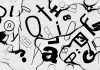
The kit includes 11 custom connecting word glyphs. The description names three examples: “and,” “the,” and “with.” Each comes in lowercase and uppercase styles. Hence, a line like SALT AND SMOKE can use a drawn AND instead of three typed letters.
Vintage signage depends on these small words. Sign painters shrink them, tuck them between big words and tilt them. A typed “and” at the same size as its neighbors looks flat. A drawn connector sits in the line as a painter would place it. I call this effect the Connector Rhythm.
I would buy this font for the connectors alone. Most hand-drawn caps fonts ignore the small words, and that is where the amateur look starts. Komet & Flicker got this right. The description lists only three of the 11 words, though. Open the glyph panel before you promise a client a specific word.
How to Access the Extra Glyphs in Illustrator and Photoshop
The alternates and connectors live in the glyph panels. You will not find them by typing alone. Also, set your text to Montmartre first, or the panel shows the wrong set.
Adobe Illustrator
Go to Type → Glyphs. Select your text, then pick the connecting word from the panel. Double-click a glyph to place it.
Adobe Photoshop
Go to Type → Panels → Glyphs Panel. The workflow matches Illustrator. Photoshop users should rasterize only after the final glyph choices.
Where the Montmartre Font Works and Where It Fails
This hand-drawn all-caps font suits posters, packaging, menus, logos, bar signage and merchandise. It works wherever a short line must feel made by a person. A rustic stamp font for logos also scales well when you test the texture at the smallest size first.
It fails in body copy. It fails in interface text and long captions. All caps with irregular edges tire the eye after two lines. Select European characters also means partial language coverage. Test your own language before you commit to a project.
Montmartre Font at a Glance
| Attribute | Detail |
|---|---|
| Foundry | Komet & Flicker |
| Category | Hand-drawn all-caps display typeface |
| Inspiration | Artisan signage and vintage print work |
| Styles | Crisp, Rustic, Stamp |
| Lowercase | Alternate renders of the capitals |
| Connecting words | 11 custom glyphs, upper and lowercase |
| Character set | Basic Latin A to Z, select European characters, numbers, punctuation, select symbols, common fractions |
| Illustrator access | Type → Glyphs |
| Photoshop access | Type → Panels → Glyphs Panel |
| Best use | Headlines, logos, packaging, menus, posters |
| Weak spot | Body text, small sizes in Stamp, language coverage |
| Framework: Double Draw | Two drawings per letter break visible repetition |
| Framework: Roughness Ladder | Crisp, then Rustic, then Stamp |
| Framework: Stamp Floor | About 24 pt in print, 36 px on screen |
| Framework: Wobble Budget | One element carries the irregularity |
| Framework: Connector Rhythm | Drawn small words mimic sign painting |
Prediction: Where Hand-Drawn Caps Fonts Go Next
I expect connecting-word sets to become standard in hand-drawn display fonts within two years. Designers already ask for them. Once buyers see one font with connectors, fonts without them will look unfinished. Style splits will follow, with one family offering several textures.
Frequently Asked Questions About the Montmartre Font
What is the Montmartre font?
The Montmartre font is a hand-drawn all-caps typeface by Komet & Flicker. It draws on vintage signage and print work. It comes in Crisp, Rustic, and Stamp styles.
Does the Montmartre font have real lowercase letters?
No. The lowercase glyphs are alternate renders of the capitals. They add variation but not small-letter shapes.
How many styles does the Montmartre font include?
It includes three: Crisp, Rustic, and Stamp. Crisp has sharp edges, Rustic has soft corners, and Stamp has a gritty texture.
What are the connecting words in the Montmartre font?
They are 11 custom glyphs for small words such as “and,” “the,” and “with.” Each exists in lowercase and uppercase styles.
How do I access the extra glyphs?
In Illustrator, use Type → Glyphs. In Photoshop, use Type → Panels → Glyphs Panel.
Is the Montmartre font good for body text?
No. All caps and irregular edges tire the eye in long passages. Use it for headlines and short lines.
Which style works best at small sizes?
Crisp or Rustic. Stamp loses detail below roughly 24 pt in print.
Does the Montmartre font support European languages?
It includes select European characters, so coverage is partial. Type your full copy into a test file before you buy.
Browse WE AND THE COLOR’s Fonts category for more trending typefaces.
Subscribe to our newsletter!