
This post contains affiliate links. We may earn a commission if you click on them and make a purchase. It’s at no extra cost to you and helps us run this site. Thanks for your support!
Basis Grotesque is the best-behaved grotesque I have seen in years, and I mean that as high praise. I tested the Basis Grotesque font family for several weeks. I set it in a magazine layout and a product interface. Then I pushed it into a pitch deck and a code-heavy documentation page. Each time I waited for a quirk to surface. None did.
Design teams have grown tired of geometric sans serifs that all look alike. They want a grotesque with a real backbone and good manners. Colophon Foundry released Basis Grotesque in 2015. Variable and Arabic editions followed in 2024. The family now suits brands that publish in print and on screens in more than one script.
What Is Basis Grotesque and Who Made It?
Basis Grotesque is a grotesque sans serif family from Colophon Foundry. The London type studio also makes Aperçu and Fann Grotesque. The founders, Anthony Sheret and Edd Harrington, drew the original. The release credits also name Jelle Bosma, Steve Matteson and Robin Nicholas.
The family began as one regular weight. Colophon drew it for the redesign of the photography magazine Hotshoe. Work started around 2012, and the commercial release followed in 2015. Three years of refinement turned a house font into a full system.
Why Did a Photography Magazine Start It?
Photography magazines need a type that stays quiet next to images. A loud typeface competes with the photograph, and the photograph always wins. I read that brief in every curve of Basis Grotesque. It never shouts.

What Does the Basis Grotesque Family Include?
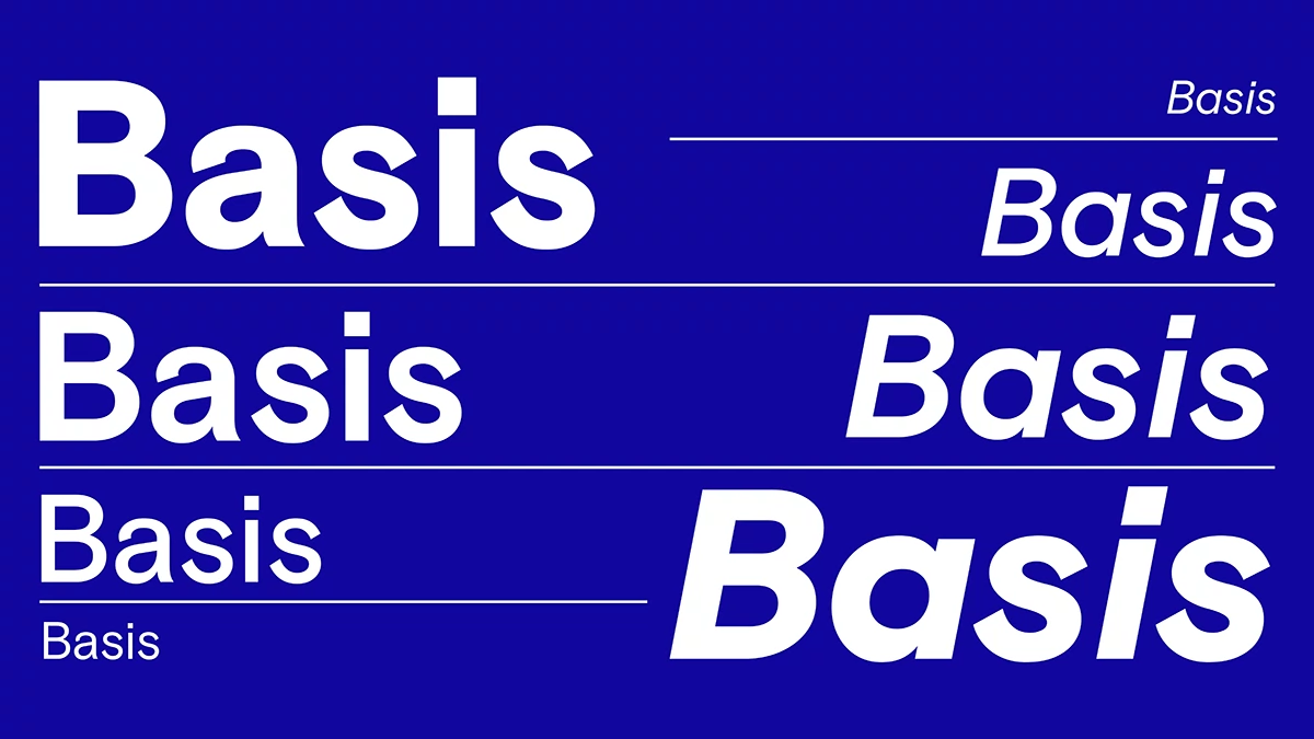
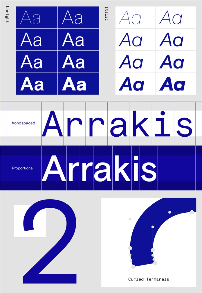
Colophon describes the family as 16 styles. The sans runs from light to black with matching italics. Two monospaced cuts in Regular and Bold, also with italics, sit alongside it. An off-white variant handles the type on solid-color grounds. Every Pro style adds Cyrillic and Greek, and the OpenType feature set is extensive.
Why Is Basis Grotesque a Behaved Grotesque?
Behaved Grotesque is my label for a grotesque with the attitude of early sans serifs and none of their layout trouble. Basis Grotesque fits that definition exactly. Colophon took inspiration from Akzidenz and early Monotype grotesques. Then it set them aside while honoring them, aiming for something calmer and more shapely.
I like that restraint. Revival fonts often copy every blemish and call it authenticity. Basis Grotesque keeps the tone of the originals and skips the blemishes.
Next to Helvetica Neue, it feels warmer. Next to Akzidenz-Grotesk, it feels calmer. That is a personal judgment, and I stand by it.
How Does the Skeleton Lock in Basis Grotesque Work?
Skeleton Lock is my term for weights that share one skeleton. A weight change alters color but never construction. Colophon designed Basis Grotesque this way on purpose. It is the single most useful thing about the family.
So, I ran a simple weight-swap test, and I set a headline in regular, then switched the same text frame to bold and black. The letters kept the same proportions and the same rhythm through every swap, so the headline still read as one voice even though the color of the page had changed completely, which almost never happens with weights drawn at different times by different hands.
Widths grow with weight, as they must. Still, no letter changed its structure. That is rare.
The consistency pays off in hierarchy. I set a Light title above a Medium subhead on one baseline grid. The pair looked like one voice. Because the skeleton stays fixed, a designer can build an entire hierarchy from one family, from a light display line to a black pull number, and the result still feels as if a single author wrote every level of the page.
Why does this matter for brands? A system that needs only one family saves licensing fees and review meetings. It also removes the most common source of typographic drift, which is a second font that nobody chose on purpose.
How Did Basis Grotesque Perform in My Four-Surface Check?
The Four-Surface Check is my method for judging a sans serif. I test it in print, on screen, in a presentation, and in code. A family that works on two surfaces is a good font. A family that works on four is a system.
In print, Regular carried 9 pt body text with an even gray. Italic added emphasis without any wobble.
Screen
On screen, Medium worked well for interface labels. The letters stayed open at small sizes.
Presentation
In the deck, Black made key numbers hard to ignore. Light gave the captions room to breathe.
Code and Data With Basis Grotesque Mono
Basis Grotesque Mono sat beside the proportional cuts without a clash. That pairing saves a design system from adding a second family just for tables and code.
What Is the Basis Grotesque Off White Variant For?
Colophon created an off-white variant for use on solid color grounds. Few families bother. Most designers reverse the regular cut to white and accept whatever happens.
I like this idea more than any other feature in the family. Type on a color field behaves differently than type on paper. I read the purpose as a fix for the glare that pure white creates against deep tones. A dedicated cut treats that glare as a design problem rather than an afterthought.
If your brand uses a dark green or charcoal as its main ground, test this cut first. It may settle an argument before the argument starts.
Is the Basis Grotesque Variable Font Worth the Price?
The Basis Grotesque Variable edition arrived in March 2024. The family has two styles, which I read as upright and italic, each carrying the full weight range. A single file replaces a stack of static weights. That means lighter pages and finer control over every size.
Each style costs $384, and the pair costs $768. That price targets teams, not hobbyists. For a brand with a website and a print program, one family that covers every weight makes sense.
The Basis Grotesque Arabic Variable edition arrived the same month, from $320 per style. It uses open counters and a mono-linear, low-contrast design. Those choices suit both large display sizes and small screen text.
Which Fonts Pair Well With Basis Grotesque?
Pair it with a serif that has real contrast. Canela gives display lines sharp edges. Plantin gives long text a warm, bookish voice. Both let Basis Grotesque play the calm partner.
For data, use Basis Grotesque Mono instead of a stranger from another foundry. The shared skeleton keeps tables and headlines on speaking terms.
Where Is Basis Grotesque Heading Before 2027?
Prediction one. Behaved grotesques will replace geometric sans serifs in many mid-market brand systems by the end of 2027. Basis Grotesque is the clearest model of why.
Prediction two. Other foundries will copy the off-white idea. Designers have waited long enough for a cut built for color grounds.
Prediction three. Colophon will add more scripts to the Basis Grotesque system after Arabic. The 2024 releases read like the start of a multi-script plan.
Basis Grotesque at a Glance
| Attribute | Details |
|---|---|
| Typeface | Basis Grotesque |
| Classification | Grotesque sans serif (Behaved Grotesque) |
| Foundry | Colophon Foundry, London |
| Designers | Anthony Sheret and Edd Harrington; credits also name Jelle Bosma, Steve Matteson, and Robin Nicholas |
| Origin | Custom Regular for the photography magazine Hotshoe; work began around 2012 |
| Commercial release | 2015 |
| Family size | 16 styles, from light to black with italics, plus Mono and Off White |
| Scripts | Latin, Cyrillic, and Greek in Pro styles; Arabic edition from 2024 |
| Variable edition | March 2024, $384 per style, $768 for the pair |
| Key concept | Skeleton Lock: shared skeleton across weights |
| Best for | Editorial design, brand systems, interfaces, decks, documentation |
| My verdict | Buy it |
Frequently Asked Questions About the Typeface
Who designed Basis Grotesque?
Colophon Foundry in London released it. Anthony Sheret and Edd Harrington drew the original for the magazine Hotshoe.
Is Basis Grotesque similar to Akzidenz-Grotesk?
It shares an ancestor. Colophon drew inspiration from Akzidenz and early Monotype grotesques, then built something calmer and more shapely.
Does Basis Grotesque support Cyrillic and Greek?
Yes. Every Pro style includes both scripts.
Does Basis Grotesque have a monospaced version?
Yes. The Mono comes in Regular and Bold, each with an italic.
Is there a Basis Grotesque variable font?
Yes. The variable edition arrived in March 2024 with two styles.
What is Basis Grotesque best used for?
It excels in editorial layouts, brand systems, interfaces, and presentations. The Skeleton Lock keeps hierarchy consistent across all of them.
How much does the Basis Grotesque variable font cost?
Each style costs $384, and the two-style family costs $768.
Feel free to browse WE AND THE COLOR’s Fonts category for more.
Subscribe to our newsletter!