This post contains affiliate links. We may earn a commission if you click on them and make a purchase. It’s at no extra cost to you and helps us run this site. Thanks for your support!
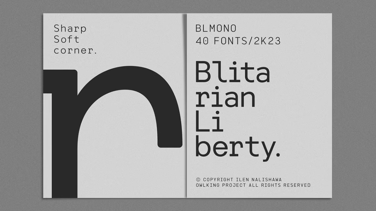
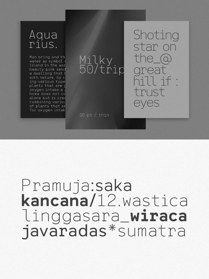
Let’s Talk About Blitarian Liberty, a Rounded Monospace Font Built for Short Tech Headlines.
Blitarian Liberty is a better poster font than a text font. Its rounded corners earn display sizes and lose paragraphs. That’s my call, and I’m keeping it.
The font family is available from:
Sharp monospace fonts dominate tech branding right now. IBM Plex Mono and Space Mono both keep hard corners. OWL KING took the opposite route with Blitarian Liberty. Every letter stays locked to a rigid grid, yet every corner bends. Does that read as friendly or merely unserious? I have a firm opinion.
The font family is available from:
What Is Blitarian Liberty and Who Made It?
Blitarian Liberty is a monospace display font family from the designer OWL KING. Each glyph occupies the same fixed width. Curves replace the sharp corners. The files come in OTF and TTF.

You can buy Blitarian Liberty on Creative Market. Envato Elements lists it too. That marketplace sells access by subscription, so members license the font per project. Read the terms before you ship client work.
How Many Styles Does Blitarian Liberty Include?
The Creative Market description promises 40 weight sizes, including italics. The style names add up differently. They list ten weights, from Thin to Extra Black, and each has an Italic twin. That makes 20 styles.
The listing may count OTF and TTF files separately, which would explain the gap. Ask OWL KING if the exact number matters to you.
Even at 20 styles, Blitarian Liberty offers a far wider ladder than Space Mono, which ships four.
Why Does Soft-Grid Typography Matter Now?
Soft-grid typography is the use of a fixed-width typeface with rounded corners. The grid stays rigid. The letterforms stay gentle. Blitarian Liberty is a clean example of the idea.
Monospace type has a cold history. Howard Kettler drew Courier in 1955 for IBM. Its slab serifs and hard edges signaled typewriters and terminals. Programmers inherited that look, and most coding fonts kept it.
Product design moved the other way. Phones and app icons both wear rounded corners. So a soft monospace font sits comfortably beside product shots.
I think that fit explains the appeal. Designers want a technical voice with a friendly face. Few fonts offer both, and Blitarian Liberty delivers them at poster scale.
Where Does Blitarian Liberty Shine, and Where Does It Fail?
Large Sizes and Short Headlines
Big type is the sweet spot. At large sizes, the curved corners read as deliberate design. The headline then looks like a custom wordmark. A four-word poster title needs nothing else.
Weight matters here. I’d keep the heavy cuts above 36 pt. Thin needs 60 pt or more, because hairline strokes vanish on screens and cheap print.
Paragraphs and Small Sizes
Now the disagreement. The Creative Market description recommends short paragraphs. I’d stop at two lines. Past that, the fixed width slows the eye.
The reason is simple. A monospace font gives an “i” the same room as an “m.” Long lines therefore look gappy. Rounded corners also soften edges at small sizes, and screens blur them further.
Readers expect proportional rhythm in paragraphs. Blitarian Liberty refuses to provide it. That refusal suits a poster headline and punishes a product description.
The Pitch Budget Rule for Monospace Headlines
Monospace type spends width evenly. I call this the Pitch Budget. Every character costs the same horizontal space, so headline length caps the type size.
Here’s the math. Courier uses an advance of 0.6 em. Suppose Blitarian Liberty runs near that value. A 10-character word at 100 pt then spans about 600 pt. Four more characters push it to 840 pt.
Check the real advance width in your layout software before you commit. Then cut words before you cut size. A six-letter title beats a twelve-letter title on a narrow poster.
The Two-Rung Rule for Pairing Blitarian Liberty Weights
The family climbs ten rungs, from Thin up to Extra Black. Neighbors on the ladder look like a mistake. The difference is too small to read as contrast. It’s too large to pass as a match.
My Two-Rung Rule fixes that. Pair weights at least two rungs apart. Regular with Bold works. Light with Extra Bold works better.
Italics deserve their own test. Set one headline in upright and italic. Then compare the curves at 100 percent zoom. Decide whether the slant fits your layout.
What Pairs Well With a Rounded Monospace Font?
Keep the partner quiet. A neutral sans serif such as Inter or Neue Helvetica does the job. Both stay out of the way, so the display type keeps the spotlight.
Avoid other rounded fonts. Two sets of soft corners compete for attention. Contrast in structure works better, so pair the fixed grid with proportional letters.
Color deserves the same restraint. Try near-black type on off-white, or white on a deep navy like #0B1F3A. Saturated backgrounds make the curves look cheap.
Blitarian Liberty vs. Space Mono and IBM Plex Mono
Colophon Foundry drew Space Mono for Google Fonts. IBM Plex Mono belongs to the Plex family that IBM released in 2017. Both lean on sharp geometry.
Blitarian Liberty wins on mood and loses on utility. I wouldn’t set code in it. Nobody should pick a display font for an editor window.
For posters, though, the verdict flips. Plex Mono was built to read in interfaces. Blitarian Liberty was built for large, short statements.
Which Projects Suit Blitarian Liberty?
Think short and loud. These briefs suit Blitarian Liberty best.
- Event posters with titles under five words
- App launch graphics that need a rounded monospace headline
- Album covers with a hi-tech mood
- Cover slides for startup pitch decks
Skip it for annual reports and book interiors. Those jobs need proportional spacing and a calmer texture.
What Comes Next for Soft-Grid Type?
Here’s my forecast. By 2028, new soft monospace releases will outnumber new sharp ones on marketplaces like Creative Market. Rounded hardware keeps spreading, and type follows hardware. Treat this as a forecast I might lose.
I also expect variable versions. A ten-rung ladder begs for a slider. The family would gain from one.
Blitarian Liberty at a Glance
| Attribute | Detail |
|---|---|
| Family name | Blitarian Liberty |
| Designer | OWL KING |
| Category | Monospace display font with rounded corners |
| Weights | Ten, from Thin to Extra Black |
| Styles | 20 (ten upright, ten italic); the listing says 40 |
| Formats | OTF and TTF |
| Available on | Creative Market and Envato Elements |
| Best use | Short headlines and posters with a hi-tech mood |
| Weak spot | Long paragraphs and small sizes |
| Key terms | Soft-grid typography, Pitch Budget, Two-Rung Rule |
The font family is available from:
Common Questions About Blitarian Liberty
Is Blitarian Liberty a true monospace font?
Yes. The listing calls it monospace, so every glyph shares one fixed width.
What file formats come with Blitarian Liberty?
The listing names OTF and TTF.
How many weights does Blitarian Liberty have?
Ten weights, from Thin to Extra Black. Each has an Italic twin, which makes 20 styles. The listing says 40.
Can you use Blitarian Liberty for body text?
I wouldn’t. Keep it to two lines at most, and use a proportional font for anything longer.
Where can you buy Blitarian Liberty?
Creative Market sells it, and Envato Elements lists it for subscribers.
What is soft-grid typography?
It means a fixed-width typeface with rounded corners. Blitarian Liberty is the example in this review.
Which Blitarian Liberty weights pair best?
Apply the Two-Rung Rule. Try Light for the subtitle and Extra Bold for the title.
Browse WE AND THE COLOR’s Fonts category for more.
Subscribe to our newsletter!