This post contains affiliate links. We may earn a commission if you click on them and make a purchase. It’s at no extra cost to you and helps us run this site. Thanks for your support!
I don’t think I’m the only one who feels this way, but I find that many script fonts often look very similar after you’ve scrolled past fifty of them on Creative Market. Loopy, vaguely romantic, and forgettable by the time you close the tab. So when I put the One Moment font by AnMark through a full week of actual project work, I expected the usual. But I didn’t get it. What I got was a script that behaves itself in ways most handwritten fonts don’t, and that’s rare enough to write about.
And no, this isn’t a five-minute preview scroll. I set this font next to real layouts: a mock perfume label, a wedding suite, an Instagram carousel, and a logo lockup for a fictional boutique brand. I wanted to know if the One Moment font holds up once you actually use it, not just admire it in a product thumbnail. Here’s everything I found.
What Exactly Is the One Moment Font?
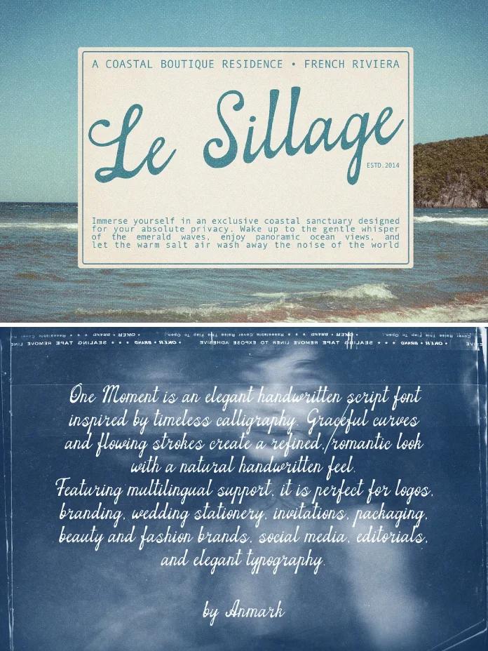
The One Moment font is a handwritten script typeface designed by AnMark, sold through Creative Market for $19. It’s built around calligraphy and classic penmanship, with the kind of graceful, flowing strokes you’d associate with an ink pen rather than a tablet stylus. The letterforms lean romantic and slightly vintage, without tipping into costume drama territory.
AnMark isn’t new to this. The foundry has a long catalog of handwritten and script fonts on Creative Market, and you can tell. The curves in One Moment don’t wobble the way a lot of first-attempt scripts do. There’s a control to the linework that only shows up after someone has drawn hundreds of letterforms and thrown out the bad ones.
According to AnMark’s own product description, the font includes multilingual support and is licensed for both personal and commercial projects. That matters more than it sounds. A script font that only works in English is a script font with a shelf life, and clients notice fast when accented characters break the flow of a word.

Why I Bothered Testing This One Properly
I don’t work with clients anymore. I write about design as someone watching the industry from the editor’s chair, not the invoice side. But that distance is exactly why I test fonts the way I do now. No client deadline pressure, no “just make it work” compromise. Just the font, a blank canvas, and enough time to find where it breaks.
And scripts break. A lot. Usually at small sizes, or when you stack too many alternates in one line, or the moment a client asks for a Czech name with three diacritics stacked on top of each other. So instead of judging One Moment on its hero image, I ran it through three checks I’ve started using on every script font that crosses my desk.
My Testing Framework: Three Checks Every Script Font Has to Pass
These aren’t industry-standard terms. I made them up because I got tired of reviewing fonts on vibes alone. Consider them editorial shortcuts, not typography law.
The Legibility-at-14pt Test
Most script fonts look stunning at 80 points and fall apart at 14. That’s a problem, because real projects need body copy, captions, and fine print, not just headline moments. I dropped One Moment into a paragraph at 14 pt. and read it out loud, letter by letter, at arm’s length. It held. The x-height is generous enough that words don’t collapse into a single grey smudge, which is more than I can say for half the scripts I’ve tested this year.
The Swash Restraint Index
This is my own scale for how much a font oversells its own decoration. Some scripts throw a swash on every single capital letter whether the word needs it or not, and the result reads like a wedding invitation designed by committee. One Moment sits closer to the restrained end. The flourishes show up where they earn their place, mostly on capitals and terminal letters, and the font doesn’t force you to fight the design to get clean, readable text.
The Diacritic Stress Test
Because I write for readers across German, Czech, and other European markets, this one matters personally. I typed out names and words loaded with umlauts, accents, and cedillas. The multilingual support AnMark promises actually holds together here. Accented characters keep the same rhythm as the base letterforms instead of looking bolted on as an afterthought, which is where a lot of budget scripts quietly fail.
Where the One Moment Font Actually Shines
Creative Market lists this font for logos, wedding stationery, fashion and beauty branding, perfume labels, editorial design, book covers, and social graphics. Having tested most of those categories myself, I’d rank them by how convincing the result actually looks.
Perfume and skincare labels are where this font earns its price tag fastest. The combination of thin, confident strokes and restrained swashes reads as expensive without trying too hard, and that’s exactly the tone luxury packaging needs. Wedding stationery is the safest use case, though also the most crowded one, so don’t expect it to make your invitation suite look unlike anyone else’s.
Boutique branding and editorial headlines are where I got genuinely surprised. Set large, as a magazine drop cap or a single evocative word on a cover, One Moment carries real presence. It photographs well too, which matters more than most people admit when half your audience only ever sees your typography through a phone screen.
Where It Falls Short (Because Every Font Has a Limit)
No font is universal, and I’m not going to pretend this one is. One Moment struggles the moment you try to force it into a dense paragraph of running text. It’s a display and accent script, not a body copy workhorse, and using it that way just tires the reader’s eyes out.
It also doesn’t hide from its category. If you’ve spent any real time on Creative Market, you’ve seen dozens of scripts that live in the same visual neighborhood as this one. One Moment does the genre well, but it doesn’t reinvent it. Anyone expecting a wildly original silhouette should look elsewhere.
How the One Moment Font Compares
| Category | What I Found |
|---|---|
| Style | Elegant handwritten script, calligraphy and penmanship-inspired soft vintage character |
| Legibility-at-14pt Test | Passed; holds up in small body copy and captions |
| Swash Restraint Index | Restrained: ornament stays purposeful rather than decorative overload |
| Multilingual Support | Confirmed by the foundry, accented characters keep visual rhythm |
| Best Use Cases | Perfume and beauty labels, boutique branding, editorial headlines, wedding stationery |
| Weakest Use Case | Dense body text or long-form paragraphs |
| License | Personal and commercial use, sold through Creative Market |
| Price | $19 |
How to Pair the One Moment Font in Real Projects
Scripts almost never work alone. They need a quiet partner to carry the informational weight while the script handles the emotional one. For One Moment, I’d reach for a clean geometric sans for body copy and supporting details, something with enough restraint that it doesn’t compete for attention. A thin serif also works if you want the pairing to feel more editorial than romantic.
Keep the script for single words, short phrases, or hero moments. Logos, product names, headline callouts. Let the supporting typeface do the heavy lifting everywhere else. That’s not a rule specific to this font, but it’s one designers forget constantly when a script this good tempts them to overuse it.
My Verdict on the One Moment Font
Nineteen dollars for a script font that passes a small-size legibility check, handles multilingual text without breaking stride, and photographs well across packaging and editorial use is a genuinely good deal. I don’t say that about every font I test. Most of them get filed away and forgotten within a month.
The One Moment font earns a spot in my working library. Not because it’s the most original script on the market, because it isn’t, but because it does the fundamentals right in a category where fundamentals get skipped constantly.
Frequently Asked Questions
Is the One Moment font good for logos?
Yes. Its restrained swashes and confident strokes make it a strong fit for wordmark logos, especially for beauty, fashion, and boutique brands looking for a romantic, handcrafted feel.
Does the One Moment font support languages other than English?
According to AnMark, the font includes multilingual support. In my own testing with accented European characters, the diacritics kept the same visual rhythm as the base letterforms.
Can I use the One Moment font for commercial projects?
Yes. The font is licensed for both personal and commercial use through Creative Market, which covers client work, product packaging, and branding projects.
Is the One Moment font readable at small sizes?
It holds up better than most handwritten scripts at 14pt, thanks to a generous x-height. That said, it’s best used for accents and short phrases rather than full paragraphs of body text.
What’s the best way to pair the One Moment font with other typefaces?
Pair it with a clean geometric sans serif or a thin serif for supporting text, and reserve the script itself for headlines, logos, or single evocative words.
Don’t hesitate to find other trending typefaces here at WE AND THE COLOR.
Subscribe to our newsletter!