This post contains affiliate links. We may earn a commission if you click on them and make a purchase. It’s at no extra cost to you and helps us run this site. Thanks for your support!
Hell yes, Monsta Mash is the Halloween Font Duo for Party Posters That Need Mischief.
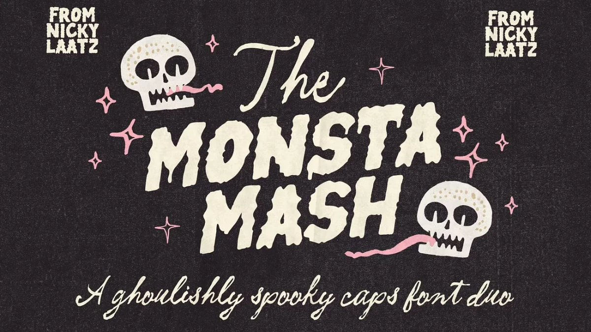
Monsta Mash is a party font, and it knows it. I like that. Nicky Laatz built this Halloween font duo for invites and seasonal labels. It never poses as horror. Halloween 2026 lands on a Saturday, 32 days from today. So the hunt for spooky fonts starts now.
This Monsta Mash font review judges the pack the way a working designer would. It also coins a few terms you can borrow. The Spook-to-Sweet Ratio measures menace against charm. Meanwhile, the Drip Budget caps how much texture a layout can carry. Will the caps survive a two-inch label? That question drives most of what follows.
What Is the Monsta Mash Font Duo?
The Monsta Mash font duo pairs chunky, drippy caps with a wobbly, witchy script. Nicky Laatz designed it. She works from Cornwall, England, and sells through Creative Market and her own shop. The listing promises a sweet spot between creepy and cute, with a vintage Halloween spirit. Creative Market lists the pack at $25. Her own shop showed a sale price of $21.25 at the time of writing.
What Ships in the Monsta Mash Pack
The caps come with bonus backing fonts that fake a hand-drawn outline. Regular and slanted versions exist for each. The script adds slanted and slightly taller variants. Also, the pack needs no special software. Language support covers English only.
That last limit deserves a test. “English only” often means thin accent coverage, so type a word like “jalapeño” before you commit. The listing also skips file formats. Check the download before you promise a client anything.

How Does Monsta Mash Balance Creepy and Cute?
The Spook-to-Sweet Ratio measures how much menace a Halloween typeface carries against how much charm. Chiller from Monotype sits near 90 spook to 10 sweet, in my rating. Monsta Mash lands at 30 to 70.
The drips supply the menace. But the wobble of the script drains it. Together they read as mischief. That ratio suits a kids’ party and a bakery window. It fails in a haunted house queue, where nobody wants charm.
I think 30 to 70 is the right dose. Pure horror-type dates fast. Cute creepy Halloween fonts age better, and Monsta Mash proves the point.
Where Do the Monsta Mash Caps Struggle?
Chunky caps with drips clog at small sizes. Counters, the enclosed holes in letters like A and O, close first. So start at 48 pt and step down until they fill in. Then go up one size and stop.
The Drip Budget is the texture a layout can carry before readers see noise instead of letters. Give each layout one drip zone. Put the caps there. Then let the script and a plain sans handle everything else. Does your background already carry texture? In that case, spend less.
Multi-line headlines need air. Drips that hang low will touch the next line, so open the leading to about 110 percent and check.
Run a ten-minute bench test before you buy or bill. Type MONSTA MASH, a street address, and a word with an accent. Set each at 96, 48, and 24 pt. Then watch which one fails first.
Why Is the Outline Stack the Best Part of Monsta Mash?
The Outline Stack is a two-layer setup. The caps sit on top. A backing font in a contrasting color sits beneath at the same size and baseline. The result looks like someone traced each letter by hand.
Chunky type on a busy photo loses its edges. A backing outline gives them back. That matters more than any single glyph. Halloween layouts often sit on cobwebs and photos, so edge control decides legibility. Monsta Mash ships the backing fonts for exactly this job.
Build it fast. Duplicate the text layer. Swap the copy to the backing font. Change its color. Then check registration. The listing doesn’t say whether the backing glyphs align without nudging, so verify that before you send a proof.
Match your slants too. Slanted caps need the slanted backing. Upright caps over a slanted backing look like a misprint.
How Do You Use Monsta Mash in Real Projects?
Halloween Party Invitation Fonts in Practice
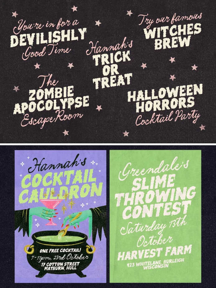
Set the event name in caps on one line and make it big. Use the script for the tagline, such as “bring your own broomstick.” Next, hand the date and address to a quiet sans like Inter. A wobbly script wrecks a street address. Monsta Mash sets the mood, and Inter handles the logistics.
Halloween Packaging and Label Design
On a small Monsta Mash label, the caps carry the product name, and the script carries the tagline. Print a proof at actual size, because a two-inch label eats drips fast. Also, read the license before you print packaging or merchandise. Font licenses often treat those uses differently from web graphics.
Spooky Social Media Graphics
For Instagram portrait posts, build at 1080 by 1350 pixels. Stack the caps in the top third and the script below. Then add the backing layer in a hue that pops against your background. Laatz’s own Monsta Mash preview shows cream caps on dark charcoal with pink sparkle stars. Borrow that palette before you invent one.
How Does Monsta Mash Compare to Creepster and Chiller?
Creepster by Sideshow costs nothing on Google Fonts. Chiller by Monotype ships with Microsoft Office, so it already sits on many office computers. Both are single fonts. Neither brings a script partner or an outline layer. Creepster wins on price. Monsta Mash wins on charm and on the pairing.
One warning on names. Comicraft sells a separate distressed font called Monster Mash. Laatz sells a different release called Monster Madness. So check the spelling and the designer before you pay.
Where Is Halloween Type Heading Next?
Prediction one. Seasonal buyers will favor font duos with built-in outline layers over single display fonts. Monsta Mash points the way.
Prediction two. Cute creepy will keep beating pure horror on retail shelves, because friendly type sells to families.
Monsta Mash at a Glance
| Attribute | Detail |
|---|---|
| Product | Monsta Mash Font Duo |
| Designer | Nicky Laatz, Cornwall, England |
| Style | Halloween font duo with chunky drippy caps and a wobbly witchy script |
| Extras | Backing outline fonts for the caps, regular and slanted; script in slanted and taller variants |
| Price | $25 on Creative Market; $21.25 sale price on the designer’s shop at the time of writing |
| Spook-to-Sweet Ratio | 30 to 70 (my rating) |
| Best uses | Party invites, posters, seasonal packaging and labels, greeting cards, social graphics |
| Weak spots | Small sizes, accented characters, address text |
| Language support | English only |
| Software | No special software required |
| Closest alternatives | Creepster (free), Chiller (Monotype) |
Common Questions About Monsta Mash
Who designed the Monsta Mash font duo?
Nicky Laatz designed it. She works from Cornwall, England.
How much does Monsta Mash cost?
Creative Market lists it at $25. Laatz’s own shop showed $21.25 at the time of writing. Prices change, so check the listing.
What does the Monsta Mash pack include?
It includes chunky, drippy caps with backing outline fonts in regular and slanted versions. It also includes a witchy script with slanted and slightly taller variants.
Does Monsta Mash support languages other than English?
The listing says English only for now. Test accented characters before you commit to a project.
Is Monsta Mash scary enough for a haunted house?
No. It rates 30 spook to 70 sweet in the Spook-to-Sweet Ratio. For straight horror, look at Chiller instead.
Can you use the Monsta Mash script on its own?
The listing says both fonts look good alone. Try the slanted script on a 5-by-7-inch greeting card first.
Check out other trending typefaces here at WE AND THE COLOR.
Subscribe to our newsletter!