
Have you ever wondered what makes a design truly good? Is it just a matter of taste, a subjective feeling? Or is there something more, something… quantifiable? Can good design be mathematically calculated? This question has intrigued designers, mathematicians, and artists for centuries.
Think about it. You see a logo, a website, or a building. Instantly, you have a reaction. You like it. You don’t like it. But why? Is it simply a gut feeling, a random preference? Or are there underlying principles and mathematical relationships, that subconsciously influence your perception? Maybe there’s a hidden code to beauty and functionality.
This article explores this fascinating question: Can good design be mathematically calculated? We’ll explore the intersection of art and science, examining how mathematical principles, like the Golden Ratio and symmetry, impact our perception of design. We will look at how designers can use math to create stunning and effective designs. We’ll also tackle the limitations of a purely mathematical approach.
Get ready to challenge your assumptions about design and discover the surprising truth behind what makes a design truly captivating. So, let’s uncover the complex, beautiful, and sometimes controversial relationship between math and design.
The Allure of Numbers: Exploring Mathematical Principles in Design
Mathematics is the language of the universe. It describes patterns, relationships, and structures. But how can math be applied to design? Mathematical principles offer designers a framework for creating balanced, harmonious, and visually appealing compositions. One of the most famous examples is the Golden Ratio.
The Golden Ratio and Fibonacci Sequence
The Golden Ratio, approximately 1.618, appears repeatedly in nature. It’s found in the spiral arrangement of sunflower seeds, the proportions of seashells, and even the human face. The Fibonacci sequence (1, 1, 2, 3, 5, 8…), where each number is the sum of the two preceding ones, is closely related to the Golden Ratio.

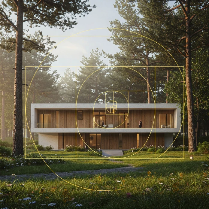
Designers often use the Golden Ratio to create visually pleasing proportions. For example, it can determine the dimensions of a website layout, the placement of elements in a logo, or the arrangement of furniture in a room. Have you ever noticed how some designs just “feel right?” The Golden Ratio might be the reason.
Symmetry and Balance
Symmetry is another fundamental mathematical principle. It is often used in design. Symmetrical designs create a sense of balance, order, and stability. Think of a perfectly symmetrical logo or the facade of a classical building. This balance is pleasing to the eye.
However, asymmetry can also be effective. Asymmetrical designs can create visual interest, dynamism, and a sense of movement. Designers often use asymmetry to draw attention to specific elements or create a more modern and unconventional aesthetic.
Geometry and Grids
Geometry plays a crucial role in design. Geometric shapes, such as circles, squares, and triangles, can be used to create visual structure and hierarchy. Grids, based on geometric principles, provide a framework for organizing content and ensuring visual consistency.
Website layouts, magazine designs, and even architectural plans often rely on grids to create a clean, organized, and user-friendly experience. The principles of mathematics are evident even in the most basic of design choices.
Measuring the Immeasurable: Can Design Be Measured Mathematically?
So, we’ve established that mathematical principles influence design. But can design be measured mathematically to determine its effectiveness? This is where things get tricky.
While certain aspects of design can be quantified, such as the use of color palettes, the size and spacing of elements, and the readability of text, measuring the overall impact of a design is much more complex.
A/B testing is a common method used to measure design effectiveness. Different versions of a design are shown to different groups of users, and their behavior is tracked to see which version performs better. For example, designers might test different button colors or headline fonts to see which generates more clicks.
However, A/B testing only provides data on specific metrics. It doesn’t capture the full range of human responses to a design, such as emotional reactions, aesthetic appreciation, or brand perception.
User experience (UX) metrics, such as task completion rates, error rates, and user satisfaction scores, can also provide valuable insights into the effectiveness of a design. However, these metrics are influenced by a variety of factors, not just the design itself.
Context, user expectations, and even cultural background can all play a role in how people perceive and interact with a design. Thus, quantitative data alone cannot fully capture the essence of good design.
The Human Element: Where Math Falls Short
While mathematics provides a valuable framework for design, it’s important to remember that design is ultimately a human-centered activity. A purely mathematical approach can lead to sterile, uninspired designs that fail to connect with people on an emotional level.
Design is about more than just aesthetics. It’s about solving problems, meeting needs, and creating meaningful experiences. It requires empathy, creativity, and a deep understanding of human behavior. This is why mathematics in design must be coupled with a human touch.
Imagine a website designed solely according to the Golden Ratio. It might be visually pleasing, but if it’s difficult to navigate, doesn’t meet user needs, or fails to convey the brand’s message, it won’t be effective.
The Role of Intuition and Creativity
Intuition and creativity play a crucial role in the design process. Experienced designers often rely on their gut feelings and artistic sensibilities to make decisions that go beyond mathematical calculations.
They experiment with different ideas, explore unconventional solutions, and push the boundaries of what’s possible. These are essential elements of design that cannot be reduced to numbers.
The Power of Storytelling
Design tells a story if it’s done well. It communicates a message, evokes emotions, and creates a connection with the audience. This storytelling aspect is often overlooked in purely mathematical approaches.
A logo, for example, is more than just a collection of shapes and colors. It’s a symbol that represents the brand’s values, personality, and mission. The best logos tell a story that resonates with customers and helps build brand loyalty.
Finding the Balance: The Sweet Spot Between Science and Art
So, can good design be mathematically calculated? The answer, as you might suspect, is not a simple yes or no. Mathematics provides a powerful toolkit for designers. It helps them create balanced, harmonious, and visually appealing compositions. But it’s not the whole story.
The best designs are those that strike a balance between science and art. They are grounded in mathematical principles, but also infused with human creativity, empathy, and a deep understanding of the target audience.
Designers should embrace mathematical principles as a guide, not a rigid formula. They should use them to inform their decisions, but not to stifle their creativity. Ultimately, design is about creating something that is both beautiful and functional, something that solves problems and makes people’s lives better.
The Future of Design: Embracing Technology and Human Insight
As technology continues to evolve, new tools and techniques are emerging that allow designers to leverage the power of mathematics in even more sophisticated ways. For example, generative design algorithms can automatically create a wide range of design options based on specific parameters.
Artificial intelligence (AI) can be used to analyze user data and provide insights into design preferences. These technologies can help designers make more informed decisions and create more effective designs.
However, it’s important to remember that technology is just a tool. The human element will always be essential to good design. Designers need to combine their technical skills with their creative abilities to create designs that are not only visually appealing but also meaningful and impactful.
Embracing the Complexity of Good Design
The question of whether can good design be mathematically calculated is a complex one. The science of good design shows the limitations. While mathematical principles provide a valuable framework for creating effective designs, they cannot capture the full range of human responses and emotions. Mathematical principles in design are a tool.
Good design is about more than just aesthetics and functionality. It’s about storytelling, problem-solving, and creating meaningful experiences. Mathematics in design is important. It requires a balance of science and art, logic and intuition, technical skill, and human empathy.
So, the next time you see a design that you admire, take a moment to appreciate the complex interplay of factors that contribute to its success. Consider the mathematical principles that underpin its structure, but also the human creativity and insight that bring it to life. By embracing the complexity of good design, we can create a world that is both more beautiful and more functional.
Hungry for more? If so, feel free to browse WE AND THE COLOR’s design section. In addition, I recommend reading this article on Wikipedia about Combinatorial design.
Subscribe to our newsletter!


